


![]() XO Logo PNG
XO Logo PNG
Eccentricity and causticity are evident in the recording studio’s gothic, gloomy visual sign. The XO logo represents a union of people who share a love of heavy music.
Meaning and History
![]()
This structure is most closely tied to music because it was initiated by the Canadian songwriter and performer The Weeknd. Her priority was to release three mixtapes. This event dates back to 2011, when the releases of Echoes of Silence, Thursday, and House of Balloons drew attention to the singer and expanded his profile. They also helped promote XO through live performances and internet links. Advertising projects with several retail outlets also contributed to the popularization.
But the studio experienced a real transition to the world of recording in 2012 when it signed an agreement with Republic Records. As a result, she became her parent company and a music producer and distributor. In 2015, XO signed a contract with Belly and Derek Wise and a year later with Nav. In 2018, Black Atlass appeared. After the brand became a subsidiary, it presented seven projects by various artists. The studio also signed a contract with 88Glam, which left after releasing the mixtape of the same name.
Throughout this time, the music studio’s logo has accompanied each new work. It is so minimal that it embellishes, allowing the singers to stand out. An individual symbol is presented in two forms, both positive and negative. Moreover, “negative” in this case does not mean “bad” or “negative.” This is just a negative, like on photographic film, where dark areas appear light, and light, by contrast, appears dark.
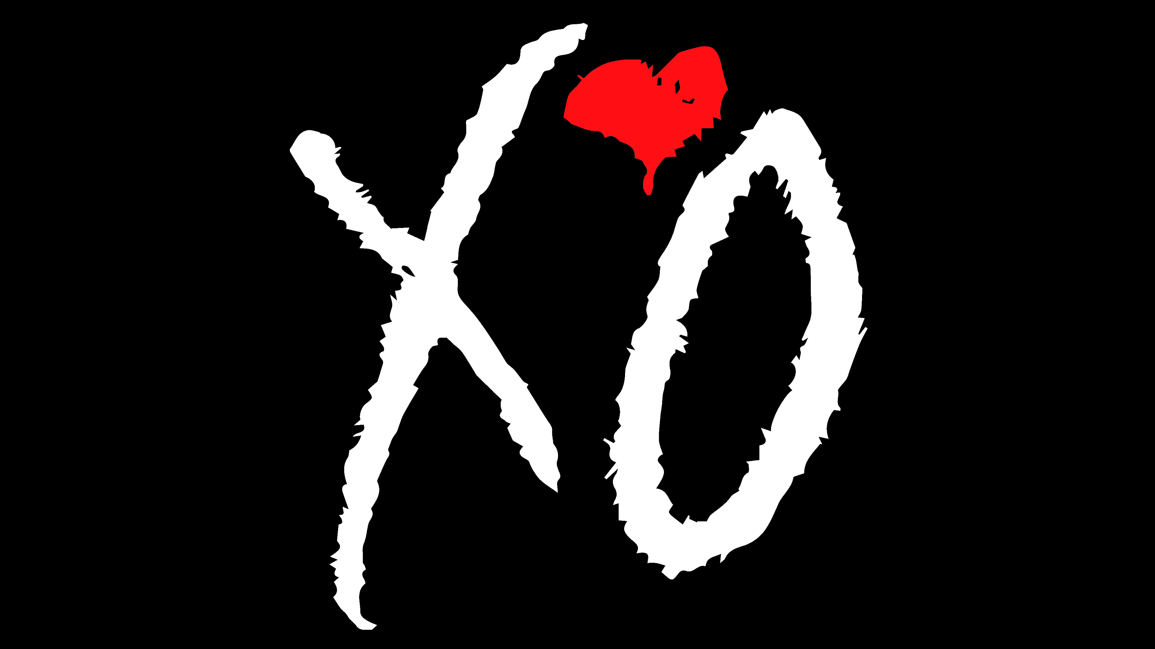
There are only two letters on the record company logo: “X” and “O”. They are both capital letters, written as if in chalk on a blackboard, and executed casually. In general, the name in its appearance resembles a chemical formula, in this case, an allegory for the formula of music. This is evidenced by a miniature heart located at the top between two symbols. It has a double function. The first one replaces the apostrophe when writing abbreviated concepts or names. The second denotes valency, as in classical formulas.
There are two versions of the logo: one with a white background and one with a black background. Accordingly, the inscriptions on them are like a photo negative: light letters on a dark background, and conversely, dark letters on a light background. This technique is called inversion.
Font and Colors

It consists of three elements: two letters and one heart. As evidenced by uneven edges, the signs are executed in a sweeping, careless manner, as if written in a hurry on slate, blackboard, or porous paper. They are vague and rough in appearance. In this case, “X” looks like a cross, which is sometimes replaced by a checkmark to indicate something. And the “O” looks like a zero because it is narrow, whereas the standard letter is round. The heart in the middle is very tiny and denotes disposition, affection, and love.
If we consider two capital letters as text, we note that they are written in distinct fonts with no analogs. The color palette is simple: monochrome, consisting of black and white.