


![]() USPS Logo PNG
USPS Logo PNG
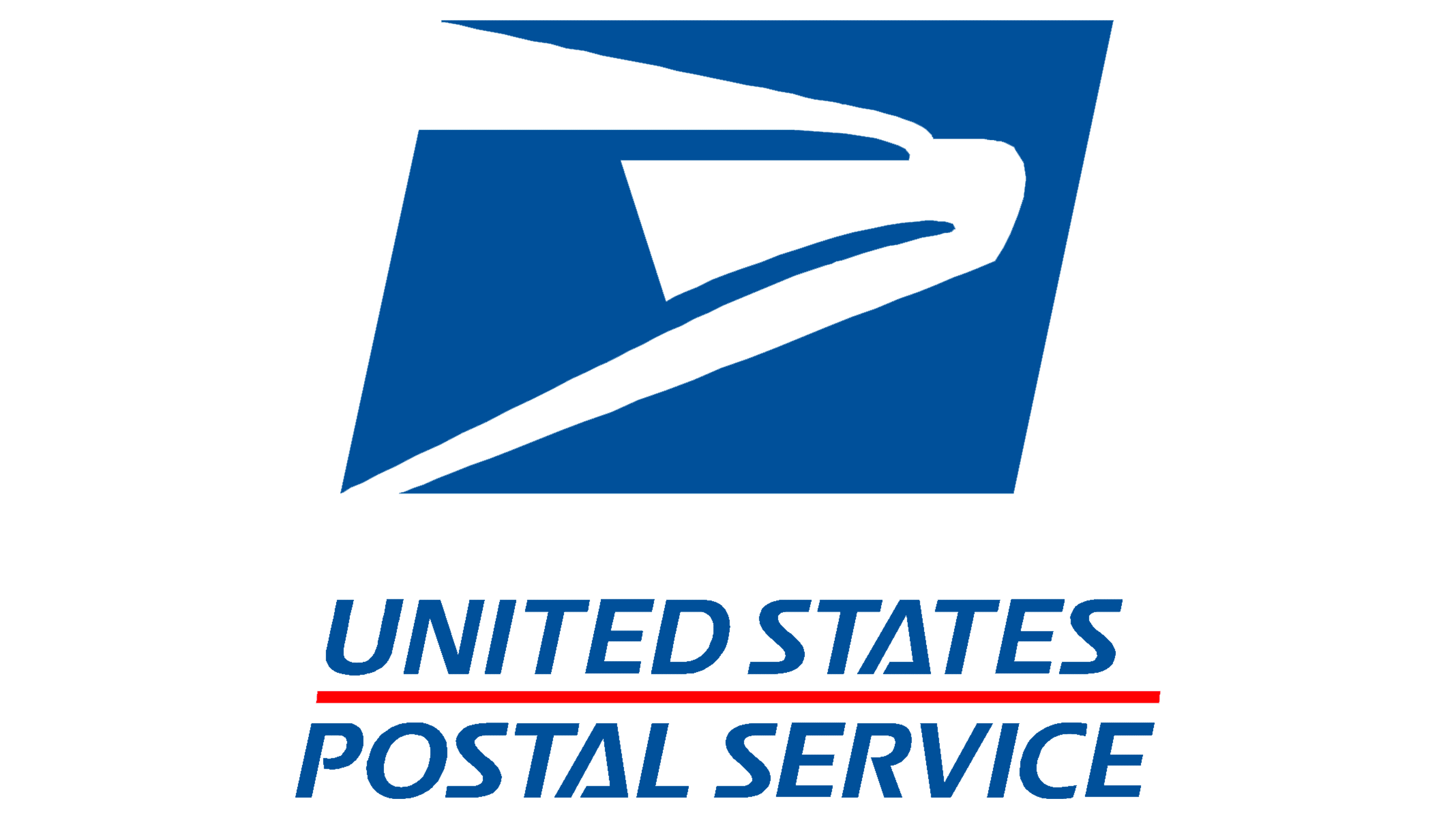
“Customer letters are our priority,” states the USPS logo. The emblem demonstrates the speed at which mail is delivered from sender to recipient, highlighting the delivery service’s reach across all corners of America.
USPS predates the United States itself. On July 26, 1775, the Second Continental Congress created a postal system and appointed Benjamin Franklin as Postmaster General. Drawing on his earlier work from 1753, he reorganized routes and cut delivery times between major cities.
By 1789, under George Washington, the network included about 75 post offices. The Constitution granted Congress authority over postal routes, turning the system into a tool for distributing newspapers and political ideas across a growing nation.
In 1847, the first postage stamps were issued with Franklin and Washington. In 1863, uniform nationwide rates replaced distance-based pricing, and free city delivery began. In 1896, rural delivery extended service to remote areas and supported road construction.
In April 1860, the Pony Express carried mail across nearly 3000 kilometers in ten days. Still, it ended in 1861 after the transcontinental telegraph was completed.
On May 15, 1918, regular airmail service began between Washington, Philadelphia, and New York, operated by military pilots. By 1920, routes reached San Francisco, and by 1924, night flights reduced cross-country delivery to about thirty hours.
In 1963, the ZIP code system enabled automated sorting; it expanded to 9 digits in 1983 to handle growing mail volume.
After a nationwide strike in 1970, reforms created the United States Postal Service on July 1, 1971, as an independent entity with control over pricing and labor agreements.
Unlike private carriers such as FedEx and UPS, USPS must deliver to every address in the country at uniform rates, including Alaska, Hawaii, and remote communities.
Meaning and History
![]()
Though many believe otherwise, the United States Postal Service has no official motto. It does have a mascot, the bald eagle, recognized as a national symbol of the USA and depicted on the modern USPS logo. However, this bird was not always the service’s representative. Previously, other symbols were used to indicate swift delivery.
What is USPS?
USPS is the internal postal service of the United States. It’s an independent federal agency and one of the world’s largest organizations by employee count. Its main office is located in Washington. The service was founded in 1775.
1829 – 1837
![]()
The United States Postal Department was formed in 1792. It was symbolized by Mercury, the ancient Roman patron of commerce and the messenger of the gods. Ebenezer Hazard proposed using the messenger of the gods as the main symbol in 1782 when the USPOD didn’t yet exist, and there was only the United States Postal Agency.
Hazard ensured Mercury was depicted in the postal center. The swift god ran across the globe with arms outstretched. He was recognizable by his characteristic attributes: winged helmet and caduceus. The mythical figure was encircled by “SEAL OF THE GEN POST OFFICE DEPARTMENT.” This emblem was used until 1837.
1837 – 1970
![]()
In 1837, the postal service adopted a new seal featuring a horseman. Not just any horseman, but a postman, as a mailbag hung from his saddle with the inscription “U.S. MAIL.” This image arose because couriers previously rode horses to deliver packages and mail overland.
Designers made the logo dynamic, as USPOD head Amos Kendall wanted it to reflect the postman’s hard work. The black-and-white drawing was inside a circle, surrounded by two inscriptions: “POST OFFICE DEPARTMENT” and “UNITED STATES OF AMERICA.” The country’s name was split by five-pointed stars to the right and left.
1970 – 1993
![]()
In mid-1970, the U.S. President signed the Postal Reorganization Act, which created the United States Postal Service. Simultaneously, the emblem changed: the bald eagle was first centered above a red horizontal line, wings spread. Below was the black inscription “U.S. MAIL,” underscored by another red line. Instead of a square frame, the full-service name and nine five-pointed stars were used in a design by Raymond Loewy, an industrial design master.
1993 – today
![]()
When Marvin Runyon became Postmaster General, he decided to update the logo. As a result, only the white head with a 90-degree hooked beak remained of the eagle. Designers placed it inside a blue rectangle labeled United States Postal Service to the right. The first two words were above a thin red line. Below is the second part of the inscription in the same distinctive sans-serif italic font.
Font and Colors
US Postal Service logo
The bald eagle symbolizes USPS’s future and the spirit of the modern era. It’s a majestic and powerful bird associated with America and the USPS. The current logo appears very decisive, as depicted by artists, soaring upward.
Andrew Higgins, a hydrodynamics enthusiast and engineering professor, even calculated a value that would help determine the eagle’s speed. He assumed the white halo around the head represented a shock wave. Using several formulas, he calculated the Mach number 4.9. This means the bird moves faster than the sound. Two other Twitter users followed suit, noting the blue color shift and estimating the eagle’s speed at about 60,000 km/s.
The italic font used for the logo gives it a unique, modern look. All letters, including the triangular “A,” were designed by typographer Daniel Zadorozny. The primary colors are white, red, and blue, corresponding to the Hex shades #FFFFFF, #DA291C, and #004B87.
FAQ
What Does the USPS Logo Represent?
The USPS logo features the bald eagle, a symbol of the United States. Positioned sideways and facing right, the bird embodies endurance, aspiration, determination, and the grandeur of the American postal service.
Is it Illegal to Use the USPS Logo?
Yes, unauthorized use of the USPS logo is illegal. To photograph the sign for personal use, one must contact the local post office and request permission from its management.
Is USPS a Trademark?
It is a trademark owned by the executive branch of the United States government.
Who Designed the USPS Postal Service Logo?
CYB Yashumura Design Inc., a subsidiary of Young & Rubicam, designs the United States Postal Service logo. The company proposed three hundred options.