Speed, reliability, and security are symbolized by the visualization of the American logistician – UPS, whose logo features a heraldic shield and the acronym of the name. The modern visualization demonstrates the brand’s responsibility, focusing on service-level growth.
UPS: Brand overview
| Founded: | August 28, 1907 |
| Founder: | James E. Casey |
| Headquarters: | Sandy Springs, Georgia, U.S. |
| Website: | ups.com |
Meaning and History
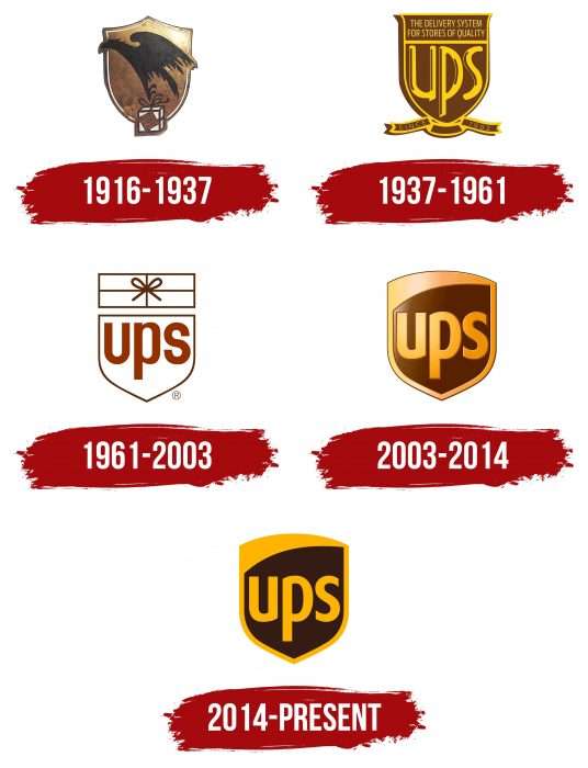
Throughout its existence, the corporation has had five emblems. The current brand name is United Parcel Service, abbreviated as UPS. This acronym has always been associated with the logo.
What is UPS?
It’s an American logistics company specializing in domestic and international transportation. It provides express delivery worldwide, utilizing an extensive fleet of vehicles and its aviation service.
1916 – 1937
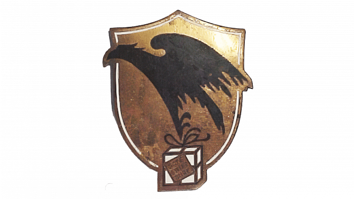
The original version dates back to 1916. The debut logo featured a flying eagle with a bag in its claws. The slogan “Safe, Fast, Reliable” was also present. Behind the brown bird was a bronze shield with a golden outline. Knightly attributes were incorporated into the branding after the company merged with a local competitor.
1937 – 1961
In 1937, the legendary UPS acronym appeared on the logo, which has remained a part of the company’s emblem ever since. The inscription (abbreviated) received a noble golden hue. The shield was enlarged and colored brown. Below was a fluttering ribbon with triangular cuts at the ends and the phrase “Since 1907” (right and left). The top prominently featured was “Delivery System for Quality Shops.”
1961 – 2003
During this period, the logo underwent a redesign, resulting in a radical change. Minor details were removed, leaving only the key elements significant to the corporation. In particular, the shield and acronym. A rectangular box tied with a bow was added. The color of the logo became minimalist: white and brown. Paul Rand, the author of the update, declared his appreciation for simplicity.
2003 – 2014
The previous version gave way to a new one – full-color and more detailed. Developers added colors, returned the shield to its classic shape, and brought back the foot of the letter “u.” Additionally, they stylized the inscription, preserving the font in lowercase. A small bevel was made in the upper left part of the abbreviation, modernizing the logo.
In this year, minor changes occurred, mainly in color. Thus, designers returned the emblem to the palette of the original version – 1916.
The current UPS emblem is a rectangular heraldic shield with a pointed bottom and rounded top. This emblem has been present in all logos in various forms. Previously, it was supplemented with symbols related to the delivery service: a box (in 1919) and a tied envelope (in 1961). Then, the designers removed them to free up space for the company name. So now the abbreviation “UPS” occupies all the free space inside the board.
American graphic artist Paul Rand developed a unique font for the company, UPS Sans. He used FF Dax as the basis, enhancing the expressiveness and simplicity of the signs. All three letters in the logo are lowercase, although it is an abbreviation of United Parcel Service. The golden inscription reflects the high status of the delivery service. Part of the shield is painted in the brown color known as UPS Brown. Both colors formally represent the brand. Hexadecimal color codes: #351C15 and #FFB500.
2014 – today
In 2014, a two-dimensional version of the previous logo appeared. Developers removed the gloss, glare, and shadows to make it flat, leaving only relevant elements – the abbreviation on the shield. The division into two contrasting zones, yellow and brown, was also preserved. The dark color almost entirely replicates the shape of the shield, while the light acts as a frame with an angle at the top. The thin outlining line running along the edge also disappeared.
UPS: Interesting Facts
United Parcel Service (UPS) is a huge company that helps deliver packages worldwide. It started way back in 1907 in Seattle with just $100.
- Simple Start: UPS began as a tiny service that delivered messages and packages on foot and using bicycles. It was first called the American Messenger Company.
- First Delivery Car: In 1913, they started using a Model T Ford for deliveries, which was a big deal because it helped them grow bigger than a local service.
- Going International: UPS started delivering in Canada and Germany in 1975 and now operates in over 220 countries.
- Tracking Packages: In 1991, UPS began using handheld devices to scan packages, making it easier for people to see where their packages were and when they’d arrive.
- Lots of Employees: UPS is one of the biggest places where unionized workers (like the Teamsters Union) work in the U.S.
- UPS Airlines: UPS started its airline in 1988, and it is now one of the biggest cargo airlines in the world.
- Caring for the Planet: UPS tries to be good to the environment by using vehicles that don’t pollute as much, like electric or hybrid cars.
- Helping in Emergencies: UPS’s UPS Foundation delivers aid when disasters occur worldwide.
- New Ways to Deliver: UPS is always looking for new ways to deliver packages, like drones or electric bikes, especially in places with lots of traffic.
- Famous for Brown: UPS is known for its brown delivery trucks and uniforms, which they chose to show they are reliable and professional.
From a small messenger company to a big name in global delivery, UPS keeps finding new ways to send packages, help communities, and take care of the planet.
Font and Colors
Designers chose a modified version of FF Dax, which served as the basis for the adapted font UPS Sans. The corporate palette moved to a simple scheme – without gradients and gloss. The emblem now has warm yellow and chocolate-brown colors.
UPS color codes
| Brown | Hex color: | #351c15 |
|---|---|---|
| RGB: | 53 28 21 | |
| CMYK: | 0 47 60 79 | |
| Pantone: | PMS 4975 C |
| Gold | Hex color: | #ffb500 |
|---|---|---|
| RGB: | 255 181 0 | |
| CMYK: | 0 29 100 0 | |
| Pantone: | PMS 7549 C |
FAQ
What does the UPS logo mean?
The 1916 logo symbolized speed and reliability, as it depicted an eagle flying with a bundle against a shield. The 1937 emblem represents the UPS acronym, formed from the company’s full name, United Parcel Services.
Why did UPS change its logo?
After 42 years of using the logo with the bow-tied parcel, UPS changed its design to demonstrate seriousness and a high level of service. Thus, the company wanted to show the vast range of delivery types, not just standard (with parcels).
Who created the logo for UPS?
James Casey developed the very first logo (with the eagle). Designer Paul Rand created the modern version. He presented only one version to the client, saying: “That’s it.”
Can I use the UPS logo on my website?
UPS freely provides users with the Authorized Shipping Outlet sign for their websites and signs. Otherwise, special permission is required to use a limited number of logos for business purposes.


