


![]() Petco Logo PNG
Petco Logo PNG
Softness, care, and the ability to condescend to the smaller brothers are embodied in the Petco logo. In the store, pets are treated with the utmost care, and the full range of animal maintenance issues is addressed. The emblem attracts accessibility and tranquility.
Petco began on February 11, 1965, in La Mesa, California, when Walter Evans founded United Pharmacal Company, or UPCO. The mail-order business started with $10,000 from his savings. It sold veterinary drugs, worm treatments, collars, and feed supplements to veterinarians, kennels, and farmers.
In 1976, UPCO opened its first retail store in La Mesa. In 1979, the company became Petco, shifting from veterinary supply orders to a full pet retail format. Its first store outside California opened in Tigard, Oregon, in 1980. In the mid-1980s, Petco moved toward premium pet food, selling brands such as IAMS, Science Diet, and Nutro.
In 1988, Petco bought Wellpet, Inc. and The Pet Department, growing from 40 to 130 stores and expanding into Oregon, Washington, and Texas. The Spectrum Group and Thomas H. Lee Company took control in the same year. In 1994, Petco went public on NASDAQ under the ticker symbol PETC, with 218 stores in 13 states and revenue above $189 million. Grooming services followed in 1995, and the PALS loyalty program launched in 1997, while PetSmart became its main rival.
In 2000, Leonard Green & Partners and TPG Capital took Petco private for about $600 million. Petco.com launched in 2001, and the company returned to NASDAQ in 2002. In 2003, Petco bought naming rights to San Diego’s Petco Park for $60 million. It reached all 50 states in 2008, was sold to CVC Capital Partners and the Canada Pension Plan Investment Board in 2016, and went public again in 2021 as Petco Health and Wellness Company, Inc.
Meaning and History
![]()
The thematic logo makes the company’s shops, offices, and centers easily recognizable. Above the entrance are a blue cat and a red dog, sitting side by side.
1965 – 1974
![]()
At first, a standard sign was used. The firm operated as Upco Ranch & Kennel Supply, focusing on the veterinary segment. She sold all kinds of pet food and treated pets. With the introduction of pet care products and accessories, Petco spun off and established its brand.
1974 – 1979
![]()
After the rebranding, the firm became Upco Animal Supplies, deepening its support for pets at all levels. As an emblem, she chose a simple inscription consisting of her name. The text on the sign formed two lines. At the top was the word “UPCO.” It took up the entire row and was large, bold, and sans serif. Smooth letters were spaced at an optimal distance from each other, so they did not touch and were easy to read. At the bottom was the rest of the title: Animal Supplies Unlimited. The words were set in capital letters and matched the general style: strict, businesslike, and minimalist. All elements were placed on a wide gray rectangle.
1979 – 1989
![]()
Following the establishment of the Petco brand, the company undertook another rebranding effort, including a logo redesign. Moreover, the visual identity signs have changed dramatically. It featured three animal figures that the firm focused on. She offered products for cats, dogs, and horses. The signboard has become multi-structured, with text and graphic parts. Behind the word “Petco,” executed in large letters of different sizes, were a horse (left) and a dog (right). Together, they looked toward the center where the cat was. The images were in different styles: for a cartoon, the artists painted the horse realistically, while the cat and the dog were painted realistically.
The smallest was the letter “E.” At the same time, it connected to “P” and appeared to be its continuation. “O” had an elongated shape, resembling an oval. The “C” was also small. In addition, the developers made it look wide and horseshoe-shaped. An explanatory inscription appeared under the pet store’s name: “Animal Supply Super Markets.” It was typed in smooth, uppercase letters.
1989 – 1991
![]()
After the veterinary network stopped serving large livestock (particularly horses), the brand changed its emblem. She not only received an update but also had it concretized: there were still a cat and a dog sitting next to it. The contour animals looked at the onlookers, which made them look very cute. The writing style of the word “Petco” has also changed: the letters have become larger and bolder. The resemblance of “C” to a horseshoe has disappeared. The serifs have been removed.
1991 – 2011
![]()
For the next ten years, the veterinarian brand used a colored logo. It consisted of friendlier animals; if I may say so, the designers changed their breeds. The dog already resembled a simple mongrel, of which there are many, and the cat, an ordinary mongrel, was not as “well-fed” as before. The drawing style has also changed: it has become closer to animation, with life-affirming, cheerful notes. The dog’s ears were ridiculously raised, and the cat’s whiskers diverged in different directions in parallel straight lines.
The animals were drawn in black contour lines and sat at the end of the brand name, with an “O” in the background. The letters were enlarged evenly and kept the same size. Moreover, they looked like inflated balloons, a typical feature of cartoon design. At the bottom was an inscription in a strict serif type with minimal letter spacing. It was a call to action – this is how the company expressed its concept.
2011 – 2020
![]()
In 2011, the emblem was updated again: a different font was used, and the cat-and-dog image was corrected. As a result, the symbols have become clearer, stricter, and smoother. The curvatures at the ends have disappeared; instead, there are smooth cuts. The letters have been converted to lowercase.
This variant was developed with input from the agency partner, Lippincott (which created the logotype). Still, Petco’s in-house creative team, led by VP James Blanton, who oversaw brand and creative from 2010 to 2015, developed a new, streamlined RUFF and MEWS icon (dog and cat).
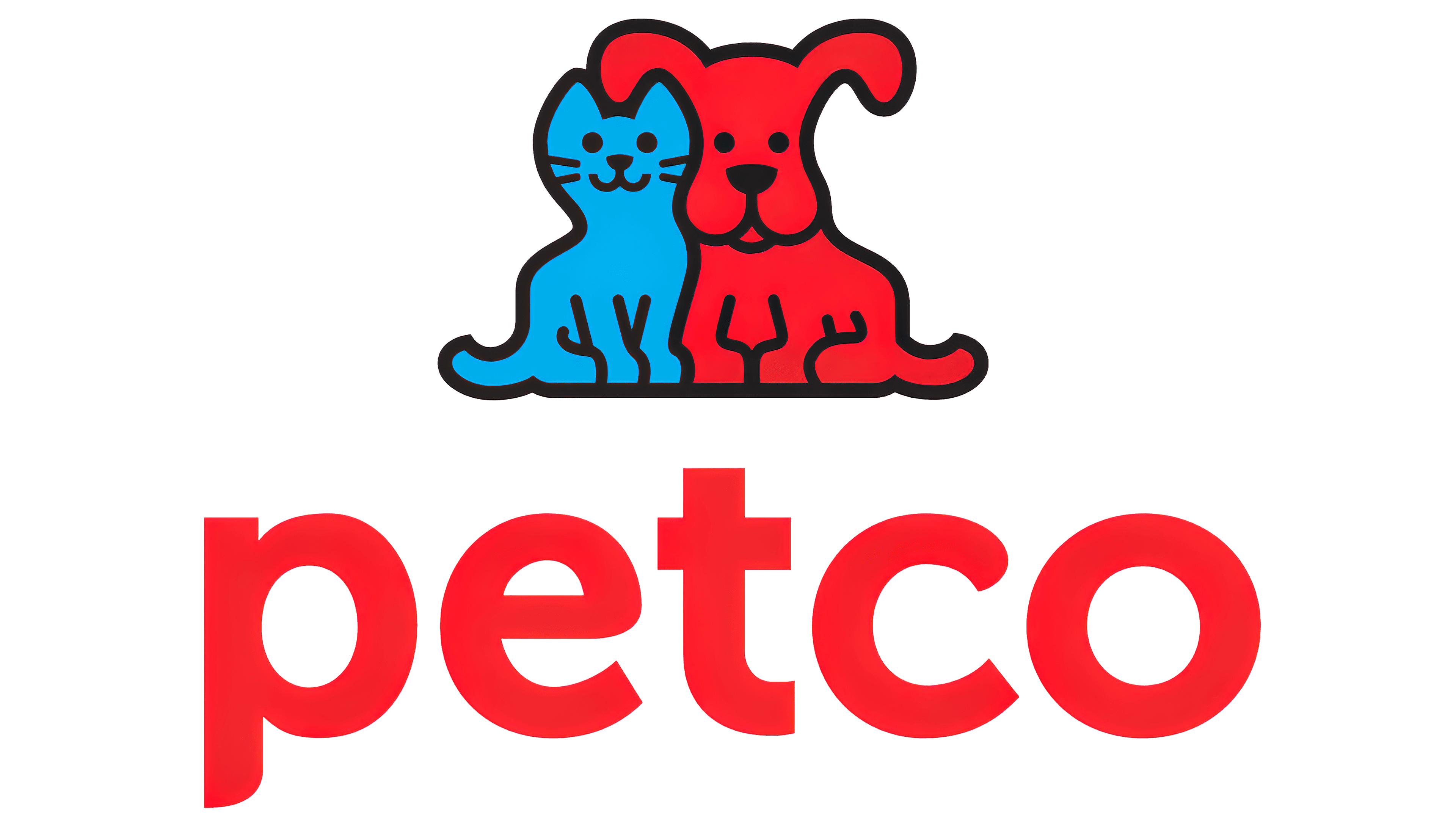
2020 – today
![]()
The modern logo is the most minimalistic of them all. This is due to a change in the pet store network’s specifications, as the service sector includes animal grooming and training. Charitable activities, pet care, and their distribution to homes have also intensified. The contingent of those to whom food and goods are intended has also changed: now, there are not only cats and dogs but also reptiles, hamsters, guinea pigs, parrots, rats, and other small animals that brighten human life. Therefore, only one inscription remained on the logo: the name.
Font and Colors
The identity of this veterinary trade network evolved from simple to complex in leaps and bounds. In early versions, it was an unremarkable text of an informational and advertising nature. It was placed on a sign above the building entrance. Then there was a drawing of pets. For the current version, the designers again chose only the inscription. They used the store names from the previous version, enlarged them, dyed them blue, and slightly corrected the lettering. However, the consumers were unhappy with the disappearance of the two cute pets.
The Petco emblems use the Amatic and Gotham family typefaces. The official palette is not very diverse. Early versions were black and white. The colors appeared later when the transition to the image of a red dog and a blue cat was realized.