For many pet owners, the Purina logo is associated with quality food for dogs and cats. But it has another hidden meaning. The emblem symbolizes balance, which is essential for robust health. Webster Edgerly, the founder of the Ralstonism movement, partly inspired this idea.
Purina: Brand overview
Meaning and History
The current company, Nestlé Purina PetCare, was formed in 2001, based on the conglomerate Ralston Purina, which emerged in 1894. The word “Ralston” is not actually a surname but an acronym invented by Webster Edgerly. It is formed from seven terms:
- Regime;
- Activity;
- Light;
- Strength;
- Temperation;
- Oxygen;
- Nature.
These are the life principles of Edgerly, a fanatic of healthy eating and the creator of the Ralstonism social movement. One of his followers was William H. Danforth, who founded the Robinson-Danforth Commission in 1894 and produced animal feed under the brand Purina. Later, whole grain cereals for people were added to the assortment under the Ralston brand, and in 1902, Edgerly allowed the company to be renamed Ralston-Purina.
The checkerboard logo, created by William H. Danforth, also reflects a deep life philosophy, though different from Ralstonism. It symbolizes health, achievable only through the balance of four components: physical, mental, social, and religious. Each is represented by a red corner square, and their arrangement symbolizes equilibrium among them. This corporate culture aligns with the views of the Danforth family, which for several generations included business people, clergy, and politicians.
What is Purina?
Purina is the abbreviated name of the company Nestlé Purina PetCare, which was formed in 2001. Its predecessors were Ralston Purina and Friskies PetCare. The American enterprise produces food and other goods for pets under various brands, including Alpo, ProPlan, Beneful, and Felix. Its headquarters is in St. Louis, and its products are sold worldwide.
1969 – today
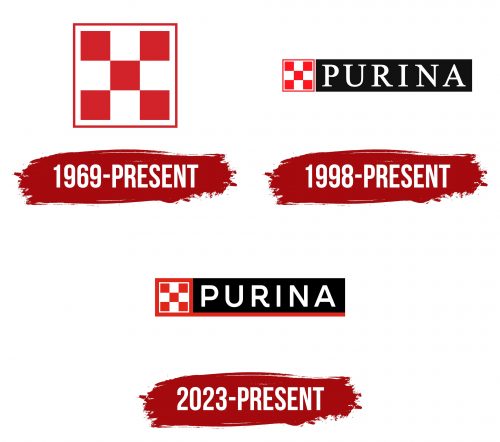
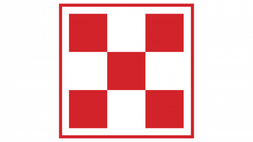
Purina began using the famous checkerboard pattern in 1894 to mark its products. However, it was not until 1969 that it standardized this pattern and made it its official logo. It looks like a large white rectangle with a red border. Inside is a “checkerboard” consisting of five red squares, with four white squares visible in the white negative space between them. According to William H. Danforth, the corner geometric figures represent elements of human well-being: physical, mental, social, and religious. Their balance symbolizes health.
But there’s a more prosaic explanation for the Purina emblem. Rumor has it that William’s mother dressed all her children in the same clothes because she sewed them from one piece of fabric. One time, she came across the material with a red and white checkerboard pattern, and this inspired the company founder’s original nine-square logo.
1998 – today
In 1998, the geometric symbol was reduced and complemented with the white word “PURINA,” positioned to the right in a black rectangle. The brand name is written in a legible font with long serifs. All letters are uppercase and have strokes of varying thickness, making them dynamic. In this logo, everything is balanced – from the square pattern to the rectangular shape of the serifs. The red color has a bright shade.
2023 – today
In the USA, a new emblem has been used since 2023, introduced after Ralston Purina joined Friskies PetCare and the subsequent creation of Nestlé Purina PetCare. It has a classic design but differs in the style of inscription: now, the brand name is in a semi-bold font without serifs. The “R” has a distinctive horizontal extension on the right side. The red square frame of the emblem has become thick and is connected to a long strip of the same color. This line stretches to the right, serving as a base for the black rectangle.
Font and Colors
The creators of Purina logos chose fairly clear fonts that can be scaled. For instance, in the 1998 wordmark, an antiqua resembling Nimbus Roman No9 L Regular from URW++ or Nyte Book from DSType is used. In the 2023 version, the inscription is made in a custom grotesque with a recognizable bend at the “R.” Here, the letters appear soft due to rounded corners.
Designers made the brand name white and placed it on a black background to create contrast for the red emblem. This classic color combination attracts attention with its emotionality.
