The Toronto Rock logo is original and captivating. It attracts attention like a magnet, and its image warms fans’ hearts through its national identity, love for music, and fiery passion for sports and country.
Toronto Rock: Brand overview
Toronto Rock’s journey began in 1998 as the Ontario Raiders in Hamilton, Ontario. After one season, the franchise moved to Toronto and adopted the name Toronto Rock.
The 1999 season marked their debut and an extraordinary success. The team claimed the championship title by defeating the Rochester Knighthawks 13-10 in the final. This victory made them the first team in NLL history to win the championship in their inaugural season.
The following year, the team achieved another championship by triumphing over the Rochester Knighthawks with a thrilling 14-13 victory in the final. In 2001, they reached the finals for the third consecutive year, facing a defeat by the Philadelphia Wings. The title was reclaimed in 2002 by defeating the Albany Attack, reasserting their dominance.
Their winning streak extended in 2003 when they secured their fourth championship in five years with an 8-6 victory over the Rochester Knighthawks. They clinched another championship in 2005, overcoming the Arizona Sting in the final, solidifying their reputation as one of the NLL’s top franchises.
Despite a period without championship titles, the team consistently performed well, regularly making playoff appearances. In 2009, a significant change occurred when Jamie Dawick sold the franchise to a group of investors led by Jamie Dawick Jr.
2011, they returned to glory by winning their sixth championship, narrowly defeating the Washington Stealth 8-7 in the final. Throughout its history, the team attracted star players. Lacrosse legends such as Colin Doyle, Jim Veltman, and Blaine Manning spent significant portions of their careers with the team.
Home games are played at the Scotiabank Arena (formerly Air Canada Centre), sharing the venue with the NHL’s Toronto Maple Leafs and the NBA’s Toronto Raptors. The arena can accommodate over 19,000 spectators for lacrosse games.
Meaning and History
What is Toronto Rock?
It is a professional lacrosse team based in Toronto, Canada. The team plays in the National Lacrosse League. Known for its successful performance, the team has many championship titles. Home games are held at the Scotiabank Arena. Since its founding, the team has gained great popularity among fans and is one of the leading teams in the league.
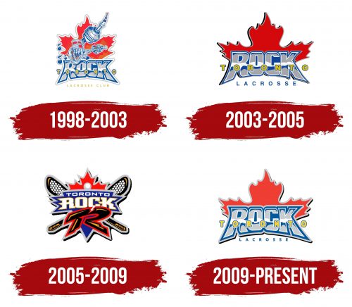
1998 – 2003
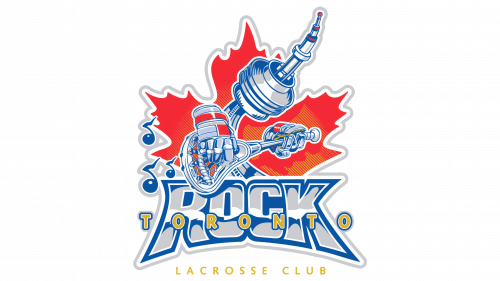
The team’s first logo impresses with its originality. The background of a maple leaf, a national symbol of Canada, resembles the flames of a campfire. The emblem signifies community, team unity, and patriotism. The fire unites fans in support of their favorite players.
The Toronto television tower is depicted wearing lacrosse gloves and playing a lacrosse stick like a guitar on the red background. The tower is a recognizable element of the city, and the gloves and stick are attributes of lacrosse. This unconventional approach brings the symbols to life and focuses on the main theme.
Musical notes emanating from the stick represent the sounds of music. The association with a guitar is inspired by the name Toronto Rock, which was chosen to highlight Toronto’s vibrant music scene. The players are as skilled in lacrosse as professional musicians are in their craft.
2003 – 2005
The team’s emblem has been simplified. The three-dimensional red leaf in the background looks noble and solid, and the intricate carving along the edges highlights the players’ skill.
The unique font turns “Rock” into a mountain. The color of each letter reflects the blue sky, Canadian lakes, and snow-capped peaks. The maple leaf and nature scenes connect the emblem to the country the team represents.
However, the logo lacks lacrosse elements. Only a small, thin inscription at the bottom indicates what the symbol is dedicated to.
2005 – 2009
In 2005, the emblem was updated to include elements of the game, addressing the shortcomings of the previous design.
In the background, crossed lacrosse sticks symbolize the battle for the ball. The collision element is shown through sharp, angular backgrounds of the letters, conveying the sound of impact. The letters “T” and “R,” the name’s initials, are combined into a large black and red symbol, split by a lightning bolt.
The logo conveys the game’s speed, intensity, danger, and fierce competition for victory. The team players are energetic and ready to plunge into the heart of the action.
The image of the ball in the center is elevated on a pedestal, resembling a precious pearl, a valuable prize for which the battle is fought.
2009 – today
Returning to the concept of the 2003 logo emphasizes the team’s commitment to preserving traditions and respecting its roots. The minimalism and neatness of the details reflect the discipline and orderliness inherent to the Toronto Rock team. The logo symbolizes athletic achievements and connects the team to its history and culture, highlighting the importance of national symbols and patriotism.
The Toronto Rock logo combines a stylized “ROCK” inscription with the image of a maple leaf, a symbol of Canada. The large letters of the logo are set against a bright red maple leaf, creating a compact and memorable image. Below the main inscription is the city name “TORONTO” in yellow letters with a blue outline, and beneath that, the word “LACROSSE” in blue.
The maple leaf in the emblem represents Canada, its national values, and patriotism. The stylized form of the leaf resembles the flame of a campfire, symbolizing passion for the game, team spirit, and the pursuit of victory. The logo expresses love for lacrosse and unites players and fans as one.
The emblem highlights the importance of national identity and pride in the team’s Canadian origin. It emphasizes teamwork, precision, and coordination in play, which are crucial elements for success in sports.
The logo’s font is large and bold, giving it a sense of strength and reliability. The “ROCK” inscription is in blue with a white outline, adding contrast and making it easily readable. The word “TORONTO” is highlighted in yellow with a blue outline, creating a bright accent.
The primary colors of the logo are red, blue, white, and yellow. The red maple leaf symbolizes Canada and passion, the blue color of the “ROCK” letters and “LACROSSE” word represents stability and confidence, the white outline adds purity and clarity, and the yellow “TORONTO” letters bring brightness and dynamism to the overall image.
