Aggressive and predatory “dinosaurs” are displacing weak and aimless creatures. Athletes from the Toronto Raptors club chose a logo featuring a prehistoric animal that inspires them to resounding victories. Basketball players are always ready for powerful attacks and brilliant maneuvers. All this is a symbol of indomitable will.
Toronto Raptors: Brand overview
| Founded: | 1995 |
| Founder: | Maple Leaf Sports & Entertainment |
| Headquarters: | Toronto, Ontario, U.S. |
| Website: | nba.com |
One of the few positive moments that made 1993 memorable was the release of Jurassic Park, one of history’s most popular and highest-grossing movies. The film had the effect of an exploding bomb: fascination with dinosaurs became universal, and the Tyrannosaurus Rex became a new cult character.
That same year, nearly half a century later, the return of professional basketball to Canada was announced. The “Toronto Raptors” are the only NBA team representing Canada. The Raptors were founded in 1993, and they joined the National Basketball Association in 1995 when the leadership decided to expand the league to include Canadian teams. Along with the “Toronto Raptors,” the “Vancouver Grizzlies” also joined the NBA, but in 2001, the club changed its location from Vancouver (Canada) to Memphis (Tennessee, USA). Since then, “Toronto” has been the sole representative of the “land of maple leaves.”
One main task was choosing a suitable name, so a contest was announced in Toronto, collecting over 2,000 entries. The most preferred option was to return to the roots: the team Toronto Huskies was remembered. However, the “Huskies” option soon fell through due to the club’s logo similarity with the Minnesota Timberwolves emblem.
The management decided to announce a contest for the best team name. Over 2,000 suggestions for the club’s name and emblem were sent, of which only nine were left for consideration: Beavers, Bobcats, Tyrannosaurs, Pigs, Dragons, Scorpions, Raptors, Tarantulas, and Grizzlies. In the end, the Toronto Raptors, inspired by the Hollywood blockbuster, won the vote.
Meaning and History
The young team, formed in 1993, received its logo three years later in 1996. Based on the name, it is associated with the theme of dinosaurs. Initially, it was an image of an anthropomorphic predator at full height, but then they removed it, leaving only the ball.
Thanks largely to the 1990s, the teams’ colors began to correspond to modern trends and tastes. Therefore, many sports franchises seemed to take a decade-long vacation in style, demonstrating a complete lack of style and good taste. The huge popularity of Steven Spielberg’s blockbuster “Jurassic Park” (1993), which had the effect of an exploding bomb, influenced pop culture. Fascination with dinosaurs became a common phenomenon, including for the Toronto Raptors team. Therefore, the team’s logo featured a cartoon Tyrannosaurus Rex as a cult character. As for the team’s color palette was influenced by the so-called purple-black revolution of the 1990s. Unsurprisingly, it was purple-black. Only after nearly 20 years of the franchise’s existence did it agree to adopt a new version of the logo, elements of which were originally present on the team’s alternative emblem.
What is Toronto Raptors?
The Toronto Raptors is a member of the National Basketball Association and the only Canadian team since 2001. It was founded in 1995 and has had varying success. In 2019, they managed to win the NBA Finals for the first time.
1996 – 2008
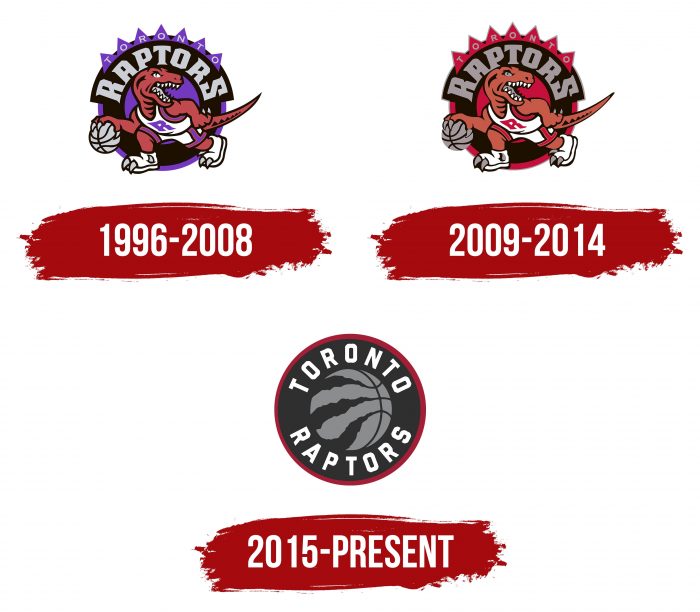
The management chose a velociraptor as the main element of the team’s logo. This fast and nimble creature, capable of instantly reacting to circumstances, has tremendous endurance and is a patient predator. The red dinosaur is dressed in white sports gear – shorts and a T-shirt with the letter “R” on the chest. He leads a basketball, looking back at the animal’s feet – sneakers with two protruding claws. The long tail extends far beyond the logo. At the top is an arched word “Raptors,” and above it, in smaller font – “Toronto.” The emblem also features purple lines, a circle, and spikes.
2009 – 2014
The 2009 changes mainly concerned color. All other elements remained the same: a round background (in the form of a disk), sharp “spikes,” like on the back of a velociraptor, an open mouth with two rows of teeth, and so on. In this version, designers replaced the purple color with red to add aggressiveness to the logo and intimidate competitors.
2015 – present
After seven years, the team presented an updated logo. It radically differs from the previous versions, as it contains a different design: no prehistoric dinosaur is on it. Thanks to this, the readability of the inscription has increased. But the predator has not disappeared completely: its presence is noticeable by the traces of sharp claws on the basketball. The logo has acquired the shape of a classic disk with a round central part and edging around the edge.
The Toronto-based creative agency Sid Lee developed the new team logo, which was aggressively stylish.
Toronto Raptors: Interesting Facts
The Toronto Raptors are a Canadian basketball team that plays in the NBA. They started in 1995, right after the Vancouver Grizzlies moved to Memphis.
- How They Got Their Name: In 1995, people chose “Raptors” because of the dinosaur craze caused by the movie “Jurassic Park.”
- Winning the Big One: In 2019, the Raptors won the NBA Championship for the first time, beating the Golden State Warriors. They were the first team from Canada to win it.
- Drake’s Role: Drake, a famous rapper from Toronto, became the Raptors’ global ambassador in 2013. He helped make the team more popular worldwide.
- New Look: In 2015, the Raptors changed their logo and colors to black, silver, and red to represent Toronto better.
- We The North: This slogan started in 2014 to show pride in being the NBA’s only Canadian team. It’s a way for fans to come together.
- Helping Basketball Grow: The Raptors help the NBA reach people worldwide through the “Basketball Without Borders” program, which makes basketball more popular globally.
- Diverse Team: The Raptors have had players from many countries, showing how diverse Canada is. This includes stars like Jonas Valančiūnas from Lithuania, Pascal Siakam from Cameroon, and Serge Ibaka from the Republic of Congo.
- Cool Courts: They’ve had unique court designs, like a black and gold one for special “Drake Night” games.
- Jurassic Park: During the playoffs, fans watch the games outside Scotiabank Arena in a place called “Jurassic Park.” It’s full of energy and fun.
- Growing Talent: The Raptors are good at developing new players in their G League team, Raptors 905. Players like Fred VanVleet and Pascal Siakam started there and became important players for the Raptors.
These points show how the Toronto Raptors have become a big part of basketball in Canada and beyond. They’re known for their community spirit and diversity and for being a team that brings people together.
Font and Colors
The current version consists of a ball in the center and two stripes around it—a wide inner and a narrow outer. On the ball, instead of three lines, there are traces of claws from a velociraptor. The emblem is no longer sharp; all elements are streamlined.
In the original versions, the team’s name was poorly readable because the powerful figure of the dinosaur attracted attention. The letters were monolithic, almost solid, with sharp serifs at the edges. The letters “R” and “S” were larger than the other symbols. The current logo uses a different font – a chopped grotesque.
Officially, the Toronto Raptors’ corporate palette includes five colors according to the Pantone Color Matching System: white, black, PMS Black, red 200, gold 872, and silver Cool Gray.
FAQ
Why is “Toronto” called “Raptors”?
Initially, the team wanted to be called Huskies, but the leaders decided that, in this case, its logo would resemble the symbol of the Minnesota Timberwolves. To avoid inappropriate associations, they decided to hold a contest among fans. In the end, the Raptors won because, at that time, everyone had heard of the fantastic action movie “Jurassic Park” from 1993.
Will the “Raptors” change their logo?
The “Toronto Raptors” team already modified their logo for the 2020-2021 season, removing the outer contour in the form of a ring, repainting the silver part of the ball in red, and increasing the distance between the letters. Whether further changes are planned is not yet known.
What dinosaur is depicted on the “Toronto Raptors” logo?
Until 2015, the basketball club’s logo depicted a Tyrannosaurus Rex. After a global redesign, the animal was removed—only the trace of the claws hints at its presence.
When did the “Raptors” change their logo?
The last time the “Raptors” logo was updated was in the 2020-2021 season. Since the team was in the middle of the playoffs at the time, they did not immediately announce the changes.
