


![]() Boston Celtics Logo PNG
Boston Celtics Logo PNG
Founded in 1946, the American basketball club “Boston Celtics” has an original and amusing style, and its logo reflects a commitment to Celtic-Irish history. The emblem symbolizes tactical cunning, confidence in victory, and a thirst for leadership.
The Boston Celtics are an American professional basketball team based in Boston, Massachusetts. The Celtics began playing in the National Basketball Association (NBA) in 1949, as part of the league’s Eastern Conference Atlantic Division. The team originally played in the Basketball Association of America (BAA). It was founded in 1946.
As mentioned, the league was formed by the merger of the BAA and the National Basketball League. Its first owner was Walter A. Brown, the president of the Boston Garden-Arena Corporation. This corporation is considered the club’s official founder.
Throughout its history, the franchise has belonged to several legal organizations: Knickerbocker Brewing Company (1965-1968), Trans-National Communications (1969-1971), and Leisure Technology (1972-1975). Boston Basketball Partners LLC currently owns it.
The team has also had many individual owners, including entrepreneurs, businessmen, and public figures: Lou Pieri, Marjorie Brown, Ballantine Brewery, Irv Levin, Harold Lipton, Robert Schmertz, John Y. Brown Jr., Harry Mangurian Jr., Don Gaston, and Paul Gaston. After the latter became a representative, the club was owned by the Boston Basketball Partners LLC.
The franchise’s nickname was invented by its first owner, Walter Brown. He argued for “Celtics” with his exclamation, “There are a lot of Irish in Boston.” And they are descendants of the Celts, ancient druids. This name was chosen among many others, including “Whirlwinds,” “Olympians,” and “Unicorns,” etc. Thus, the founder connected two factors: the team’s location and the city’s population with Irish/Celtic roots.
Meaning and History
![]()
The Boston Celtics’ branding debuted during the first sports season and has been associated with Celtic traditions ever since. Therefore, the team chose an oxalis plant leaf as its logo. According to legend, it brings good luck. The club has had six logo variants, including its debut.
What is Boston Celtics?
The Boston Celtics are one of the many franchises of the NBA’s Atlantic Division. It has never moved from its hometown and has not changed its original name, given in 1946. The team’s general manager and principal owner is American entrepreneur Wycliffe “Wyc” K. Grousbeck. Since 1995, its home stadium has been the TD Garden.
1946 – 1950
![]()
The original logo features a shamrock, one of the iconic signs and a long-standing talisman. It’s a classic oxalis leaf, the so-called “clover of fortune,” rendered in white. A semicircle above it contains the team’s name, referencing Celtic traditions. Both elements take center stage and are placed within a green circle with a red border.
1950 – 1960
![]()
In the 1950s, the club’s management decided to expand the emblem’s historical side and added a jester. Now, the shamrock has become just a pattern on his vest, with the main character fancifully holding a curved stick resembling a crooked stick. The man’s feet (presumably those of the famous patron Saint Patrick) have laces with huge buckles, a smoking pipe in his mouth, and a crown inscribed “NBA” on his head. Only the vest with the leaf pattern was colored; everything else was made in contour and colorless.
1960 – 1968
![]()
A new version of the “leprechaun logo” with the addition of an orange color in the background. Originally, this design was developed by Zang Auerbach, the brother of the Celtics’ head coach, Red Auerbach. The leprechaun squatting down gained size and color. The jumper’s vest is green with a magical shamrock. The leprechaun is on an orange background, which repeats his contour. The image of the leprechaun on the logo remained the same: a pipe in his mouth, a crown with the inscription “NBA,” a stick in his left hand, and white half-boots on his feet.
1968 – 1976
![]()
In 1968, the image of the leprechaun on the Boston Celtics logo was changed. Now, the leprechaun stands, leaning on a stick, grinning slyly, and twirling a white basketball on his finger. The character is dressed in green pants, a green Irish hat, black shoes with large buckles, a bow tie, and a white vest with a characteristic Irish pattern, a shamrock, the symbol of the northern state. The Boston Celtics logo became more colorful, and the background was changed to a large red basketball with a black outline and the club’s nickname.
1976 – 1996
![]()
The Boston Celtics logo from this period is green and white, emphasizing Boston’s Irish roots. The cheerful guy smiles and cunningly winks with his left eye. The half-boots, pants, and shirts are white. The vest, hat, and bow tie feature a shamrock-shaped pattern. He’s still spinning a basketball on one finger and leaning on a stick. The basketball in the background disappeared, replaced by a green ring bearing the white inscription “BOSTON CELTICS”.
1996 – today
![]()
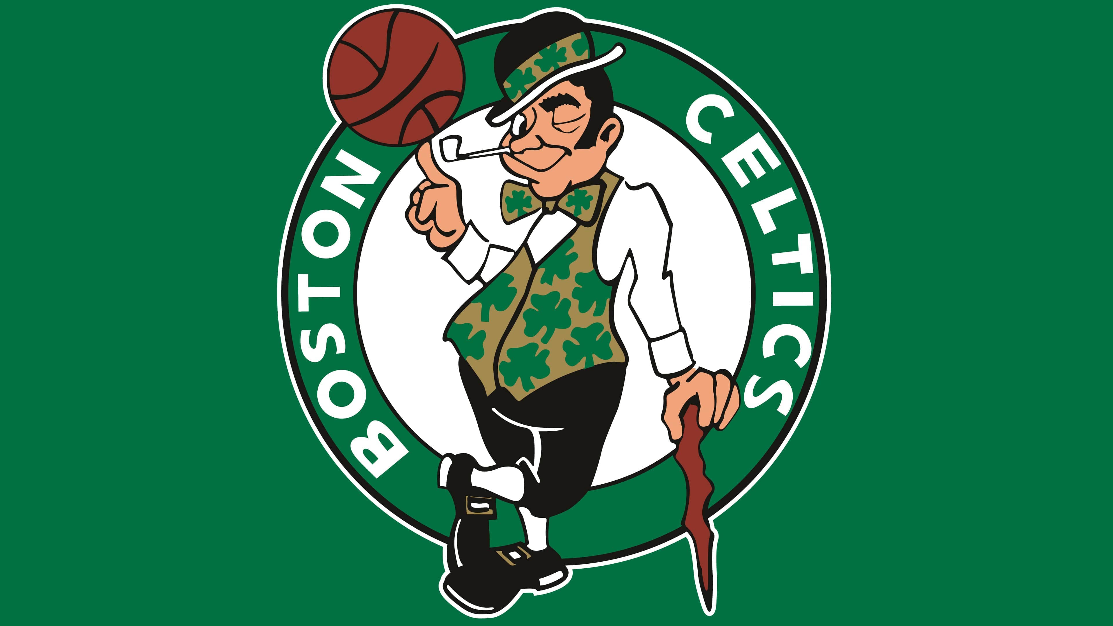
The modern Boston Celtics logo has become more colorful and realistic. Now it has new details: the inner and outer contours, the team’s nickname, black pants, white knee-high socks, and brown buckles on the shoes. Some elements have been updated: the vest and hat band on the smiling guy’s black derby hat have turned beige, and his stick and basketball are red. The pipe sticking out of the right corner of his mouth is the only thing that remains unchanged.
Font and Colors
Each version of the logo, regardless of its creation date, corresponds to the name and reflects the Celtic theme. They are united by the legendary element, the shamrock, the clover of fortune, bringing luck and indicating a white stripe in a sports career. On the debut emblem, the leaf was one large, though schematic, leaf; on all subsequent ones, the pattern was the vest of the “gentleman” with a cane. Since 1968, another significant attribute has been basketball. It indicates the team’s affiliation with the National Basketball Association.
The club had two font types: one on the debut emblem and another on modern versions. The early version is an individual, hand-drawn font, and the next one is from the Sans Serif category. Now, the name is executed in uppercase block letters. The words are placed on the right and left edges of the logo on a wide contour strip. The corporate palette traditionally includes green, white, and black colors. Other colors constantly change. Among them are brick red, yellow-straw, brown, and beige.
FAQ
What does the Boston Celtics logo represent?
The main symbol of the Boston Celtics is a leprechaun, who, with one hand, leans on an Irish club and, on the index finger of the other hand, spins a basketball. His vest, hat, and bow tie are adorned with a shamrock print. The background is a white circle with a green ring in the frame, on which the franchise’s name is written: BOSTON on the left and CELTICS on the right.
Why is “Boston” called “Celtics”?
This name was chosen at Walter Brown’s initiative. The head of the Boston Garden Arena corporation wanted the new franchise to carry the nickname of the old basketball team, the Original Celtics, which existed in New York from 1914 to 1930. He explained his choice by noting that the state capital of Massachusetts, where the “Boston Celtics” are based, is home to many people of Irish descent.
Does the Boston Celtics logo have a name?
The leprechaun, the main element of the “Boston Celtics” visual identity, is called Lucky. However, the logo itself does not have an official name.
Do the “Celtics” change their logo?
This sports team often changed its logos. The current version, adopted in 1997, features modern graphics and a multicolored design. It has been in use for over 20 years, and as far as is known, the “Boston Celtics” does not plan to abandon it.