


![]() Philadelphia 76ers Logo PNG
Philadelphia 76ers Logo PNG
The “Philadelphia 76ers” have a strong national logo. It reflects the basketball players’ aspiration for victory both domestically and internationally. The open emblem carries the spark of energy and conveys that movement is the foundation of life on the planet, hence the ball resembles the globe.
In this cozy haven, a muted whisper of history can be heard, preserving the achievements of great teams of the past and the city’s glorious chronicle, which has produced numerous NBA stars and memorable confrontations.
The team’s name has a rich, long history dating back to 1946. Initially named the Nationals, the team was based in Syracuse, a territory with a rich basketball scene. It played in the NBL until the unified NBA was formed in 1949.
The debut NBA season was significant: at the end of the regular season, the team performed slightly weaker than the “Lakers”, with a record of 51-13. During the playoffs, the “Nationals” showed their strength in matches against Philadelphia and New York opponents.
In 1963, the owner of the “Nationals” agreed to sell the club to a group of investors led by Irv Kosloff, who sought to bring the best ball game back to the USA’s first capital. After the team moved, there was a pressing question about the name: after brief discussions, the team was named Philadelphia 76ers.
Thus, this name is considered one of the best in the NBA for several reasons:
- Firstly, the team’s name is associated with the most significant date in United States history. 1776 was the year the Declaration of Independence was signed by the North American colonies, declaring their independence from Great Britain. By the way, the team’s name soon took hold among the city’s residents, who called each other “Sixers.” The team is more commonly known as the Sixers.
- Secondly, the name was extremely appealing from a marketing standpoint (a very important aspect). The spacious, sonorous abbreviation “Sixers” and the team’s logo were perfect for advertising campaigns and newspaper headlines.
Meaning and History
![]()
Athletes of the Philadelphia 76ers club have been associated with the number indicated on the logo since its founding. It reflects the patriotic spirit of the United States and the importance of Philadelphia as the birthplace of American independence. The team received its first logo in 1947, when it was still named the Syracuse Nationals. Over its long history, it has changed six times, evolving into a modern interpretation that is stylish and deeply meaningful.
What is Philadelphia 76ers?
The Philadelphia 76ers are an NBA franchise from Greater Philadelphia. But it has only been called that since 1963; previously, it was known as the Syracuse Nationals. The basketball team was established in 1946 and is one of the league’s oldest participants.
1947 – 1949
![]()
The debut emblem features a map of the USA on a dotted red-and-white striped background. It is located in a circle and surrounded by eleven stars. The administrative unit’s protruding edges extend beyond the emblem. The team name, Nationals, is placed on the map, spanning from left to right. All elements are executed in the colors of the national flag.
1950 – 1963
![]()
Two years later, the designers changed the colors. Now, the map became white, and the inscription on it, conversely, was blue. “Nationals” is supplemented by the team’s first name, “Syracuse.” They made it lowercase and placed it above. The stars around the red stripes turned blue.
1964 – 1977
![]()
It adopted new symbolism after the basketball club was renamed the Philadelphia 76ers. As a result of the redesign, it became radically different. Then the legendary numbers appeared on the logo: a red “7” and a blue “6.” Above the seven, there was a circle formed of small five-pointed stars.
1978 – 1997
![]()
In 1978, the developers reduced the numbers, designated them “ers,” and placed them in a circle representing a basketball with characteristic lines. The colors remained the same, a combination of red, blue, and white, as on the American flag.
1998 – 2009
![]()
The emblem underwent a radical change after being in its familiar design for almost twenty years. On a dark background, a golden inscription “76ERS” appeared. The numbers were larger than the letters; the first contained a silver star with a red border. To the bottom right was a basketball, the same color as the inscription. Curvy blue-white stripes led from it to the star.
2010 – 2014
![]()
Eleven years later, the team made minor changes to the original logo. The original version was placed on a square red background. At the bottom was an inscription “Philadelphia,” which occupied all the space of a blue horizontal rectangle. A wide silver stripe separated the ball from the numbers and the lower inscription. The square was outlined with a thinner line of a similar color along its perimeter.
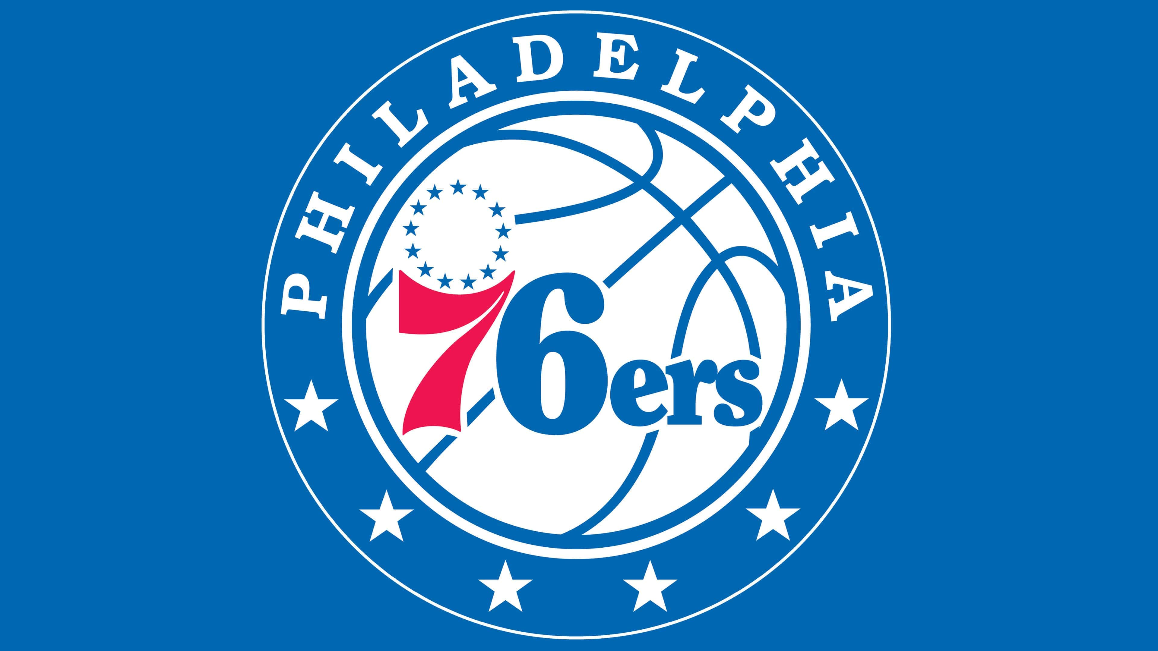
2015 – present
![]()
The current emblem represents a modern interpretation of the team’s traditional distinguishing marks. They are stylistically reworked, combined with a common, wide line and an improvised circle shaped like a basketball. It features the trademark inscription “76ers,” which was introduced in 1978. Above the number “7” is a ring of 13 five-pointed stars. Around the ball is a double border of blue and white stripes. On the wide outer stripe, the word “PHILADELPHIA” is written (above) and six large stars (below).
The combination of dark burgundy and blue on the Philadelphia 76ers logo, also known as the “Sixers,” was comfortable to perceive, as neither color is aggressive. Instead, it is subdued and soft. The old-fashioned font on the Philadelphia 76ers logo harkens back to the 60s the era of the team’s dominance under Wilt Chamberlain. The Sixers (Philadelphia 76ers) logo is considered one of the two best in the NBA: a simple ball adorned with fine details. The red number 7 looks stylish, and the 13 stars symbolize the 13 American colonies.
Font and Colors
The team has always used 76 on the logo and 13 stars above the first number. They are very symbolic of the country as a whole and the club in particular, since the club was originally called Syracuse Nationals and used a map of the USA as a distinguishing mark. The numbers “7” and “6” refer to the month and year of adopting the Declaration of Independence, July 1776. The 13 stars forming a ring are the number of American colonies that first signed the Declaration.
In early versions of the Philadelphia 76ers logo, a cursive handwritten font with lowercase characters, including the first letter “n,” was enlarged. Although such a design looked old-fashioned, it resonated with the inscriptions in the Declaration of Independence. A different font is associated with the classic Times New Roman capital letters, which have serifs.
The emblem’s palette has always consisted of white, blue, and red. This combination of colors is the USA flag. They reflect the patriotic nature and set the mood for victory.
FAQ
What does the “Philadelphia 76ers” emblem mean?
The basketball on the Philadelphia 76ers logo speaks of love for the sport, and the little star above the number 7 symbolizes the 13 colonies that laid the foundation for the United States.
Who created the 76ers logo?
Mel Richman invented the red-blue number “76” with a ring of stars. Now, this element is at the center of the modern logo developed by the basketball club’s employees.
When did the “76ers” change their logo?
The “Philadelphia 76ers” last changed their logo in 2015. It’s worth noting that it is very similar to the version created in 1977.
How many stars are on the 76ers logo?
The ring above the number “7” is formed by 13 blue stars, one for each of the original colonies. But at the bottom of the frame are six more white stars. In total, there are nineteen stars.