


![]() Charlotte Hornets Logo PNG
Charlotte Hornets Logo PNG
In 2004, the NBA welcomed a new team from North Carolina, replacing its predecessor from 1988. The Charlotte Hornets logo symbolizes the aspiration for leadership, efficiency, courage, determination, and effective defense.
The history of the Charlotte Hornets dates back to the late 1980s, when George Shinn sought to bring the NBA back to Charlotte, drawing on the Carolina Cougars’ experience of the 1970s. The city’s rapid growth and fan interest helped secure NBA commissioner David Stern’s approval for a new franchise. The name Hornets was chosen through a public vote, replacing the earlier option, Charlotte Spirit.
Through the 1990s, the team built a strong following, but structural issues emerged. The arena lacked sufficient premium seating, limiting revenue potential, while legal accusations against Shinn weakened the club’s market position. By 2002, these pressures led the team to relocate to Louisiana, ending its first stage in Charlotte.
The relocation agreement included a provision for a new franchise in the city. In 2003, preparations began, and in 2004, a new team entered the league as the Charlotte Bobcats. Fans were again involved in the naming process, with options such as Dragons, Fly, and Cougars. The final choice referenced the regional bobcat population and was associated with owner Bob Johnson.
In 2014, after a decade under the Bobcats identity, the franchise was renamed back to Charlotte Hornets. The agreement with the New Orleans club reassigned the original Hornets history, covering the period before 2002, to Charlotte. This move restored the connection between the modern team and its earlier identity, consolidating records, branding, and historical continuity under one name.
Meaning and History
![]()
The expansion franchise, which debuted in 1988, received its original logo immediately after the name was approved. It was proposed during a contest. The choice of this variant is not only due to the insect’s aggressive nature but also to historical statements by famous personalities. For example, General Cornwallis once called the city of Charlotte a “hornet’s nest of rebellion.” Residents showed themselves during the Revolutionary War when the British were fierce defenders and formidable opponents. Therefore, George Shinn, the club’s owner, chose this particular name. Over the years, the team has had six logos.
What is Charlotte Hornets?
It is one of the thirty franchises of the National Basketball Association. It plays in the Southeast Division and represents the most populous city in North Carolina. The team’s history began in 1985, when George Shinn assembled a group of entrepreneurs to head the new NBA team in Charlotte.
1988 – 1989
![]()
All history and glory were inherited by the team from Charlotte by agreement with the club that moved to New Orleans and dropped the “Hornets” from the name. The initial version contained an image of a hornet, one of the swarm’s representatives, fierce and merciless toward opponents. The insect is in flight. Dark wings are spread, and a basketball is clutched in its front paws. The hornet is in front of a large white letter “H.” Behind it is a large turquoise letter “C.” Below is the word “Charlotte.” It has an arc shape and is written in capital letters.
1989 – 2002
![]()
In the 1989 season, an updated team logo was presented. The anthropomorphic, winged insect in white gloves and sneakers is playing basketball. Small strokes around each object indicate movement. On the hornet’s face is a condescending smirk, and on its chest is the letter “H,” above which is written the word “Charlotte.” The club’s full name surrounds the insect, expressing readiness to attack. This is indicated by its raised antennae, piercing gaze, spread wings, and sharp sting.
2005 – 2007
![]()
Until 2005, the club did not play because Hurricane Katrina forced it to relocate. After the team’s forced move and renaming to the “Charlotte Bobcats,” management approved a new logo. It’s a roaring lynx with its head turned right. The image’s author is designer Chris Weiller. He presented a red forest predator with an aggressive grin and sharp teeth. Above it is the slanted inscription “Bobcats,” and even higher is the sign “Charlotte.”
2008 – 2012
![]()
In 2008, the logo was slightly redesigned, which affected the color palette. As a result, the colors became subdued: instead of fiery red, orange appeared, and dark blue became a little lighter.
2013 – 2014
![]()
Color experiments continued in 2013 when the designers removed the orange from the logo and replaced it with gray. But the text became orange: it says the word “Charlotte,” which the designers added to the overall background, framing it. The second part of the name is in white.
2014 – today
![]()
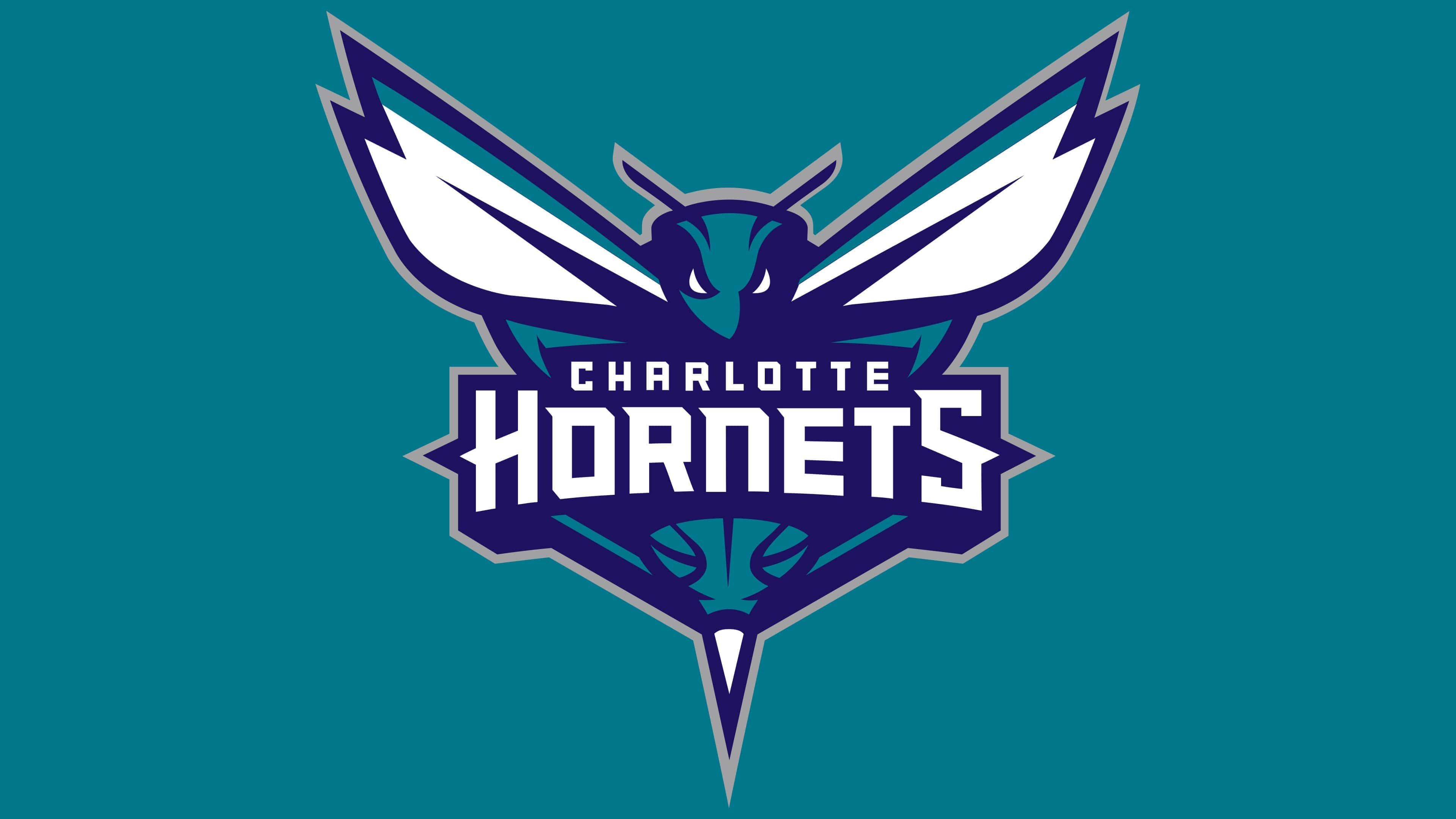
At the end of 2014, the team returned to its original name, “Hornets,” and switched to the debut image featuring the formidable Hornet. In the current version, it is positioned in profile and depicted in front of the phrase “Charlotte Hornets.” The insect has white wings spread in flight, a piercing gaze, and a sharp sting. It clings to the word “Charlotte” with its upper paws. A basketball replaces the lower part of its body.
Font and Colors
Due to frequent relocations, the club repeatedly changed its logo, following the next name. In particular, they were based on two images: a hornet and a lynx. The latter is an aggressive insect with a powerful sting.
The logo’s font changes with the seasons. In the emblem of the “Charlotte Hornets,” elongated letters with serifs have been used from the very beginning. On the logo of the “Charlotte Bobcats,” the symbols, on the contrary, are blocked and grotesque.
The team’s official palette is turquoise, dark blue, and white. In some versions, red, orange, and gray are also present.