


![]() Denver Nuggets Logo PNG
Denver Nuggets Logo PNG
The image of the Denver basketball club, founded in 1967, is a tribute to the state’s history and the club itself. The Denver Nuggets’ logo and name evoke the “Gold Rush” era. The modern style marks the transition to a new stage of development.
In 1967, the Denver Nuggets club was founded in Denver, Colorado. Initially, the team was called the Denver Rockets and competed in the ABA (American Basketball Association).
The Nuggets managed to stay in the NBA after the ABA-NBA merger. Soon, the team was disbanded, leaving the Silver State without a basketball event for many years.
In 1967, a group of businessmen led by James Trindle negotiated with George Mikan (the newly appointed ABA commissioner) to revive the team in Denver under the ambiguous name “Denver Larks.” Due to financial issues, Trindle had to sell 2/3 of the shares to Bill Ringsby, owner of the large transportation company Rocket Truck Lines.
After becoming the majority shareholder, Ringsby initiated changes to the team’s name. Thus, the funny “Larks” were replaced with the threatening “Rockets.” In its seven-year existence, the “Denver Rockets” made it to the playoffs five times but never won the championship.
In 1972, the club had new owners again. The ABA-NBA merger was accelerating, and under its terms, there couldn’t be clubs with the same name in the future Association. Since the “Houston Rockets” were already playing in the NBA, “Denver” had to change its name again. The team didn’t do anything special: the resurrected “Denver Nuggets” entered the 1974/75 season.
The team’s name is a nod to the 1850s, when gold deposits were discovered in Colorado. Colorado is known worldwide as the most coveted place for every gold prospector. In the mid-19th century, crowds of settlers rushed there, hoping to get rich quickly. The Gold Rush became one of the reasons for the formation of the state of Colorado. Hence, the Nuggets’ nickname, “Gold Nuggets,” is derived from “Gold Nuggets.”
The team’s mascot is Rocky, the mountain lion.
Meaning and History
![]()
The franchise has a long history and an incredibly rich legacy, with numerous logos and color changes. Formed about half a century ago, it has always experimented with symbolism, evolving from a simple sign to a profound print. Over its history, the Denver Nuggets have had nine logos.
What is Denver Nuggets?
The Denver Nuggets are a National Basketball Association club that has played home games at Ball Arena since 1976 and is owned by Ann Walton Kroenke. The club was founded in 1967 as a franchise of the American Basketball Association. Its original name, “Denver Rockets,” lasted until 1974, when the owners decided to rebrand.
1968 – 1971
![]()
In 1968, the team’s logo was first presented to the public. It was designed by Bill Ringsby specifically for the team. The earliest version dates back to the club’s formative period. The emblem is a classic rondel featuring an orange basketball at its center. “Ringsby System” (bottom) and “Denver” (top) are written on a white strip. The lower part of the text refers to Bill Ringsby’s shipping company, the franchise’s owner, and the upper part to its location. Across the circle, in a long rectangle, is the word “Rockets,” the club’s old name.
1972 – 1974
![]()
A year after its foundation, the team’s management decided to link the logo closely with its name. As a result, a rocket running with a basketball against a mountainous backdrop appeared. The franchise’s name is depicted at the top and bottom of the round logo.
1974 – 1976
![]()
The Denver basketball team completely changed its concept. Instead of “Denver Rockets,” there were “Denver Nuggets.” After the club was renamed “Denver Nuggets,” designers used the image of prospector Maxie. The red, blue, and white character was Yukon Cornelius, the explorer. He has a cheerful disposition: he joyfully shouts and jumps, holding a pickaxe in one hand and a small ball in the other. The new team name is located around the prospector. A thin blue line surrounds all elements.
1976 – 1981
![]()
After the redesign, the emblem remained the same, except for the circle, which the developers removed. They also darkened the colors, blackened the mouth of prospector Maxie, highlighted the letter “D” on his cap, and removed the acronym from the ball.
1982 – 1993
![]()
In 1982, the club’s most colorful new logo was approved. It features a semicircle with rainbow lines and houses made of multicolored squares against a backdrop of snow-white mountains. The logo represents the horizon of the so-called “rainbow city.” Artists conveyed the diversity of gems. Below is the inscription “Denver Nuggets,” stylized as an ornament.
1994 – 2003
![]()
Another redesign initiated the era of emblems, featuring a lone mountain peak and the large word “Nuggets.” The first part of the sports club’s name, “Denver,” is placed above the mountain peak in a semicircle shape.
2004 – 2008
![]()
In 2004, designers made minor adjustments to the color scheme. They lightened the colors, replaced the red background in the central rectangle with blue, and made “Nuggets” golden.
2009 – 2018
![]()
The previous emblem was entirely preserved. Only the color of the word “Nuggets” was intensified, making it bright.
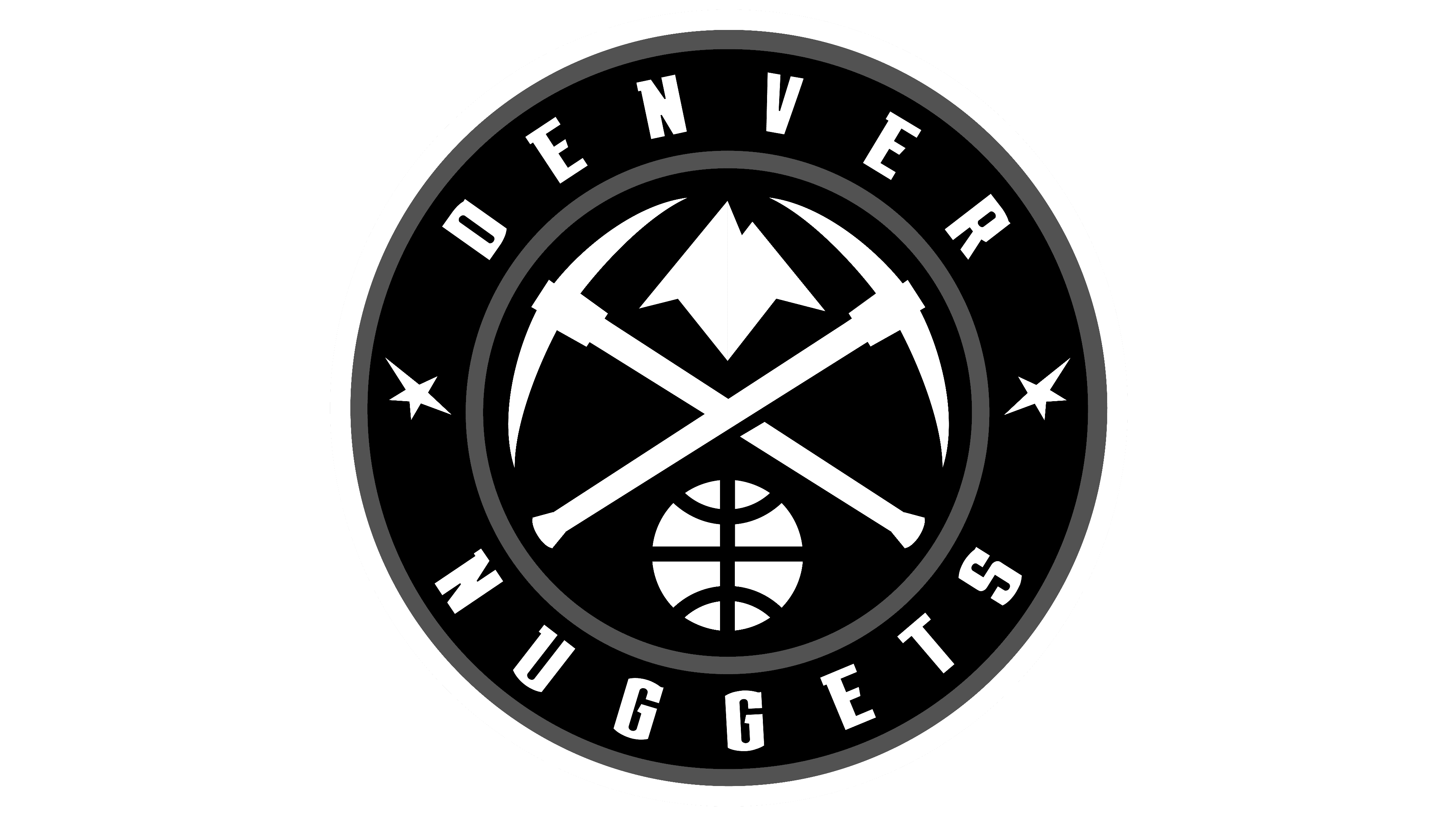
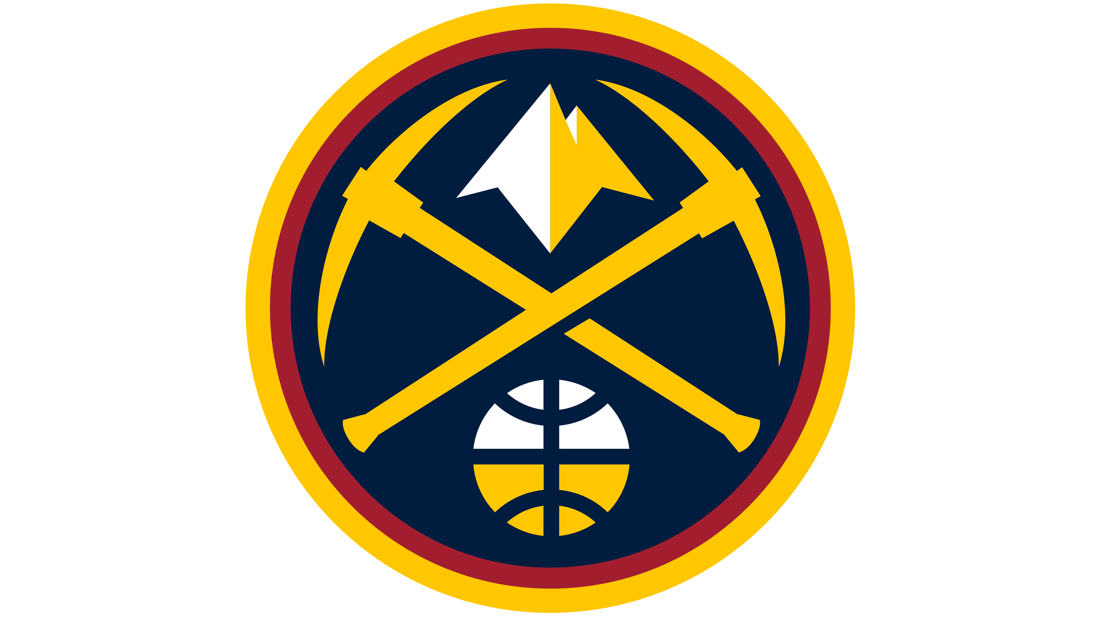
2019 – today
![]()
Since 2019, the logo has been adorned with two golden picks. They are crossed in the center and occupy almost the entire middle. Between them, in the upper part, mountain peaks are visible as if illuminated by the sun. Below the handles is a basketball that resembles a globe. This effect is created by lines very similar to meridians and parallels. A thin red line encircles all central elements. A wide stripe with the inscription “Denver Nuggets” follows it. Stars are placed between the top and bottom words. A double frame along the outer edge surrounds the logo.
Font and Colors
The current version is a classic font with a central part and several borders. Earlier versions overlaid on older team names. They share the word “Denver,” used in an extended form or as an initial letter.
Depending on the release time of the emblems, the inscriptions had different characters. They were grotesque, elongated, serif, ornamental, classical, and arched. One of the logos was written in the Aachen Bold font by Colin Brignall.
The franchise’s official palette includes gold and two shades of blue (dark and light). White plays a supportive role. Previously, red, purple, and beige were also used. The most colorful version contains all the colors of the rainbow.