


![]() Chicago Bulls Logo PNG
Chicago Bulls Logo PNG
The Chicago Bulls logo, founded in 1966, symbolizes might and ferocity, strength, and irresistibility. It represents respect for the city’s history and the club’s foundation and demonstrates a constant readiness for a mass attack.
The establishment of a professional basketball team took three attempts. In the late 40s, the “Chicago Stags” became the first NBA team representing the Windy City. In the early 60s, they were replaced by the Chicago Packers/Zephyrs, who moved to sunny Baltimore after a couple of years.
The Chicago Bulls were founded on January 16, 1966. They play their home matches at the United Center alongside the “Chicago Blackhawks” from the National Hockey League. The name of the third team goes deep into the city’s history. In 1865, the world-famous Chicago stockyard was established. The facility became one of the largest production centers in the world. Over 30,000 employees worked on the 2.5-square-kilometer site, operating under the motto: “Only the animal’s scream can be wasted.” Annually, 19 million heads of cattle are sold worldwide. Contrary to popular belief, assembly-line production was first applied at the Chicago stockyard, where Henry Ford, the “inventor of the conveyor belt,” adopted it.
A city legend determined the themes for the club’s suggested names, such as Chicago Matadors, Toreadors, oddly Beers, and Blackhawks, classic for Illinois. The uncertainty was resolved by Dick Klein’s son, one of the club’s owners, who childishly characterized the proposed collection as “Thisisbunchofbull[s**t].” Thus, the names of the future basketball legends were chosen.
Bulls became a marketer’s dream: a short, sonorous name was as tough as a hoof strike. The team turned out to be extremely successful: 18 years before the arrival of the famous Michael Jordan, the “Bulls” made the playoffs 10 times, and the events after the 1984 draft are also well known.
Meaning and History
![]()
The branding of the “Chicago Bulls” is attributed to two people, making it controversial. Experts claim one of them is Dean Wessel and the other is Ted Drake.
After extensive clarification, experts concluded that Dean Wessel invented the legendary emblem, as historical records preserve many details of his correspondence with Dick Klein. The team’s founder asked the artist and neighbor to draw something suitable. The result was an original sign that stood the test of time. In return, the designer received free tickets. The only amendment was blood on the horns.
What is Chicago Bulls?
The Chicago Bulls are an American professional basketball team. It plays in the NBA and represents the Eastern Conference, playing in the Central Division. The franchise appeared in the 60s of the last century and had its first season in 1966-1967. The club’s home stadium is the United Center. The most successful period was 1991-1998, when it won six association championships.
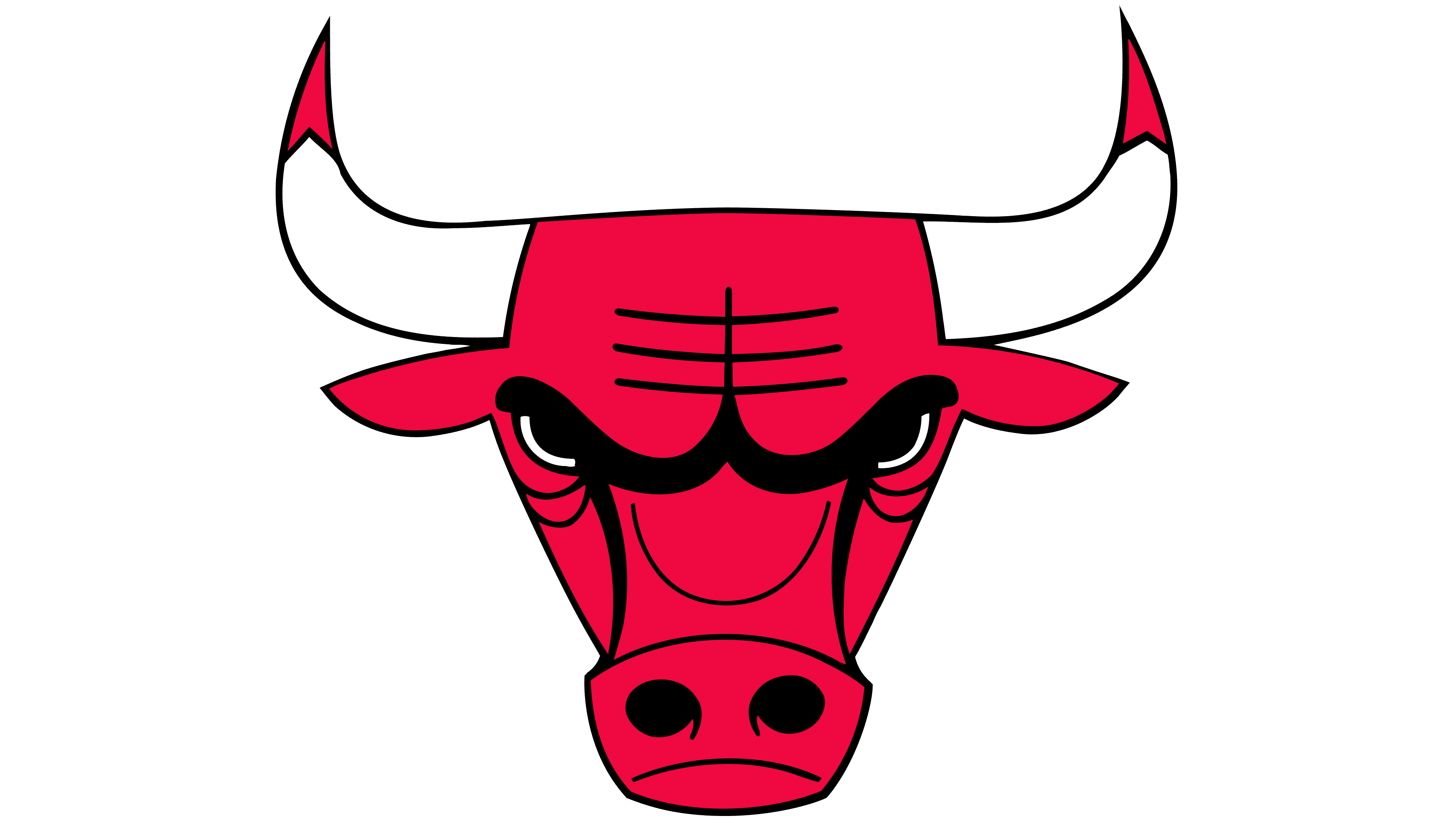
The iconic logo features an enraged red bull. The fierce gaze, flaring nostrils, menacing face, and furrowed brows suggest it’s always ready for a mass attack.
1966 – today
![]()
The emblem of the “Chicago Bulls” is the head of an enraged red bull. The logo was created by American graphic designer Dean P. Wessel and adopted in 1966.
Dick Klein asked Mr. Wessel to use red and black, the colors of the school team he played for. Probably many of you will be surprised, but the designer depicted a bull, specifically its face, with the team’s name inscribed above the animal. Wessel tried to make the logo as aggressive as possible, but he failed, so the emblem turned out to be quite adequate and relevant at all times. Yes, it’s the only NBA team logo that hasn’t been rebranded or changed at all. It successfully survived to the present day in its original form. It’s worth noting that, given Klein’s inexplicable penchant for slaughterhouses, he wanted to see droplets of blood on the horns, adding color and character without disturbing the image’s harmony. In the early 70s, an alternative team emblem was used, but it looked different. In this version, there was the same bull and a cloud with the inscription “Windy City.”
It’s rumored that after Michael Jordan left the team, the bull’s facial expression became less fierce.
Font and Colors
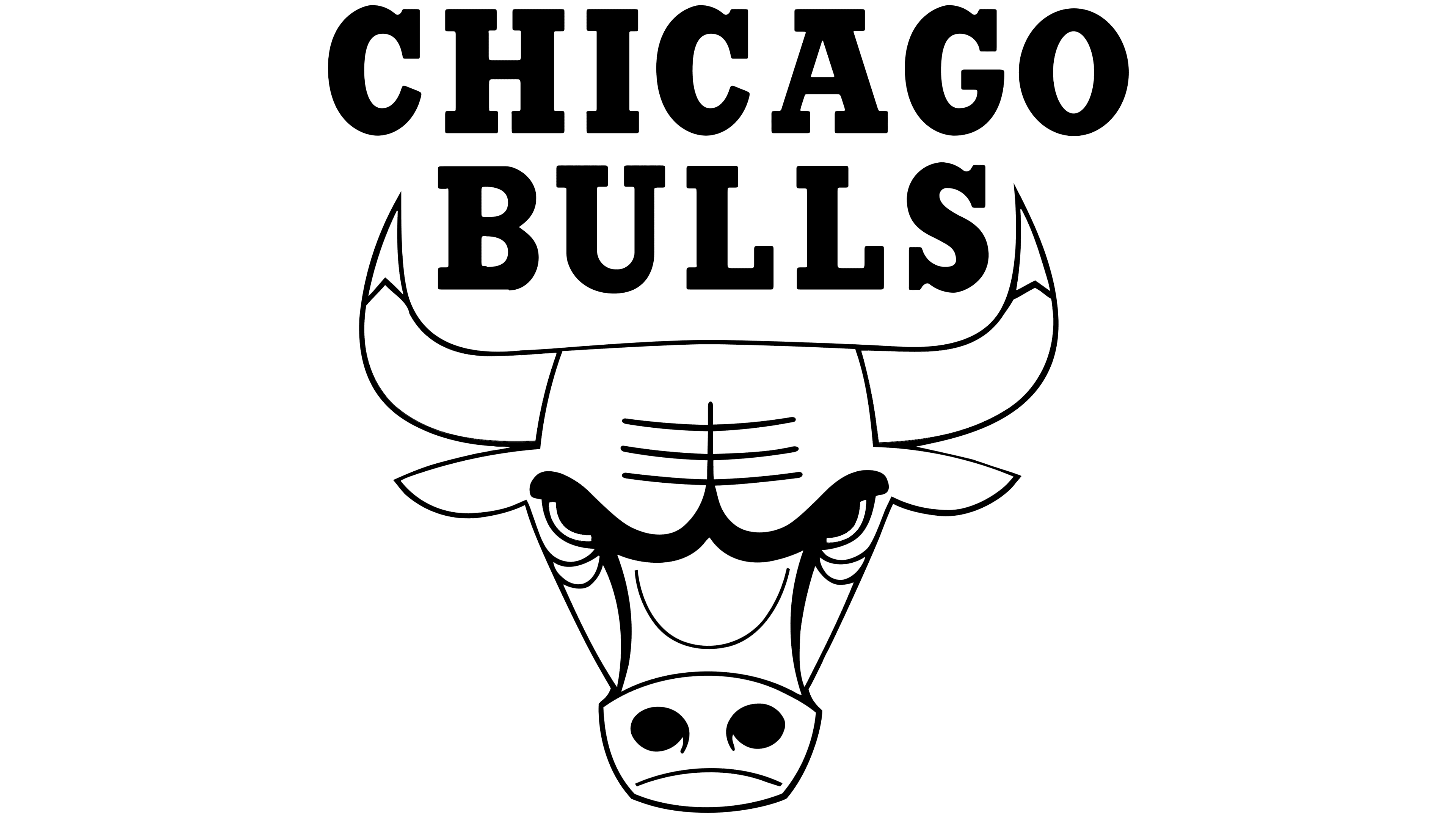
The debut version of the logo was the only one used in the “Chicago Bulls” career; it’s still used today. It features a full-length bull’s head. The animal’s eyes are half-closed by the eyebrow ridge, giving a very menacing look. Above the nose is an inverted arc line, and on the forehead are three straight lines. They say the bull is incredibly angry. There are bloody traces on the tips of the massive and sharp horns. It suggests he has already dealt with the previous opponent and is ready to defeat the next. The team’s name is at the top.
Graphic designer Dean Wessel used a serif font to depict the club’s name. The letters are large, round, and uppercase. The words are arranged in two lines, one of which is between the horns.
The official colors of the basketball team are red (head), white (horns), and black (eyebrows, wrinkles, eyes, nostrils). They convey the intensity of passion, strength, blood, and determination, regardless of any obstacles.
FAQ
What does the inverted “Chicago Bulls” emblem represent?
The inverted Chicago Bulls emblem conveys unequivocal associations. It shows two images (separately, not together). The first is a crab; the second is a robot having a good time. Fans noticed this feature and used the logo as a fun patch or sticker.
What does the “Chicago Bulls” logo mean?
The Chicago Bulls logo features the crimson head of an enraged bull, with a focused gaze, a furrowed brow, and flaring nostrils, as if the animal is poised to charge opponents and tear them apart with its sharp horns. At the top, the basketball team’s name is written in black letters. To maintain balance, the designers used a bold font with wide serifs. Dean P. Wessel created it.
Who created the “Chicago Bulls” logo?
American designer Dean P. Wessel designed the Chicago Bulls franchise logo. He presented it in 1966. Dick Klein, an athlete and founder of the basketball team, also contributed to the logo’s development. He suggested the color for the bull’s sign and asked the graphic artist to draw it in black and red, the colors of the school team he started playing for.