


 Los Angeles Lakers Logo PNG
The Los Angeles Lakers’ logo, which became the team’s name, was adopted in 1948. The modern identity links the brand to a new “address,” symbolizing high-speed gameplay and reflecting a professional orientation.
The franchise began in 1946 as the Detroit Gems. The 1946–47 season ended poorly, with weak averages and high points allowed, exposing limited prospects. In 1947, the team’s short Detroit run ended.
After one year, the franchise moved to Minneapolis and became the Minneapolis Lakers. Owner C. King Boring sold the rights, and Ben Berger and Morris Chalfen acquired them for $15,000. They received only the name and equipment, not a stable roster.
The new owners broke with the past and chose a name tied to Minnesota. Options included “North Star,” “Gopher State,” and “Land of 10,000 Lakes.” The last idea gave rise to “Lakers,” a term also associated with cargo transport on the Great Lakes.
In the draft, Minneapolis selected George Mikan, who became the team’s key figure. The club opened the next season with strong results and secured a championship, marking a sharp shift from the Detroit period.
Mikan retired twice, and after his final exit in 1956, interest declined. Financial issues pushed the owners to consider a sale. The team avoided a move to Kansas City when a Minnesota group led by Bob Short stepped in.
After the Brooklyn Dodgers moved to Los Angeles, the franchise looked west. In 1960, it relocated to Los Angeles, keeping the Lakers name despite the new setting, and became the Los Angeles Lakers.
Meaning and History
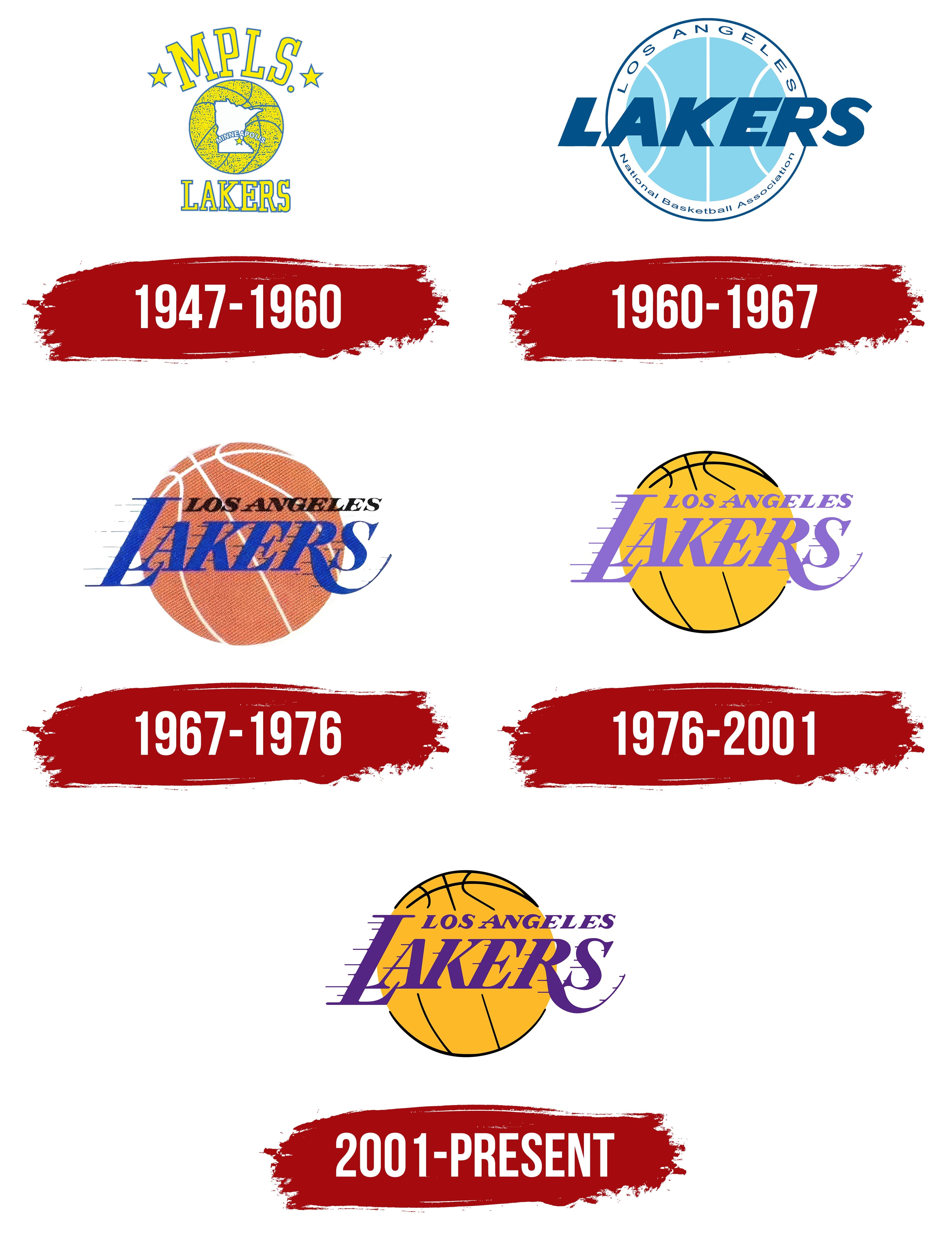
The basketball team “Lakers,” originally from Minneapolis, has existed for over 70 years. Forbes magazine says it’s expensive and one of the most titled NBA teams. The “Los Angeles Lakers” are one of many NBA teams that had to change their logo and name after moving to another state. When it was based in Minneapolis, players’ jerseys featured an abstract, bright yellow logo. After relocating, the club redesigned its logo and adopted its final style.
What is the Los Angeles Lakers?
It is one of the most successful basketball teams in National Basketball Association history. It has won 17 championships. The club began playing in the NBL in 1947 as the “Minneapolis Lakers” and was headquartered in Minneapolis, Minnesota. It then moved to Los Angeles and changed its name. The franchise is part of the NBA, represents the Pacific Division, and participates in the Western Conference.
1947 – 1960

The first logo of the “Minneapolis Lakers” was quite memorable. It embodied the arrival of something new in basketball. The original emblem appeared when the franchise was called the Minneapolis Lakers. It featured a basketball-shaped globe, with the artists depicting Minnesota’s borders within the circle and marking Minneapolis with a small five-pointed star. Above was the “MPLS” abbreviation, with a dot at the end and two large stars on each side. Below is the word “LAKERS.”
1960 – 1967
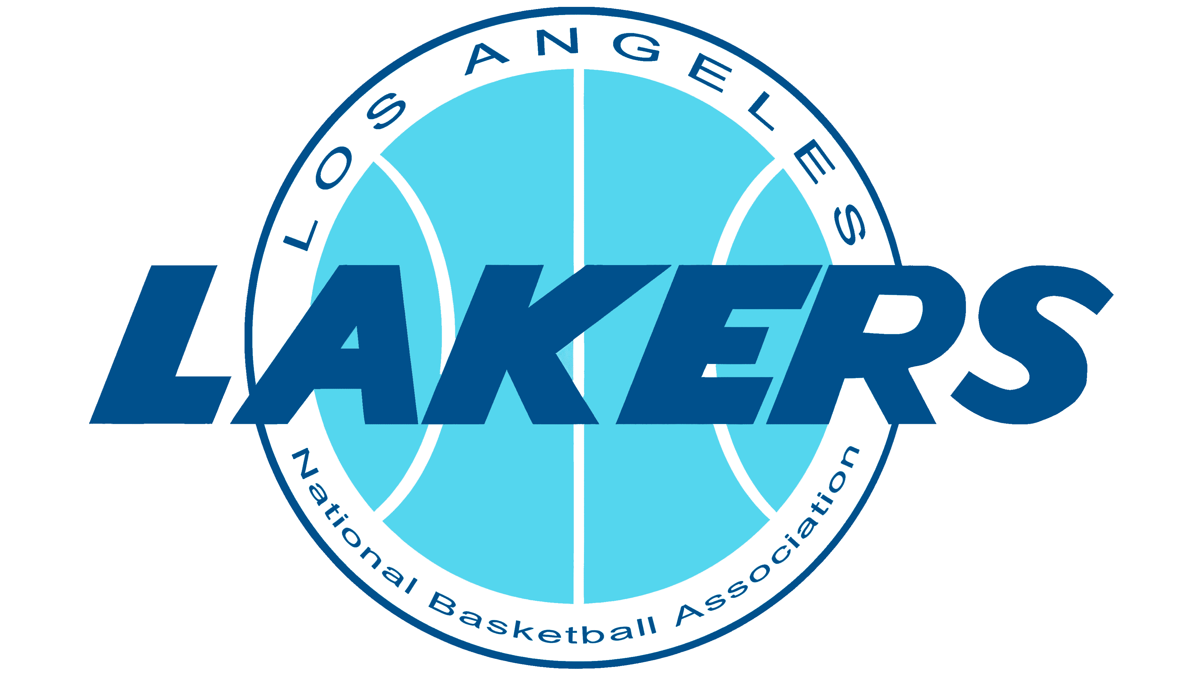
1967 – 1976

1976 – 2001

After nearly 30 years, the team changed its primary colors. The ball’s main lines changed from white to black. Other colors also changed: green to orange and dark purple to light blue. The ball’s seams shifted in the opposite direction.
2001 – today
In 2002, the developers improved the logo’s clarity by using more saturated shades of gold, black, and purple. However, the composition didn’t change: the team stuck to its old style.
Font and Colors

The shape and proportions of the club’s sign have remained unchanged since 1961. As before, a basketball with distinctly drawn seams occupies a prominent place, and the full name Los Angeles Lakers is written across it. Numerous horizontal stripes stretching from the letters in “LAKERS” add dynamism and make the logo recognizable.
Developers used a stylized font for the inscription. The font is italic with serifs and decorative elements, such as an elongated leg of the letter “R” that wraps around the neighboring “S” from below. The palette includes only three colors: purple for the text, gold for the basketball, and black.