


![]() Milwaukee Bucks Logo PNG
Milwaukee Bucks Logo PNG
Founded in 1968, the Milwaukee basketball team paid close attention to its mascot selection. The Milwaukee Bucks logo reflects nobility, courage, and natural athleticism. The brutality of the latest version, its severity, and its threats encapsulated the spirit of the sports club.
In 1968, the NBA approved the creation of a professional basketball team in Wisconsin. Talented basketball enthusiasts began suggesting names for the future team. Among them were various animals, including beavers, ponies, hornets, and even skunks. Eventually, the management settled on representatives of the higher-order animal kingdom, and soon the team received its official name: Milwaukee Bucks. Mr. Treblicox, a Wisconsin resident who first suggested this name, made club history and received a new car as a gift.
It’s worth noting that the white-tailed deer, abundantly present in North America, is one of the official symbols of the state of Wisconsin. Deer hunting in Wisconsin is not just a favorite hobby but also a vital necessity. Ever since American pioneers exterminated all the wolves there, the number of deer living in the forests has increased dramatically, and now people have to cull them.
The Milwaukee Bucks’ symbol is quite controversial. On the one hand, every fan would like their favorite players to demonstrate “deer-like” nobility and natural athleticism. On the other hand, these antlered creatures are harmless, even cowardly, preferring to live in solitude, thus completely lacking team spirit.
American slang offers a much more suitable interpretation of the term buck. It’s a young, self-assured man.
Meaning and History
![]()
The second professional basketball team of Milwaukee was named the Milwaukee Bucks in May 1968. At the same time, the logo based on this name was approved. Forty-five people, including R. D. Trebilcox from Whitefish Bay, Wisconsin, suggested this name. He best justified his choice and was awarded a car. Since then, the emblem has always featured a deer. The “Milwaukee Bucks” have had four original emblems.
What is Milwaukee Bucks?
The Milwaukee Bucks are the only team in the National Basketball Association to have won championships in both the Western and Eastern Conferences. The team debuted in 1968 and has never changed its name since.
1968 – 1993
![]()
The debut emblem is done in a cartoonish style. It features a friendly, adorable eight-point buck in a green sweater with a white “B” on its chest. It sits atop a two-tiered inscription consisting of the team’s name. Additionally, the animal smiles warmly, closes its eyes, and holds a spinning basketball on one hoof.
This embodies the club’s confidence that athletes can play excellently at a professional level even with their eyes closed. The creator of this version was Matt Kastelic, an advertising artist appointed by the team’s General Manager, John Erickson.
1994 – 2006
![]()
In May 1993, the franchise management began implementing a new logo. It was a fundamentally different symbolism: serious and aggressive in style. The image depicted a male white-tailed deer looking straight ahead. It peers from behind a two-line inscription, Milwaukee Bucks, where the first word is small and the second large, with the letters B and S highlighted. Against the backdrop of an inverted triangle, only the head and upper part of the strong torso are visible. As noted by Creative Director Tom O’Grady, the updated symbolism signifies a united team confidently looking to the future and ready to take on any challenge. This version was created by the design group NBA Properties Inc.
2007 – 2014
![]()
Before the 2006/07 season opened, the club introduced a new logo and changed the color scheme. The iconic green and silver remained, and red replaced purple. NBA Vice President Christopher Arena said the saturated red color matches the team’s spirit, conveying victory and reflecting warmth and energy. The rest of the design is identical to the previous version, except for the background rectangle for the inscription, which now has cropped edges.
2015 – today
![]()
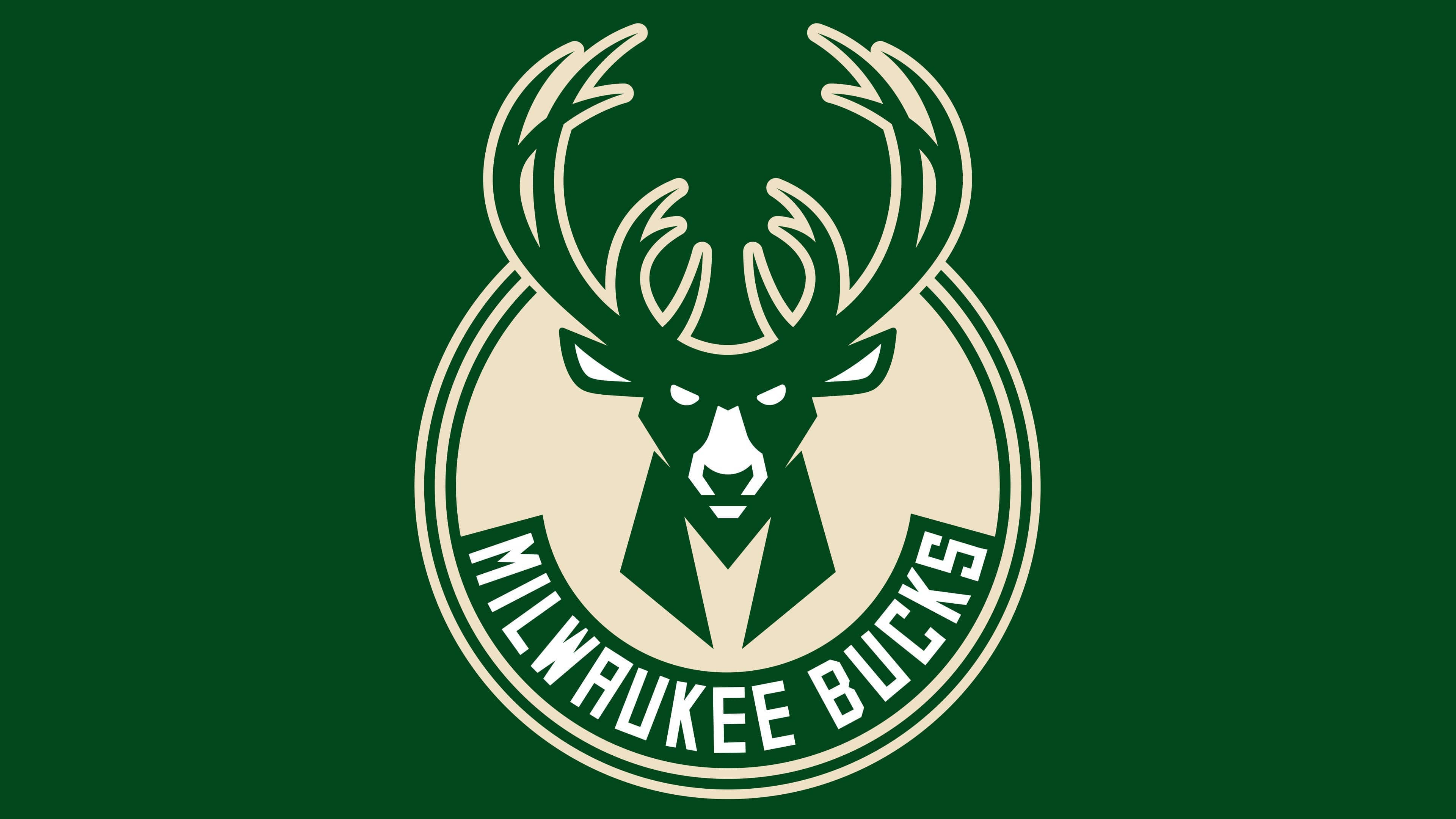
In 2015, the new owners of the Bucks club introduced a new version of the emblem. The new logo is not a restyling of the previous one; the main concept remains the same: the deer depicts the “Bucks” emblem head-on. In this version, the emblem looks artistic and conceptual. The deer’s gaze grew more confident, its eyes stern, its antlers larger. Additionally, the basketball theme is encrypted three times in the drawing. Thus, the shape of the round ball is depicted in the space outlined by the inner small and large outer antlers, and the circle of the basket is reflected in the circular border. The animal’s chest is depicted as the capital letter “M” – a tribute to the city of Milwaukee.
According to NBA rules, the team’s full name must be displayed on the main emblem. Therefore, the designers decided to place the inscription Milwaukee Bucks at the very bottom. The entire composition is enclosed in a cream-colored circle. The fact is that cream is used for the first time in an NBA team’s color scheme and reflects the team’s main nickname, “Cream City”. Thus, Milwaukee was called because many settlers’ houses were built from brick made from local cream-colored clay.
Font and Colors
The team’s mascot and main symbol is the white-tailed deer. It was chosen for its agility, grace, instantaneous reaction, impeccable running speed, and ability to jump high. In the current logo, it looks like a dominant and commanding male; nothing can prevent it from achieving its goal. This is evidenced by the stern look and confidence conveyed by the monolithic figure.

Initially, the inscription “MILWAUKEE BUCKS” was written in black, with a slight rightward tilt. Then, the word size became disproportionate: the designers made the first part of the name small and the second large. In the modern version, the font is hard, engraved, high-precision, elongated, and blocky.
The green color remained as a reminder of the basketball club’s past achievements. Purple was just fashionable, so it was replaced with red – a symbol of energy. Silver first emphasized the shades of purple, then became one of the main ones.
FAQ
Did the “Milwaukee Bucks” change their logo?
Yes, the Milwaukee Bucks had four logos, and with each redesign, they became increasingly brutal. The current version, adopted in 2015, looks very severe and intimidating, unlike the first emblem with a cartoonish deer. But it uses negative space: the lower half of the antlers forms the silhouette of a basketball.
Who designed the Milwaukee Bucks logo?
As far as we know, the 1994-2006 logo was created by the advertising department of NBA Properties Inc., headed by Tom O’Grady. The Milwaukee Bucks designers likely developed the modern version.
What animal is depicted on the “Bucks” logo?
The Milwaukee Bucks logo features the head of a white-tailed deer, which is also the team’s mascot. It’s one of the most common animals in North America.
How many points are on the Milwaukee Bucks logo?
The deer on the Milwaukee Bucks logo has twelve antlers, four more than the previous version. Designers added new tines to show the animal’s growing danger and strength.