The Detroit basketball club, founded in Indiana in 1941 as the “Fort Wayne Zollner Pistons,” reflects its history and significant characteristics in its emblem. The Detroit Pistons emblem demonstrates patriotism, commitment to its heritage, and professional affiliation.
Detroit Pistons: Brand overview
| Founded: | 1937 |
| Founder: | Tom Gores |
| Headquarters: | Detroit, Michigan, U.S. |
| Website: | nba.com |
Fred Zollner was an industrialist and the founder of Zollner Corporation in Fort Wayne, Indiana. In 1939, he decided to enrich the mundane routine of a piston manufacturer and establish a basketball club. The man named the team Fort Wayne Zollner Pistons. For seven years, the Pistons competed in the NBL, where they became champions twice. In 1948, the club joined the BAA, which soon transformed into the NBA. Despite the team’s popularity in its hometown, management, following the trends of the time, considered relocating to a more spacious place. Therefore, in 1957, the team moved to Detroit. It’s worth noting that the city’s name was very fitting for the team.
It’s worth mentioning that there were already basketball clubs in the capital of the Automotive State, but “hungry” fans, passionately loving spectacles, warmly welcomed the newcomers, who changed their name to the more patriotic Detroit Pistons.
The contributions of the team’s owner, who was an avid basketball fan, cannot be overlooked. Zollner provided all kinds of support to the newly formed Association and was one of the initiators of introducing throws and the 6-foul limit into the game rules. Moreover, he was the first owner to purchase a private plane for team flights between cities.
Fred Zollner’s significant contribution was duly recognized: in 1999, he was inducted into the NBA Hall of Fame, and the Western Conference champions’ trophy still bears his name.
Meaning and History
The Detroit Pistons club’s sports career is very long. Moreover, it includes relocations that significantly influenced the original symbolism. As a result, since 1941, the team has had numerous logos, united by only one element – a basketball. Six emblems are directly related to it, while the other four include it as a base component, accompanied by other details.
What is Detroit Pistons?
Detroit Pistons is a basketball team that moved from Fort Wayne (Indiana) to Detroit (Michigan) in 1957. Before that, it was known as the Fort Wayne Pistons, and even earlier (from 1937 to 1948), it was known as the Fort Wayne Zollner Pistons. Since 2017, the franchise’s home stadium has been the Little Caesars Arena. The club is part of the National Basketball Association and has even won three league championships.
1941 – 1947
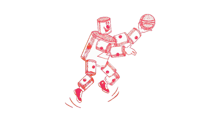
The program started with the name “Fort Wayne Pistons” and received a corresponding symbol. It was an anthropomorphic character made of automotive pistons: two for each arm and leg, one as the head, and the largest one served as the torso. The improvised basketball player was tossing a ball up. All details of the logo were red and white.
1948 – 1957
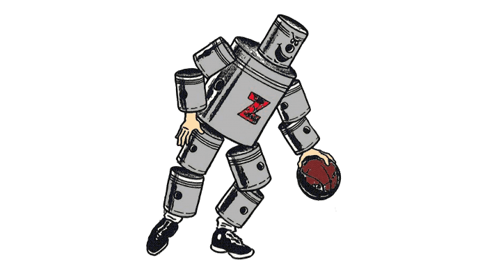
In 1948, the emblem was redesigned, making the pistons that make up the basketball player more realistic – both in drawing and color. The gray “metallic” basketball player is dribbling. On his chest is a red letter “Z” – the first letter of “Zollner,” which was part of the club’s debut name.
1957 – 1971
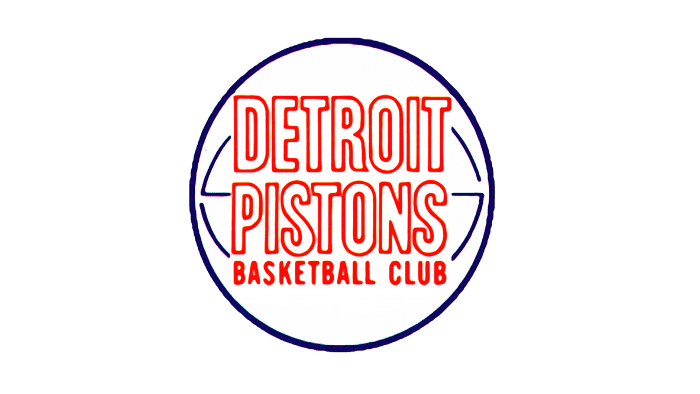
After the franchise’s relocation to Detroit, it underwent a renaming process to Detroit Pistons. The emblem also changed – it was simplified to a ball, focusing on basketball themes and text. Several inscriptions appeared on the emblem: the largest at the top – “DETROIT PISTONS,” medium in the middle – “BASKETBALL CLUB,” and small font at the bottom – “NATIONAL BASKETBALL ASSN.”
1971 – 1975
Another intervention in the structure made the logo visually simpler: the badge now depicted only a ball with two inscriptions. The third (bottom) one was removed by the designers.
1975 – 1979
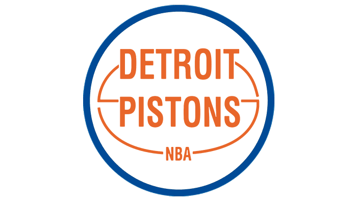
Management decided to give the emblem expressiveness, making the outline of the ball thicker. They also shortened the phrase “NATIONAL BASKETBALL ASSN” to “NBA” and changed the letter color to a muted orange.
1979 – 1996
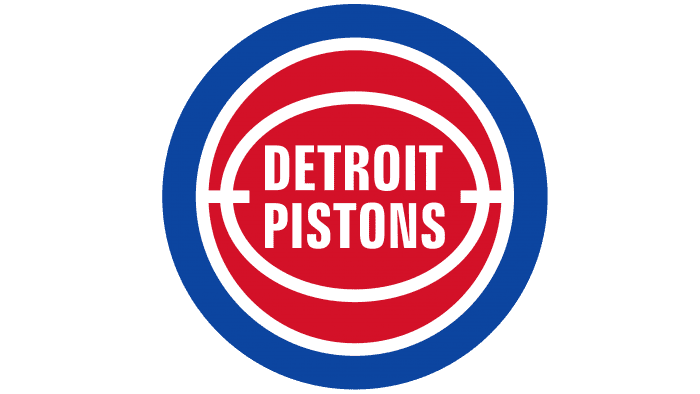
In this version, developers used the principle of a classic round disc, placing several round elements inside one another. In the center is a horizontal oval with the inscription “DETROIT PISTONS.” Next is a circle with a thin white stripe, followed by a wide blue ring. It occupies the entire outer side of the logo.
1996 – 2001
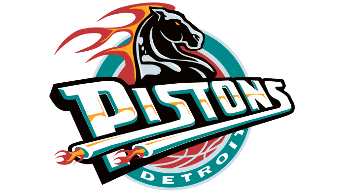
To modernize the logo and make it fresher and more appealing, the basketball team changed its design. This version introduced a nod to the transportation theme: the image of a horse (hinting at horsepower, which measures engine power) and elongated legs of the letter “S” (styled as car exhausts).
The logo also contains a basketball (in the center), the word “PISTONS” (horizontally), and flames (in the horse’s mane). The round background is still outlined by a blue framing ring, and on it is the second part of the sports club’s name – “DETROIT.”
2001 – 2005
In 2001, new colors appeared on the logo. Now, instead of black, yellow, and turquoise, blue, red, and light blue dominated. The gray color remained the same. The shape of the elements was also preserved.
2005 – 2017
The emblem with the horse’s head was not popular. Both fans and journalists mostly criticized this version of the “Detroit Pistons” emblem. Moreover, it was called an emblem of racing or horse racing. As a result, in the 2005/2006 season, the team’s management adopted a new simplified design. The emblem consists of a red basketball, a white inscription with shadows, and a circle with a blue border. The palette matches the colors of the US flag. The team name is placed in the center and is shaped like an arc. The top word is small, and the bottom word is large.
2017 – today
In 2017, the basketball players decided to return to one of the old emblem versions, namely the one from 1979. In its modern interpretation, it looks like a ball surrounded by a wide light-blue ring. In the central oval is the phrase “DETROIT PISTONS,” arranged in two lines. Thin white stripes separate all elements. In Michigan, it is believed that this will be a new chapter in the club’s history. This is the eighth update of the club’s emblem for the team founded in 1941.
Detroit Pistons: Interesting Facts
- How They Started: They began as the Fort Wayne Zollner Pistons in 1941, making pistons for cars. They joined the NBA in 1949 and moved to Detroit in 1957.
- The “Bad Boys”: In the late 1980s and early 1990s, the Pistons were called the “Bad Boys.” They played tough basketball and won two NBA Championships in 1989 and 1990. This team had famous players like Isiah Thomas and Dennis Rodman.
- Their Stadium: They played in The Palace of Auburn Hills from 1988 to 2017. This place was special because it was one of the first to have luxury suites.
- 2004 Champions: In 2004, the Pistons were the underdogs but won the NBA Championship. They beat the Los Angeles Lakers with teamwork and strong defense.
- Honored Players: The Pistons have honored several players by not letting anyone else use their jersey numbers, like Isiah Thomas (#11) and Ben Wallace (#3).
- Ben Wallace: He wasn’t picked in the draft but became one of the best defenders in basketball history, winning the Defensive Player of the Year four times.
- The Teal Era: In the 1990s, the Pistons changed their colors to teal, black, yellow, and red. People had different opinions about it, and in 2001, they returned to red, white, and blue.
- Great Coaches: The Pistons have had famous coaches like Chuck Daly and Larry Brown, who helped them win championships.
- New Arena: In 2017, they moved to the Little Caesars Arena in downtown Detroit, sharing it with the Detroit Red Wings hockey team. This was to help make downtown Detroit lively again.
- Worldwide Impact: The Pistons have players from all over the world, including Serbia and Guinea, which shows how basketball is loved by people everywhere.
The Detroit Pistons have a big role in NBA history with their tough play, great players, and big moments.
Font and Colors
In its current interpretation, the 80s logo looks somewhat different from its prototype. It has an elongated middle, so the oval contours directly touch the right and left edges of the ball, while the top and bottom parts have a crescent shape. The outline lines have become twice as thin, and the colors have changed to light. The inscriptions have also undergone changes. Chrome outlines have also appeared, which, according to the developers, are a tribute to Detroit automakers.
In previous versions, a separate font was created specifically for the Detroit Pistons logo. At the early stage, they were white stickers with a red outline. Subsequent changes concerned color, shape, style, and size. If initially, a sans-serif font was used, later small serifs appeared, as seen on the letters “P” and “D.” In some cases, the letters “S” are graphically highlighted: they resemble mufflers or now the number “5.”
Speaking of color, the logo has always been dominated by the palette of the American flag – a combination of white with red and blue.
Detroit Pistons color codes
| Royal Blue | Hex color: | #1d428a |
|---|---|---|
| RGB: | 29 66 138 | |
| CMYK: | 100 78 0 18 | |
| Pantone: | PMS 7687 C |
| Red | Hex color: | #c8102e |
|---|---|---|
| RGB: | 200 16 46 | |
| CMYK: | 2 100 85 6 | |
| Pantone: | PMS 186 C |
| Gray | Hex color: | #bec0c2 |
|---|---|---|
| RGB: | 181 179 179 | |
| CMYK: | 30 25 25 0 | |
| Pantone: | PMS Cool Gray 5 C |
| Navy Blue | Hex color: | #002d62 |
|---|---|---|
| RGB: | 0 45 98 | |
| CMYK: | 100 68 0 54 | |
| Pantone: | PMS 282 C |
FAQ
What does the Detroit Pistons logo mean?
The Detroit Pistons logo embodies the sports team’s commitment to its cause and its heritage. Basketball has accompanied the team throughout its history, and the combination of blue, white, and red has been used in the logo since 1957.
Why did the “Detroit Pistons” change their logo?
The Detroit Pistons team updated their logo in 2017 because they decided to move to downtown Little Caesars Arena. Of course, this is more of an evolution than a global change: the image of the basketball player and the red-white-blue color scheme have stood the test of time. Designers combined traditional elements with a modern font that has been in use since 2001.
Is “Pistons” still a team?
Yes, a basketball club with that name still exists. It plays in the Eastern Conference (NBA) and is based in Detroit, where the home arena Little Caesars Arena is located.
Who is number 1 in the “Pistons” team?
In 2002, Chauncey Billups was accepted into the “Detroit Pistons” team and took the number 1 spot because another basketball player was already playing under number 4. Having left the team in 2008, Billups returned to it for one more season – 2013-2014. In February 2016, the “Detroit Pistons” retired Billups’ number 1 jersey. As of 2021, there are no players in the basketball club with the number 1.
