Attractive and informative symbols distinguish American basketball teams. Athletic profile, tactical characteristics, and respect for the city’s founding history – that’s what the logo of the New York Knicks, founded in 1946, symbolizes.
New York Knicks: Brand overview
| Founded: | 1946 |
| Founder: | Madison Square Garden Sports |
| Headquarters: | New York City, New York, U.S. |
| Website: | nba.com |
The New York Knicks is an American professional basketball team founded in the USA in 1946. The Knicks play in the National Basketball Association (NBA) as part of the Atlantic Division of the Eastern Conference. This team was one of the founders of the Basketball Association of America (BAA). It is located in New York.
The initiators of the team’s creation were Max Kase, a New York sports journalist and sports editor of the Boston American newspaper, and Walter A. Brown, owner of the Boston Garden. The two of them and a group of seventeen people gathered at the Commodore Hotel and talked about the great prospects for basketball players. However, they failed to agree with the local stadium authorities – they were outpaced by Ned Irish. The team owners were more impressed by the college basketball promoter’s vast resources than the guarantees of the sports writer. Kase conceded the franchise, although he initially planned to own and manage the New York franchise himself. The franchise was transferred to the Irish.
Thus, an Irishman became the owner and led the club with the participation of The Madison Square Garden Company. Initially, they wanted to choose a different nickname, but then they gathered the team members at a meeting to cast their votes in a hat. After counting the votes, the franchise was named the “Knickerbockers.”
The name “Knickerbockers” comes from the pseudonym used by Washington Irving in his book “A History of New York.” This name came to apply to the descendants of the first Dutch settlers in the area, which later became New York. This term denotes such trousers as crop pants or pantaloons tucked under the knee: they were an integral part of the image of the New World settlers.
In addition, in 1845, a local baseball organization was called the Knickerbocker Nine. This nickname was suggested once again. The team is most often called the “Knicks.” James Dolan became the team owner in 1999. He still shares stocks with the Madison Square Garden company.
Meaning and History
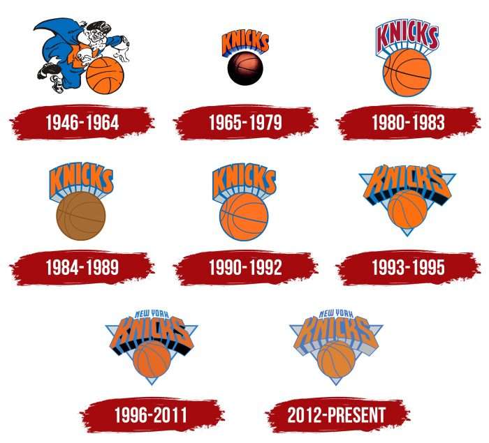
The New York Knicks’ logo was approved in the year the team appeared and fully meets the requirements of a basketball orientation. It features a ball and the name. Moreover, the entire history of the emblem is an evolution from simple to complex. Over the years of the sports club’s existence, it has had eight logo variants.
What is New York Knicks?
The New York Knicks is an abbreviation of New York Knickerbockers, a sports franchise of the National Basketball Association. This team has existed since 1946 and conducts its home matches at Madison Square Garden. The team owner is Madison Square Garden Sports Corp.
1946 – 1964
The club’s very first logo was “Knickerbockers,” derived from the Dutch settlers who arrived in the New World. Most of them settled in the area now known as New York. Specifically, this refers to the style of trousers worn by settlers. Pants rolled below the knee came to be called “breeches” or “pantaloons.” Now, this word is mostly forgotten, and the team name is shortened to “Knicks” in 100% of cases.
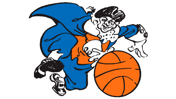
The debut emblem was designed for the first official basketball competition in the 1946/47 season. It featured a player nicknamed Father Knickerbocker. He is running forward, trying to catch a ball that he is catching with both hands. The main character wears a black cap with a visor, a red-orange vest, blue pants, and a jacket of the same color. On his feet are boots with large buckles. The cartoon version’s author is Willard Mullin. He is an animator, hence the corresponding drawing style.
1965 – 1979
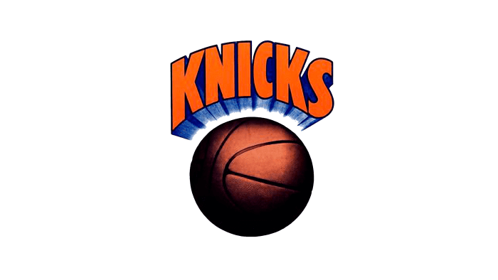
The New York Knickerbockers will present an iconic logo that will last for the next three decades. It was developed by Bud Freeman of the advertising agency J.C. Bull. The New York Knicks logo depicts a brown basketball “highlighted” by the word “KNICKS.” The letters are orange, with a shadow on the lower part for a 3D effect. The letters also have a black outline.
1980 – 1983
In this version of the New York Knicks logo, the designer changed the color of the basketball, making it much lighter. He also added black seams and a blue outline. The font remained the same, only the color scheme changed: the letters became burgundy with a white-blue outline. The shadow from the bottom of the word “KNICKS” expanded and became deeper, enhancing the 3D effect.
1984 – 1989
The New York Knickerbockers’ logo of this period had different colors, but the form, fonts, placement, and size remained the same. The color palette had pastel shades, so the elements did not look aggressive. The Knicks made minor changes to the logo, again changing the basketball to brown with dark brown seams. Reflecting light from below, the letters became blue. All details of the New York Knicks logo have a blue outline, except for the basketball – its outline is dark brown, as are the seams.
1990 – 1992
In this version of the New York Knickerbockers logo, the colors changed. The designers lowered the saturation and enhanced the foggy effect. The basketball became the same orange shade as the word sign “KNICKS.” All key elements have a blue outline. The 3D shadows of the letters became bluish-gray.
1993 – 1995
In 1992, the Knicks updated their logo. Michael Doret proposed using a triangle. Tom O’Grady developed other elements. Against the backdrop of a bluish-gray geometric figure, the slightly tilted backward word “KNICKS” appeared, enhancing the 3D effect. The letters extend beyond the triangle and are darkened from below. The contour and seams of the basketball are light blue. The primary color is orange.
1996 – 2011
The 1996 logo version has very minor changes in colors. The inscription “NEW YORK” is located above the team’s nickname – between the letters “K” and “S.” The fonts, triangle, basketball, and its seams remained the same, as did the outlines of the elements.
2012 – today
The current version differs radically from the debut one: only the basketball connects them. In the process of evolution, the emblem acquired more complex details than it was originally, although it is a remake of the previous logo. The designers removed the black shadows (replacing them with grayish-gray) and reduced the intensity of the brick color. Everything else was left unchanged.
Many Knicks fans were pleased to return to the blue color palette, which the club used for most of its history. Orange, blue, and white are New York’s official colors. But the blue color is very common. It looks neutral and suits any team in any sport. The current Knicks logo’s orange color is quite rare, and the focus is on shine and confidence, which suits a team from a big city. In this case, the blue color looks good as a border, and the white font draws attention to the team’s name.
The New York Knicks logo somewhat resembles a label from a second-rate laundry detergent and would be appropriate on the chest of some superhero. Of course, this isn’t very bad, but somehow not serious for an enterprise of such level and rich history.
New York Knicks: Interesting Facts
The New York Knicks, also called the Knickerbockers, are among the oldest and most famous basketball teams.
- Starting Out: They began in 1946, making them one of the first teams in the league.
- Why “Knickerbockers”?: The name comes from the pants Dutch settlers wore, and it’s a nod to New York’s history.
- Championships: They won the NBA Championships twice, in 1970 and 1973, with famous players like Willis Reed and Walt Frazier.
- Madison Square Garden: Their home is in one of the world’s most famous arenas, known for its exciting games.
- The Willis Reed Moment: In the 1970 Finals, Reed, though hurt, played the beginning of the game and motivated his team to win.
- Walt Frazier’s Big Game: In the 1970 Finals, Frazier scored 36 points and helped win the championship.
- Part of New York: The Knicks are a big part of New York, drawing celebrities to games and appearing in movies and songs.
- Big Rivalries: They’ve had major rivalries with teams like the Pacers, Heat, and Bulls, especially in the 1990s.
- Patrick Ewing: Drafted in 1985, Ewing led the team for years and took them to the NBA Finals twice in the 1990s.
- Breaking Barriers: In 1967, they hired Red Holzman, who led an all-black starting lineup to win the 1970 championship.
- “Linsanity”: In 2012, Jeremy Lin became famous worldwide after leading the team to win many games unexpectedly.
- Hall of Fame: Many Knicks players and coaches, like Ewing and Reed, have been honored in the Basketball Hall of Fame.
These points show the importance of the Knicks in basketball and New York City culture.
Font and Colors
The team’s visual identification mark has gone through several stages. The most significant changes occurred in 1965 and 1993, more than half a century apart. In the first of the noted periods, there was a transition to a simplified design, where the ball and the name were combined in a 3D format. The version that became the prototype of all subsequent ones was offered by Bud Freeman from the advertising studio J.C. Bull. The 1993 version developer is Michael Doret. He used a triangle in the emblem against the background of a voluminous name and basketball.
The main feature of the font is the volume. To achieve a 3D effect, artists used the shadowing technique. Moreover, the letter style does not resemble any known commercial fonts. It’s unique because it was created specifically for this logo. The colon is visually tilted and narrowed towards the center.
The team’s color palette echoes the official palette of New York City. It consists of white, blue PMS 293, and orange PMS 165. Some periods also included silver and black.
New York Knicks color codes
| Blue | Hex color: | #006bb6 |
|---|---|---|
| RGB: | 0 107 182 | |
| CMYK: | 100 56 0 0 | |
| Pantone: | PMS 293 C |
| Orange | Hex color: | #f58426 |
|---|---|---|
| RGB: | 245 132 38 | |
| CMYK: | 0 59 96 0 | |
| Pantone: | PMS 165 C |
| Silver | Hex color: | #bec0c2 |
|---|---|---|
| RGB: | 190 192 194 | |
| CMYK: | 0 0 0 29 | |
| Pantone: | PMS Cool Gray 5 C |
| Black | Hex color: | #000000 |
|---|---|---|
| RGB: | 35 31 32 | |
| CMYK: | 30 0 0 100 | |
| Pantone: | PMS Black C |
FAQ
Why is there a triangle in the Knicks logo?
The inverted triangle became part of the New York Knicks’ emblem in the mid-1990s. It was added to make the basketball team’s logo resemble a superhero symbol, as the triangular base, according to the developers, should evoke precisely such associations. The design was inspired by the emblems of Gotham City, Batman, and Superman.
Who designed the Knicks logo?
The original version of the current logo was created in 1993 by Tom O’Grady. Later, the New York Knickerbockers designers remade the iconic symbol twice.
Where is the New York Knicks located?
The New York Knicks are based in the smallest and most densely populated borough of New York – Manhattan. That’s where its home stadium, Madison Square Garden, is located.
Is the Knicks still a team?
Yes, the New York Knickerbockers remains an original team of the National Basketball Association; it has never changed its name or relocated.

