The balanced geometric shape of the Best Western logo suggests that everything has its individual place; the hotels offer perfect comfort and are under vigilant control. At the same time, the emblem exudes noble luster and sophistication – some of the key factors in the well-being of foreign tourists.
Best Western: Brand overview
Best Western is an international hotel chain that covers not only the United States but also countries in Europe, Asia, Mexico, New Zealand, and Australia. In fact, it is a vast franchise of more than 4,700 hotels located around the world. The main management center is located in Phoenix, Arizona. The founder of the company is Meryl Key (M.K.) Guertin. The company was founded in 1946.
Meaning and History
M.K. Guertin chose a simple name for his business based on the location of most of his hotels west of the Mississippi River. The golden crown appeared on the logo later, in 1964. It indicates not only the royal accommodations but also emphasizes the scale and leadership of the project among its competitors. Although the logo has undergone changes over time, it has consistently retained its royal attribute. For 32 years, there were few changes until the blue and yellow design was introduced in 1996. In 2015, the hotel chain received a dramatically updated sign.
What is Best Western?
Best Western is the name of an American company and its international chain Best Western Hotels & Resorts. It is the largest franchise in the hotel industry, covering the entire United States, Asia, Europe, Australia, New Zealand, and Mexico. The company has more than 4,700 hotels located around the world. The chain’s founder is Meryl Key (M.K.) Guertin who opened his first hotel in Arizona in 1946.
1946 – 1950
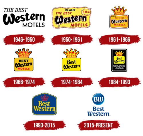
The logo is black and white and simple. The simplicity lies not in the number of elements but in their two-dimensionality: all components are flat. The emblem contains only text and is divided into three levels: the upper and lower are straight, and the middle is slanted. The first row is left-aligned and is a thin, italicized text with serifs. The third row is aligned on the right edge and has diagonal cuts at the ends and pointed tips at the letter “M.” In the center line of the text are bubble letters – inflated, large, rounded. The abundance of smooth strokes makes the glyphs look soft and friendly. In the word “Western,” the letters are lowercase, and in two neighboring words, they are uppercase (“The Best” and “Motels”).
1950 – 1961
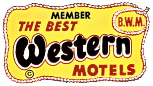
A background was added to the text, which greatly enhanced the mark and became the focal point. The original structure of the emblem was retained: two small straight lines of text (top and bottom) and one large curved line (in the middle). The designers made them more expressive by increasing the boldness and adding an outline. Two additional lines have also appeared: the word “Member” is now at the top, and the abbreviation “B.W.M.” is now at the bottom right. The yellow rectangle with wavy edges is framed by a thick rope that forms a loop at one point.
1961 – 1966
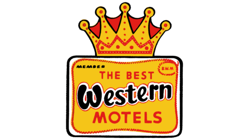
The era of the crown, which the founder of the hotel chain placed above the rectangle with the name (this logo was invented by Gerten himself), began. Everything else remained the same: the wavy edge, the yellow color, the rope frame, the loop, the text. But there are also changes: the lines are slightly shifted (except for the central one), the yellow color has become more intense, and the sign has an outline – a straight black stripe. The crown is in the upper part: it is voluminous, decorated with a pattern of red dots, and has five rays with small circles at the ends.
1966 – 1974
Muted colors and a lack of unnecessary information characterize the Best Western logo of this era. It became minimalist by removing the words “Member,” “B.W.M.,” and the article “The.” Only three words remained, filling the entire interior of the background rectangle: “Best,” “Western,” and “Motels.” As before, they were typed in different fonts. Recognizability was retained only in the center line, and the glyphs in the two adjacent lines became much larger. The pattern on the crown was reduced: some lines became single lines.
1974 – 1984
During this period, the logo was greatly simplified. The word “Motels” was permanently removed, as customers already knew that the Best Western name was associated with hotels. The remaining lines were standardized: both in a casual, bloated typeface and arranged diagonally. The glyphs became lowercase, except for the initial letters. The yellow rectangle with rounded corners became much brighter – its hue approached warm sunlight. The border of the crown became evenly thin all around.
1984 – 1993
Despite retaining all the basic elements, the emblem became much more complex. Designers added another rectangle – vertical, large, and black, inside of which they placed a horizontal yellow rectangle with the name and crown. The colored areas in the crown ornament were also changed, giving it a sense of modernity and novelty. At the bottom of the dark field, the phrase “Worldwide Lodging” appeared in white uppercase font. The yellow color took on a lemon hue, and the logo received a double border.
1993 – 2015
After the modernization, the Best Western emblem acquired new colors: red, blue, and yellow, which moved to a pastel palette. Designer Lister Butler envisioned the modern logo this way. He used a narrower font because the elongated letters look elegant and original. The yellow lettering occupies two lines centered in the center. The author also transformed the crown, turning it into a red “W” in accent style – with a blank center and a thin border line outlining the silhouette of the capital letter. At the top, he placed two triangular brackets joined together as if to form the top of a crown. The background rectangle became blue, with a curved top edge. From afar, this geometric shape resembles a house with a roof.
2015 – today
Continuing the theme of the crown based on the letter “W,” the designers added another letter representing a new variant of the Best Western hotel chain’s abbreviation. The white decorative letters are located in the center of a blue 3D circle with reflections. This effect was achieved by darkened edges of the glyphs, bright highlights, and cast shadows. Below is the full version of the title. Its glyphs have smoothly rounded tips. These are particularly noticeable in the letters “W” and “r,” although they are present in other letters as well.
Font and Colors
In the latest version of the logo, the lettering is in the tall Century Bold Condensed font. Previously, a unique bubble style font dominated, characterized by bloated and jagged letters. Geometric grotesque fonts were also used in both thin and bold versions.
The color palette of the emblem varies, but yellow is always present in it, albeit in different shades. Later, the color scheme included red and blue, with blue becoming the main color. For some time, black and white colors were also used.
Best Western color codes
| Safety Blue | Hex color: | #003c7f |
|---|---|---|
| RGB: | 0 60 127 | |
| CMYK: | 100 53 0 50 | |
| Pantone: | PMS 228 C |
