![]() Hampton Inn Logo PNG
Hampton Inn Logo PNG
The Hampton Inn logo is a respectable symbol that reflects the hotel’s atmosphere. On the one hand, it conveys its universality; on the other hand, it underscores a relaxed atmosphere. In this, it is aided by simple lines, geometric shapes, and a clear structure, so the emblem looks like a chevron.
Hampton Inn opened in the summer of 1984 in Memphis, Tennessee, under Holiday Corporation, the parent company of Holiday Inn. The first hotel had two floors, exterior room entrances, and 128 rooms of about 225 square feet. The brand was created to fill the gap between roadside motels and full-service hotels without weakening the Holiday Inn name.
The early format was deliberately simple. Guests received coffee, a doughnut, and a Danish pastry for breakfast. At the same time, staffing and operating costs stayed lower than in full-service hotels. In the first two years, ten Hampton Inn hotels opened, mainly in the southeastern United States, where franchise interest grew quickly.
In 1989, Hampton Inn introduced a 100 percent satisfaction guarantee, offering refunds to unhappy guests. That same year, Holiday Corporation sold Holiday Inn to Bass PLC and placed Hampton Inn, Embassy Suites, and Homewood Suites under Promus Hotel Corporation. Under Promus, the brand moved from an economy model toward midscale hotels with interior corridors, pools, gyms, and fuller breakfasts. By 1990, it had more than 220 properties and over 27,000 rooms.
In 1995, Promus launched Hampton Inn & Suites, adding two-room suites with living areas. In December 1999, Hilton Hotels Corporation bought Promus for $3.7 billion, adding Hampton Inn, Embassy Suites, and Homewood Suites to Hilton’s portfolio, as competitors such as Marriott International’s Courtyard and Starwood’s Four Points were active in the same segment. Later updates included “Make It Hampton” in 2004, the Hampton by Hilton name in international markets from 2009, the “Perfect Mix” lobby redesign in 2012, and more than 3,000 hotels in over 40 countries and territories by 2024.
Meaning and History
![]()
The hotels appeared under the name Hampton Inn (or more precisely, Hampton Inn & Suites), which is occasionally used now. At present, the hotel complex is called Hampton by Hilton. Each name had a significant impact on the network’s visual identity because it appears in its logos.
The text signs have a presentable appearance and look like staff name badges. Moreover, the “badges” have clear inscriptions and minimal decorative elements, thereby emphasizing the hotels’ budget nature. That is, the emblems directly tell customers that there are no frills here – only everything necessary within reasonable limits, which is how the moderate pricing policy is achieved.
What is Hampton Inn?
Hampton Inn is the largest hotel operator in the U.S. It has been around since 1984, starting with a single building and gradually transforming into a large international network. The budget hotels operate on a franchise model, keeping prices below average due to limited services and a small selection of food and beverages. The Promus Hotel Corporation founded the brand.
1984
![]()
The Hampton Inn logo features the hotel chain’s name. It’s simple, business-like, and practical, without any designer frills. It’s more of a prototype emblem than a fully-fledged one. The text is set in a classic font reminiscent of Times New Roman. The first letters in both words are capitalized (“H” and “I”), and the rest are lowercase. Each has a slight rounding that makes the inscription soft and streamlined. Such an unobtrusive design inspires customer trust and expands the number of hotel guests.
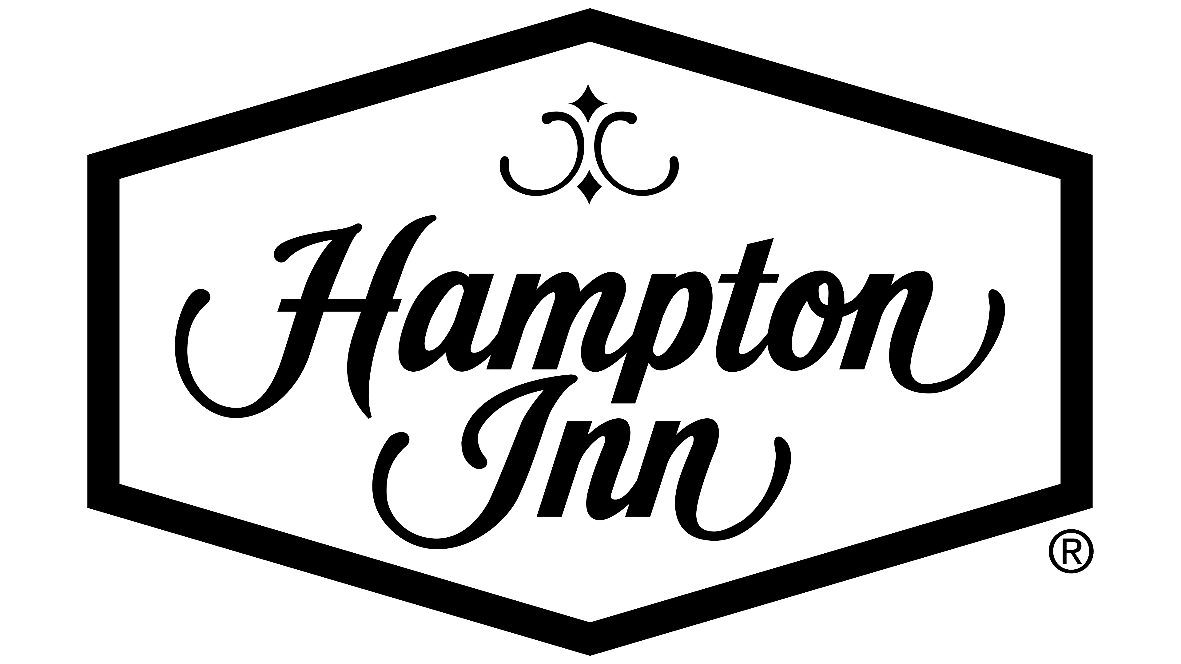
1984 – 2015
![]()
The emblem consists of a horizontal rhombus with truncated ends that resembles a honeycomb; it’s also a hexagon with the same configuration. This analogy was likely intended to emphasize the possibility of living in an environment with many similar rooms and cells, forming an entire hotel complex. The outer frame of the geometric figure is painted red, and the inner one white. It separates the central blue segment with a cursive inscription in a handwritten style.
At the top is a refined composition consisting of two miniature rhombuses and two thin semicircles. Their shape is visible in the outlines of some letters: for example, semicircles are present in “H,” “I,” and “n.” Meanwhile, the cartouche adds an Eastern sophistication to the logo. The background is a pleasant dark blue color.
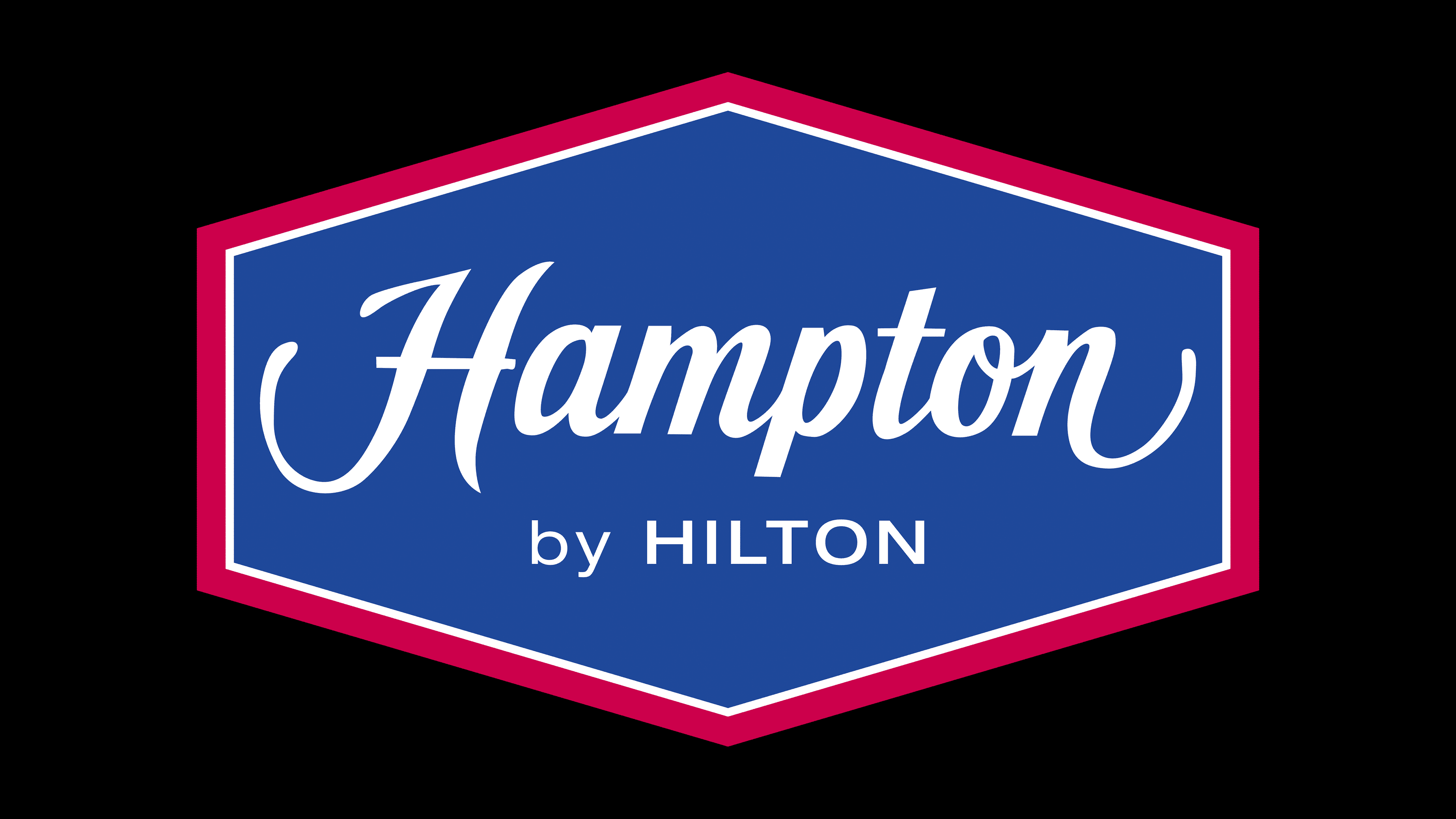
2007 – today
![]()
After the rebranding, a new Hampton Inn emblem appeared. It fully corresponds to the old one, which looks like a flattened hexagon, a rhombus with truncated vertices. The two-level inscription has a different design.
- The top row is set in italics. The letters are lowercase (except for the initial one), calligraphic, and semi-connected, with gaps between “H” and “a,” “p,” and “t.” The lower legs in the first and last glyphs are elongated and rounded.
- The second line contains an inscription in a print font. The characters are small and thin, with minimal spacing between them. The word “by” is in lowercase, and “Hilton” is in uppercase.
The hotel chain’s name is centered on a light-blue background and framed twice.
Fonts and Colors
Two font types were chosen for the text logo: thin Canaro, used to set the bottom word, and semi-bold italic Frutiger, which served as the basis for the calligraphic inscription at the top. At the same time, the first line is set in a font that resembles the styles of Saber du Rhinoceros, Playball, Milkstore 01, and Krinkes Decor.
The emblem predominantly features two colors: red and blue. Depending on the year the logo appeared, its shades differ. For instance, the early variant consists of blue (Pantone #280) and red (Pantone #207). Later on, the designers slightly lightened them. White is used as a neutral color.