


![]() CrossFit Logo PNG
CrossFit Logo PNG
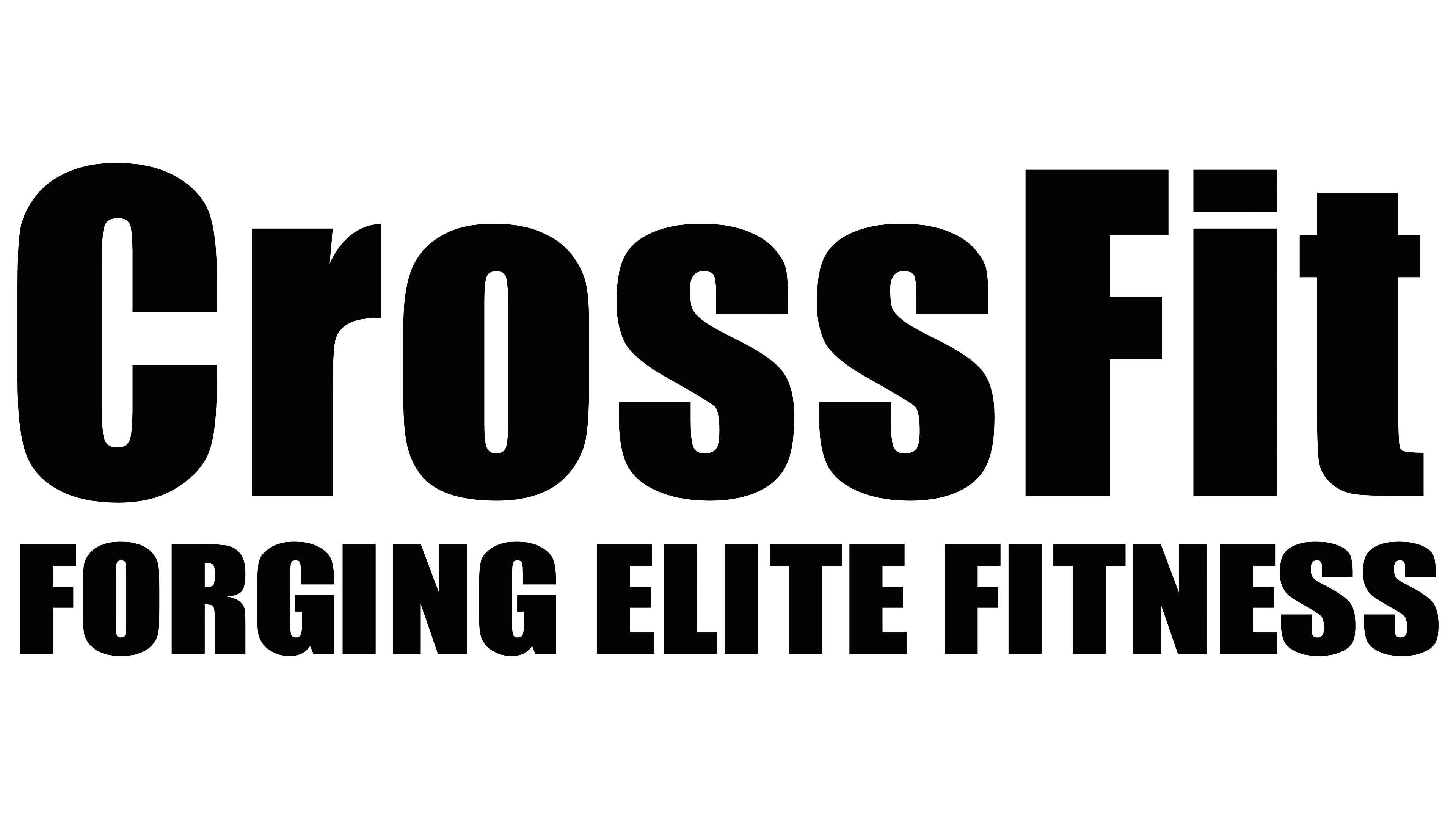
The CrossFit logo embodies the immense physical exertion, the seriousness of the sport’s methodology, and the high intensity of the workouts. It represents a philosophy that keeps the body in excellent shape through high-intensity exercise, preparing it to withstand unexpected, exhausting, or excessive loads without adverse consequences.
CrossFit began in the mid-1990s with Greg Glassman, a former gymnast and personal trainer from California. In 1995, he tested his training method with police officers in Santa Cruz, focusing on strength, endurance, flexibility, coordination and speed for practical physical tasks. In 1996, he opened the first CrossFit gym in Santa Cruz, using barbells, kettlebells, ropes and gymnastic equipment instead of standard machines.
In 2000, Glassman registered CrossFit Inc. and launched crossfit.com. The site published the daily Workout of the Day, or WOD, giving people a ready training plan they could follow with limited equipment. In 2002, CrossFit introduced an affiliate model, allowing independent coaches and gym owners to open CrossFit boxes under the brand for an annual fee. The model differed from fitness chains such as Gold’s Gym, which relied on direct ownership and management.
The affiliate network grew quickly. By the late 2000s, CrossFit had surpassed 1,000 gyms, and in the early 2010s, it reached several thousand locations worldwide. In 2007, the first CrossFit Games were held on a ranch in Aromas, California, with a small group of competitors and a modest prize. In 2010, a ten-year sponsorship deal with Reebok brought wider marketing support, branded shoes and apparel, larger venues, and television coverage.
By the mid-2010s, CrossFit had over 13,000 affiliated gyms in more than 100 countries. In June 2020, Glassman faced a public crisis after comments linked to protests against racial discrimination. Hundreds of affiliates left, athletes and coaches cut ties, and Reebok ended its deal early. Glassman resigned as CEO and sold the company to Eric Roza. Later, NOBULL became the title sponsor of the Games.
Meaning and History
![]()
Greg Glassman, the creator of a unique training program with intensified methodologies, laid the foundation for the brand. He and Lauren Jenai opened a sports club that promotes this new form of physical exertion, enabling the body to withstand extreme conditions. The training gained success and expanded to other regions. By 2022, half of the 12,000 centers were outside the United States, covering 150 countries. This led to a unique franchise with a unified visual identity and a distinctive sports program regimen. The name CrossFit fully conveys the intensity of the workouts and forms the basis of the logo.
What is CrossFit?
This is a training system and network of gyms operating under a unified brand managed from Santa Cruz, California. The method is based on high-intensity workouts and incorporates elements of gymnastics, weightlifting, powerlifting, plyometrics, and strength training. The program is designed for individuals whose professions involve a high physical risk, aiming to prepare the body for unpredictable situations. Gyms following this approach operate worldwide.
2000 – 2003
![]()
The emblem uses the name as the key element, with nothing else alongside it. The text logo is minimalist, emphasizing the methodology’s seriousness, with a focus on training and high endurance. Stability, resilience, and strength are fundamental to identity. The inscription is continuous and presented in a two-dimensional design. The presence of two bases is indicated by the capital letters at the beginning of the words “Cross” and “Fit.” The other glyphs are lowercase. They are bold, block, and black.
2003 – 2016
![]()
The designers modified the font without changing the predominant business style. The letters became shorter and clearer. The transformation is especially noticeable in the letter “r”: its shortened top stroke makes it appear more massive than before. The rectangle replacing the dot above the “i” has narrowed, and the crossbar of the “t” now looks very tiny. The boldness and case of the font remained unchanged.
2016 – today
![]()
The CrossFit logo returned to its earlier variant, with some differences. For instance, the rectangle above the “i” became a square, and the crossbar of the “t” grew longer. The designers also increased the letter spacing, rounded the “s,” and slightly elongated the top stroke of the “r.”
Font and Colors
The company chose a bold typeface with precise geometric forms, emphasizing its athletic identity and sense of stability. The logo’s characters appear compact, with thick strokes and minimal spacing between letters, creating a dense and confident visual presence. Early versions used a typeface resembling Haettenschweiler narrow and tall, with sharp lines and abrupt stroke transitions. Later versions retained the same geometric clarity and boldness, drawing comparisons to fonts like Impact Std Roman and Champion Gothic Welterweight.
The logo’s color scheme is strictly black. This choice gives the brand a strong, grounded, and high-energy presence. Black evokes physical strength and confidence, conveying reliability and endurance qualities central to CrossFit’s mission. The classic color makes the logo resistant to passing trends, maintaining its relevance over time and ensuring clarity across all formats.