The Longines logo reflects a company that has successfully mastered time. It combines years of experience, reliability, and precision embodied in the performance of its mechanisms. The emblem with the winged hourglass, which consistently accompanies the brand’s identity, symbolizes longevity and expertise in measuring every moment. This element highlights the company’s continuous pursuit of perfection and its stable position in the global market.
The wings surrounding the hourglass represent a symbol of constant forward movement and the ongoing advancement of technology, allowing the brand to maintain its leadership while staying true to its traditions. The hourglass embodies the brand’s philosophy, where time is a resource that can be accurately measured and controlled.
Longines: Brand overview
In 1832, Auguste Agassiz and two partners established a watchmaking workshop in Saint-Imier, Switzerland, marking the beginning of Longines’ history. Initially named “Raiguel Jeune & Cie,” the business focused on producing pocket watches.
In 1846, Agassiz took full ownership of the company. He introduced an innovative production method in which workers made individual watch parts at home and assembled them in the workshop. This approach helped reduce costs and boost productivity.
Agassiz’s nephew, Ernest Francillon, joined the business in 1852 and quickly became a key figure in its expansion. Francillon believed that centralized production was the future of watchmaking and aimed to build a factory where all manufacturing steps could occur under one roof.
A major shift occurred in 1867 when Francillon purchased land on the right bank of the Suzé River in an area known as “Les Longines” (French for “long meadows”). Here, he built the first factory, one of the first in Switzerland to manufacture watches on an industrial scale.
That same year, the company introduced its first watch under its name—the 20H pocket watch, which featured an anchor escapement. In 1889, the brand registered its winged hourglass logo, one of the oldest trademarks still used today.
During the late 1800s, the company actively expanded into international markets. It participated in numerous world exhibitions, winning awards for its excellence and innovation.
The early 1900s marked advancements in sports timing. In 1878, the company introduced its first chronograph movement, the 20H, which quickly found use in equestrian events. The brand served as the official timekeeper at the 1912 Olympic Games in Stockholm, starting its long-standing association with sports.
In 1919, the company became the official supplier to the International Aeronautical Federation, deepening its ties to aviation. Famous pilots, including Charles Lindbergh, who completed the first solo non-stop transatlantic flight in 1927, wore timepieces from the brand.
The 1930s saw further technological innovation. In 1931, the company introduced the 13ZN caliber, the first wristwatch chronograph with flyback functionality. In 1936, the 13.33Z caliber was developed, and the first chronograph could measure time to one-tenth of a second.
Like many other Swiss watchmakers, the company produced watches for military use during World War II.
After the war, the business continued to advance its technology. In 1945, it released the 30L caliber, known for its precision. 1954, the company introduced its first automatic watch with a calendar feature.
The 1960s and 1970s were notable for the creation of ultra-thin watches. In 1960, the brand launched the 360 caliber, which, at just 2.95 mm thick, was the world’s thinnest movement at the time.
1969, the Ultra-Quartz model was introduced, marking its first quartz watch and one of the earliest mass-produced quartz wristwatches.
The 1980s marked a period of transformation for the company. In 1983, it became part of the SMH Group, later renamed the Swatch Group, gaining access to new resources and technologies.
The brand continued refining its watch lines in the following decades, combining modern technology with timeless design. It solidified its position in the sports world as the official timekeeper for various prestigious events in gymnastics, alpine skiing, and equestrian sports.
To celebrate its 175th anniversary in 2007, the company released a series of anniversary models inspired by vintage designs.
The 2010s saw a return to roots with the launch of collections like the Heritage Line and The Longines Master Collection, which drew inspiration from classic timepieces.
In 2012, the brand celebrated its 180th anniversary with several limited-edition releases, including a faithful reproduction of the company’s original 1913 timepiece.
By 2023, the company had established itself as a mid-range luxury watch market leader, known for its elegant designs, high quality, and rich history. It continues to evolve its core collections, balancing modern technology with traditional heritage.
The brand’s history is one of continuous innovation and progress, closely tied to the evolution of Swiss watchmaking. From its humble beginnings in a small workshop to becoming a globally recognized name, it has consistently produced timepieces that blend style, precision, and reliability.
Meaning and History
What is Longines?
This Swiss watchmaker with a rich history has carved out a unique place by blending elegance and accessibility. The brand, known for its winged hourglass logo, has established itself as a producer of refined and slim watches, skillfully combining traditional style with cutting-edge technology. Many of the brand’s watch designs are inspired by its close connections to sports, including equestrianism, aviation, and alpine skiing. The product range varies from modern sports watches with advanced technology to vintage models that pay homage to the brand’s classic heritage.
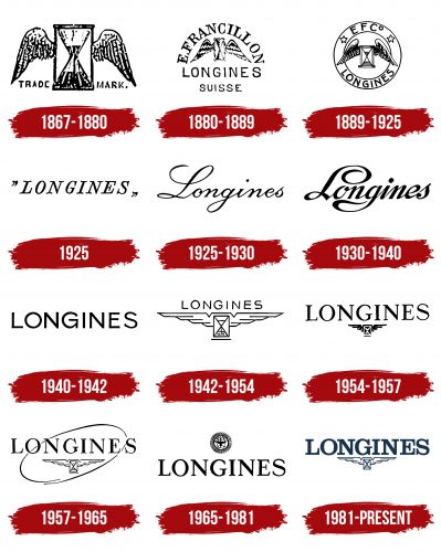
1867 – 1880
The company’s first emblem dates back to the factory’s construction by Ernest Francillon, the nephew of the watchmaking business’s founder. This period marked the release of the first L20A movement, although the firm began operations in 1833 under Comptoir Raiguel Jeune & Cie.
The emblem is presented as an image of an hourglass symbolized by time and wings on the sides representing movement. This image conveys the company’s essence—producing mechanisms that capture and track the passage of time. The products are refined yearly, reflecting the company’s continuous pursuit of precision and innovation.
At the bottom of the logo, it is emphasized that the image is a “Trademark,” affirming the authenticity of the products. This indicates the brand’s high status and commitment to quality.
1880 – 1889
In 1880, Ernest Francillon registered the trademark and introduced a new logo. The brand’s name came from the factory’s land—Les Longines, which translates to “long fields.” The emblem featured an arched inscription with the owner’s name, emphasizing his involvement and authorship of many production innovations. One of Francillon’s significant achievements was the development of the winding crown, which eliminated the need for a key to wind the watch.
At the center of the logo was the company’s signature symbol—the hourglass, but with wider wings and detailed feather illustrations. This element reflected the idea of movement and infinite time.
The lower part of the emblem displayed the brand’s new name and the word “Switzerland” in French, highlighting its origin.
The logo’s composition evoked associations:
- The sunrise symbolizes the company’s emergence and growth and plays a significant role in the luxury watch market.
- With a clock, visually representing half of a watch dial.
The visual symbol was compact, easy to remember, and contained all the key elements that characterized the manufacturer and its pursuit of perfection.
1889 – 1925
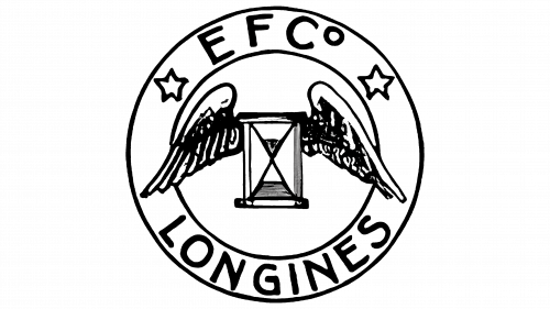
After the brand and trademark were officially registered, the manufacturer updated the logo, changing its shape to a circle symbolizing the outline of a watch. Two stars were placed on the circle’s rim, separating the first letters of the abbreviated company name—EFCo (Ernest Francillon & Compagnie)—and the brand name Longines. These stars served as a mark of quality, representing the brand’s proudly upheld watchmaking traditions.
The abbreviation of the company name drew attention to the brand, making it more recognizable. The signature winged hourglass symbol remained at the center, reflecting the company’s core philosophy—precision, movement, and reliability in every mechanism created.
1925
In 1925, the company opted for simplicity. The logo became the brand name enclosed in quotation marks. This approach created the impression that the brand had already become well-known and discussed worldwide, with its name being seen as a standard that other manufacturers aspire to and that customers talk about.
1925 – 1930
The new visual symbol, which replaced the previous one that existed briefly, took on an elegant appearance in line with the Art Deco style—a popular artistic movement of that period. The script font’s graceful lines and smooth curves emphasized the status of a luxury brand whose products were created with impeccable taste and attention to detail.
1930 – 1940
In the 1930s, the logo’s script style changed: the lines became more pronounced and gained weight through increased boldness, while the smooth loops became elegant swirls. These changes symbolized the expansion of production and the company’s strengthened position as a serious player in the market. The brand developed unique models, such as the Longines Hour Angle Watch for aviation, and watches and instruments capable of operating in extreme conditions, such as arctic expeditions, elevating its status in the industry.
1940 – 1942
The logo from the wartime period is characterized by restraint and clean lines. The font glyphs appear strict and official, reflecting a more serious and businesslike approach. Active orders for the production of watches for military needs drove these changes. The design of the visual symbol aligned with the practical requirements of the time, excluding any decorative elements and accents, such as lacework and monograms, emphasizing the importance of functionality and reliability.
1942 – 1954
In 1942, a strict “military” design was created, which later became the basis for the modern logo. The hourglass gained steel wings, echoing the emblems of military aviators, and the symbol itself pointed to the high precision of the company’s products intended for aviators. The brand name is subtly written above the image, creating a sense of lightness and harmony that does not weigh down the wings but emphasizes their airiness.
1954 – 1957
The logo acquired a more harmonious feel, focusing on the brand name, as it fits into the corporate identity. The large serif capital letters reflect the brand’s historical heritage and unique journey. The company’s achievements, which have become legendary, are reflected in this new version. The hourglass with wings at the center creates perfect visual balance. The enhancement of black elements in the design symbolizes the trials the company has undergone, its accumulated experience, and the brand’s undeniable strength.
1957 – 1965
The oval, dynamically cutting through the image diagonally, strengthens associations with time. Its open edges emphasize circular movement, symbolizing the passing seconds and the motion of the hands, with Longines at the center of this flow. The transformation of the font into a more expressive one, with sharp and thin serifs, connects the inscription to the markings on the dial, highlighting the precision of time. The winged hourglass has also undergone changes — the wings have become lighter and wider, hinting at the company’s ambitious prospects and bold plans for the future.
1965 – 1981
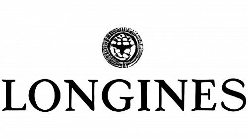
The Longines logo was updated with a stylized image of a clock at the top, resembling a globe, symbolizing the brand’s global recognition. The font of the inscription returned to the classic version from 1954, giving the emblem a sense of stability and reliability. The composition creates the impression of a prestigious award, highlighting the brand’s status and worldwide recognition.
1981 – today
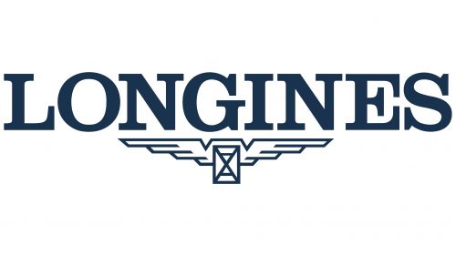
The modern logo departs from the traditional black-and-white color scheme for the first time, adding a rich dark blue hue to the palette. This color embodies professionalism and craftsmanship, making the new design more striking and relevant. The key element remains the winged clock, inspired by the 1942 version of the logo. It continues to emphasize the brand’s core values — the precision and reliability of its timepieces.
The metallic wings in the design symbolize the stability and durability of the products, reflecting the company’s highest quality standards. The visual mark evokes confidence in the future and demonstrates the brand’s lasting success. The updated design seamlessly merges the company’s classic heritage with modern trends, maintaining an unwavering commitment to high standards and excellence.


