


 Audemars Piguet Logo PNG
The Audemars Piguet logo reflects the high precision of its mechanisms, underscoring the brand’s exclusivity. For many years, the brand has consistently maintained its high quality, thanks to the continuity of the family business and the preservation of unique manufacturing secrets. The temporal lines embedded in the emblem’s fonts and inscriptions symbolically connect the past and the present, highlighting the brand’s history and relevance in the modern world.
Audemars Piguet began in Le Brassus, Switzerland, in 1875, when watchmakers Jules-Louis Audemars and Edward-Auguste Piguet joined forces in the Vallée de Joux. Both came from watchmaking families and first produced complex movements for other manufacturers. The company was registered under their names in 1881, followed by pocket watches with minute repeaters in 1882.
In 1889, the firm produced a wristwatch with a minute repeater, bringing a complication normally used in pocket watches to the wrist. The 1899 Grande Complication combined a minute repeater, perpetual calendar and chronograph. Despite weaker demand during World War I, technical development continued. Skeletonized wristwatches appeared in 1934, followed by an ultra-thin model in 1938.
A major change came in 1972 with the Royal Oak, designed by Gérald Genta. Made from stainless steel, it used an octagonal bezel, eight exposed screws and an integrated bracelet. The model created a new category of luxury sports watches and became central to the company’s recovery. Royal Oak Offshore followed in 1993 with a larger, more athletic form.
During the 1990s and 2000s, Audemars Piguet expanded internationally through boutiques and versions of established collections. Code 11.59 launched in 2019 with new case construction and a mix of traditional and contemporary details. By 2023, the company remained independent and family-owned, producing complicated watches and continuing the Royal Oak, Offshore, and Code 11.59 lines.
Meaning and History
What is Audemars Piguet?
This renowned Swiss watchmaker specializes in creating high-end mechanical watches that combine cutting-edge technology with centuries-old craftsmanship. The company is one of Switzerland’s few remaining independent family-owned watch manufacturers. One of the brand’s most famous creations is the Royal Oak, the first luxury sports watch made of stainless steel, distinguished by its innovative design featuring an integrated bracelet and an octagonal bezel with exposed screws. The company’s collection of complex watches includes models with tourbillons, minute repeaters, and perpetual calendars. Often included in the “big three” of Swiss watchmaking alongside Patek Philippe and Vacheron Constantin, the brand is recognized as one of the most prestigious watch companies in the world.
1875 – 1950
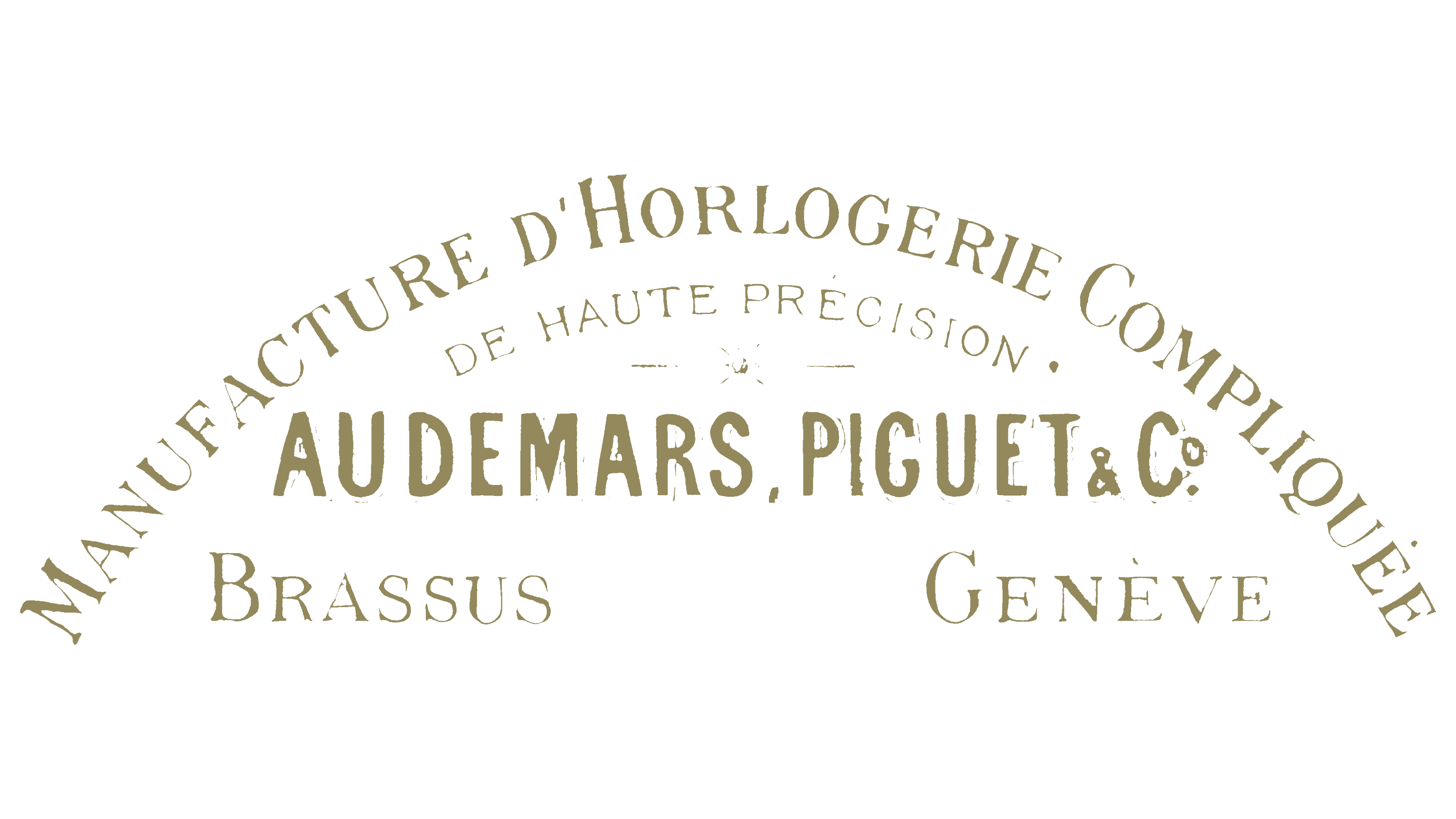
The first Audemars Piguet logo’s elements resemble components of a watch mechanism. Although the logo is word-based, the inscriptions are arranged in an arc, as if outlining the shape of a clock face. At the top, it specifies the company’s main area of expertise: “Manufacture d’Horlogerie Compliquee,” which translates to “manufacture of complicated watch mechanisms.” This emphasized the brand’s specialization in creating intricate mechanisms for elite companies.
The phrase “De Haute Precision” was added to the center of the arc, highlighting the brand’s key strength: high precision. Between these elements, a delicate separator resembling clock hands is elegantly placed. At the center of the dial, the company name is displayed, consisting of the surnames of its founders, Jules Louis Audemars and Edward Auguste Piguet.
Below, on both sides of the name, positioned like hour markers at “3” and “9,” were key geographic locations for the company: Le Brassus, the village where production began, and Geneva, the capital of the Swiss watch industry. All elements of the visual logo were rendered in gold, underscoring the brand’s exclusivity and prestige.
1950 – today
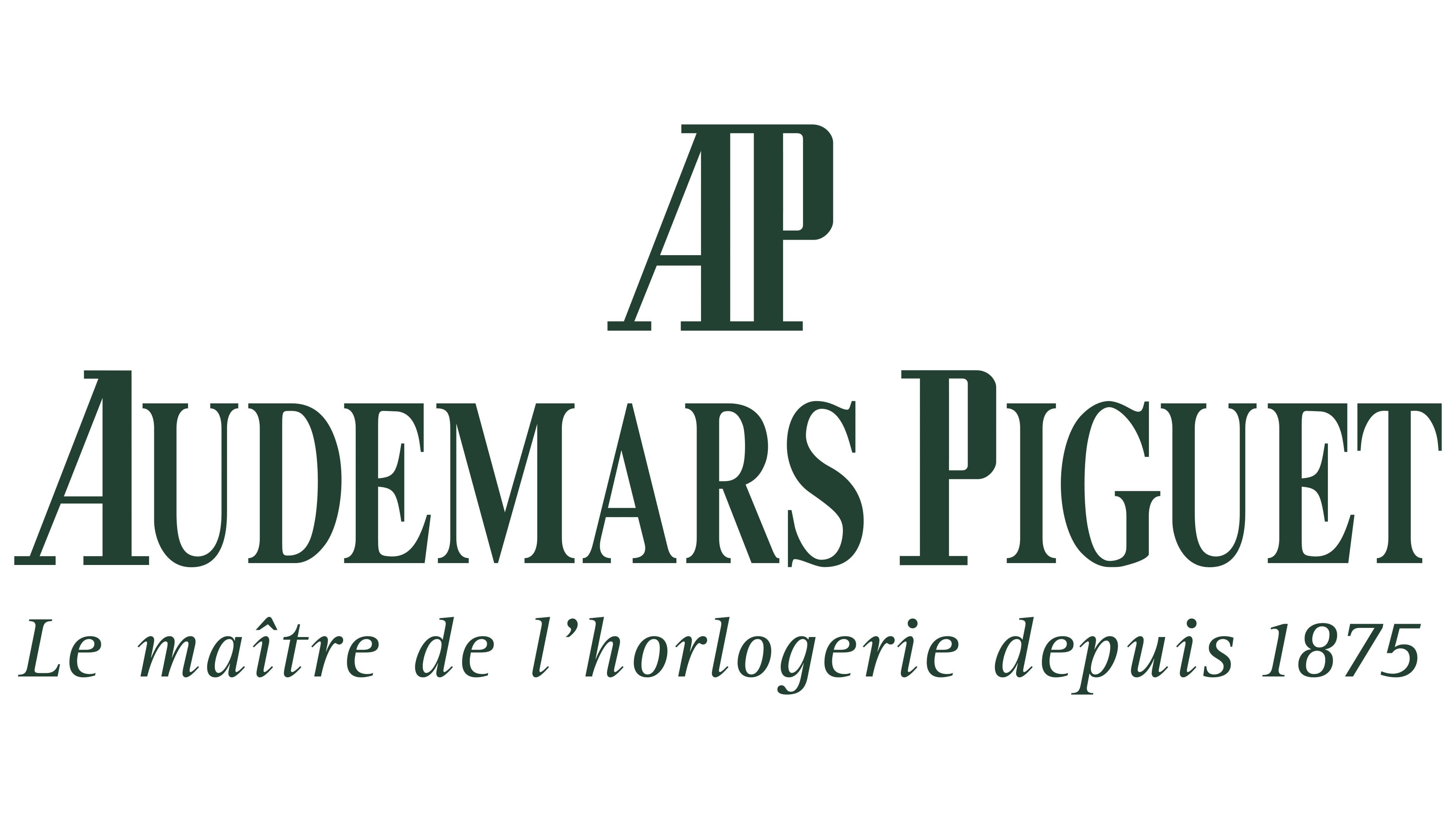
Almost a century later, the company’s third-generation owners changed the emblem. The black color of the inscription now symbolizes a strict and reliable business partner, emphasizing the watches’ high precision and technical perfection.
At the top of the logo is a brief monogram composed of the first letters of the founders’ surnames, symbolically marking “noon” on the dial and representing the equal partnership between the two families. Below it is the company name, with the period between the surnames removed, making the brand unified and focused on its collective name rather than individual owners.
The letters of the visual mark reach upward, adding a sense of dynamism, while some characters feature thin serifs reminiscent of hour markers or the movement of the second hand. The font appears elegant, emphasizing the company’s aristocratic roots and commitment to high standards.
A fine inscription, “Le maître de l’horlogerie Depuis 1875,” located at the very bottom of the logo, refers to the brand’s mastery of watchmaking and its founding year, completing the composition and underscoring its heritage.