


Social Pinpoint and Consultation Manager have joined to form Open Point. The new brand represents a unified platform for public consultation and stakeholder engagement. London agency 20(SOMETHING) developed the name, logo, and identity, inspired by inscriptions carved into public building stone.
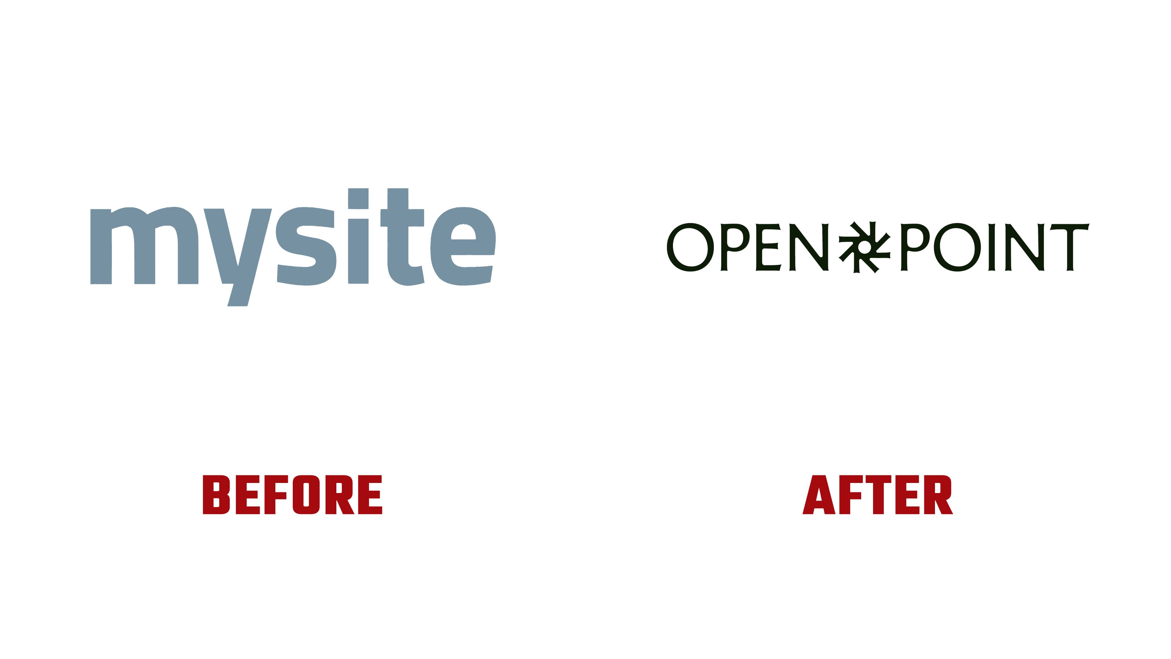
The company’s history began in 2003, and its previous corporate name was MySite. The two services served different purposes. Social Pinpoint helped engage residents in discussions, while Consultation Manager managed relationships with project stakeholders. Open Point brings together feedback collection, contact management, analysis, and reporting. Its users include local governments, real estate developers, and infrastructure companies. They conduct consultations while planning housing, transportation networks, energy facilities, and public spaces.
The agency needed to address the needs of both clients and residents. Government agencies and large companies require a reliable software provider familiar with approval processes and reporting requirements. Participants need an accessible space to share their views. The designers connected these needs through the idea of civic-participation tools, starting with a stonemason’s chisel. The digital platform carries forward the idea of a tool that helps people shape their surroundings.
The architectural theme extends to the OPEN POINT wordmark. It uses Memoir, a typeface by Cologne-based Studio Daniel Gremme. Its proportions draw on Roman inscriptions, while its flared stroke endings recall chisel marks. Rounded “O” letters sit alongside an angular “N.” The terminals of the “E,” “P,” “I,” and “T” flare slightly outward, and thin sections transition into heavy vertical strokes. Through these associations with architecture and public institutions, the agency sought to build trust in the platform.
A radial emblem sits between “OPEN” and “POINT,” roughly matching the letters’ height. Eight projections extend around a circular opening, pointing vertically, horizontally, and diagonally. Angled cuts appear where they meet the inner ring. The shape resembles a toothed rosette with an open center. Its angles complement the rounded letterforms, while a shared color unites the two parts of the logo.
Previously, the company used a blue-gray “mysite” wordmark set in bold lowercase Titillium, a sans-serif typeface. The logo consisted entirely of the name. In the new version, uppercase letters form a long line divided by the emblem. Changes in case, proportions, and stroke endings shift the emphasis from familiar software branding to architectural references.
In one primary version, a pale yellow-green logo appears against an almost black green background. Elsewhere, shades of green are paired with neutrals and purples. For digital channels and launch videos, the emblem takes on a three-dimensional, animated form. The flat version appears within the OPEN POINT wordmark.