


The idea of beginning a transformation with the desired outcome provided the foundation for Vanto Group’s new logo. Brazilian studio Tátil Design combined a “V” with an arrow, connecting the emblem to the consulting company’s method. The studio announced the update in June 2026. Led by Creative Director Julia Liberati, the project covered the logo, typeface, messaging, and visual identity.
Founded in 1992, Vanto Group helps organizations develop leaders, improve teamwork, and strengthen business performance. Its clients include NASA, GSK, Red Bull, and Gerdau USA. New business came primarily through referrals and personal relationships. To reach a wider audience, Vanto needed to explain its services more clearly and align its identity with its international experience.
Tátil’s leaders began by participating in a Vanto program to experience the company’s method firsthand. The team then interviewed leadership, spoke with clients, and surveyed the audience. The research revealed a gap between Vanto’s expertise and how people perceived its brand. Some executives considered it outdated. The website’s abundance of text, percentages, and statistics felt like a hard sell. The update needed to help prospective clients understand what the company offered.
To explain Vanto’s method, the studio used a seismic-shift metaphor, connecting it to changes in an organization’s internal relationships. The company encourages clients to define their desired future first, then organize their work around achieving it while moving beyond the constraints of experience. An arrow within a flowing V-shaped form expresses this principle in the emblem.
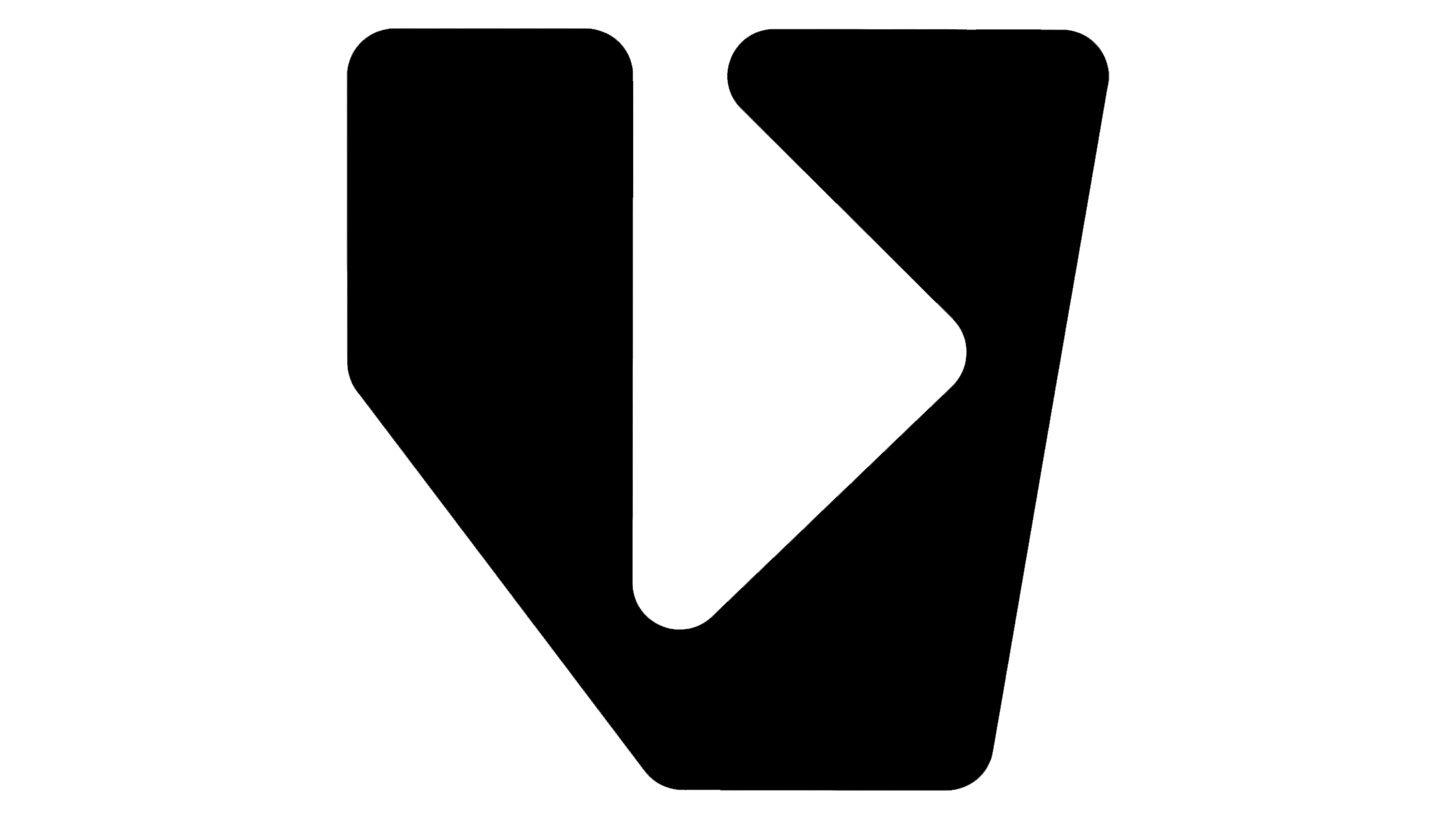
The symbol is constructed on a modular grid of circles. Its points represent people, problems, or opportunities, while shapes emerge in the spaces between the circles. As the diameters change, individual sections expand, contract, and connect. The designers intended this adaptability to reflect Vanto’s work with challenges of different scales and relationships within organizations. The emblem and supporting identity share this geometry.
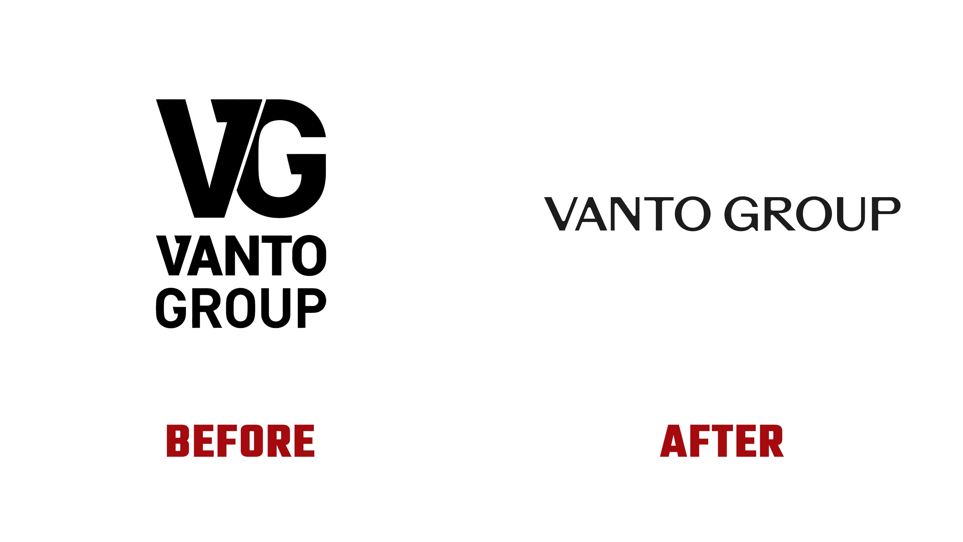
The VANTO GROUP wordmark is lighter and now occupies a single horizontal line. In the previous logo, the name appeared on two lines beneath a large VG monogram. Its angular letters joined into a heavy structure with a narrow diagonal gap, and the lettering below matched the symbol’s thick strokes. The new letters are wider and thinner. The V-shaped emblem functions as a separate identity component.
A custom typeface was developed with slightly expanded proportions and carefully refined curves. In the name, an open “G” appears alongside rounded “O” and “U” forms, while straight sections flow into soft arcs. The uppercase treatment remains, preserving a connection to the previous version.
Marlus Araujo created a software tool that generates shapes from circles. Nature and geological photography extend the theme of transformation. The new website explains Vanto’s services through client challenges and the stages of its process. It begins with assessing existing relationships and removing obstacles, then moves to aligning actions and implementing changes. The materials were designed for Portuguese-, English-, Japanese-, and Vietnamese-speaking audiences.