



Schuman Cheese has refreshed its Cello cheese brand to encourage shoppers to seek it out by name when buying their favorite variety. Brooklyn studio The Young Jerks announced the project on June 23, 2026, and presented it at the Summer Fancy Food Show in New York. The new logo features heavy lettering and a crown, inspired by Art Deco-era Italian food packaging.
Cello produces American cheeses rooted in Italian cheesemaking traditions. The update was intended to introduce the products to new audiences and convey their award-winning quality. References to vintage packaging helped the designers balance a premium presentation with the appeal of cheese served at a family dinner or shared with friends.
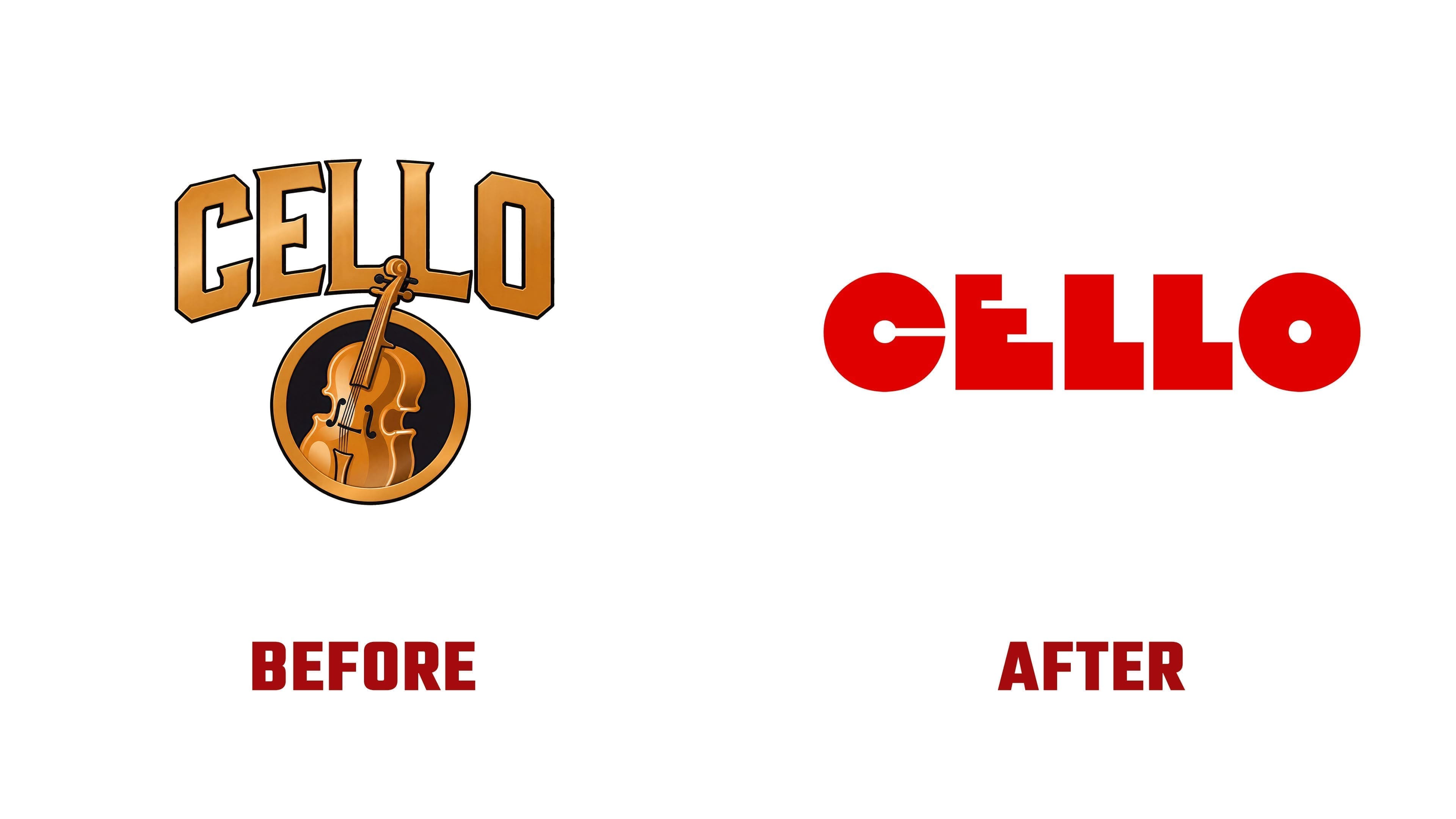
The previous identity revolved around music. An illustration of the brand’s namesake instrument appeared in a circular medallion beside the wordmark. Its strings, fingerboard, tuning pegs, and curved body accompanied tall, gold “CELLO” lettering. Angular forms and slightly flared stroke endings, combined with light and shadow, created a metallic effect. Schuman Cheese connected the musical theme to the harmony of ingredients in well-made cheese.
The Young Jerks made the lettering the focus of the new identity. Five heavy sans-serif letters share the same height and sit close together. The “C” and “O” resemble solid disks with small circular openings. In the “C,” a narrow horizontal slot connects the inner opening to the right edge. The “E” has a stepped construction, with its horizontal strokes growing longer from top to bottom. The two “L” letters consist of thick vertical strokes and short bases. Alternating rounded and angular forms extend the Art Deco theme.

In the main presentation, the cream-colored wordmark appears against a red background. The flat color treatment draws focus to the letters’ cutouts and proportions. A gold version with a black outline and shadow was created for packaging. Both versions use the same letterforms, with changes limited to color and edge treatment.
A separate emblem pairs the initial “C” with a crown above it. The crown’s arched base follows the letter’s upper contour, and its five points have rounded tips. Single-color and gold versions are available, along with a variation that places the name’s letters atop the crown’s points. The brand uses either the full wordmark or the compact emblem depending on the application.

On the packaging, striped borders and large cheese names further carry the Italian Art Deco theme. Colors distinguish the varieties, while cream-colored areas and the recurring crown unify the range. Aging details appear beside the product name, adding information about the cheesemakers’ craft.