


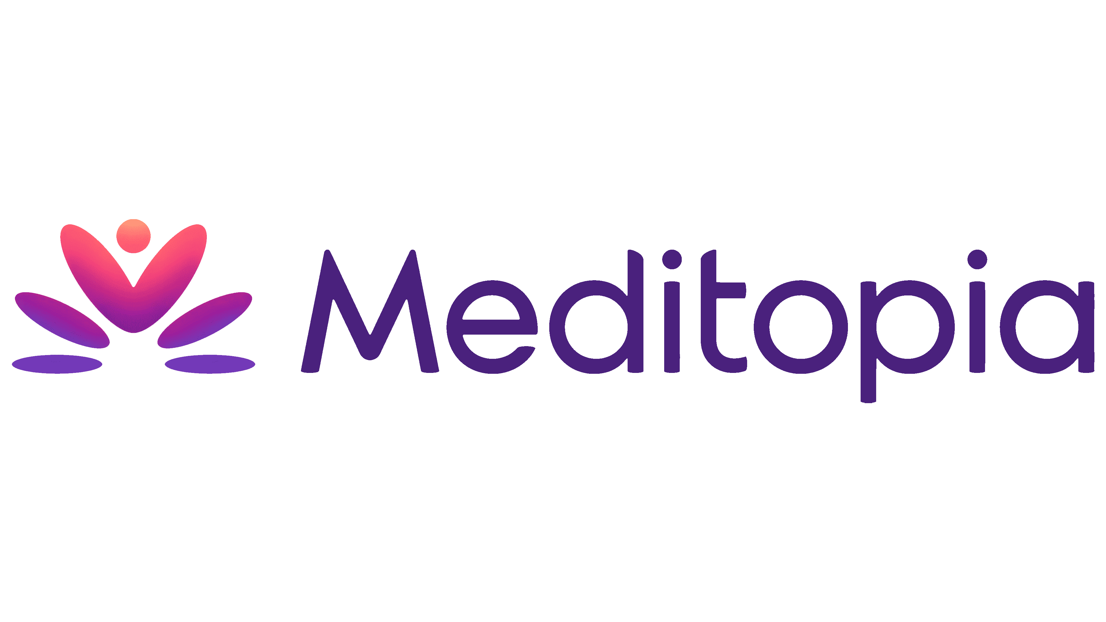
Meditopia has reshaped its lotus logo to reflect the platform’s expanding services. Unveiled in summer 2026, the new logo was designed by Artı Stüdyo, based in Istanbul and New York. Solid, rounded shapes replace the flower’s thin outlines, while the wordmark is heavier and more compact. The redesign brings meditation, mental health support, and fitness classes under a shared identity.
Meditopia launched in 2017 as a meditation app. It introduced corporate programs in 2022, then added consultations with psychologists, dietitians, physical therapists, and personal trainers in 2024. Its WellnessPass offering provides access to fitness classes. The platform serves more than 40 million users in 15 languages, offering employees and their families access to specialists, an AI coach, and a library of 10,000 wellness resources.
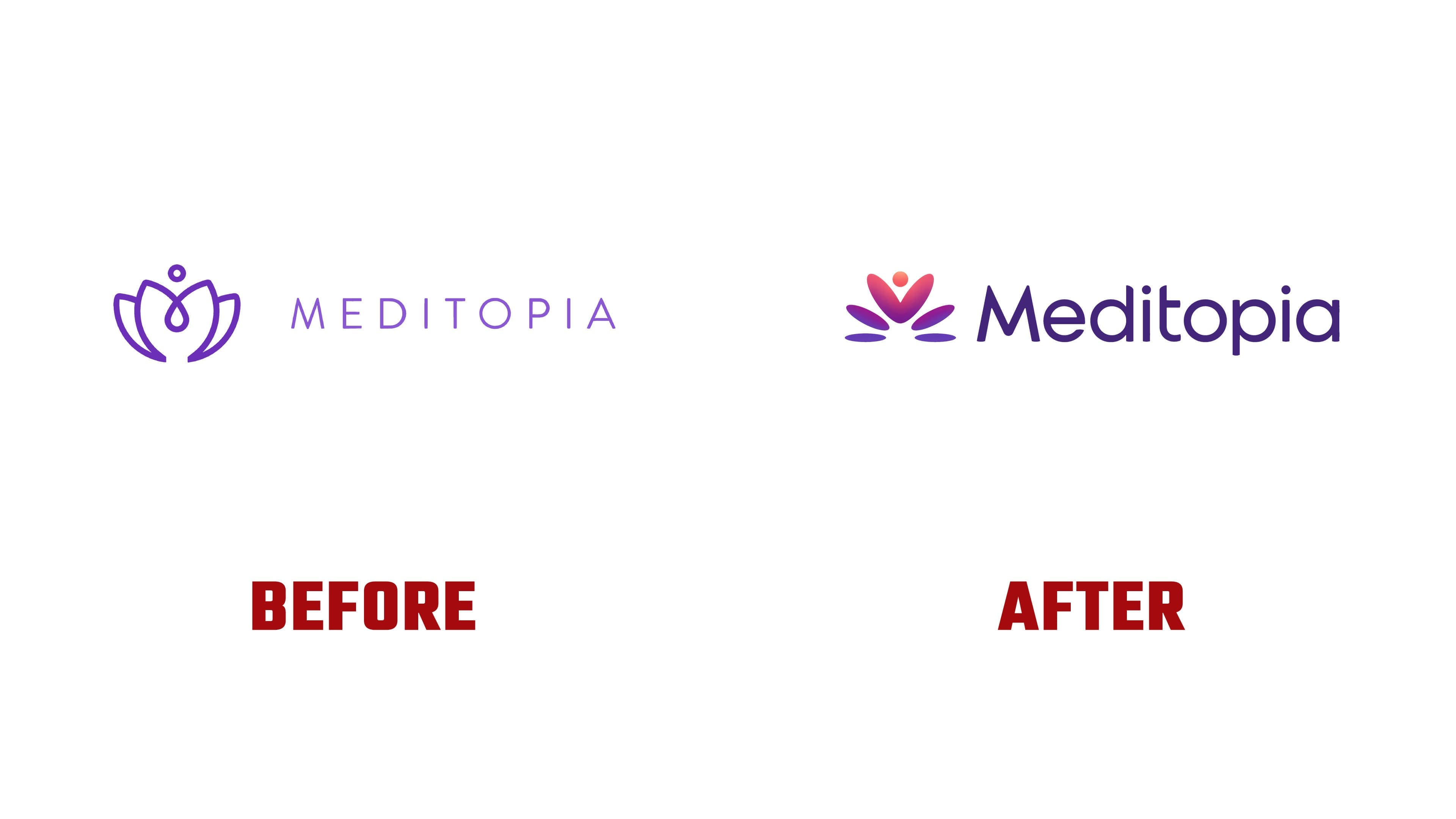
The previous logo was closely associated with meditation. Its purple lotus consisted of thin lines, with overlapping inner petals forming a teardrop-shaped loop and a small ring above the flower. To the right, MEDITOPIA appeared in thin, widely spaced sans-serif capitals. As its services expanded, the brand needed an identity that encompassed mental, physical, and collective well-being.
Artı Stüdyo retained the lotus, rebuilding it from rounded shapes. The top ring became a solid circle. Beneath it, 2 elongated petals with rounded ends meet, flanked by tilted ovals, with 2 horizontal ellipses at the base. Together, the shapes form a hidden “M,” the first letter of the name. A heart is also visible within the flower, referencing care for the community and shared well-being.
The designers drew on chronophotography, a technique that captures successive stages of an action in a single image. The repeated ovals suggest a sequence of changing positions. The studio connects them to personal growth and the transition from one state to another. Animation develops the idea through successive shape changes and smooth transitions.
The Meditopia wordmark continues the ellipse motif. The “M” remains uppercase, while the other letters are now lowercase. The strokes are thicker, and the spacing is tighter. The outer strokes of the “M” are angled, the “a” is single-story, and both “i” letters have round dots. Curves near the tops of the “d” and “t,” along with rounded terminals, echo the emblem’s petals.
Purple maintains a connection to the previous identity, now in a brighter shade. In the emblem’s multicolor version, purple blends into pink and coral, adding depth. Warm tones support the themes of activity and growth. The tagline “Wellness for every you” speaks to the different states and life circumstances in which Meditopia offers support.
The redesign extends across the main platform and its individual offerings, including corporate services. The project team included Aksel Ceylan, Taylan Özgür Akçam, Hıdır Yüksel, Eda Kanmaz, Sude Kuruca, Bora Civelek, and Kaan Duygu.