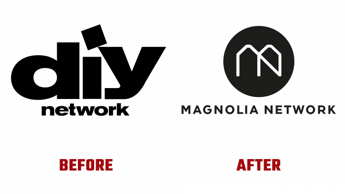
In 1999 a cable TV channel was launched among the U.S. broadcast networks that included the then-popular show Fixer Upper with Chip Gaines and Joanna Gaines. Dedicated to home improvement, home improvement, and remodeling, it became widely popular with the common American man. The show was accompanied by the actual implementation of renovations, in particular the Magnolia Market Store in Waco. In 2021, the brand became the owner of two hotels and a new TV station as part of the Discovery+ Magnolia Network streaming service, which replaced the DIY Network. Through joint ownership with Discovery, the new channel moves into the category of informative and educational, repeating previous shows and new engaging and developmental series. Its programs focus on home, design, garden, food, and art, with recognized experts in each of these areas demonstrating their knowledge.
The brand’s new visual identity was developed and presented by the New York-based creative team Loyalkaspar. The presented channel strategy and its new architecture created all the conditions for defining its place in the Magnolia universe, which consists of more than 30 brands. The Silocon sign, used in the identity, proved to be a particularly successful solution. It became the “face” of the chain and the entire portfolio offered by the brand. Despite such extensive use of the mark, it did not lose its individuality.
Inspired by the Silocon Magnolia shape, it became a key brand element. The mark was individually designed with thoughtful use of every curve, every angle, and the thickness of the slightest stroke used in the logo graphics. Two original fonts were used in the formation of the logo to enhance the desired effect. The first one, Recoletta, is a classic typeface characterized by serifs and whimsy, which ties in very effectively with the publishing base. The second, Walsheim, is simple, airtight, and informative. Its confident execution adds thoroughness and authority to the brand visualization. The combination of such different fonts guarantees the same impact when used on any print and a digital scale. Particularly appealing and accurately reflects the root essence of the channel, the monogram created for it from the two letters of the brand name – MN, in which a diagonal line is applied to animate the image, creating new directions in the visual evaluation of this mark.


