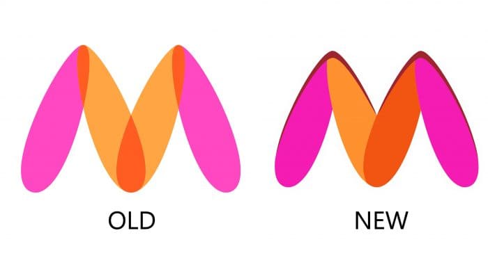
 A complaint about a prominent Indian website was filed by activist Naaz Patel last December, citing the old logo’s similarity to a part of a nude woman’s body. She believes the emblem offends women and asks the Mumbai police to take action against the company.
The emblem only consisted of the letter “M.” It is painted in pink, yellow, and orange with white frames, but activists saw a hidden meaning in it. The complaint was received by the cybercrime department and reported to the company’s management. Myntra, in turn, promised to change the logo within a month.
The e-commerce giant has already begun the process of replacing the old logo. There have been no fundamental changes. Now the yellow lines do not intersect with each other, forming an orange-red center. The emblem idea has not changed; the designers just tweaked the color combinations and graphic elements. Even though the logo no longer resembles a woman’s body, if you saw it in the first logo, then in the second, you can no longer get rid of the obsessive thought.
Myntra is already using the new logo on the website and app. The company also promised to change the logo on the packaging material for its packages and all marketing products.
Of course, social media users could not pass up the opportunity to share their comments on the situation. They remember the famous Gmail and MasterCard logos, joke about tangerines, and compare them to other bad logos. Many companies tend to make design mistakes; remember the new Amazon icon, which reminded the German politician.
Myntra is one of the largest e-commerce websites selling fashion clothing. It was founded in 2007 but was acquired by Flipkart in 2014. Also, in 2016, the company acquired the Jabong online store.


