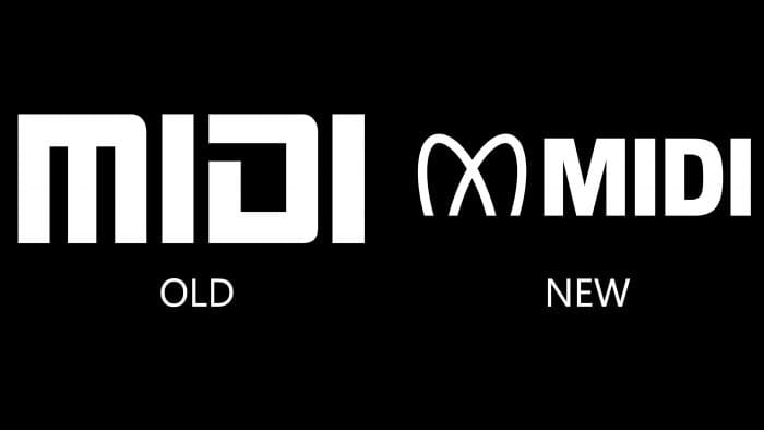
 MIDI is a standard for transmitting data between electronic musical instruments and digital devices. The company introduced MIDI 2.0 last year. It marks the first major update in over 35 years. Since 1983, the company has used one update and decided that the standard’s release would be an excellent reason for rebranding. The logo was created by Yuri Suzuki and Sascha Lobe from Pentagram.
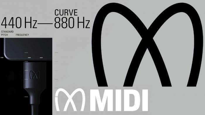
The new style consists of a visual and sound logo and a special video demonstrating how the update works. The emblem is represented by the letter “M,” created using sine waves that can be seen during the recording process. The designers used frequencies ranging from 440 Hz to 880 Hz, and the result was curved and eventually connected. The frequency of 440 Hz is called “Stuttgart pitch,” which is used to tune instruments. As the designers themselves say, it is great for conveying MIDI ideas.
Using this method of creating a logo is a good example of full immersion in the standard’s essence. Lissajous figures were also used to design the emblem, which consists of harmonious, smooth lines. After the symbol, you can see the MIDI name written in a specially designed sans serif font. The sound logo fully reflects the visual and complements it perfectly. It consists of a fade-in sound from 440 Hz to 880 Hz and reminds users of setting up an orchestra.
The new logo will be visible on all devices that support the standard: hardware, tools, and even cables and ports. Sascha Lobe stated that “nobody buys just MIDI. Users buy a device with MIDI inside. “It works like Bluetooth or Intel. The design team moved away from using sheet music or musical instruments in the logo design. It is more important to convey the meaning of the standard and its capabilities. As stated by the developers, the main idea of the logo is an abstract visualization of sounds.


