


Animalistic themes in logo design often inspire automakers. There is nothing strange about it, as powerful animal imagery looks relevant and convincing. One of the most popular images used in car logos is the lion.
If we talk in general about the universal meanings it carries, they are as follows:
- Courage. Automakers need to signal that they are brave enough to keep up with the times and equip their cars with everything necessary for driver comfort.
- Strength. In this context, this could be a strong market position and state-of-the-art production facilities.
- Leadership. Any major automobile concern strives to be a leader in its niche and to earn customers’ respect.
In world culture, the lion’s image is associated with royalty, influence, and power.
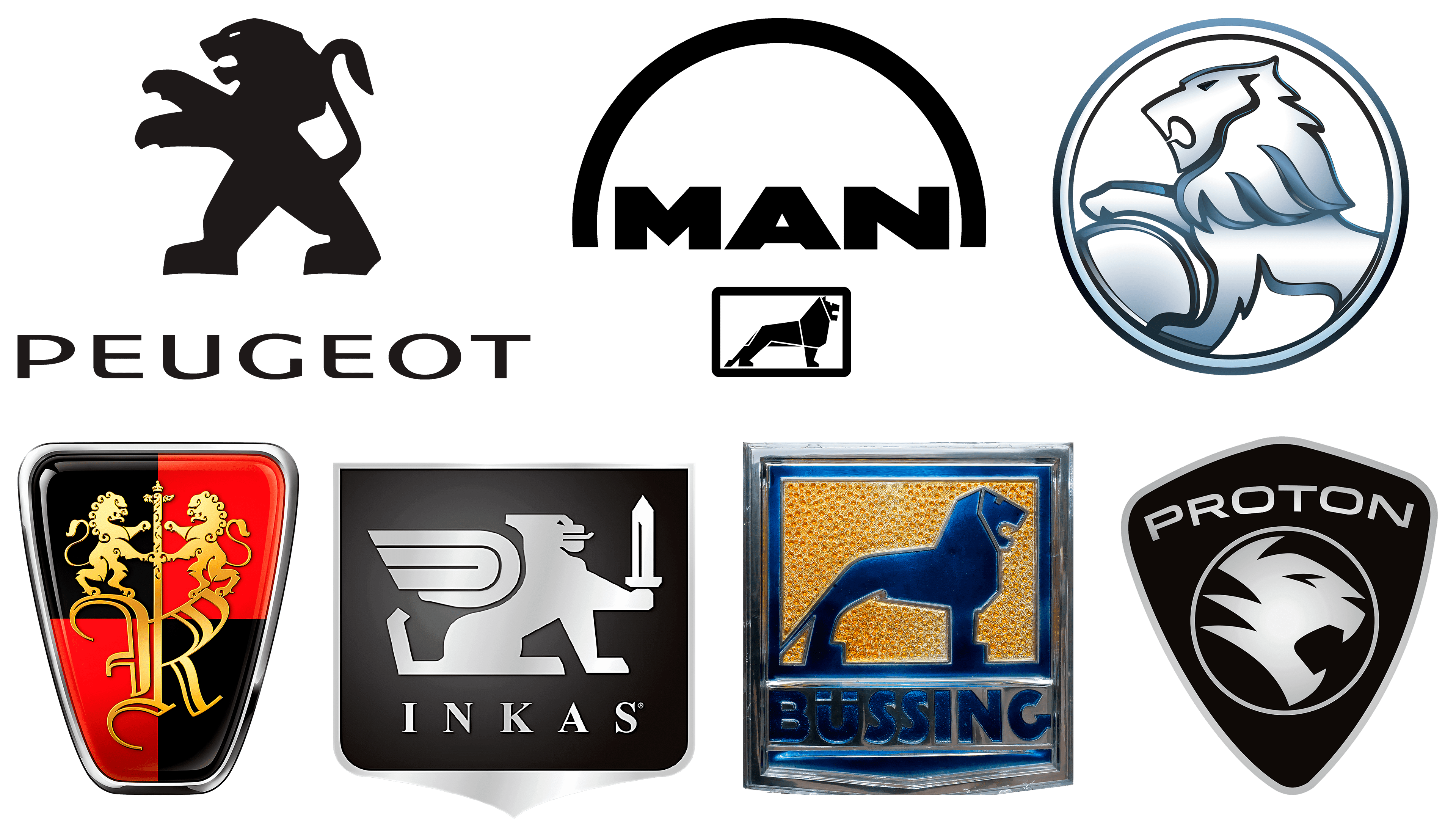
Peugeot
![]()
Perhaps, among car brands with a lion image, this logo is the most recognizable. The company-manufacturer is based in France and seeks to endow its cars with the virtues summed up in the phrase “European quality.” Originally, the Peugeot logo depicted a lion walking on an arrow. This had a wide range associated with speed, flexibility, and power.
The lion first appeared on the logo in 1847. At that time, the company manufactured steel products. The image of the lion was used to convey the products’ features, many of which had sharp teeth.
The pose of the lion on the Peugeot logo speaks of readiness to attack. At the same time, he stands very powerfully and firmly on his hind legs. On the one hand, it can symbolize a strong market position; on the other, it is ready to meet the challenges of time and deliver quality cars to its customers.
Holden
![]()
The company was founded in 1858, so its history is amazing. It is a pity, though, that the brand has recently ceased to exist. For a while, the company operated independently, then became part of General Motors, and has now been abolished.
The Australian company was named after the founder, whose last name was that. The first logo featured a horse, as the company manufactured equipment for carts and horses. Even the entrance to the company’s building was adorned with a life-sized statue of a handsome horse, which James Alexander Holden commissioned to show customers even more convincingly what his company was doing.
When the company eventually shifted its focus to car bodies, a lion appeared on its logo. The round Holden logo shows a lion holding a wheel with its paw. It looks beautiful and symbolic. It is a pity that such a giant of production has ceased to exist. However, a solid history and a powerful logo remind motorists that such a brand existed.
Proton
![]()
The logo was used for the Proton Waja car in 2000. Interestingly, many still argue over which head is depicted in this logo: a lion’s or a tiger’s. Either way, it looks powerful and imposing. The animal’s head is depicted on a dark blue shield, and the company name is written in full capital letters at the top of the logo.
The roaring lion, which conveys the power of these cars, is quite appropriate for their positioning. It is not for nothing that the Proton logo is used not only in the domestic market but also for export. The lion’s roar can be symbolically compared to the sound of a car rushing along the road.
The lion’s head’s interesting stylization also deserves special attention. It looks minimalistic but convincing.
If we look at the company’s history, it began producing its cars in 1985. Despite its young “age,” this Malaysian manufacturer feels confident in the market. Therefore, there are reasons to believe it has a promising future.
Roeve
![]()
The name of this brand has an interesting history. The SAIC company wanted to buy the Rover brand from BMW, but the deal did not go through because the buyer at the time was already Ford. There is a version that the name is formed by combining two Chinese words, which, when translated, mean “magnificent power.” It is worth noting that such a brand name is quite appropriate for the car. This is exactly the range of values that car enthusiasts appreciate in good cars. However, naming is not as simple as it seems at first glance.
Some experts believe the name is a transliteration of the word “Rover,” the brand name the company wanted to buy. But the company’s representatives deny it, claiming that the name is generally based on the German word Löwe, which translates as “lion.” That’s the kind of confusion we get.
The Roeve emblem uses black, red, and gold colors. The two lions standing on the capital letter in the name hold a rod. An interesting vintage font is used for the letter itself. It looks powerful and artistic.
MAN
![]()
This company produces buses and trucks. A subsidiary of Volkswagen AG owns it. The last company on this list also specializes in producing large commercial vehicles.
There is an interesting story associated with the logo, too. The lion originated from the logo of Büssing AG, which MAN acquired decades ago (in 1971). The logo resembles Braunschweig’s coat of arms.
If you analyze the MAN logo, there is a lot to see in detail in the lion image. It stands firmly on straight front legs and slightly backward hind legs. The lion’s posture is calm, but its mouth is open. Here again, the association with the roar of a powerful automobile on the road arises. At the same time, the lion’s confidence hints at the company’s position in its chosen market segment.
Büssing AG
![]()
This company was mentioned above. It is no coincidence that the lions on the logos of Büssing AG and MAN are so similar. The German manufacturer of trucks and buses has a long history. The company was founded in 1903. Its founder is Heinrich Büssing, who established his company in Braunschweig.
The company quickly gained a strong position in its niche, becoming one of the most influential truck manufacturers in the European market. Particular success began in the 30s. And even after the acquisition of MAN, the lion adorns not only the logo of Büssing AG but also that of its subsidiary.
INKAS Armored Vehicle Manufacturing
![]()
The company specializes in the production of armored vehicles. The range of products is very wide. These are both premium SUVs and special-purpose vehicles. In addition, the company even produces armored vehicles.
Despite such a complex niche and production scale, the company was founded relatively recently, in 1996.
The lion looks particularly appropriate on the INKAS logo. This allows us to emphasize that the manufactured equipment is really durable, safe, and resistant to any threats. It is not in vain; on the brand logo, the lion is depicted with wings and a sword. And the logo itself resembles a coat of arms, which lends it greater solidity. Such a visual composition looks spectacular and is quite consistent with the company’s industry.
Summarizing this selection, we can say that in each of the presented emblems, the lion is stylized differently. Somewhere, he looks like a superhero, as on the last emblem, somewhere on the tiger, as on the emblem Proton. But everywhere, the lion looks appropriate and distinctive, expressing the meanings embedded in the company’s visual identity.