


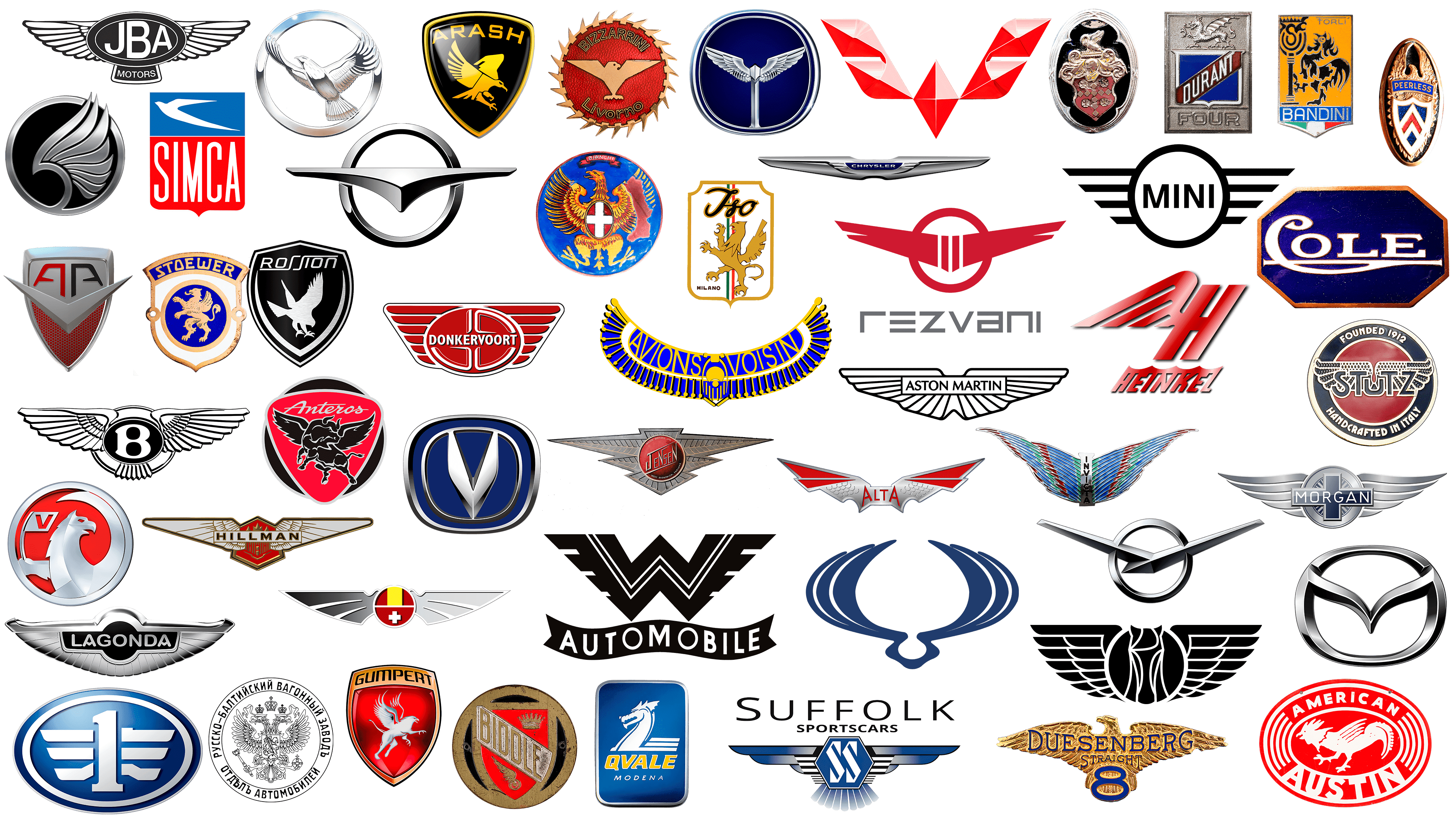
The art of logo design is a visual representation of a brand, serving as a powerful tool that can evoke recognition and emotion in consumers. In the world of automobiles, where speed, power, and innovation are key, the symbolism of wings in logos assumes a special significance.
Wings symbolize freedom, impetuosity, and the notion that there are no boundaries. This mythical element is associated with tales of gods, heroes, and creatures capable of soaring above the earth and clouds. It is, therefore, not surprising that automotive brands that emphasize the dynamism, luxury, and innovation of their vehicles often turn to the symbolism of wings.
For many automakers, incorporating wings into their logos has become a way to stand out by creating a unique and striking visual representation of their brands. From light and elegant to powerful and aggressive, wings in logos have become a universal symbol of excellence and forward motion.
While for some, wings may evoke memories of ancient aviation traditions, for others, they symbolize the pinnacle of quality, luxury, and innovation. Automotive logos with wings continue to inspire and mesmerize, bridging the gap between history, mythology, and modernity.
Chrysler
![]() USA
USA
Chrysler is an American company that offers consumers premium automobiles. The brand, established before World War II, even surpassed Ford’s sales, the consumer favorite of the time. The modern Chrysler logo consists of a colored blue part with the company name and silver wings. The main goal is to maintain a connection between early models and modern cars.
Alta
![]()
The automobile company was founded in Greece and produced leading trucks. Alta was also known for its reliable motorcycles and cars, which were well-maintained. The models featured a pleasant design and an unusual color palette. The brand ceased to exist in 1978. The Alta logo resembles a bat with the company name inscribed on it. Red and silver colors were used for the design.
Hillman
![]() England
England
The British company was founded in 1907 by William Hillman, who was almost 60 years old. The brand remained on the market until 1979. For 72 years, Hillman was part of other automobile companies, and even after the closure, some models continued to be produced. The brand’s emblem features red, white, and gold elements. The Hillman’s name is centered on the wings, and above it, you can see elements resembling a crown.
Aston Martin
![]() England
England
Aston Martin is an iconic British luxury sports car brand. The company’s name is composed of Aston, derived from the race track where the Singer model was developed, and Martin, in honor of one of the founders. The cars have appeared in numerous iconic cinematic films. The minimalistic logo emphasizes the brand’s status and elegance.
Rezvani
![]() USA
USA
The young company was founded in 2014. It specializes in producing sports cars. The models appear in music videos of musical artists. The Rezvani logo consists of red wings and a rudder. The company’s founder, who had dreamed of becoming a fighter pilot, created cars that allow you to feel the excitement of flight.
JBA Motors
![]() England
England
The company JBA Motors is known for its car, the JBA Falcon. The brand’s original name is JBA Engineering. The abbreviation JBA is a tribute to the company’s founders, consisting of the first letters of their surnames. Specialization in the production of retro cars until 2007. The JBA Motors logo is black and white, which emphasizes its identity even in the early 2000s.
Suffolk Sportscars
![]() England
England
Roger Williams founded Suffolk Sportscars in 1990. Initially, the brand produced updated Jaguar SS100 models. Now, the company has expanded its activities and is producing the Suffolk XK120 and C-class. The logo features an unusual blue color typically associated with the automotive industry, along with graphic elements such as wings, hexagons, and brand-name abbreviations.
MINI
![]() England
England
The MINI company has been a part of BMW since 2000. The model range comprises stylish, modern cars with a recognizable winged logo. Throughout its operations, the company has undergone significant changes to its core image, often influenced by other brands. MINI now focuses on minimalism and brevity, using a black-and-white color palette. The flat logo design has been in use since March 2018.
Duesenberg
![]() USA
USA
The American manufacturer Duesenberg ceased operations 84 years ago, but its cars remain highly sought after. The brand produced very expensive models, including racing models. To this day, cars remain a symbol of excessive wealth. Collectors dream of getting their hands on one of the 600 models still in operation, which sell for over $1 million. The company logo features a golden eagle with the name Duesenberg in blue inside.
Hispano-Suiza
![]() Spain
Spain
Hispano-Suiza specialized in developing premium cars and aircraft engines. The brand’s activity occurred during the First and Second World Wars. Since the products were expensive, there was no great demand for them. The Hispano-Suiza logo uses the national colors of Spain: red and yellow. The main elements of the image are large wings and a white cross underneath.
Stutz
![]() USA
USA
The Stutz company produced high-quality, expensive cars, including sports models. The company existed from 1911 to 1935. The brand tried several times to revive and release new models. The Stutz logo consists not only of wings and the name but also of the phrase “A car that became good in one day.” The U.S. national colors for the design were white, red, and blue.
Genesis
![]() South Korea
South Korea
The new Korean company was founded in 2015 as part of Hyundai Motor. The brand produces premium-class cars. The Genesis logo effectively conveys the company’s status and specialization. The 3D logo features a pair of silver wings, complemented by matte details, and a black shield at its center. The brand name is also in silver. The designers used an imitation of different textures.
Morgan
![]() England
England
Morgan specializes in limited-edition premium sports cars. The Morgan family owns the company outright. The brand’s logo has remained virtually unchanged for 112 years, with only minor details updated. It is also unknown why the main image featured a winged shape combined with a circle and a crosshair. According to one version, a famous World War I pilot drove a Morgan and said that the ride was like flying.
Bentley
![]() England
England
The legendary British company has been part of the Volkswagen Group since 1998. The brand positions itself as a manufacturer of hand-built luxury cars. The Bentley logo symbolizes a blend of aristocracy and modernity, thanks to its distinctive two-wing design. Between them is a circle with the large letter “B.” The combination of white, black, and silver colors makes the image unique and elegant.
Mazda
![]() Japan
Japan
Mazda is a Japanese company founded in 1920. The brand derives its name from the deity Ahura Mazda. He is the creator of the sun, moon, sky, earth, water, and people. The surname of the company’s founder, Jujiro Matsuda, was consonant with the deity’s name. The company logo is the letter “M” in a circle. According to some reports, it resembles the wings of a seagull or an owl.
Lagonda
![]() England
England
Lagonda, a British company that merged with Aston Martin in 1947, began as a motorcycle manufacturer. A year after its founding, Wilbur Gunn built the first automobile. During the war, the company produced artillery shells. The company name within the silver wings serves as the brand logo.
London EV Company
![]() England
England
A subsidiary of the Chinese manufacturer Geely, it produces the iconic black cabs that are found in London. London EV Company also plans to produce electric cars, moving towards more environmentally friendly transportation. The brand’s stylish logo perfectly complements the famous cars, featuring brightly colored fenders and a black circle with graphic elements on the inside.
Bignan
![]()
Bignan was a French automobile company that existed from 1918 to 1931. The reason for the liquidation was bankruptcy. For the logo, the brand chose an unusual symbol, a flying stork. Many believe that the bird brings happiness to any home, and a flying stork is often associated with an angel. Originally, the bird’s wings protruded beyond the circle’s edges, but in 1923, they were placed inside the figure. Additionally, the name “Bignan Sport” is placed in the circle below the image.
Laraki
![]()
Laraki manufactures luxury sports cars. The company was founded in 1999 in Morocco and produced extremely expensive cars in small runs. For example, the Laraki Epitome was introduced in 2013 as a limited edition with a very high price tag of $2 million per car. French Montana boasts one of them in its collection. The elegant logo confirms the exclusive status. The silver wing is set against a black circle and is highlighted by a metallic sheen.
Arrinera
![]()
Poland’s first supercar company was founded in 2008 by Lukasz Tomkiewicz. Arrinera specializes in producing sports cars, and the first concept was presented in 2011. The Arrinera logo is bold and confident. Pay attention to the color combination: bright red and dark gray. A symbol of upward-pointing wings also complements the logo. They symbolize development and progress. At the top of the logo, you can also see one of the racing flags.
Vauxhall
![]()
Vauxhall is a car manufacturer with a very long history. The company was founded in 1857 in Fulks Hall (Sir Falx de Breote’s mansion), which eventually became known as Vauxhall. The brand’s symbol is the griffin, a creature with the body of a lion and the head and wings of an eagle. In 2020, the logo underwent a slight update, becoming more modern. One wing wraps around the image, symbolizing strength and power. The creature’s image is gray with a metallic sheen.
American LaFrance
![]()
American LaFrance is a symbol of pride among Americans, particularly firefighters. The brand has existed for over 100 years (1873-2014) and is closely associated with the company’s signature fire trucks. The company is fully dedicated to manufacturing firefighting equipment and vehicles as a division of DaimlerChrysler. The company logo represents an eagle perched on a plate. The name of the famous brand is centered. The image is completely black and gray.
Hawk Cars
![]()
Although not very popular, this British company boasts a minimalist logo. You won’t be surprised, as the designers displayed the brand name and placed a hawk inside a circle. The logo is beautifully drawn with smooth lines, and the bird spreading its wings symbolizes movement, progress, and freedom. In addition, the company made the image monochrome, using the color “metallic.”
FAW
![]()
FAW is a large company and one of the four largest manufacturers in China. Six vehicle categories are produced under this brand, including cars and trucks. The brand logo is the number 1 with wings inside a blue oval. FAW is an abbreviation for First Automotive Works. Indeed, the company was established in 1953 and became the first in its industry to adopt a brand logo. The company produces a large volume of cars every year, and in 2014, this figure reached almost 3 million units.
Simca
![]()
The French brand existed from 1934 to 1970. The car brand successfully produced a wide range of high-demand models, and in 1959, the company sold 100,000 units. The company’s logo is bright, and the delicate color combination fully conveys the spirit of France. Simca used atypical industry colors: light blue, pink, and white. The brand’s symbol is a swallow with pointed wings and a distinctive tail.
Durant
![]()
The American manufacturer was founded in 1921 and has existed on the market for only ten years. Durant used a busy logo with lots of graphics and colors. At the very top is a mythical winged creature; below is a coat of arms against a gray star. Different color combinations of red, blue, gray, and white were used in the logo. The name Durant Motors is prominently displayed around the rim of the circle.
Trojan
![]()
The British brand Trojan was founded in 1914 and ceased operations in 1965. The company was primarily engaged in producing passenger cars for everyday use and commercial purposes. The logo does not claim to be the most memorable; it consists of simple elements: silver wings above a red circle and the name “Trojan” inside. The manufacturer also used red and silver colors.
Stoewer
![]()
Originally from Germany, the brand was founded in 1858 and specialized in producing sewing machines, bicycles, and, later, cars. The brand lasted until 1945, but during the war, the factory was heavily damaged by bombing. In addition, Szczecin became part of Poland, and this country did not want to support the machine industry. Stoewer used a griffin as a symbol placed in the center of the logo. The combination of gold and blue colors twisted the brand.
UAZ
![]()
UAZ is a Russian manufacturer founded in July 1941. Initially, the company specialized in producing military vehicles; however, it now produces SUVs, minibusses, and trucks. The logo consists of a stylized letter “U” that, due to its arrangement, resembles wings. In 2016, as part of the company’s development, UAZ presented an improved logo. The wings took on a metallic color, and a more modern font was used for the name.
Invicta
![]()
The little-known British brand has gone through several closures and revivals. Invicta was founded in 1925 and finally ceased operations in 2012. The company released several car models, but the logo remained unchanged. The laconic fenders, available in two beautiful colors, complemented the cars’ look. Between the fenders, the Invicta lettering was vertically placed on a green background. The main colors of the fenders are blue and purple, as well as red and pink.
SsangYong
![]()
One of the largest manufacturers in Korea initially existed without symbols. The first cars were assembled for military purposes, and all that adorned the SUVs was a white star and a serial number. Over time, SsangYong developed its logo. In translation, the company’s name means “a pair of dragons,” which is reflected in the logo. The brand’s cars are decorated with a logo featuring two wings arranged to resemble a wreath. This image symbolizes independence, confidence, and constant development.
Peerless
![]()
Peerless, the company, was founded in 1889, initially specializing in clothing production before transitioning to bicycles ten years later. The company began developing automobiles in 1900 and continued to do so until 1932. Due to financial difficulties, the company ceased car production, and the buildings were converted into a brewery. The Peerless logo bears a strong resemblance to the United States coat of arms. Additionally, the brand utilized the color palette of the country’s national flag.
Isdera
![]()
Isdera was founded in 1982 and remains in operation to this day. The brand specializes in producing exclusive cars in limited quantities. Each client must personally apply to the company director and receive a customized project. The private company keeps most of the information about its activities secret. The brand’s logo features a black eagle on a blue background. Also, below the bird is the name Isdera, underlined.
Virago
![]()
One of the exceptions in our selection is Virago. This is not an automobile brand but a motorcycle line from the world-famous Japanese company Yamaha. The model was first released in 1981. The line’s logo is the inscription “Virago” with a stylized first letter “V.” It is depicted as wings. The inscription is enclosed in a silver rectangle. The badge appears unusual and modern, especially given that it is not part of the company’s overall image.
Arash
![]()
Arash is a relatively young company that entered the market in 1999. The brand, originally from England, produces sports cars. The company’s first model, the Farboud GT, pleasantly surprised car enthusiasts at the Birmingham exhibition with its design, particularly its aerodynamics. It is a black shield featuring a golden bird and the brand’s word mark, Arash, a modern 3D logo.
Russo-Balt
![]()
Russo-Balt, an enterprise of the Russian Empire, existed from 1896 to 1923. Initially, the company produced railroad cars. An automobile department was created only in 1908. Very often, “Russo-Balt” cars could be seen at various competitions. The company’s emblem is the main symbol of the Russian Federation. The image shows an eagle with two heads and crowns. Along the rim of the logo, the company name is written, with the branch indicated.
Anteros
![]()
Anteros has a very unusual logo. Large companies often use mythical creatures or other symbols in their logos. Anteros chose a bull with brightly colored wings. The combination of black, red, and silver colors sets the young brand apart from others. Anteros is an American company that entered the market in 2005. Specialists are engaged in developing premium sports cars.
Bandini
![]()
The Italian manufacturer existed from 1946 to 1992. Following the death of founder Ilario Bandini, production was discontinued. But in March 2020, the company announced its return to the market. Bandini has also announced plans to produce 30 Dora cars. The company uses its striking signature logo. The bird, placed against a yellow background, adds to its uniqueness. You can also see the company name and colors from the Spanish flag at the bottom. The logo is a shield composed entirely of saturated elements.
Gumpert
![]()
Gumpert specializes in producing sports cars. The company is currently known as Apollo. Roland Gumpert, a former Audi director, founded the company. For the logo, the company used a griffin, a motif commonly used in automobile branding. This creature is associated with greatness, and since the griffin represents the elements of earth and air, it suggests the speed and high performance of Gumpert’s cars.
Haima
![]()
The Chinese manufacturer produces cars for another famous brand, Mazda. Their logos are very similar, and this is not accidental. The very name Haima consists of two parts: the province of Hainan and the company Mazda. The brand badge is a modified version of the Mazda logo. The wings of a bird are positioned above a silver circle. This cooperation was formed to supply Mazda products to the Chinese market.
Rossion
![]()
Rossion is a young American manufacturer specializing in developing ultra-modern sports cars with advanced technical specifications. The brand launched in 2006. The company’s cars are considered revolutionary due to their speed and handling. The brand’s logo can also be described as ultra-modern due to its combination of noble colors and an eagle image. The logo is presented as a shield with a black background and gray-white details.
Biddle
![]()
The small automobile company existed on the market for about seven years (from 1915 to 1922) and produced only 1,750 cars. The first Biddle automobile emerged rapidly, as other manufacturers supplied all parts, and the brand itself was engaged exclusively in assembly, setting a very high price for cars. The name Biddle is the surname of one of the brand’s shareholders. The logo features bright elements, including a red shield, a golden crown, and wings, as well as the inscription “Biddle” at the center.
Venturi
![]()
Venturi specializes in the production of premium sports cars. The brand underwent bankruptcy proceedings in 2000 and was acquired by Gildo Pallanca Pastor in 2001. The company’s original goal was to produce a product that could compete with Bugatti, Ferrari, and Porsche. The brand’s logo is modern and concise. The letter “V” is stylized as wings and painted red. The designers chose a contrasting black background and added a white Venturi inscription.
Bizzarrini
![]()
The Italian brand existed from 1964 to 1969. The company attempted to revive itself in 1990, but the cars failed to capture car enthusiasts’ interest. In 2008, only one model was released: the Scuderia Bizzarrini. The brand’s logo is very interesting and unusual. It depicts a stylized gear on a red background. The central figure of the image is a bird with triangular spread wings. In this way, Bizzarrini demonstrated freedom. The logo was rarely visible because the brand produced only a small number of cars.
Wanderer
![]()
The German brand was founded in 1896 by Winklhofer & Jaenicke (the founder’s surname). In 1911, the company was named Wanderer, which means “wanderer” in German. The company specializes in a wide range of products, including cars, bicycles, minibusses, and other vehicles. An unusual color palette, a combination of green and white, was chosen for the Wanderer logo. The image was a large letter “W” with pointed ends, which gave the brand confidence.
TRAUM
![]()
The young Chinese car brand, which debuted in 2017, encourages everyone to dream. In this way, it aimed to emphasize a simple yet utilitarian truth: its cars are a real dream. And achievable, which can be curbed if desired, because they inspire. That is why, on its emblem, there are two spread wings. That is, there is no practical or historical implication in them. There is just an artistic allegory because “TRAUM” in German means “to dream.”
Wuling
![]()
The young Chinese brand Wuling has already produced about 22 million cars since 2002. The manufacturer specializes in passenger cars, but minibusses have become especially popular. The company logo is presented in red. The letter “W” consists of 5 voluminous rubies. In 2020, the company unveiled its gray logo and announced the start of globalization and expansion into other markets. According to the manufacturer’s statement, there will be no differences in technical specifications.
Packard
![]()
Packard is a famous American manufacturer that existed from 1899 to 1956. James Ward Packard, the founder of the brand, was dissatisfied with the quality of the cars on the market. He sent a letter to one of the companies expressing his dissatisfaction, and in response, he was advised to create a better car if he desired. The founder created his popular models. The brand’s logo is a coat of arms in red and gold, featuring numerous details, including a bird at the top.
Cole
![]()
Cole, one of the first American car brands, is another owner of a winged logo. The company was on the market from 1909 to 1925. Cole specialized in producing premium cars. The company logo features an eagle image within a square, with the name “Cole” displayed above. At the bottom of the image is the city where the brand was founded, Indianapolis.
Bianchi
![]()
Bianchi is a famous Italian bicycle manufacturer founded in 1885. The company also manufactured automobiles and introduced many models. The company’s logo features a majestic eagle with expansive wings. Earlier, the bird was gold on a blue background. On modern bikes, you can see a badge in the form of a silver eagle with a crown over its head. The company’s official website shows a similar pattern, only in turquoise.
Jensen Motors
![]()
Jensen Motors existed on the market from 1922 to 2011. The company specializes in producing sports and commercial vehicles. The brand’s logo features an interesting winged shape. All the ends were pointed and painted taupe. Inside the base of the wings was a red badge with a stylized Jensen inscription. Like the base, the font consisted of straight, pointed lines.
Iso Rivolta
![]()
Iso Rivolta was an Italian company that existed in the mid-20th century. The brand produced cars and motorcycles. Like most Italian brands, ISO Rivolta chose the colors of the country’s national flag for its visual design. It also features a golden griffin on a white background with stripes and an ISO inscription at the top. In 2020, Zagato announced the revival of the ISO Rivolta model. Only 19 cars will be made, and 9 have already been sold.
Heinkel
![]()
Heinkel is known primarily for manufacturing airplanes, especially during World War II. The company closed in 1965. In addition to a wide range of airplanes, the brand was also involved in microcars, mopeds, and scooters. The Heinkel logo is associated with the profession. The letter “H” is complemented by a wing and placed in a wave above the Heinkel name. The badge’s base color is red, but it turns silver when placed on a vehicle.
Qvale
![]()
The brand specializes in developing sedans. The company existed for only a few years, starting in 2000. Due to the unstable global financial situation, the founders were forced to sell Qvale. The brand’s logo was very bright. It represents a blue, rounded rectangle. Inside it, there is an image of a white dragon. Under the symbol, you can see the name Qvale.
Changan
![]()
Another car symbol with wings is popular in China. This Chinese company is regarded as one of the country’s top companies. It was founded in 1862 and is also one of the first in China. The name consists of two parts, “chan” and “an.” Translated from Chinese, the name means “reliability that has passed the test of time.” The brand’s logo is quite simple and concise. The blue background symbolizes the planet Earth and constant innovation, while the winged letter V represents the victories and values Changan embodies.
Panther
![]()
The British company was founded in 1972 and, like all the other brands in our selection, specializes in producing various types of cars. For a long time, Panther belonged to the Korean corporation SsangYong Group. The company’s logo is laconic and simple. The black-and-white logo features additional wings centered on a black background, with the word “Panther” displayed.
American Austin
![]()
The company existed from 1929 to 1956. American Austin produced small cars at competitive prices, but economic hardship greatly affected customers who were unwilling to pay attention to them. The company produced 8,000 cars in the first year. The American Austin logo is very colorful and memorable. Red-gold colors, combined with a mythical “winged” creature, best suited the brand’s product. The logo was oval-shaped, featuring the wordmark “American Austin” and additional graphic details.
Avion Voisin
![]()
The French company specialized first in aircraft production and then in automobile production. Avion Voisin existed from 1905 to 1958. The brand introduced numerous automobiles throughout its operations. The company logo is massive and meaningful. The cars were decorated with a bird with large blue wings, symbolizing reliability and confidence. The logo itself was associated with speed and elegance.
Donkervoort
![]()
The famous sports car manufacturer was founded in 1978 in the Netherlands. Donkervoort produces new models under the motto “Without compromise.” The brand has introduced a variety of models. The logo features red wings with white lines. An oval with graphic elements is added inside the wings, and inside it is the name Donkervoort.