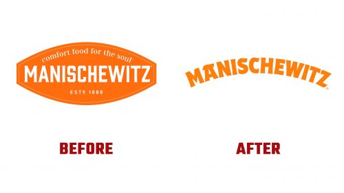
Manischewitz, a well-known brand in the U.S. for kosher Jewish foods, has launched a new logo. This update, created by Jones Knowles Ritchie, comes as the brand continues to offer a wide range of kosher products, from matzos to gefilte fish, since its founding in 1888.
The new logo features bolder, rounder lettering, making the brand feel more welcoming and modern. It keeps the traditional orange color, making the logo fresh and familiar.
The logo design addresses the challenge of blending curvy and angular letters in the word “Manischewitz.” The bolder, wider style of the letters keeps the logo interesting from the first letter to the last. The curls on the “A,” “S,” “C,” and “Z” add a fun twist that makes the logo stand out.
The redesign includes shorter logo versions, “MANI’Z” and “M’z.” These are meant to help people recognize the brand more easily in various marketing materials without always using the full name.
The color scheme ranges from yellow to brown, with orange as the main color, linking all parts of the brand’s visual identity. The logo uses a variable typeface in various typographic badges with different widths and weights. This echoes the arched logo style, reinforcing the brand’s visual theme.
The new logo is accompanied by illustrations that add charm and appeal to the brand, aiming to attract a diverse audience. These illustrations are styled to remind people of New Yorker cartoons, appealing to young and old customers.
This new logo and branding are designed to keep Manischewitz relevant and competitive. The new design aims to enhance the brand’s image as it prepares for the Passover season.


