The first references to the meaningful transmission of information to their descendants date back to the Paleolithic era when history was expressed in cave paintings. This is how mankind separated from the animal world, although it left an invisible connection with it. This later led to the emergence of heraldry, as the images of coats of arms and logos tried to embed certain traits that characterize a clan, country, or company. For example, most automobile brands include representatives of fauna in their distinctive marks that have a historical or symbolic basis.
Each animal symbolizes a certain quality or combination unique to it. Therefore, the brand has an appropriate logo that embodies the product’s virtues. Companies that produce exclusive cars with a special temperament, such as Porsche, Ferrari, Lamborghini, etc., occupy a special place in this niche of visual identification. Many of them imply privilege, which affects their price.
Car logos with horse
The horse is a strong animal with an unwavering character, so its image is considered the most popular when creating logos. Regardless of cultural differences and the people’s religion, its symbolism remains unchanged, denoting strength, beauty, freedom, and grace. Sometimes, the primordial elements—fire, wind, and water—are also mentioned in this meaning. Thus, no matter how this symbol is interpreted, it still implies activity and movement.
So, you can designate the style and elegance of individual design elements or the composition. Emphasize the desire to win, declaring its genuine strength and speed complemented by the fluidity of forms. This is to reflect part of the plot, reinforcing it with the spirit of freedom and irrepressible character. The multifaceted meaning of the horse image allows you to use it to visualize different spheres and directions.
Pegaso
Pegaso is a Spanish company that produced engines, tractors, trucks, and automobile equipment from 1946 to 1990. The company did not produce two identical models, as the customer’s wishes were considered when manufacturing each body. In 1990, the brand was acquired by Enasa, and in 1994, it ceased to exist.
The logo emblem is a monochrome image of a mythological flying creature that fully reflects the brand’s name. The execution is original due to the clear contours of the silhouette, highlighted by the round frame. The emblem symbolizes decisive actions, freedom, and speed. The badge has a strong fighting spirit, emphasizing the company’s strengths.
Ferrari
The Italian automobile concern, founded in 1947 in Maranello, produces cars for sports and racing. Its origins are the Scuderia Ferrari racing team, established in 1929, which won 15 world championships and about 16 constructors’ championships. Participating in races such as Formula 1 brought the brand’s greatest success.
The main element of the logo is a galloping horse in a monochrome palette. It originally stood for the memory of the pilot Francesco Baracca. It symbolizes speed, rawness, and power, which are the hallmarks of Ferrari cars.
Baojun
In 2010, the Chinese company Baojun was founded to produce low-cost automotive products as an alternative to companies such as Buick and Chevrolet. A sharp increase in sales from the first years of production indicates an acceptable combination of price and quality, which led to the expansion of the brand and the emergence of a dealer network.
Visual identification is presented as a horse’s head turned to one side and placed inside the shield. The composition looks quite realistic, conveying the spirit of freedom and nobility symbolized by this animal. Brevity, in detail, speaks of conservatism and emphasizes the availability of this brand’s cars. The gradient color palette resembles the reflection of silver in the light, which gives the brand aristocratism.
Porsche
1931, Ferdinand Porsche founded a company in Stuttgart to produce sports and off-road cars. During World War II, the company created several heavy tank projects, the development of which was used in creating the Panzerjäger Elefant. Today, the concern’s products are characterized by high performance and quality.
The Porsche logo combines a shield from the coat of arms of Württemberg and the coat of arms of Stuttgart, consisting of a blistered horse placed in the central part of the composition. Thus, it was decided to pay tribute to the history of Germany and the city where the company’s head office was erected. The emblem became a symbol of luxury and high status, thanks to which the brand was widely recognized worldwide. Shades of yellow and red combined with black outlines symbolize privilege and reflect the colors of the country’s flag.
Kamaz
Since 1969, KAMAZ has produced diesel engines, trucks, and buses. Its main production facilities are located in Naberezhnye Chelny. The plant has been completed by 19 countries, including the USA, Japan, Canada, etc. For ten years of its existence, the plant has fully justified the funds invested in it.
The emblem depicts an argamak steppe horse galloping across the fields, characterized by devotion, intelligence, and agility. It symbolizes speed and great strength, directly reflecting the products’ basic qualities. At the same time, it expresses the desire for further development and expansion of the company. The logo is made in a laconic monochrome style, thanks to which it traces beauty and nobility. The lines have no sharp transitions, representing friendliness and willingness to cooperate.
Corre La Licorne
Founded in 1901 in the city of Levallois-Perret (France). It developed and produced automotive equipment until 1947, producing 33,962 copies. In 1950, the company was closed.
The company logo is a unique badge taken from the coat of arms of the Corré family and depicted in the form of a soaring unicorn facing to the left. Thus, the company’s founder emphasized his belonging to this ancient family. In addition, this way symbolized the power and speed parameters of the products. The color palette is dominated by shades of red, which speaks of the company’s rapid development in its field of activity. Also, the emblem, taken in a ring, implies independence and adherence to its traditions.
Iran Khadro
The joint-stock company, founded in 1962 in Tehran, Iran, produces buses, transportation components, cars, and trucks. IKCO produces 13 different brands of vehicles and is the largest manufacturer in North Africa, the Middle East, and Central Asia.
The main element in the logo is a profile image of a horse pointing to the right, indicating further expansion of the company. The mark is placed on a shield, symbolizing reliability, power, and the spirit of freedom. In unity with the laconic composition, the volume implies affordable prices and a trustworthy customer approach. This is clearly expressed through the contrast of the color palette of gray and blue shades.
Eicher
Eicher is an Indian manufacturer of commercial vehicles and mid-range motorcycles. Its history dates back to 1948 in New Delhi. It includes a subsidiary, Royal Enfield Motors, which manufactures exclusively motorcycle products. Eicher has invested in customized designs, guides, and maps.
The visual identification is a horizontally arranged red oval. On its background is carved the profile of a horse pointing to the left, its mane developing stripes in the wind. The logo symbolizes dynamic movement, speed, freedom, and vigor. Its color palette reflects courage, passion, and stability, emphasizing a responsible approach to solving tasks.
Ford Mustang
The Ford Motor Company line of automobiles has been produced from 1964 to the present day. Active advertising promotion of these products is considered the most successful in the history of the automobile industry. Unification was achieved by developing mechanical units, and parts from inexpensive models were used.
The trademark Ford Mustang is a horse galloping to the left, reflecting the American spirit and power invested in the developed car. The emblem is dominated by flowing lines, emphasized by sharp head, tail, and hooves transitions. Thus, the emphasis is placed on the wild temperament and speed of the produced model. The monochromatic and laconic design indicates conservatism, an integral part of the model range.
Carlsson
Tuning studio Carlsson Autotechnik is known worldwide as a manufacturer of modifications for Mercedes-Benz cars. It was founded in 1989 in Merzig by brothers Andreas and Rolf Hartge. The company is also known for its wide range of alloy wheels.
In the company’s visual style, the main element is the silhouette of a running horse, which implies dynamic development with the overcoming of emerging difficulties – the emblem taken in a ring symbolizes the integrity and independence of the company. The color scheme is chosen in such a way as to emphasize the belonging of the products to the elite classes of cars. Below the horse emblem, the name of the atelier, typed in ITC’s Crillee Bold Italic typeface without any special modifications, is capitalized in lowercase letters. The text is characterized by flowing lines that suggest a friendly relationship.
Car logos with Griffin
A griffin is a creature with the body of a lion, an eagle’s head, wings, and clawed paws. In legends, he was assigned the role of guardian of secret knowledge or treasure. He symbolizes strength and vigilance, representing dominance on the ground and in the air. Often, he uses a full-fledged visualization of a mythological creature so that there are no questions about his belongings in the future. It can be an abstraction, combining disparate elements, or a detailed image. It is also enough to designate the silhouette with sketches, emphasizing the presence of a legendary character if the title has his mention.
Gumpert
Roland Gumpert, former CEO of Audi, founded his luxury sports car company in Denkendorf in 2004. 2008, the successful Apollo Sports creation was unveiled, breaking the speed record of models such as the Pagani Zonda and Bugatti Veyron. However, the firm closed in 2013 due to bankruptcy.
Gumpert’s visual style includes a shield-shaped emblem with a griffin on its surface. The color palette of the background is made in a burgundy-red shade and is emphasized by a golden frame, symbolizing the sophistication of the product. The mythological creature is a powerful heraldic symbol that reflects elegance. Thanks to the use of different shades of light gray in its coloring, it seems alive, which gives the composition dynamism and strength.
Saab
Founded in 1937, the company produced military aircraft, so the second letter stands for “Aeroplane.” The company’s greatest fame was the single-seat fighter Viggen 37, which showed it from the best side. 1949, production was transferred to passenger cars, as reflected in the abbreviation.
The brand logo was borrowed from Scania after their union was dissolved. It represents the crowned head of a red-colored griffin in profile, looking to the left. This emphasizes the power and vigilance to detail in the machinery’s design. Below, in a silver gradient fill, is the SAAB company name. The entire design is surrounded by rings, symbolizing the company’s independence.
ISO
From 1939 to 1974, the Italian company produced automobile, motorcycle, and scooter products with production facilities in Bresso. The most successful model was the Grifo GL 365, whose speed exceeded 255 km/h. However, despite all efforts, the company was closed in 1974 due to bankruptcy.
The emblem is presented as a rectangular white shield framed in gold, with a protrusion in the lower part and cutouts in the upper corners. In the center, there is a galloping griffin looking to the left. All this emphasizes the seriousness of the approach to solving project tasks and symbolizes vigilance and perseverance. Behind the creature are vertical lines of national colors, and above it – the word “Iso” is written in cursive in dark gray font with a golden border. The composition evokes associations with wealth and luxury.
Vauxhall
Today, Vauxhall is a division of Stellantis, a British automobile company. Since 1857, it has been engaged in the development and sale of steam engines. However, the company’s line of business later changed to the automotive industry, and in the middle of the XX century, it began to cooperate with the German manufacturer Opel. Subsequently, the Vauxhall brand name was used to sell Opel and Holden products in the UK.
The visual identification is a circle within which a griffin is depicted. He holds a flag in front of him in his right paw, on which the letter “V” is engraved. Its torso is turned to the right, and its head to the left. This symbolizes the memory of the company’s past, which allows it to strive for further development. The emblem looks laconic, but all elements combine it with nobility and confidence in the future. The color palette of red and grey only emphasizes these qualities.
Scania
Founded in 1891, the Swedish company originally manufactured bicycles and carts. 1920, it converted to motor, automobile, truck, and bus products for commercial and industrial applications. Since 1968, it has partnered with SAAB, thanks to which it has gained popularity with heavy trucks.
The history of the Scania logo began in 1984 when the image of a crowned griffin from the coat of arms of Skane County was adopted as a unique element of the brand. It implies courage, strength, speed, and attention to detail. Modern technology allowed for a simplified visualization of the brand, which enhanced its perception and ensured greater memorability. The circle describing the logo’s base and the parts beyond symbolize a willingness to cooperate.
Car logos with eagle
The eagle can often be found in the logos of various companies or on the coats of arms of countries because, in heraldry, it is considered a symbol of power and strength. Many see it as a messenger of the sun, a divine messenger, denoting immortal life, freedom, or courage. In versions with two heads, he is assigned the role of victory of good over evil. In the periods of the birth of the Christian religion, he became the personification of the cross.
Today, the heavenly king emphasizes pride, recklessness, and seriousness of intentions. Regardless of the execution-style, whether a detailed profile or a light outline, it will still impress and attract attention. Placed inside the shield, the regal predator does not cease to symbolize freedom. In some cases, you can even do without drawing clear boundaries.
Eagle
A division owned by the American company Chrysler from 1988 to 1999, headquartered in Auburn Hills, it was created from the AMC facility with the prospect of mass-producing passenger cars. Difficulties in legal matters led to the trademark being later abolished.
The brand’s logo is a shield resembling a triangular figure with two arc-shaped sides. In its center is the contour of the eagle’s head, facing right, which combines clarity and smoothness of lines. The image’s symbolism lies in its strength, speed, and development aspirations. Above the sign is the name of the unit, written in lowercase letters, which gives the image originality. The color palette of the emblem consists of light and dark shades of gray, giving the impression of matte silver.
FPV
The FPV brand was a Ford Motor Company Australia division from 2002 until its discontinuation in 2014. During its existence, a line of premium vehicles based on the Falcon model was developed under its logo and was a success for consumers.
The company’s visual identity has two variants of the monochromatic color palette – blue and dark gray. The emblem is an oval outline of variable thickness, with the profile of an eagle pointing to the left in the middle. Clear, sharp lines of eyes and beak emphasize its aggressiveness and danger. This symbolizes the impetuosity that the cars produced possess. Below the sign is the text “FPV” in italicized Snasm Heavy Italic font with slight modifications below the sign.
Isdera
A privately owned German automotive products company founded in 1969 in Hildesheim, it produces luxury sports cars in limited quantities. A team of specialists assembles each model by hand, and each car is individually designed for a particular customer, so it takes up to six months to produce.
The logo is presented as a vertically arranged rectangle of sky-blue color with a black outline. A monochrome image of a flying eagle spreading its wings on its background indicates a serious approach to producing unique automotive products. Despite its brevity, the emblem is filled with power, expressed in every line. The company name is placed in bold, non-standard font at the bottom of the emblem.
Car logos with lion
The lion has been considered the most popular symbol in heraldry for centuries. Historically, he has been the personification of strength, courage, bravery, valor, and dignity, having the title of the king of beasts. His frequent use of various symbols has led to each pose having its specific name. The most common visual image is presented in profile, emphasizing the majesty. A natural-born leader can inspire not only fear but also respect. He is often associated with the image of the Sun, implying nobility in appearance and superior physical qualities.
Today, many brands use the image of this animal in their logos. In the automotive industry, it denotes leadership qualities backed by courage and strength.
INKAS
Canadian private security corporation INKAS was founded in 1995 in Toronto. One of its categories is the design and manufacture of armored vehicles. 2015, the first exhibition center opened, expanding its products across the country and continent.
The logo is presented in the form of a shield, against the background of which a winged lion is depicted in profile, denoting a vigilant guardian standing to protect the vehicle’s owner. In his front paw, he holds a sword turned to the sky, which indicates seriousness, endurance, and self-confidence. Below is the text “INKAS” with an increased distance between the letters. The composition is made in an angular, laconic form with a monochromatic light gray shade. Thus, the emblem has acquired a more formidable appearance.
MAN AG
The European concern, whose history dates back to 1758, is now a subsidiary of Traton SE. The company’s main activity is developing and producing heavy commercial vehicles.
The visual identity of the company is a horizontally arranged rectangular outline. It symbolizes stability backed by many years of experience. The figure features a laconic silhouette of a lion looking to the right, denoting courage and strength. A collective image is created from various angular elements, which gives the emblem massiveness. The overall impression is balanced by the company’s name, located above the image, made in the usual bold font with small additions. The color palette resembles chrome-plated metal, combining conservatism and modern trends in the overall composition.
Holden
The Holden company was founded in 1856 in Melbourne, Australia. Initially, it produced saddles and various accessories for them. However, by the end of the 1900s, the production facilities were converted to the production of automotive equipment. The firm was independent until the 1930s, after which General Motors took over the company’s management.
The 2016 logo redesign features a simplified color scheme that includes light gray shades and a black outline, creating a metallic shine effect. The emblem is presented in the form of a circle, within which is encased a grinning lion holding its front right paw on a rounded stone block. It symbolizes steadfastness, strength, ferocity, and confidence in one’s actions. The brevity of the image gives the brand more elegance, making it easier to visualize. All the logo lines have rounded, smooth outlines, which speak of a friendly and strict character.
Peugeot
Founded in 1810 in Paris, France, Peugeot is one of the largest automobile manufacturers in the country. In 1975, the company became the majority owner of Citroën. At the end of 2007, the company ranked second in the number of cars produced in Europe.
The image of a lion standing on its hind legs and looking to the left has become the main distinctive feature of Peugeot. This is how the powerful qualities of the company’s products are shown. In addition, it emphasizes confidence and stability, which are integral parts of the models produced. The iconicity of the image adds visual individuality and ease of perception, removing all unnecessary elements from the composition. Under the emblem is the brand name, typed in a thin font, which adds elegance to the emblem. The gradient filling of the figure with gray shades creates a three-dimensional effect, making the logo fresher and modern.
Bussing
Since 1903, the German company Büssing has been developing products for buses and trucks on par with other, more established companies. This has brought it fame in Europe. However, in 1971, the brand stopped producing vehicles and was declared closed.
The company logo is made in a laconic modern style in light gray tones with elements of black edging. The emblem features a mascot and a lion standing in profile, symbolizing courage and further company development. With the simplification of the color palette, the image has acquired a touch of conservatism and seriousness. Under the sign, the company’s unique inscription is in bold font. It is emphasized by a rectangular figure, one of the sides of which resembles an arrow pointing downwards. This speaks of Büssing’s solid foundation and long history.
Roewe
The Chinese manufacturer headquartered in Shanghai founded the automobile brand in 2006. Roewe cars were initially developed based on technology acquired from BMW’s now-closed MG Rover division. Subsequent attempts to buy a controlling stake were unsuccessful.
A shield with rounded corners divided into four parts, painted in a black and dark red checkerboard pattern, was chosen as the basis of the logo. It fully reflects the interpretation of the company’s name. Translated from Chinese, it sounds like “glorious power”. However, according to SAIC representatives, the word was recycled from German and translated as “Lion.” The logo features a gradient gold hue in the upper half of the rendering, standing on their hind legs and their heads facing each other. This symbolizes the power, determination, and aristocratic nature of the products produced.
Proton
Proton is the largest automobile manufacturer in Malaysia. It was founded in 1985 by Mahathir Mohamad. Initially, the models were modernized Mitsubishi models. However, in 1996, controlling stakes in Lotus Cars were acquired. The division then engaged several companies to develop and manufacture original equipment.
The visual appearance is gray and black, creating the polished metal effect. The shape resembles a triangular shield with rounded corners, representing quality and safety. The circle is placed inside a tiger’s head on its background, symbolizing the product’s swiftness and power. The emblem is dominated by straight lines and sharp angles, which denotes wildness and nobility. Above the sign is the inscription “Proton,” which emphasizes the individuality of the technique.
Car logos with wolf
Indian tribes of North America endowed fearless and strong warriors with the image of a wolf, able to stand alone against adversity and protect weaker comrades. Thus, the animal symbolizes free spirit, altruism, independence, and sacrificial essence. For this reason, automobile companies that use the image of the wolf as the main symbol in their logo imply independence from other enterprises in development. However, despite this animal’s advantages, it is rarely used in emblems. The reason is the intimidating grin of the predator, which symbolizes a formidable character and unruly temperament.
This sign can capture not only the influence of the automobile brand but also impose its imprint on engineering and design developments, allowing it to reflect the characteristic features of the proud animal in the products’ exterior. The trademark includes pointed elements symbolizing speed characteristics and increased power parameters.
Lobini
Lobini has been developing and manufacturing Brazilian sports cars as its core business since 1999. The technologies used in its products are not inferior in quality to the international requirements for vehicles of the same category. The company gained fame thanks to a single model—H1, characterized by increased power characteristics.
A distinctive feature of the brand logo is a yellow oval with a metal border, against which a wolf’s head is directed to the right. This emphasizes the power of the cars. The evil grin is menacing, and the silver contour emphasizes the unique style. Under the main element is the name of the company, composed of letters with serifs, which expresses the attitude to the direction of sport, symbolizing speed. Laconic execution gives the composition confidence and rigor.
Spania GTA
Since 2010, Spania GTA has been producing sports cars in limited numbers. However, it is controlled by the company GTA Motor. The company gained popularity by participating in various racing leagues, where the first models were introduced.
The company’s visual style has an elegant traditional coat of arms in a shield, which speaks of safety as the main priority. On its background are two elements. In the upper part of the coat of arms is the silhouette of a black wolf, signifying impetuosity and indomitable character. And in the lower part, filled with a dark red hue – a white checkered flag, hinting at overcoming the finish line. This symbolizes the power and superiority of the products produced. The company name is placed in the center, separating the two areas.
Car logos with ram
Aries hides the symbolism of fire, vitality, courage, and power. His image speaks of purposeful, persistent, and impulsive actions. Twisted horns are associated with security and wisdom. Hence, the universality of visual identification for different spheres of production allows the image to emphasize one or another meaning.
The most recognizable elements of the animal are its horns, silhouette, and head. Regardless of the style of execution of the sign, it can be given the appropriate mood, emphasizing the attention to specific details. Thus, for example, the image of crossing animals manifests the qualities of the company associated with unwavering and decisive positions. If there is a textual component in the logo, combining pictorial parts with letters is applicable, which leads to the creation of the necessary association. In modern times, the brand’s design undergoes minimalist moods, simplifying the overall picture’s perception and increasing memorability.
RAM
The RAM brand of automotive products is an offshoot of Dodge, which has specialized in producing full-size pickup trucks since 1981. The main production facilities are located in Mexico and the United States. In 2008, the fourth generation of RAM Dodge, which refers to full-size trucks, was brought to the market.
The logo’s image of a ram’s head against a shield background was originally used as Dodge’s trademark symbolism. The animal symbolizes dominance on the highway and reflects the power, safety, and reliability of the cars produced. The color palette includes shades of gray in harmony with black, creating the effect of polished silver. Thus, the composition emphasizes a conservative approach and aristocratism.
Car logos with deer
Among the emblems of cars, where the silhouette of an animal is used, the use of both stylized and perfectly copied figures of deer is widespread. This beautiful and proud animal has always attracted attention in the heraldry of all times and peoples. Here, the question is not only about noble beauty. A correctly chosen totem is believed to reward its owner with the best qualities protected by its nominal protective characteristics. In turn, placing a deer on an automobile provides a slightly different attitude towards the latter, transferred directly from the living and historical prototype chosen for the logo.
The mark does not simply cover, in this case, the make of the automobile. It puts an appropriate imprint on the work of designers and constructors, seeking to reflect all the features inherent in the noble beast in the characteristics and appearance of the unit. At the same time, designers and constructors themselves sometimes do not even notice this influence, acting on a deeply subconscious level. That is why most brands with the emblem of a deer have correct and noble outlines, characterized by increased controllability and high starting speeds as if repeating the main features of their totem.
GAZ
One of the automobile brands whose logo has featured the deer since its inception is the Russian automaker GAZ, founded in 1932. It is a world-renowned manufacturer of cars, trucks, vans, engines, and components. Today, it is considered a major component of the Basic Element industrial group, headquartered in Nizhny Novgorod.
The famous “running deer” emblem has undergone some changes today. Some elements have been removed from the emblem, bringing the deer to the foreground and making it the main accent. His figure, adopted in 1949, has acquired volume, contour clarity, and the lines’ dynamics. The addition of the chrome effect made the sign particularly attractive. Thanks to this effect created on a black background, the stag became more realistic and expressive.
SSC
Among the automobile brands that use a deer in their logo is the American manufacturer of exclusive cars, SSC, founded in 1999 in Washington, DC. It earned its fame thanks to the development of high-tech and high-speed hypercars. The design and shape of the technique were inspired not only by the noble silhouettes of the branded animal but also by the beauty of modern fighter jets.
The brand logo includes a stylized symbol of a deer – a noble animal. Its stylized head, crowned with beautiful branching antlers, decorates the space of the triangular pointed heraldic shield in the center of its base. Executed in gold on a dark blue background, it stands out clearly and is visible in any armorial position. It is an auspicious symbol associated with the Sun, light, purity, and the permanence of renewal. Its branching horns symbolize the success of the brand and a direct link to the Tree of Life, which grants success and victory.
Car logos with dog
The dog is an animal that also finds its place among the accepted elements of heraldry logos in the automotive industry. It is not often seen as part of the car’s emblem. It is designed to form the required psychological perception of the brand and endow it with the appropriate properties and characteristics that the type of animal chosen to form the sign possesses. She finds her place where she needs to demonstrate her main characteristic – impeccable service. A dog is the best option for branding car brands as the personification of fidelity, devotion, and unconditional service.
However, as many dog breeds exist, designers have many opportunities to reflect their ideas, demonstrate the required characteristics, and focus on the desired features and properties. A bulldog (Mack) or a hound (Lincoln) has been accompanying “their” cars for many years on a long journey along the world’s roads. They effectively reflect the important features of a particular model, forming the required opinion about it or the entire car brand, ensuring ease of recognition and uniqueness of their visual identity.
Artega
Klaus Dieter Frers founded the car manufacturing company in 2006. The headquarters of the brand are located in Delbrück (Germany). The company was created to produce sports cars, incorporating many achievements of modern technology. However, the company realized only one of its ideas—Artega GT, which included the greatest amount of know-how at once. In 2012, the brand ceased to exist, leaving a significant mark in the history of automobile manufacturing.
Its logo has remained in the memory of many car enthusiasts as one of the original in its execution. Representing a heraldic shield divided into several segments, it contains a stylized image of a dog with a fiery red tongue in the right part. The character is depicted standing on its hind legs, threatening any opponent. The symbol demonstrates constant readiness to fight for what has been conquered and achieved – its position and success. However, this did not save the company from closure.
Mack
One of the world leaders in truck production is an American brand—Mack Trucks. Starting in 1900 as Mack Brothers Company, the brand became famous for experimenting with the first steam engines. Subsequently, the Greensboro-based company constructed specialty vehicles, buses, and trolleybuses and closed to expand truck production. In 2020, the brand will become the property of Volvo.
The brand’s well-deserved prominence before World War I was reflected in adopting the bulldog as the logo, a symbol of Great Britain. Its figure was not only used in the logo. The shiny dog crowned the central part of the brand’s car’ hood, symbolizing the British’s steadfastness, perseverance, and firmness in the struggle to achieve their goals. Power and strength, which radiated from the figure of the animal, were inherent in all the vehicles produced by the brand throughout its existence.
Car logos with jaguar and leopard
Logos that include images of various animals have exceptional appeal and reflect important brand features. The reason is that such an emblem will cause certain associations that directly characterize the strengths of the fauna. Man is inherent in the desire to possess many properties characteristic of animals. This makes them especially popular in heraldry and logo design regarding the reflection in the visual image of the power closely associated with beauty and grace. The most often used images are of beautiful felines—leopards or jaguars.
However, their use requires special care in handling and application because, having incorrectly presented the image, you cannot show it from the best side. Emphasizing the aggressive and self-centered side of the leopard would be appropriate when creating a logo for a formidable and powerful automotive product. While the jaguar is suitable for more streamlined forms, emphasizing the gracefulness of a particular type of machinery. In addition, the image of these animals is also influenced by the two most interesting characteristics embodied by these animals for car manufacturers – speed and power. It is these that, first of all, influence the creation of predatory felines as an element of their emblem.
Spirra
Oullim is a South Korean automobile manufacturer founded in 1997 in Gyeonggi Province. It was disbanded in 2007 and taken over by Proto Motors, which produced the only sports model with a turbo V6 engine, ¬ Oullim Spirra, from 2008 to 2017. At the end of 2017, the firm closed and announced its disbandment.
The logo is a triangular outline with rounded corners, resembling a shield. This means protecting the driver, which indicates the quality of the product. In the figure’s background is the head of a snarling jaguar, made in a laconic style. The animal in the emblem symbolizes confidence, speed, and determination, which indicates the car’s involvement in the sports class. The whole composition is made in a monochrome black palette, which gives conservatism and seriousness to the created image.
HSV
A subsidiary of Holden Group, founded as a brand in 1987. The main direction of production is developing and producing automotive products with high-performance parameters. For all the time, the company has modified some of the automotive equipment owned by General Motors.
Visual identification is represented by a solid black circle around the border – a double red contour. This implies self-sufficiency in production lines and independence in making important design decisions. The figure’s background features a laconic image of a raised jaguar head and a man in a racing helmet in the foreground. The color palette of the main part of the logo is based on white. Its elements symbolize power, speed, and racing products and refer the brand to the category of luxury cars.
Cizeta
The automobile company Cizeta was founded in 1988 in Modena (Italy). Thanks to the only hand-built car presented, the Cizeta-Moroder V16T, it got its name. Its design was later proposed as the basis for the later version of the Lamborghini Diablo. Eleven cars were produced during the company’s existence.
The brand’s logo is a circular figure of blue shade framed by a yellow outline. In its center, there is also a rounded area of the color of the border, against the background of which there are three heads of a jaguar turned to the right. The brevity of the design and the play of two colors in the visualization of each jaguar against the background of the other create the impression that they are competing while remaining calm and purposeful. At the same time, the angular lines and austere look speak of the seriousness and power of the product. In creating the logo, the manufacturer wanted to emphasize the main qualities inherent in the technique. At the same time, Modena’s flag, where the first production was opened, was used as the basis for the color scheme.
9ff
Tuning Studio 9ff was founded in 2001 in Germany and modifies basic Porsche cars to the level of certified racing equipment. At the same time, it sells finished car products and spare parts kits. The company gained its fame thanks to the developed model, which exceeded the speed threshold of 400 km/h.
The brand is visually laconic and easy to remember. Its basis is a heraldic shield with rounded edges and a light border, which emphasizes the lion’s share of attention on the image inside. It is presented as a silhouette of a leopard’s head, looking to the left with a predatory, imperious look, thus emphasizing the strength, speed, and formidable character. The color palette of the emblem represents the brand as an example of extravagance and aristocracy, having light and dark shades of gray, dark gold, and black at its disposal.
Jaguar
Jaguar is a multinational company with production lines worldwide. It was founded in 1922 and is headquartered in Coventry, UK. Initially, its factories produced motorized wagons and then cars. In 1975, the concern went through a nationalization procedure. However, today, Tata Motors, a part of Jaguar Land Rover, controls the company.
The brand’s visual identity is represented as an animal that embodies the image of strength, power, and elegance – the jaguar. It is depicted at the moment of jumping, thus implying the impetuosity and performance of the vehicles produced. The color scheme includes dark and light shades of gray, which creates the effect of volume, and the figure acquires a metallic structure. The image of the beast is dominated by smooth lines, giving the emblem mobility and filling it with vitality. The logo has become an example of high quality and style, which, thanks to its brevity, keeps pace with the times.
Car logos with bird
Images of terrestrial fauna are often a source of inspiration for most automotive business members. The desire to display in their heraldry or any other visual identification the features that characterize the best aspects to a greater or lesser extent leads to animal images. This is the way to display the merits of the products and the principles followed by the company.
Birds have a separate role in modern advertising direction, as they embody a happy, peaceful, and free life. In addition, they find inspiration for the further spiritual development of enterprises that want to emphasize their individuality and follow the trends of a certain period. Many automotive brands have chosen to use the image of a celestial animal to describe the benefits of their technology; these include Rossion and Arash.
Arash
Arash Motors, founded in the UK in 1999, mainly develops and produces luxury sports car products. The company’s first brainchild was the Farboud GT model, which embodied the spirit of avant-garde, unusual design, and improved aerodynamic qualities.
The main distinctive feature of the brand’s logo is the image of an eagle. Despite the laconic execution, the eyes and curves of its body have excellent detailing. The image looks natural and haphazard. In the emblem, the bird symbolizes speed, lack of limits, and power over its element, which fully reflects the character of the products. Its formidable appearance and fighting stance speak of coherence and effectiveness of actions in unforeseen situations. The animal is placed at the bottom of the black shield with a gold border, symbolizing safety and style.
Packard
The American brand Packard produced luxury cars in Detroit (USA) from 1899 to 1958. Initially, the vehicles’ design was planned to focus on quality rather than quantity, so their cost was prohibitively high in small-scale production. During World War I, the company was engaged in the production of aircraft engines and chassis parts for armored vehicles.
Packard’s visual style is a vertically arranged black oval with a wide golden frame, emphasizing the independence and friendliness of the company. In the central part of the figure, there is a heraldic shield of red shade with luxurious decorations on the background. It is crowned by a knight’s helmet, from which branches branch off, and at their base, there is a graceful animal resembling a swan with outstretched wings and bowed head. The bird speaks of aerodynamics, speed, and beauty inherent in the brand’s cars in all this splendor of detail. The symbolism of the emblem implies belonging to the high society, and the coat of arms, in which gold tones prevail, confirms it.
Rossion
The company, founded in the early 2000s in Florida (USA), produces sports cars. The Noble M400 was taken as an analog for creating the flagship model Rossion Q1. The company strives to increase its creations’ speed and dynamic parameters, not forgetting handling, an important criterion for sports cars.
To express the efficiency and power of the produced vehicles, the company decided to use the image of an eagle on the background of the heraldic shield as the main element of the logo. The color scheme of black and gray tones allows us to emphasize the uniqueness of the composition, highlighting the notes of conservatism and elitism. A bird of prey on the emblem spreads its wings in readiness to grab the prey, symbolizing the desire for further development. Above it rises the brand’s name, which is made in large letters with rounded corners. The letters “S,” located in the center of the text, have undergone a special addition, expressed in the form of strokes that continue the marks above and below the word.
Bizzarrini
The Italian company Bizzarrini is known for its sports cars, as each model was made individually for the owner. The company was founded in 1964 under the leadership of talented engineer Giotto Bizzarrini, who began his career as a teacher. After five years, equipment production was discontinued, and the attempted revival in 1990 did not arouse the proper interest.
The logo was based on the image of a small agile bird – a sparrow, made in a laconic style. This is how the manufacturer denoted its creations’ high power, speed, and aerodynamic parameters. The image is placed on the background of a circle with a border in the form of golden claws, reminiscent of a circular saw disk. The color scheme of golden and red shades gives the composition volume and aristocracy, putting the brand on par with such companies as Lamborghini and Ferrari. In the ring, above and below the bird, there is the name of the company, made in thin letters of dark shade with golden edges.
Duesenberg
The American company Duesenberg is known for its luxury racing cars, produced from 1913 to 1937 in Auburn (USA). Despite such a short period of existence, the company presented its technique to various races. During the First World War, they produced Bugatti U-16 aircraft engines under the license issued by Colonel Bolling.
The Duesenberg logo is presented as a large golden eagle with outstretched wings, reminiscent of the symbols of Germany. Its image has a three-dimensional and detailed structure, filling the emblem with vitality and the effect of mobility. The torso and head create the image of a noble and strong animal, ruling in its element. The company’s name is on the two wings, and the figure eight – is on the tail. Their execution in a dark blue color palette strongly contrasts against the background of the whole composition, accentuating a person’s attention to the brand’s textual component.
Simca
In 1934, an automobile manufacturing company was founded in France under the leadership of Henry-Theodore Pigozzi. In 1935, a factory in Nanterre was bought from the bankrupt company Donnet to ensure mass production of vehicles. 1970 Chrysler took over the shares, and the brand was abolished.
The brand’s visual style is a rectangular shield with a small protrusion at the bottom and rounded lower corners. Thus, it emphasized the importance of ensuring the safety of owners of cars produced by the company. The color palette is represented by three shades – white, blue, and red, which are reminiscent of the colors of the flag of France and speak of national belonging. In the upper third of the shield, made under a clear sky, a swallow is striving upwards, symbolizing development, speed, and grace, which are the basis of the design of the brand’s technology. The company’s name is located at the bottom of the heraldic element.
Car logos with snakes
Since ancient times, the image of a snake has been invested with great meaning, representing strength, health, and wisdom. However, many also believed it could attract its owner success, wealth, and good luck accompanying his life. The animal is characterized by an independent character, bordering on grace and beauty, which allows you to fully express the design qualities available in the products. However, it is important to do it correctly so that, looking at the logo, a person immediately understands the company’s main direction.
Based on these factors, many automotive brands, such as Alfa Romeo or Ford Mustang Shelby, choose this element to maximize the uniqueness of their logo. This allows for the obtaining of extremely interesting creative solutions that are fully in line with current trends.
AC Cobra
Founded in 1961, this British car company is one of the oldest independent companies based in the UK. It specializes in small-scale sports equipment production. The brand’s models earned their fame due to their extensive sporting history. However, in 2004, the brand was declared closed.
The logo is presented as a ring of red shade, connected almost in the center by a line of the same palette. The stripe contains the brand name in a regular lowercase font with wide letters. The outer and inner border of the figure has a silver tint. The emblem, with its execution, speaks about the independence and self-sufficiency of the company. The central place of visual identification is occupied by the main element of the composition – the frontal image of a cobra, denoting revival and further development. The color palette includes red, gray, and blue colors, which give the sign energy and freshness.
Mustang Shelby
The Shelby Mustang was first introduced to the market in 1964. It was developed with the participation of the Shelby American company, and as a prototype, it was a less powerful model of the Ford Mustang. This car is still being produced today. However, its design has lost connection with the classic versions of the technique of that period.
The brand’s emblem is a stylization of a cobra, curled up on its back but ready to strike anyone who tries to disturb it. Thus, a formidable, aggressive, and quite powerful image was created, fully describing the nature of the equipment produced. The image is drawn competently and powerfully, which is noticeable by the quality of the scales, starting from the tail in the form of diamond-shaped figures with a dot in the middle and ending with squares on the head. The color scheme is presented in black, light, and dark gray tones, and thanks to the gradient filling, a three-dimensional effect is created. This emphasizes belonging to the conservative luxury class, which can provide a worthy image to the car owner.
Alfa Romeo
The history of the Alfa Romeo company began in 1910 in Italy. It acquired its final name in 1915 when Nicola Romeo took the leading position. Certain successes distinguished all stages of the company’s development in one direction or another, and participation in racing competitions such as “Formula 1” only added to its fame. An innovative approach was applied when designing the exterior and interior, allowing the brand to lead in its category.
The final version of the logo was designed with digital technology in a concise and slightly futuristic style, which added to its presentability and refreshed the existing image. The color palette retained Biscione’s green crowned serpent, the blue circle encapsulating the emblems, and the red cross. The line dividing the left and right into two halves was removed. At the same time, the white and blue background was replaced by a silver structure. This led to the expansion of the coils and the reduction of their number in the serpent, causing it to unite with the cross that denotes the coat of arms of Milan. In addition to flexibility, the mythical animal symbolizes the movement, agility, and strength characteristic of Alfa Romeo cars.
Zarooq Motors
Zarooq Motors, based in Dubai, UAE, develops and manufactures high-performance automotive products. It holds a leading position in producing body and running gear parts, directly participating in the mass production of sports cars.
The snake was chosen as the main element of the brand logo, not by chance. The company’s name symbolizes a species characterized by fast movement and inhabiting the desert area of the UAE, which is the main distinctive feature of the products. The cold-blooded animal is placed on the background of a triangular shield with a silver border and rounded corners. Its image is made in a laconic style, alternating light gray and black lines that make up the entire color palette of the composition. The emblem emphasizes the luxury and privilege of the brand, focusing attention on the attitude of the highest class.
Dodge Viper
The Dodge Viper belongs to the main model range of the sports category. It is produced by the American company Dodge, which Chrysler controls. The first generation of two-seater cars of this brand was presented in 1992. From 1997 to 2008, this technique was often used to participate in racing tournaments, in which it often won.
The brand’s emblem is a wide five-pointed shield with rounded corners and a light border. A laconically executed but simultaneously very extensive image of the head and part of the snake’s body is in its background. It is distinguished by a stern look and open mouth, which indicates its readiness to deliver a fatal blow. The animal’s body consists of separate parts of different thicknesses, which creates the effect of applying a brush. This symbolizes the impetuosity and power of the vehicle, which, like a snake, rushes from the place to its goal. The color scheme is made in monochrome shades of light gray and black, emphasizing the seriousness and costliness of the brand.
Car logos with bull
The bull personifies unbending character, invincible strength, perseverance, self-sacrifice, and boundless power. Car manufacturers try to incorporate these traits into their logos. A vivid example of successful branding can be attributed to the company Lamborghini, which used the image of a calf in its visual image.
In creating an emblem based on this animal, there should not be any framework to fully express its power and strength. However, if it is still necessary to designate some boundaries, then it is worth considering dimensions that will not embarrass the noble animal. Most often, businesses are limited to combinations of red, black, and yellow shades of the color palette, emphasizing the courage and fury of the representative of the fauna.
Kaiser
The American company Kaiser, founded in 1945 in Michigan (USA), originally intended to produce convertible and sedan cars. The production site was a long-term leased plant, Willow Run, owned by Ford. In 1953, the brand ceased to exist, merging with Willys-Overland.
The official logo is a pentagonal heraldic shield with elongated serifs at the top, signifying reliability and steadfastness. Visually, it was divided into two components horizontally. On the striped background in the upper half, there is a massive smooth letter “K” with a dark border, denoting the company’s name. In the lower part of the shield, against the background of the night sky, there is a buffalo in silver color standing on the top of a hill. It creates a feeling of security, determination, and confidence. This animal symbolizes calmness and great strength. At the same time, the color scheme is composed of gray shades, creating an unsurpassed composition.
Lamborghini
The Italian company Lamborghini is one of the most famous European car manufacturers. It is famous for the quality and elegance of its sports cars. It was founded in 1963 by Ferruccio Lamborghini in Sant’Agata Bolognese. Today, the brand has come under the control of the German Volkswagen Group.
The last redesign of the logo was developed in 1998, based on a logo created back in 1972, but with digital technology, new life was breathed into it. It is a black three-pointed shield with a gold border, designed with rounded corners and slightly convex sides. In its center is a powerful zodiacal animal, symbolizing strength, resilience, and stability. Taurus is made in golden colors of various shades, which gives it mobility and vitality. Above it hangs the letter component, created using bold capital font, emphasizing the uniqueness and privilege of the brand.
Tauro Sport Auto
The Spanish company Tauro Sport Auto was founded in 2010 in Valladolid and produces elite sports equipment. The brand was created by Spanish businessmen who partnered with British production. Today, the company is at the stage of mass distribution of its trademark worldwide.
Visual identification is presented as a red circle framed by a wide black border, separated by a thin gold ring. The company name is on a black border at the top and bottom, with willow branches around the edges. The text is in a thin font with serifs and sharp corners, indicating friendliness and openness. In the central part of the emblem is a black silhouette of an angry bull, ready at any moment to rush into battle. The composition reflects the main parameters of the developed products, characterized by high power, quality, and reliability. The laconic design of the logo allows it to increase its memorability, which corresponds to modern trends.
Car logos with gecko, scorpion, and other animals
Among the emblems related to automotive themes, you can find many representatives of exotic fauna. They have always attracted a lot of human attention, which, with special zeal, sought to reflect them in their mythology and heraldry, transferring this passion for automobile branding. Giving exotic animals and insects supernatural properties was caused by a lack of understanding of how nature can create unusual forms and survive in difficult conditions. Man has always sought to adopt these properties or give them to his protective heraldry, making such creatures his totems.
This attitude has been reflected in the formation of automobile brands. Reptiles and amphibians often became symbols of wisdom and good fortune. The Italian company Abarth included lizards, turtles, and scorpions in its bestiary, and the German luxury Wiesmann is home to geckos and iguanas. Even British Gordon-Keeble found it necessary to use the silhouette of a tortoise as a sign of stability and reliability. This is only a small part of the group’s representatives who protect today’s interests of automakers.
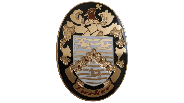
Tucker
Founded in 1946 by engineer Preston Thomas Tucker, the Tucker Corporation is an automobile company headquartered in Chicago, USA. The company was engaged in development only until the Second World War. After its end, unable to invest in new products, the brand continued pre-war production, which led to its collapse in 1951. During its existence, the brand created the American dream – a beautiful and inexpensive car.
A special trace in history was left by a model called “Blue Dream” – Torpedo, on the hood of which was depicted the hippocampus – a mythical fish-horse. It served as a mount for nereids, characterized by beauty and grace. These characteristics prompted the automaker to choose this mythical animal, also considered the king of fish. Such a significant origin and ownership of the symbol was to reflect the main features of the brand’s equipment.
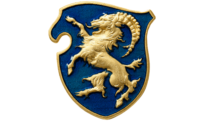
Cisitalia
Italian businessman and motor sportsman Piero Dusio opened a workshop in Turin in 1946, destined to grow into a full-fledged automobile production company. The company developed and assembled racing cars. The name was part of the Compagnia Industriale Sportiva Italia, a business conglomerate. The brand became famous thanks to the Cisitalia 202 GT model. The company has not existed since 1963.
The brand’s original logo was peculiar, which included a coat of arms with the image of a golden horned goat yelling, standing on its hind legs, and threatening all enemies with its front legs. This creature from European mythology represents proud defense and characterizes the desire to develop and use the latest scientific achievements—not without reason. Yale is depicted on the official flag of the President of Yale University.
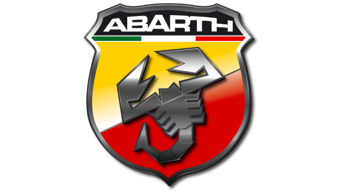
Abarth
1949, Harold Wester founded Abarth in Turin, Italy, to manufacture automobile mufflers and exhaust systems. In the early 1950s, the company began to develop sports cars based on Fiat models. The subcompact Abarth 850 TC became particularly famous. In 1971, the last car under this brand was released. However, since 2007, Fiat has revived this brand.
Throughout the entire existence of the brand, it was accompanied by a mascot – a symbol of a scorpion, located on the entire inner surface of the coat of arms, which was the brand’s emblem. Its inner field, divided diagonally, was made in the company’s corporate colors – bright yellow (top) and red (bottom). The top segment featured a scorpion in a fighting pose with its upper body. Its use is a signal to all enemies of the brand’s constant readiness for self-defense. The logo has a strong symbolic meaning for a growing business utilizing the latest technological advancements, which is true for Abarth.
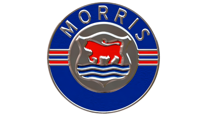
Morris Motors Limited
Morris Motors Limited, a privately owned manufacturing company, is known for its automobiles, which accounted for 42% of the British car industry in 1926. Founded in 1912, the company took its current name in 1919 and used it as a trademark until its closure in 1984. The company was headquartered in Cowley, Oxford, Oxfordshire, and Longbridge, England.
The brand’s original logo was based on the image of a leopard or a marching lion. The choice of this heraldic animal was influenced by the historical heraldry of the place where the brand was founded and by the characteristics of this mythical animal. Its majestic grace, characteristic of the king of beasts, speaks of the brand’s greatness and dignity, of its desire not only to live up to the chosen image but also not to cede any achieved position.
Intermeccanica
The Italian automotive brand Intermeccanica was founded in 1959 by Frank Reisner in Turin as a manufacturer of tuning kits. The brand changed its location during its activity, moving first to the USA and then to Canada. Starting with developing Formula Junior single-seater models, the brand moved on to the small Intermeccanica series, the Puch.
The founder’s passion for heraldry strongly influenced the choice of the brand’s logo. When he chose the heraldic shield as his trademark, he settled on the image of a lion in a protective pose on two hind legs. In this way, the brand confirmed its commitment to always protect its interests and the interests of the owners of the equipment created, ensuring safety. A strong and proud animal, the king of beasts, was the best way to demonstrate the brand’s advantages and characteristics.
Wiesmann
The German automobile manufacturing company Wiesmann, founded in 1988 by brothers Martin and Friedhelm Wiesmann in Dülmen, Germany, is famous for the high quality of its hand-built convertibles. The brand is known for its MF 30 roadster, a classic open-top two-seater, and GT MF 4, an enclosed two-seater. In 2014, the company ceased to exist.
Nevertheless, the brand left its mark in automotive history, and its silver metallic gecko is now known worldwide. The choice of this reptile as an element of the brand’s logo was due to its philosophy – to create cars that simply “hold on to the road” even when traveling at high speeds. This property of holding firmly to the surface made the gecko reflect the best characteristics of the premium segment car brand.
