The Scania logo reflects the rich history of the Swedish company, founded in the early 20th century. The brand’s heritage and traditions intertwine remarkably with modernity, as no automobile manufacturer can thrive without progressive technologies.
Scania: Brand overview
In the Swedish town of Södertälje, the Vagnfabriksaktiebolaget i Södertälje (VABIS) was founded in 1891, marking the beginning of Scania’s history. At first, VABIS concentrated on producing railroad wagons, but it quickly broadened its scope to produce automobiles and trucks.
In the meantime, Malmö, Sweden, saw the founding of Maskinfabriksaktiebolaget Scania in 1900. It began with making bicycles and subsequently expanded to include trucks and cars.
1911 saw the merger of VABIS and Scania to become AB Scania-Vabis. Through this merger, the new business was able to leverage the resources and experience of both companies, thus enhancing its position in the market.
The company was actively developing during the 1920s. It concentrated on building buses and trucks, soon gaining a reputation for dependability and effectiveness. The company started exporting its goods to other European nations during this time.
Like many other industrial companies, the manufacturer was compelled to change its focus during World War II to manufacturing military hardware for the Swedish army. The company produced military vehicles such as armored personnel carriers and trucks.
In the 1950s, the manufacturer increased its global footprint and resumed producing civilian vehicles after the war. An important milestone in the company’s worldwide expansion was opening its first plant outside of the United States in Brazil in 1957.
There were many notable technological advancements throughout the 1960s. In 1961, the company pioneered a breakthrough method of truck manufacturing when it unveiled its first series of modular engines. This strategy allowed for more effective production and maintenance of its vehicles.
There was a big structural shift in 1969. Saab AB and the Scania combined to establish Saab-Scania AB. Nonetheless, the brand was still used by the truck and bus industry.
The manufacturer saw significant expansion and innovation during the 1970s and 1980s. The business improved its buses and trucks, emphasizing comfort, safety, and fuel economy. Additionally, the company increased its footprint in Europe by establishing additional facilities and offices.
After Saab and the manufacturer split up in 1995, the company reestablished itself as a stand-alone business and went public on the stock market. This allowed the business to concentrate on its main business, making trucks and buses.
The manufacturer continued its global expansion throughout the 2000s. The business established new production sites globally, particularly in China and Russia. The company made significant investments in the development of greener transportation options at this time, such as alternative fuel-powered trucks.
In 2008, the German carmaker Volkswagen bought a majority stake in the company, making it the manufacturer’s largest stakeholder. This gave the two businesses fresh opportunities to collaborate and share technology.
The 2010s were distinguished by an emphasis on creating environmentally friendly transportation options. The company unveiled several cutting-edge products, such as electric and hybrid buses and trucks, and made a concerted effort to advance autonomous vehicle technology.
In 2014, Volkswagen acquired a 100% share in the manufacturer, turning it into a subsidiary. Despite this, the company maintained its operational autonomy and built its brand.
The corporation invests in developing digital technologies and electric and hydrogen-powered vehicles to improve transportation operations.
Meaning and History
What is Scania?
It is a leading Swedish manufacturer of trucks, buses, and diesel engines for use in the industrial and marine sectors. The brand produces reliable, robust, high-quality vehicles that optimize performance, uptime, and fuel economy. Thanks to the modular product concept that maximizes functionality and cost-effectiveness, customers can customize their vehicles according to their unique needs. The company provides various services to help its customers maximize profitability and operational efficiency, including fleet management, driver training, and maintenance contracts.
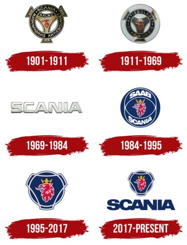
1901 – 1911
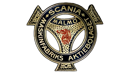
The original logo dates back to the era when Maskinfabriks-Aktiebolaget Scania had not yet merged with Vabis to form the modern Scania automobile manufacturer. This old emblem was the foundation for all subsequent versions, lasting into the 21st century and cementing its place in automotive history.
It is difficult to pinpoint what exactly inspired the logo’s shape: a car steering wheel or a bicycle sprocket system. In 1901, the company produced two-wheeled vehicles and experimented with four-wheeled ones, so the ring connected to the “spinner” could relate to both. The versatile design shows the brand’s connection to both bicycles and automobiles. The outward-pointing ends balance the logo and give it a dynamic feel, creating a sense of reliability and stability.
At the center of the “spinner” is a griffin—a mythical creature with the body of a lion and the head of an eagle. It symbolizes grandeur, vigilance, and strength. In a cultural context, the griffin represents the province of Skåne, as its image was taken from the region’s coat of arms. This shows the company’s pride in its origins.
The griffin’s head looks almost identical to that on the coat of arms: red feathers, an open beak, a long tongue, and an elegant crown. The bright color makes it the most noticeable element of the logo, as everything else is rendered in black and gold. This combination evokes classic elegance. The ring and the three-pronged figure have a metallic texture, simulated with a gradient.
The emblem features many decorative elements: bold dots, ornate patterns, and border lines. These align with the romantic style popular in the early 20th century. Even the depiction of the mythical creature seems special, with thin strokes giving the impression of hand-drawn artistry.
The ring serves as a base for the inscriptions “SCANIA” and “MASKINFABRIKS AKTIEBOLAGET” (the full name of the bicycle and automobile manufacturer). Above the griffin’s head is the word “MALMÖ” (the city where the company’s headquarters were based until 1912). A unified font—a classic grotesque with rounded letter ends—is used for all text parts. Its aesthetic design emphasizes a commitment to traditional values.
1911 – 1969
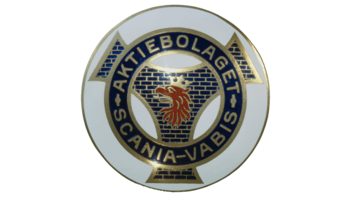
Scania-Vabis, formed in 1911, inherited its logo from Maskinfabriks-aktiebolaget Scania. Designers preserved the emblem’s recognizable shape, which resembles a ring overlaid on a “spinner.” This stylized depiction of a bicycle transmission component serves as a reminder that the brand’s predecessor manufactured bicycles before changing its specialization.
Although the automobile manufacturer’s headquarters moved to the province of Södermanland in 1912, the emblem still features the griffin’s head from Skåne’s coat of arms. This honors Scania’s cultural heritage and maintains a recognizable visual identity, as the old company was well known for its crowned griffin. The mythical creature’s lush red mane and large golden crown exude aristocratic grandeur, reflecting the brand’s pride in its rich history and quality vehicles.
Designers aimed to keep the logo recognizable while adding uniqueness through several details:
- A new dark blue color replaced the black.
- A brickwork pattern instead of the dots that previously surrounded the griffin’s head.
- Simple golden outlines along the edges of the ring and a three-pronged figure.
- A base in the form of a large light gray circle makes the emblem cohesive and complete.
The blue and gold combination creates an atmosphere of luxury and enhances the clarity of the inscription “AKTIEBOLAGET SCANIA-VABIS,” which states the brand’s full name. The font has become more severe and angular to convey the seriousness of the automobile manufacturer.
1969 – 1984
In the late 1960s, the company had to change its logo for two reasons. First, it shortened its name by removing the word “Vabis.” Second, the German corporation Daimler-Benz claimed that Scania’s three-pronged emblem was too similar to the Mercedes symbol, which could cause confusion.
Pressure from the competitor forced the automaker to abandon its old symbol—a stylized bicycle crank. Thus, the colorful logo featuring the griffin’s head was replaced by a simple wordmark in a modern minimalist style.
The bold sans-serif font looks sufficiently technological to represent an automotive brand. Straight lines and sharp angles highlight a focus on detail, while the geometrically precise letter shapes convey strength, confidence, and innovation.
The logo has a metallic texture, giving it a very robust appearance. A silver gradient runs through the entire word—from lighter tones at the top to darker ones at the bottom—creating an illusion of depth. Shadows along the edges of the letters enhance the three-dimensional effect, making the company name clear and striking. Light reflections on the upper edges add realism, reinforcing the impression that the emblem is made of polished metal. This texture emphasizes the company’s connection to modern materials used in automotive manufacturing.
All the letters in the word “SCANIA” are sequentially connected by short horizontal lines, creating a sense of cohesion, continuity, and unity. The merging of letters symbolizes the brand’s reliability and the durability of its machinery. Another reason for this design is practicality: an emblem where all elements are joined together is easier to install on vehicles.
1984 – 1995
This logo was created shortly before the company entered the US market. At that time, it was named Saab-Scania due to its merger with Saab. Designers placed the name in a large blue circle, dividing the words with a pattern of thin white lines that form a cylinder-like shape. The brand’s traditional symbol is at the center of the geometric figure—a red griffin’s head with an open beak, a protruding tongue, and a large golden crown.
The mythical creature combines the qualities of two animals: the eagle and the lion. It inherits strength and keen eyesight from the eagle and from the lion, power and majesty. Culturally, the griffin represents the province of Skåne, where the company was originally based. The circular shape of the emblem also conveys several meanings:
- It is associated with a wheel, as Scania produces vehicles.
- The circle, combined with the curving white lines, creates a sense of motion, highlighting the dynamism of the vehicles.
- It symbolizes the globe, reflecting the company’s long-standing presence in the international market.
The brand name is rendered in a difficult-to-read font, causing the letters in the words to blend and curve in various directions. On one hand, this style hampers the visual clarity of the logo; on the other, it makes the logo distinctive and memorable.
1995 – 2017
In 1995, the truck and bus division separated from Saab-Scania. The new company was named Scania and adopted the well-known logo featuring the griffin’s head. Designers removed the text and decorative white lines, allowing the central image to be enlarged. The colors became noticeably lighter and brighter, giving the image an optimistic look.
To showcase its rich historical heritage, the brand returned to the traditional emblem shape, combining a circle with a hexagon resembling a three-pointed star. This is a stylized bicycle transmission component, a reminder of the company’s beginnings. The “spinner” protruding edges extend beyond the circle as if trying to embrace it. This design conveys the company’s global presence and effort to encompass all important processes.
The logo became more robust compared to previous versions, which fits Scania’s focus on heavy machinery. The symbol’s geometric shape evokes a sense of reliability, durability, and stability—qualities especially important for a manufacturer of buses and trucks.
The circle remained blue but adopted a richer shade, which pairs well with the silver outlines, the crimson griffin’s head, and the bright golden crown. This color combination adds boldness and regality to the brand, highlighting its great ambitions.
2017 – today
The 2017 redesign helped the company express individuality, as the new logo prominently features the large inscription “SCANIA.” It is rendered in a bold sans-serif font that appears cluttered due to the narrow spacing between the letters. The glyphs touch each other, creating a sense of sequence, cohesion, and unity.
Straight lines and sharp angles give the logo an industrial and technological look, while smooth curves maintain visual balance. However, this style has a downside: The condensed font makes the brand name difficult to read.
Next to the inscription is the traditional Scania symbol: a blue circle overlaid with a spinner-shaped figure. This element refers to the distant era when the company manufactured bicycles long before becoming a globally renowned vehicle and diesel engine producer.
The stylized bicycle transmission component pays homage to the brand’s historical heritage, while the griffin’s head represents authenticity. The griffin, taken from the coat of arms of Skåne province, signifies the company’s pride in its Swedish origins.
The golden crown continues to symbolize the high quality of Scania’s products, and the predatory profile of the half-lion, half-eagle griffin conveys a sense of grandeur and strength. The red color demonstrates its powerful energy, while the thin silver lines highlight each contour of the mane, creating an illusion of lightness.
