


![]() Toyota Logo PNG
Toyota Logo PNG
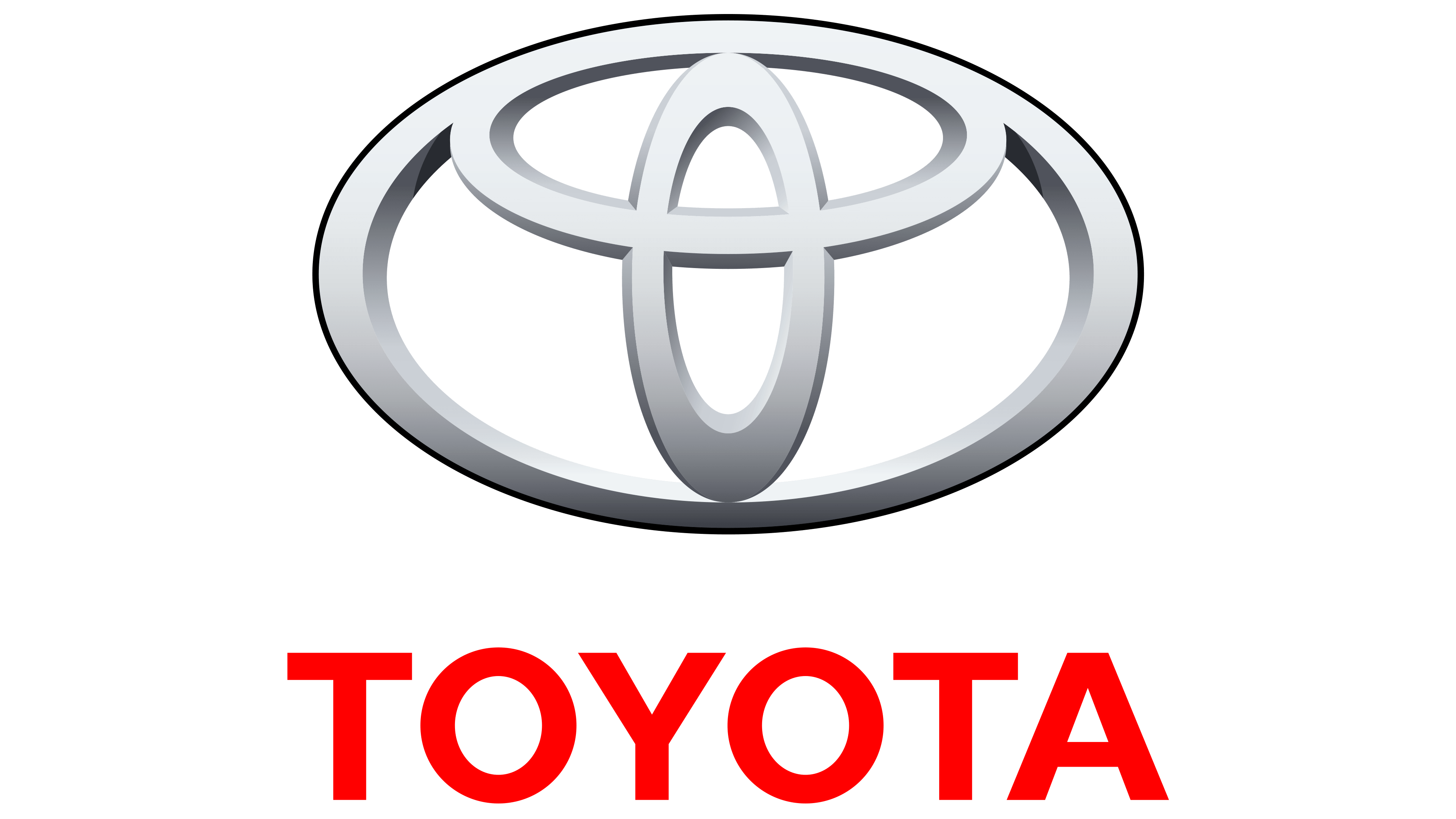
The Toyota logo features a distinctly Eastern approach to visualizing its meaning. A large oval symbolizes the brand’s life space; the perpendicular line represents the brand’s heart and the mutual trust between the brand and the customer; the negative space represents core values.
The history of Toyota began in the textile industry. In 1926, Sakichi Toyoda founded Toyoda Automatic Loom Works after developing automated looms. In 1929, he sold the patent rights to Platt Brothers for 100,000 pounds, directing the proceeds toward automotive research led by his son, Kiichiro Toyoda.
In 1933, an automotive division was formed. Early prototypes drew from Chevrolet and Chrysler designs. By 1935, the Model A1 was built, followed by the Model AA in 1936. In 1937, Toyota Motor Co. became an independent company, adopting a revised name for linguistic and symbolic reasons.
During World War II, production shifted to military trucks. By 1950, financial pressure and labor disputes pushed the company to the brink of collapse. Kiichiro Toyoda resigned, while bank loans and demand during the Korean War stabilized operations.
In the postwar period, Taiichi Ohno developed the Toyota Production System, focused on eliminating waste and controlling quality. In 1957, Toyota entered the US market with the Toyopet Crown, but withdrew after weak performance. It returned in 1965 with improved models.
The 1973 oil crisis increased demand for efficient cars. The Corolla, introduced in 1966, became a global bestseller. By 1975, Toyota surpassed Volkswagen as the largest importer in the US.
In 1980, a joint plant with General Motors opened in California. In 1989, Toyota launched Lexus to compete with Mercedes-Benz and BMW.
In 1997, the Prius introduced mass-produced hybrid technology. By 2007–2008, Toyota briefly overtook General Motors in global sales.
Meaning and History
![]()
The famous Toyota logo, consisting of three ovals, appeared in 1989. Before this, wordmarks were used to denote the brand.
What is Toyota?
Toyota is the flagship brand of Toyota Motor Corporation, the world’s largest car manufacturer. The company was founded in Japan in 1937 and is now part of the Toyota Group conglomerate. Its range includes crossovers, SUVs, pickups, buses, and luxury cars. The most famous models are hybrid electric vehicles.
1935 – 1949
![]()
Initially, the company was named Toyoda after Sakichi Toyoda. This word became the central element of the logo. It was depicted inside a rectangle with truncated corners, which, in turn, was in the center of an octagon. To make the inscription readable, designers chose a bold sans-serif font and used red Latin letters. The debut emblem is found on the company’s early cars.
1949 – 1989
![]()
The manufacturer held an open contest for the best logo design. The winning entry contained Japanese characters representing Sakichi Toyoda. They were set against a red circle with a double contour.
It was then that the company changed its name to Toyota. The owners decided that the muted consonant “t” sounded better than the ringing “e.” Moreover, the word “Toyota,” written in katakana, consists of eight strokes (so-called Jikaku), and the number eight is considered lucky in Japan. Another reason for the rebranding was the small company’s expansion into a corporate enterprise.
1958 – 1969
![]()
In 1958, designers removed geometric shapes from the emblem and added an English inscription. The result was a concise trademark: the black word “Toyota” on a white background. The strokes of the letters are unevenly thick. The ends have narrow, long serifs.
1969 – 1978
![]()
The new logo is a little different from the previous one. Designers changed the font, preferring the classic Helvetica. Straight lines, clear geometric shapes, and the absence of serifs characterize it. Meanwhile, the printed symbols in the word are so close together that the letter “Y” literally presses against the two “O”s on the sides.
1978 – today
![]()
In 1978, the inscription became more legible by increasing the spacing between the letters. Red replaced black.
1989 – today
![]()
In the late 1980s, the company introduced a logo with a trademark symbol of three ovals. It was timed to coincide with Toyota’s 50th anniversary, but brand managers began developing it five years earlier. In 2004, designers modernized the image, presenting the ovals in a silver metallic finish. Shadows, highlights, contours, and gradients are used to achieve a 3D effect.
The trademark has become so well-known that private automaker Zhejiang Geely Holding Group Co stole it. In 2003, it used the so-called “Fun Logo,” which looked like the registered Toyota trademark. However, the court decided otherwise and found no signs of unfair competition. The case was closed at the end of 2003. Geely changed its corporate symbol but did not acknowledge the obvious resemblance.
2010 – 2019 (United States)
![]()
In 2010, the logo with silver ovals began to be used to promote the Toyota brand. Designers retained the structure of the previous version but recolored the figures, adding a bit of shine. Thus, they imitated a metal badge adorning car hoods. To achieve the desired texture, developers experimented with color. They made the gradient uneven: the central part of the emblem was light, and the edges darkened. The side edges of the ovals were also dark gray, creating a 3D effect. The silver palette emphasized perfection and sophistication.
As for the inscription “TOYOTA,” its placement, scale, and shape remained unchanged. The letters remained uppercase, bold, and still sans-serif. The only change was the color. It acquired a burgundy shade.
2019 – today (United States)
![]()
In 2019, the composition of three ovals became entirely white, ending with a large red square. In the Toyota branding guidelines, this element is called the “stage platform.” For the border design, the designers chose the company’s corporate color, Toyota Red (#EB0A1E). It symbolizes a spirited disposition, a thirst for speed, and a passion for cars. The geometric shapes inside the quadrangle are perfectly white (#FFFFFF). This is an example of negative space, where an object is formed by an empty area, visible through contrast. This version is still used in the USA.
In the horizontal logo configuration, the word “TOYOTA” is positioned to the right of the square. Developers retained the traditional bold sans-serif font, leaving the letters uppercase but recoloring them black (#000000). Bright, saturated colors distinguish the American version of the emblem from the European one, which features only dark gray (#58595B) ovals.
2020 – today (Europe)
![]()
This is a flat two-dimensional version. The name of the automotive company is omitted only the graphic sign is used. The brand name is encoded in three ovals of different sizes. The geometric shapes are arranged so that all the letters are visible. Small horizontal and vertical ovals form the letter “T.” The letter “Y” is also clearly visible in them. There is also the letter “A” with a crossbar in the middle. Both letters, “O,” are readable in all ovals. The red square and textual trademark designation are absent, as the developers focused on monochrome, resulting in a black-and-white palette. The first is the Toyota logo; the second is the background.
Font and Colors
The emblem contains three ovals arranged symmetrically. Two small perpendicular ellipses symbolize the heart of Toyota and the heart of the customer. The points of their intersection symbolize trust and mutually beneficial cooperation. The connected geometric figures resemble the letter “T,” the first letter of the manufacturer’s name. Moreover, they represent a steering wheel.
The large oval denotes the life space encompassed by Toyota. The voids to the left and right of the letter “T” represent the brand’s core values: integrity, innovation, quality, and responsibility. The uneven thickness of the lines hints at a Japanese brush.
The famous logo first appeared on the luxury sedan Celsior. Then, it “migrated” to other vehicles located on the rear wall of the trunk. But the front panel is not empty: each model has its distinctive sign. For example, Lexus uses the letter “L” inside a circle.
During the period when Toyoda changed its name to Toyota, the company revised its spelling. In the debut version, a classic serif font is used. Since 1969, a smooth sans-serif font has been used in a maximally simple design. Minimalism is also evident in the color palette, where red predominates. But it was used only at the beginning; at other times, the logo was black.
FAQ
What is the hidden meaning of the Toyota logo?
Toyota invests hidden meaning in its logo. According to the official version, the large oval symbolizes the company’s life space, and the space inside it represents its core values, such as responsibility, quality, and innovation. The perpendicular ellipses resemble a steering wheel but represent the heart of Toyota and the heart of the customer. Their interconnection testifies to trust.
What does the Toyota symbol mean?
The brand name is encoded in three ovals of different sizes. But that’s not the only meaning of the symbol. The two inner ovals represent the intersection of hearts, one belonging to Toyota and the other to the company’s customers. The points of their connection symbolize trust. At the same time, the perpendicular figures remind one of a car’s steering wheel.
Why has the Toyota logo become what it is?
The current Toyota symbol was part of a logo created in 1989 to commemorate the company’s 50th anniversary. Designers removed the brand name, leaving only one graphic element. Perhaps the automaker decided that this sign was popular enough and no longer needed a signature.
What letters are hidden in the Toyota logo?
The most obvious letter hidden in the Toyota logo is the capital “T.” Two intersecting ellipses form it. The letter “O” is also easily recognizable: it is denoted by a vertical circle. The letter “Y” has a common base with the letter “T” and differs from it only by the upward protruding “horns.” The sides of the vertical ellipse and the horizontal line connecting them denote the letter “A.”