


![]() Porsche Logo PNG
Porsche Logo PNG
Reliable and strong, as if forged from metal, cars are personified by the Porsche logo. Inside the cab, the driver is well-protected. The car will easily overcome any obstacles on the road. The emblem guarantees a quality assembly from the finest parts.
Porsche is a German car brand founded in 1931 by Ferdinand Porsche in Stuttgart. The company began as Dr. Ing. h.c. F. Porsche GmbH is an engineering office that designed vehicles for other manufacturers. From 1934 to 1938, Ferdinand Porsche worked on the Volkswagen Beetle project, commissioned by the German government.
During World War II, the company was involved in military engineering, including work related to the Tiger tank. In 1948, Ferry Porsche, Ferdinand’s son, introduced the first Porsche car, the 356, built with Volkswagen parts. The 356 helped the brand gain recognition in the 1950s through sports car production and racing results.
In 1963, Porsche introduced the 911, a model that became the core of its identity and one of the most recognized sports cars in the world. The 1960s and 1970s brought major racing success, including victories at Le Mans with cars such as the 917 and 956. In 1972, Porsche became a joint-stock company, reflecting its growth beyond a family engineering business.
During the 1980s, models such as the 944 and 928 expanded the lineup, though the company faced financial pressure in the early 1990s. The Boxster, launched in 1996, helped stabilize the business, while the Cayenne SUV, introduced in 2002, opened a major new revenue stream. In 2009, Porsche became part of Volkswagen AG after a complex corporate struggle. In 2019, the Taycan became Porsche’s first fully electric production car, marking a new phase in the brand’s history.
Meaning and History
![]()
The Porsche emblem contrasts tradition and innovation. It represents the brand as exclusive, powerful, and stylish. The founder drew on the historical heritage of the lands where the trademark appeared, making it a legendary sign.
The automaker used the coat of arms of the Free People’s State of Württemberg as part of its visual identity to better convey its roots, since Stuttgart was a central city. The state coat of arms was adopted in 1922 and featured two deer. Now, branched horns remind them of them. Also, the local lands were famous for horse breeding, and the first factory appeared on the stable site, so a reared horse was featured on the logo. The coat of arms of Stuttgart, with a black horse on a yellow background, was adopted in 1938.
The original Porsche emblem was first introduced in the second half of 1952. It was located in the center of the steering wheel of the 356 Pre-A. The brand identity has remained the same from launch to the present. After all, it has everything that a car brand needs: grace, uniqueness, and brightness.
What is Porsche?
This famous German luxury sports car manufacturer grew from a modest family business into a globally renowned brand. Headquartered in Stuttgart, the company is renowned for combining technical performance with classic design, and the distinctive profile of the 911 model has become a symbol of automotive excellence. It is one of the most successful and sought-after car manufacturers in the world, producing a broad range of high-performance vehicles, including its flagship sports cars, while staying true to its core values of engineering precision and exhilarating driving.
1922 – 1938
![]()
The original emblem shows two deer standing on their hind legs to the shield’s right and left. The animals look in opposite directions and lean on the central element. They have powerful horns in several branches, which speak of unsurpassed strength and a desire to compete. These qualities are extremely important for Porsche because the company produces passenger and sports cars, where speed, endurance, and swiftness are valued.
The shield depicts black and red stripes, echoing the flag and the deer’s antlers, three in each of the two sectors. Wide lines occupy two more parts and are staggered. Both the shield and the deer are on sharp, elongated elements resembling horn fragments.
1938 – 1948
![]()
On the logo of those years, a restive horse flaunts, rearing up. It is painted black and contrasts well with the yellow background. The heraldic shield is also taken as a basis. Inside, the animal’s figure is made of yellow, thin, barely noticeable lines that form the body’s contours. The mane flutters freely, and the tail is slightly trimmed on the right so it does not go beyond the frame.
1948 – 1952
![]()
A heraldic shield again represents the emblem, but narrower than the previous version. He repeats the first version almost verbatim. The only difference is the absence of double edging along the edge and the thinner antlers on the bright yellow segments. The remaining parts are traditionally occupied by alternating black and red stripes.
1952 – 1963
![]()
When Porsche first introduced its emblem, it combined the previous two symbols, the heraldic and horse shields. The designers tried to preserve the famous traditions and emphasize the historical roots. They used the authentic coats of arms of the Free People’s State of Württemberg and the City of Stuttgart to do this. This is how the modern car logo evolved from local heraldry.
The authors superimposed one emblem onto another, placing the horse-bearing sign at the center of an older coat of arms composed of four fragments, with six-pointed horns and eight stripes. An innovation was the upper inscriptions on the billboards: on the small one, “Stuttgart,” and on the large one, “Porsche.”
1963 – 1994
![]()
In 1963, the company introduced the 911 sports car, later named one of the most influential cars of the 20th century. Porsche refined its logo to closely resemble its modern version, marking the beginning of a new era in sports cars and celebrating its grand achievements in auto racing.
- The top band with the brand name was arched, making the shield appear more streamlined and evoking a sense of speed.
- The bottom was given a sharp point, which required shortening the deer antlers. The sharp angle emphasizes the power and competitive spirit of the sports cars.
- The Stuttgart coat of arms in the center was flattened to make more room for other elements.
- Designers made the black horse more elegant by adding a flowing mane and separating some details with lines of different colors. This visual lightness highlights the company’s dynamism and the agility of its cars.
Yellow was replaced with gold, a symbol of prestige, luxury, and high status. It shines brightly, highlighting the engraved letters and creating a three-dimensional effect. This design makes the automaker’s name appear stylish and solemn, drawing attention to its products.
The logo appears convex because the central part has a light gradient, while the shield’s outer frame is painted in a dark shade. Some sections feature a textured surface with raised dots, creating a rough effect. This unique style is associated with the innovations and modern technologies that Porsche employs in car manufacturing.
1994 – 2014
![]()
After the redesign based on the previous logo, its modernized version appeared. It came in handy since the brand offered progressive products that required a logo reflecting the times and high technologies. The result of the design searches was a shield narrowed at the bottom, featuring 3D elements. Instead of yellow, gold appeared. The black horse has acquired graceful features. Burgundy ones replace the bright red stripes. The central shield has been trimmed as a thin black line. The upper part of the large shield is now arched.
2014 – 2023
![]()
Like the brand’s cars, the new Porsche logo exudes luxury and prestige. Its refined design reflects innovation and a commitment to the highest quality, emphasized by clean lines and a harmonious color combination. The shield’s smooth shape, rounded top, and pointed bottom convey the brand’s dynamic spirit.
The creators achieved a three-dimensional effect by using a variety of textures.
- The central part and contours are adorned with a gradient, evoking the metallic shine of luxury cars.
- The gold and red sections feature a rough surface formed by numerous raised dots.
- The black elements stand out due to their matte texture. Narrow outlines around the letters and deer antlers give them a three-dimensional appearance.
This style demonstrates the company’s focus on technological innovation and modern design, aiming to make its cars the best in their segment. The smooth shapes and contrasting colors evoke a sense of movement, reflecting the dynamism of Porsche sports cars. The horse depicted in the center, once the state symbol of Stuttgart, now represents unyielding energy.
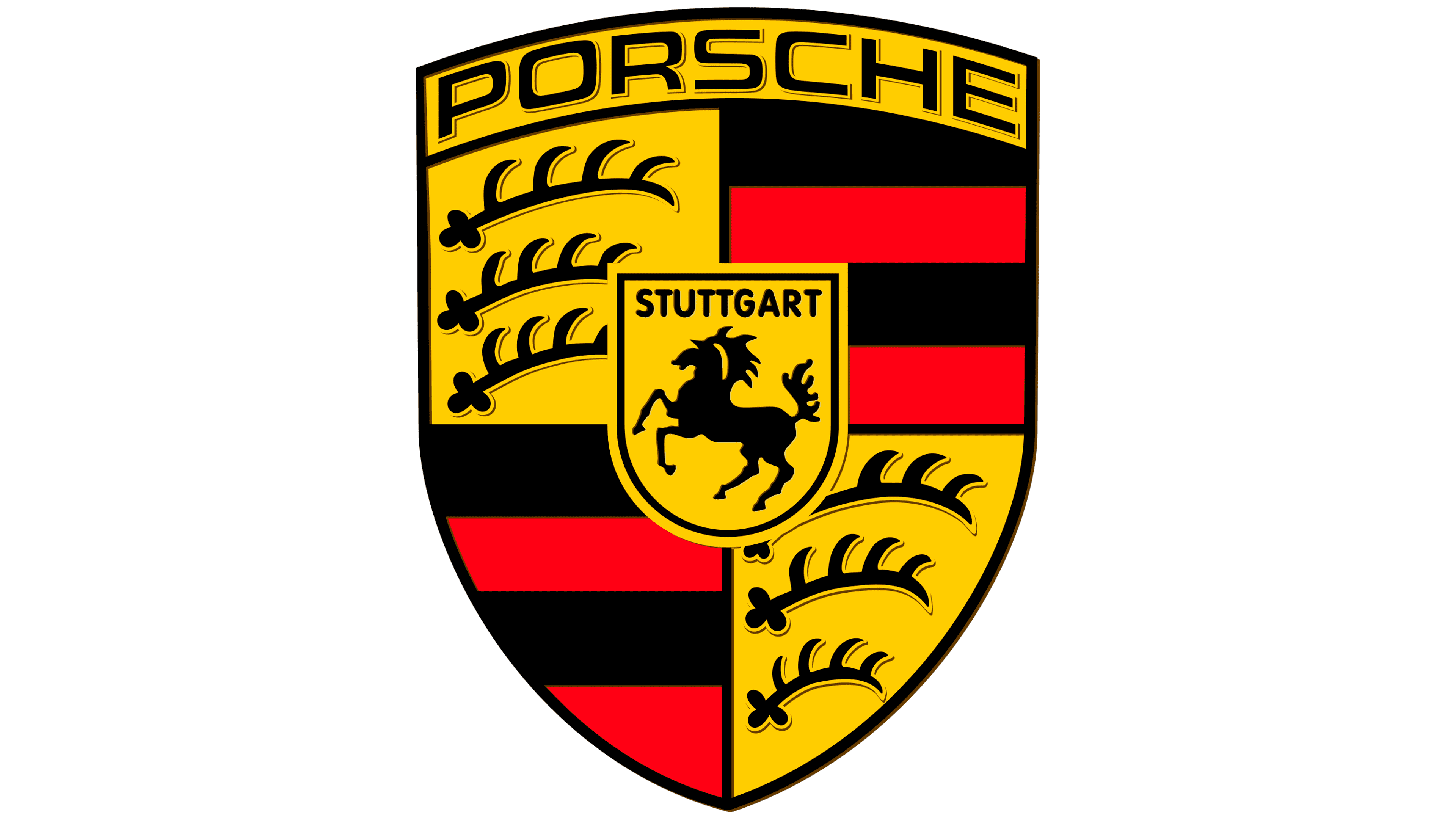
2023 – today
![]()
While the historic emblem maintains its instant recognition, keen observers will notice a few subtle changes that add a contemporary flair to the timeless design.
One of the first changes you’ll notice is the expertly smoothed bronze knurling of the crest. This refined texture allows the iconic “PORSCHE” lettering to take center stage, proudly emblazoned across the badge. The lettering maintains the brand’s distinctive font, exuding elegance and power.
As your eyes travel towards the center of the badge, you’ll be greeted by the city name “STUTTGART,” now written in bold black. This change pays homage to Porsche’s roots in the vibrant city of Stuttgart, Germany. The prominent display of “STUTTGART” reinforces the brand’s heritage and pays homage to the birthplace of the Porsche legend.
The updated crest features red striping and a captivating honeycomb pattern reminiscent of a carbon-fiber weave. This pattern infuses the badge with a contemporary edge, reflecting Porsche’s commitment to innovation and cutting-edge technology. The juxtaposition of the classic red striping with the modern honeycomb pattern creates a harmonious blend of tradition and progress.
The updated Porsche crest badge represents the brand’s dedication to evolution while staying true to its iconic heritage. By carefully refining the design elements, Porsche has successfully balanced the past and the future. The updated badge captures the essence of the brand’s legacy, symbolizing performance, craftsmanship, and timeless elegance.
Porsche enthusiasts and automotive connoisseurs alike will appreciate the attention to detail and the thoughtful design choices that have gone into the updated crest badge. It is a visual testament to Porsche’s commitment to excellence and relentless pursuit of automotive perfection.
Font and Colors
The developers used two heraldic symbols in the emblem to avoid immediately losing authenticity. Moreover, there are two versions of its origin. According to one account, the icon’s author is the engineer Franz Xaver Reimspiess, while another account attributes it to Ferdinand Porsche himself. He sketched the logo on a napkin, and then Erwin Komenda from the design department made the final drawing from the sketch. Both assumptions are considered official and cited in various reputable sources.
The text in the logo first appeared in 1952. These were two geographic indications that were critical to the automotive brand. The word “Stuttgart” was on the inside, “Porsche” was on the outside. They were executed grotesquely and placed in the upper register. The modern emblem uses a different typeface: “Stuttgart” is set in tightly grouped, thin black letters, and “Porsche” in wide, light letters with a free arrangement. The color scheme traditionally includes black, red, gold, or yellow.
FAQ
What animal is on the Porsche logo?
There is a prancing horse in the center of the Porsche logo. The deer is also partially present: its antlers are inside the shield.
Does Ferrari make Porsche?
The German brand Porsche is not related to the Italian company Ferrari. Porsche’s cars are produced in cooperation with Volkswagen Aktiengesellschaft.
What is the Porsche badge made of?
The base of the Porsche badge is a rectangular shield with a sharp base. The brand name is written at the top, and antlers and a pattern of red-and-black vertical stripes are shown below. In the center is a shield with the inscription STUTTGART and a prancing horse.
How many antlers are on the Porsche crest?
The Porsche Crest features six horns.