The Ferrari emblem, an emblem of the Italian sports car manufacturer Ferrari, has existed since 1947 as a tribute to an Italian ace of World War I. The emblem symbolizes the brand’s nationality, style, elegance, and the elitism of its products.
Ferrari: Brand overview
Meaning and History
The logo of this company has always been adorned with a prancing horse rearing on its hind legs. This is how it is known in all countries of the world. The image of the emblem appeared long before the company itself – around 1929 when entrepreneur Ferrari opened a small enterprise. This very enterprise served as the foundation for the future automotive giant.
The owner used the image of a rampant horse as the primary sign —a symbol of power, unbridled strength, and speed. The brand’s yellow and black palette reinforces the hidden emotional tension.
But the first on the emblem was drawn Count Francesco Baracca – a military aviator, hero, and veteran of World War I, who was an idol for millions of Italians. Among his fans was Enzo Ferrari. In the summer of 1923, he met his mother, Countess Paolina. Paolina asked him to base the emblem on an image of a rearing horse, which symbolizes luck and triumph. The future automotive magnate kept a photograph of Baracca with a commemorative inscription from his parents for a long time.
Several years later, he used the image of the galloping horse for his company’s logo. Initially, the image was applied to the hoods of cars. But then it was supplemented with yellow – a shade symbolizing Enzo Ferrari’s hometown, Modena, in the Emilia-Romagna province.
What is Ferrari?
Luxury Ferrari sports cars are known worldwide. The first car under this brand was released in 1947. The brand’s head company is Ferrari N.V., and the main owner is the Dutch Exor N.V. It owns about 23% of the shares. Another 10% is in the hands of Piero Ferrari, and the rest of the shares are freely traded on the market.
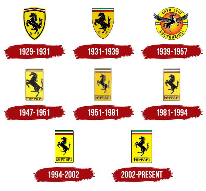
1929 – 1931
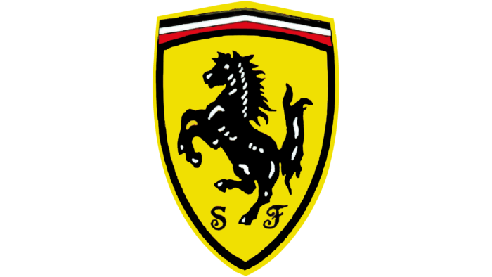
The debut version is immediately associated with horsepower, which measures the power of a car’s engine. The logo depicts a spirited horse: calm, physically developed, and ready to race forward. The black horse with white highlights is depicted on a yellow background.
In addition, its image evolved from stocky to refined. This is related to the concept’s expansion: if in the first versions, the animal emphasized the meaning of “motor horsepower,” later, it began to be associated with the winged Pegasus. The classic shield has a double border (black-yellow), a triple red-white-black stripe at the top, and italic letters “S” and “F” at the bottom.
1931 – 1939
The debut logo consists of a sun shield with a black horse, to the right and left of which are the letters “S” and “F.” They are written in thin italics in uppercase and stand for “Scuderia Ferrari.” At the top are three stripes of the Italian flag’s colors.
This emblem was first used in 1932 on cars participating in the Grand Prix in Spa. Since then, it has always accompanied the brand’s products and was automatically approved as Ferrari’s main symbol. The emblem’s history includes several key dates.
1939 – 1957
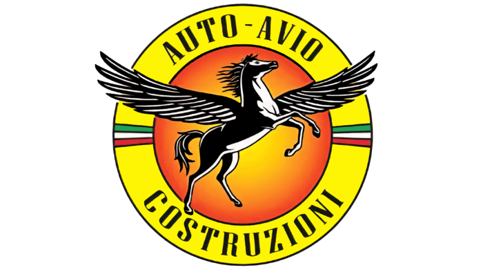
This is the only Ferrari emblem in which the horse is depicted at an unusual angle and looks not to the left but to the right. In this interpretation, it’s not entirely black—artists added many white highlights to make its silhouette voluminous. The animal also has large wings with intricately detailed bird feathers. They are widely spread, implying that the rearing horse is about to take flight.
The main symbol of Ferrari is set against a yellow-orange circle with a radial gradient, going from a light center to dark, almost red edges. The circle is enclosed in a yellow ring with thin black lines on both sides. The tips of Pegasus’s wings extend beyond the frame and intersect the inscription “AUTO-AVIO COSTRUZIONI.” The first two words are at the top and are arranged in an arc, while the third is at the bottom and curved in the opposite direction, resembling a horseshoe. To the right and left are three stripes, each executed in the colors of the Italian flag.
1947 – 1951
In 1947, the first version of the rectangular Ferrari logo with rounded corners appeared. It replaced the traditional triangular shields. The base is still yellow but with a pale shade. The black horse is turned to the left and enlarged for increased space. One leg stands on a long strip that continues the upper horizontal stroke of the letter “F.” The other glyphs are located below this line and are written in a bold serif font. Above the animal’s head waves the Italian tricolor. All elements are outlined in gold.
1951 – 1981
In 1951, the horse’s silhouette was reduced to no longer touch the lower inscription. The base acquired the shape of a classic vertical rectangle and became a saturated yellow color. The colored stripes at the top also became rectangles but were oriented horizontally.
1981 – 1994
After the redesign, the horse’s appearance changed: its body became visually heavy, and the expressive muscle relief disappeared. The frame around the rectangle has a silver gradient, while the other colors of the Ferrari logo changed in intensity and shade.
1994 – 2002
This year marked the company’s official appearance in its modern format. As its distinctive sign, it took the image of an unrestrained black horse standing on its hind legs. The central element is placed on a bright yellow background.
Above it are three thin lines—green, white, and red—conveying a direct connection with Italy. Below is the brand name, executed in an original serif font. The top of the capital letter “F” is extended as a solid line and stretches over the word to the flattened dot on the “i.” The italic letters “S” and “F” have disappeared.
2002 – today
This is the second most significant period in the brand’s history. That’s when a redesign was carried out. It concerned minor details: colors and some lines. Thus, the sun-yellow field acquired a saturated shade, and the colors at the top merged – their dividing line was removed.
The drawing of the horse also changed: it now looks much more powerful. Moreover, the horse’s right front leg is depicted slightly higher than the original, so the left leg no longer covers it.
Ferrari: Interesting Facts
Ferrari is a famous car brand known for being fast, fancy, and good at making cars.
- How Ferrari Started: Enzo Ferrari started the company in 1939 in Italy. At first, they didn’t make cars for regular driving; they only made race cars. The very first Ferrari car came out in 1947.
- The Horse Logo: The logo with a horse resembling jumping comes from an Italian pilot named Francesco Baracca. Enzo Ferrari put this horse on his car because Baracca’s mom said it would bring good luck.
- Racing Wins: Ferrari is super good at Formula 1 racing. They’ve won lots of championships, more than any other team. Their first big win was in 1951.
- Making Cars Rare: Ferrari doesn’t make too many cars. They do this purposefully so that everyone wants one because they’re hard to get.
- Cool Tech and Design: Ferraris look amazing and drive well because they use some of the best technology from their racing cars.
- A Very Expensive Ferrari: The most money ever paid for a Ferrari at an auction was $48.4 million for a 1962 model. This car is loved because it’s rare, looks beautiful, and has a great racing history.
- Custom Ferraris: People can make their Ferraris special by choosing different colors, materials, and more. This way, no two Ferraris are the same.
- Ferrari Theme Park: There’s a place called Ferrari World in Abu Dhabi. It opened in 2010 and has the fastest roller coaster in the world. It’s like you’re driving a Formula 1 car!
- Red Ferraris: Lots of Ferraris are red (about 45% of them). This color is a big deal for Ferrari because it’s Italy’s racing color.
- Helping Others: Ferrari also helps needy people by donating money and doing charity auctions.
People love Ferrari because their cars are more than just vehicles; they’re a mix of top-notch engineering, beautiful design, and car magic that makes them stand out.
Font and Colors
Ferrari’s main colors are black (the prancing horse, the distinctive mark of Francesco Baracca’s plane) and gold (the palette of Enzo’s hometown—Modena). They have always been present on the company’s logo and never disappeared, and if they underwent any changes, they were minor. The dark silhouette of the horse looks very effective against the contrasting light background. The national colors of Italy are constant and located at the top of the emblem.
According to the author’s idea, such a palette conveys prestige, power, beauty, and the dominating position of the automotive brand in the industry. The font used for the name is individualized in classic writing – with uppercase and lowercase letters. Moreover, all three letters “r” in the word “Ferrari” repeat the features of a horse standing on its hind legs.
In the first version, the text is highlighted in italics; the letters are uppercase and mimic handwriting. In 1947, the designers changed the font, introducing the company’s full name. Since then, the word has been written in an individual style: “F” has an elongated top line, and “r” resembles a rearing horse.
The black horse is the central element of all logos, demonstrating readiness to rush forward at any moment. Another unchanging detail of the emblem is the three lines of the Italian flag (red, white, green). On the yellow background, the dark horse stands out more effectively. Moreover, this shade symbolizes Enzo Ferrari’s small hometown, Modena.
FAQ
What is the hidden meaning of the Ferrari logo?
The horse is a symbol of strength, endurance, and speed. These qualities characterize Ferrari cars from the best side. In addition, thoroughbred horses are equated to elite ownership, similar to luxurious sports cars. The black color was initially used as a sign of mourning for pilot Francesco Baracca, from whom the company borrowed the horse logo. The yellow color is a tribute to Modena, Enzo Ferrari’s hometown.
What is the emblem of Ferrari?
The Ferrari emblem is a rectangular yellow shield with rounded sides and a black outline. At the top are three horizontal lines: green, white, and red. Below them is depicted a black horse. The company’s name is written even further down, for which designers used a bold serif font. The most noticeable design element is the long stripe from the top stroke of the letter “F.”
Why does Ferrari have a horse logo?
Enzo Ferrari stated that he began using the horse emblem at the parents’ request of the deceased pilot, Francesco Baracca. The fuselage of his plane was adorned with a similar drawing but in red color. The ace’s relatives promised that this symbol would bring luck to the racing team.
Where did Ferrari get its logo?
According to Enzo Ferrari, he met the parents of World War I hero Francesco Baracca, and they kindly offered him to use the emblem from their son’s plane. Thus, the sign depicted on the plane’s fuselage became the automotive company’s emblem. Where Francesco himself got it from is unknown.
What does the Ferrari emblem represent?
The Ferrari emblem consists of several elements. In the center is a gracefully prancing black horse. Underneath it is the brand name, written in bold letters with serifs. Above the animal’s head are three horizontal stripes in the colors of the Italian tricolor: green, white, and red. The base of the logo is a large yellow rectangle with rounded corners.
Why did Ferrari choose its logo?
Enzo Ferrari himself chose the emblem of the automotive company. He decided to immortalize the memory of pilot Francesco Baracca, so he based it on the image of a prancing horse on his plane’s fuselage. The ace’s parents offered to use this sign. Of course, Enzo slightly modified it, adding additional elements and a base in the form of a yellow heraldic shield.
