Wherever your journey takes you, the Renault logo shows that Renault is the best traveling companion. The cars of this brand are reliable and are able to withstand long journeys easy uphill and off-road driving.
Renault: Brand overview
Renault (full name Renault Group or Renault SA) is a world-renowned automobile manufacturer from France. It entered the market in 1899. Its founders are the Renault family – brothers Louis, Marcel, and Fernand. Today, the company is part of the Renault-Nissan alliance.
Meaning and History
Although it is officially believed that the automobile company came into existence in 1899, the first car was designed back in 1897 and then sold to a family friend. It was after this that engineer Louis Renault started his own business, Societe Renault Freres.
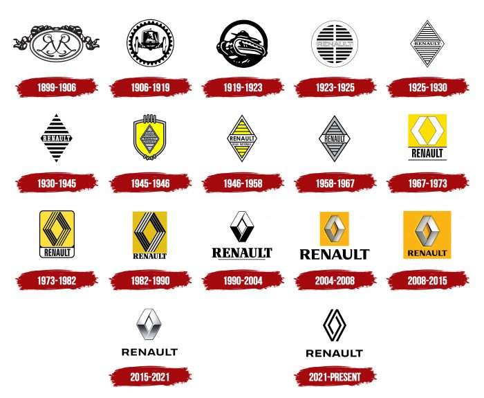
The first emblem was adopted in 1899, right after the brand was registered. For more than a century of history, it has undergone many transformations. As a result, the emblem has been widely recognized throughout the world. It acquired its famous diamond shape during the redesign in the second half of the twentieth century and kept it forever. In total, there are 18 emblems in the career of the automobile giant.
What is Renault?
It is a car manufacturer from France, officially registered under the name Renault S.A., but in the international market, it is better known as Groupe Renault. Its history began in 1899 when the Renault brothers started producing four-wheeled cars. Now, the company owns a wide range of cars, including the Duster, Logan, Kangoo II, Clio V, etc.
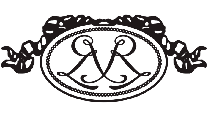
1899 – 1906
The debut sign of visual identification is an exquisite example of its time. It takes the form of an oval medallion with a monogram on the inside. The first letters of the surname and first names of the brothers – Louis, Marcel, and Fernand Renault – are encrypted in an elegant interweaving of handwritten symbols. The horizontally elongated ellipse is decorated with a ribbon.
1906 – 1919
The second logo is made in a purely masculine style. It is an image of a car of that time, enclosed in a round frame in the form of a gear. On the outside, there is a solid, thin line.
1919 – 1923
During the First World War, the company retrained for the production of military equipment, so the image of a powerful tank was chosen as the logo. Its tracks extend beyond the circle bordered by a wide stripe.
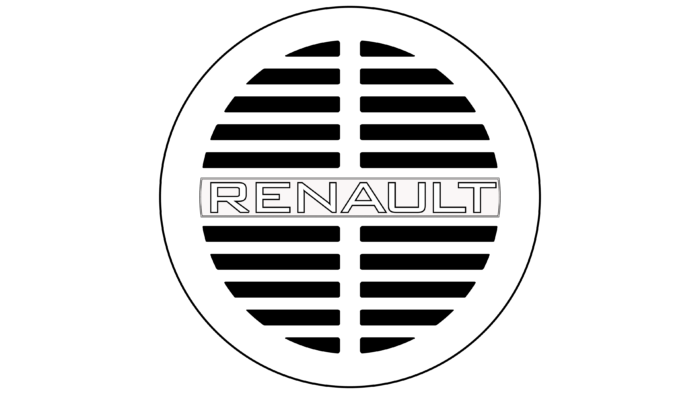
1923 – 1925
In 1923, the name first appeared in the emblem of the automobile company, which took center stage. It is arranged horizontally and appears as a frontal imprint on the radiator grille of the car. The emblem has a circular shape and consists of 20 short strokes of equal thickness enclosed in a thin line.
1925 – 1930
After the redesign, the logo changed significantly – it became a rhombus. This geometric figure has survived to this day. The developers replaced the grotesque with a serif font and placed the name on an improvised plate with two screws on the edges.
1930 – 1945
The rhombus stripes became wider, the bezel disappeared, and the letters took on an elongated shape.
1945 – 1946
During this period, designers placed the rhombus on a yellow shield with a wide gray border. The inner element with the French inscription “Regie Nationale Renault France” is also painted in gray. The shield also has vertical strokes – four at the top and four at the bottom.
1946 – 1958
The designers fixed the yellow color to the company, making it the corporate color, and reapplied it. But this time, they removed the shield and the word “France,” placed the lettering on a white background, and added a double border to the rhombus.
1958 – 1967
This period used an emblem with thinly sliced lettering on a white background. The rest of the details were painted gray. The number of stripes was reduced to six – three at the top and three at the bottom.
1967 – 1973
In 1967, Renault introduced an updated rhombus design consisting of two wide triangular markers placed opposite each other. However, Kent sued because its logo also featured a similar rhombus rotated 90 degrees.
1973 – 1982
The scandalous emblem was replaced by another variant – proposed by Victor Vasarely. This is also a rhombus but formed by the negative space inside the sixteen stripes – four on each side. The black shape is placed in a yellow rounded rectangle. Below is the name of the stamp.
1982 – 1990
The designer removed the frame of the rectangle, replaced the serif font with a sans serif font, and sharpened the edges of the rhombus to resemble a racing field.
1990 – 2004
Linearity disappeared from the rhombus, leaving only four flat edges. The upper part of the geometric figure is colored white, and the lower part – is black. The inscription is enlarged and emphasized by a thin black line.
2004 – 2008
The developers painted the rhombus in silver color, added a yellow background, and chose a different font for the company name.
2008 – 2015
All items are saved and placed in a large rectangle.
2015 – 2021
The current logo is a gray rhombus with a metallic sheen and a graphite symbol of victory at the bottom – the Latin letter “v.”
In 2018, the anniversary of the car concern was celebrated, so the management decided to respect the traditions and approve the old version of the logo. It resembles the 1925-1971 version and consists of alternating black and white stripes with an inscription in the middle.
2021 – today
The company has unveiled the emblem that is expected to be used on the updated Renault 5 models in 2025. It depicts a diamond-shaped pattern made up of broken lines resembling a labyrinth. The author of this variant is designer Gilles Vidal.
Renault: Interesting Facts
Renault, with a history that’s over a century-long, is known for its creative car designs and major impacts on the car industry, making it a significant name worldwide.
- The Beginning: Founded in 1898 by the Renault brothers, the company sold its first car, the Renault Voiturette 1CV, to a friend after a test drive. This sale marked the start of Renault’s journey.
- Leading with Innovation: Renault has always been at the forefront of car innovation. In 1977, it was the first to introduce a turbo engine in Formula One, changing the sport and the industry.
- Global Partnerships: In 1999, Renault teamed up with Nissan and later Mitsubishi, creating one of the biggest global automotive alliances. This move showed how collaboration could lead to success on a global scale.
- Electric Vehicle Trailblazer: Renault has been a leader in electric vehicles (EVs), with the Renault Zoe becoming one of Europe’s top-selling EVs since its launch in 2012.
- Motorsport Success: Renault has a rich history in motorsport, especially Formula One, winning numerous championships. This success highlights Renault’s engineering expertise.
- Iconic Models: The Renault 4L, introduced in 1961, is one of its most famous models, selling over 8 million units worldwide.
- War Contributions: During both World Wars, Renault played a key role in France’s military efforts by manufacturing ammunition, planes, and vehicles, including the innovative FT-17 tank.
- Bold Designs: Renault is known for its daring designs, such as the Avantime and the Twizy, pushing the boundaries of traditional car design.
- Commitment to Zero Emissions: The Renault-Nissan Alliance aims to lead zero-emission transport, introducing electric models and investing in EV technology.
- A Cultural Icon: Renault is more than a car maker; it symbolizes French innovation and has been featured in various films and TV shows.
From starting in a small French workshop to becoming a global leader, Renault’s story is about innovation, quality, and environmental responsibility. The company continues to develop new technologies for today’s drivers and the planet.
Font and Colors
The French automobile brand chose the rhombus as a sign of visual identification, presenting it in various modifications. It was first used in the late 1920s.
Different fonts were used for authentic emblems: Century Gothic Bold, Compact Light, Renault MN Bold, Renault Identite, and Renault Life Bold. The corporate palette is standard: it includes gray (silver, metallic), yellow and black colors.
FAQ
What does the Renault logo stand for?
The Renault logo has the shape of a rhombus made up of two broken lines. At first glance, it is an abstract design, but it actually stands for diamond and represents the brand’s most valuable qualities.
Has Renault changed its logo?
Yes, Renault has changed its logo for 2021. It retained the overall lettering style but removed the small serifs in the top left corner of the letters “R,” “N,” and “U.” The geometric shape was significantly redesigned: designer Gilles Vidal turned the wide silver stripes into thin black lines and made them double. At the same time, the rhombus shape remained the same.
Renault color codes
| Black | Hex color: | #000000 |
|---|---|---|
| RGB: | 0 0 0 | |
| CMYK: | 0 0 0 100 | |
| Pantone: | PMS Process Black C |
