The Ford logo demonstrates elegance, brilliance, and a complete warranty package. The company’s cars will decorate any garage because it knows the customer’s needs. The emblem speaks of excellent technical characteristics and additional pleasant bonuses.
Ford: Brand overview
Ford is the largest American automobile company, owning the stakes of many other automakers. Its full name is Ford Motor Company. The head office is in Dearborn, near Detroit, Michigan (USA). The official date of the company’s founding is the summer of 1903. The founder is Henry Ford.
Initially, the organization for the production of cars appeared a few years earlier than the accepted date. It was founded in November 1901 and was called Cadillac Motor Company. But a year later, the founder left it along with the right to this trademark. As a result, in the late fall of 1903, twelve investors created a new company. It immediately received its emblem.
Meaning and History
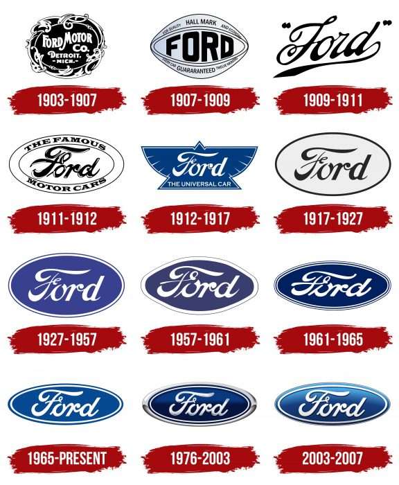
Ford changed the emblem several times as she tried to find the perfect balance of shapes and colors. As the main element, she used her name, which was designed in cursive. This variant appeared in the early 1900s and was improved over time. After much experimentation, the inscription appeared inside a vertical ellipse – first white and then dark blue. The emblem sometimes became three-dimensional through a gradient, but a flat two-dimensional design recently appeared.
What is Ford?
Ford is the flagship brand of Ford Motor Company, the second-largest automaker in the United States, recognized as one of the largest family-owned businesses in the world. Its vehicles are sold almost everywhere: they are driven in cities, off-road, and on race tracks. In addition to models with gasoline engines, the manufacturer produces cars that run on alternative fuels.
1903 – 1907
The debut logo is a vivid example of its time. It looks like a round badge intertwined with a floral pattern of stems and leaves. In the center, in a diagonal oval, there is the abbreviated name of the brand. In the top row is the phrase “Ford Motor,” in the second row is “Co.”, in the third row is “Detroit,” and in the fourth row is “Mich” (part of the state name). The lines are wavy.
1907 – 1909
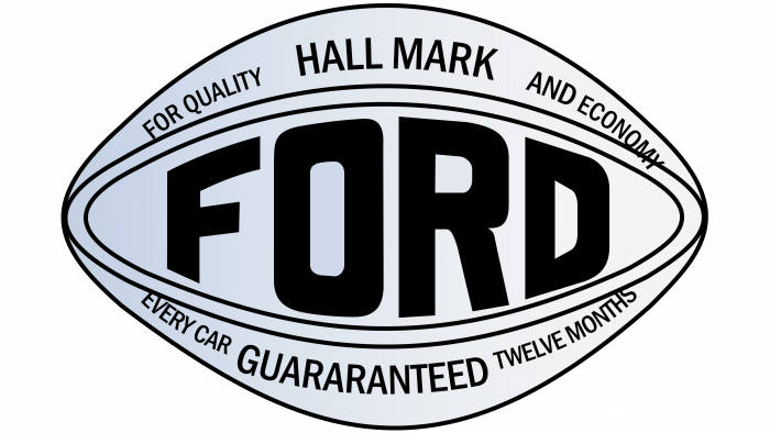
In 1907, the company replaced the retro emblem with a modern one. Therefore, leaves, stems, and curls disappeared from it – now it looks strict and has the shape of an eye or a rugby ball. The oval shape contains several inscriptions. The largest one is located in the center. This is the word “Ford” with uneven letters: the central ones are large, and the side ones are small. Then, color first appeared on the logo: the background became gray. The author of this version of the logo is Child Harold Wills, the designer.
1909 – 1911
At this time, the car company adopted a new logo, recognized as the basis for all subsequent variations. It represents a single inscription – a handwritten stroke. The word “Ford” is written in cohesive italics, mimicking handwriting, and is enclosed in quotation marks as two merged dots. It is decorated with many curls and rounded shapes and has a long tail extending from the letter “d” to form the bottom line.
1911 – 1912
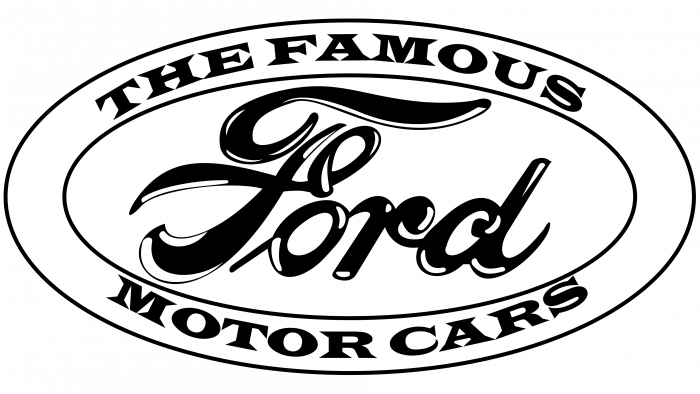
The designers took Henry Ford’s signature as a base. They placed it in a horizontal oval enclosed in a double line—a wide inner line (white) and a thin outer line (black). Around it, the developers placed the phrases “The Famous” (above) and “Motor Cars” (below).
1912 – 1917
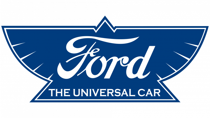
After a radical redesign, the automobile manufacturer received a completely different logo. It resembles a coat of arms in the form of a soaring bird with a wide tail and spread wings. The emblem is blue and contains the old signature with the slogan “Universal Car.”
1917 – 1927
For ten years, Ford used a minimalist version of the emblem. It consists only of the name, the shape of the founder’s signature, and an oval surrounded by a thin black band. The inner background is a light lilac.
1927 – 1957
The background color increased by several tones and became a deep purple. A double border was also added. The text and lines are in white. However, in the 1949 models, a different logo was used – the coat of arms.
1957 – 1961
The Ford emblem has an updated shape: now it is an oval with a protruding middle and tapering ends. The bright purple color has been replaced by a darker one. The letters are slightly transformed: the strokes are lengthened, and the symbols are rounded.
1961 – 1965
Another redesign introduced a different style of lettering—flattened and elongated. This is because the oval became narrow and standard, with no thickening. The developers removed the magenta color and used dark blue. A double stroke was also added.
1965 – today
The brand name was radically rethought: now it is an ellipse with a white inner contour, which is very reminiscent of the emblem of 1927. The font is italic but tall and elegant. In 1976, this logo was transferred to alternative logos, but the car company returned to the main group again (in 2017). Two other emblems were used in parallel with it.
1976 – 2003
The Ford emblem became dark cobalt, elegant, voluminous, with highlights, gradient, and chrome border (now the border is wide silver, with shadows).
2003 – 2017
For the centennial, the automaker redesigned the oval badge. Pantone Studios developed the new design, which removed the wide silver border, replaced the metallic texture with a blue gradient, and added a 3D effect. However, in 2017, the company switched to the old 2D logo from 1965. That said, the 2003 version hasn’t disappeared completely: some models are labeled with it inside.
Ford: Interesting Facts
Ford Motor Company, founded by Henry Ford in 1903, has been a major force in the car industry.
- Moving Assembly Line: In 1913, Ford changed manufacturing with its moving assembly line, making car production faster and cheaper. This innovation made cars affordable for more people.
- Model T: Launched in 1908, the Model T became known as the car that put the world on wheels. It was affordable, reliable, and easy to keep up, leading to over 15 million units produced by 1927.
- $5 Workday: In 1914, Ford doubled its factory workers’ pay to $5 a day, significantly improving their living standards and helping create the middle class in America.
- Soybean Car: In the 1940s, Henry Ford explored using soy-based products, creating a car with body panels made from soybeans, showing an early interest in sustainable materials.
- Ford Mustang: Since its introduction in 1964, the Mustang has defined the American muscle car, known for its sporty look and affordability. It’s been in production ever since and has become an iconic vehicle.
- Safety Innovations: Ford led the way in car safety, offering seat belts in 1955 and inventing the first retractable hardtop with the Ford Fairlane 500 Skyliner in 1957.
- Global Presence: Ford builds cars on six continents and operates in many countries, tailoring vehicles to global markets.
- Ford F-Series Trucks: The F-Series, including the F-150, has been America’s top-selling truck for over 40 years thanks to its durability and versatility.
- Electric Vehicles: Ford is pushing into electric vehicles, like the Mustang Mach-E and the electric F-150 Lightning, showing a strong commitment to an eco-friendly future.
- The $5 Day Revisited: The introduction of the $5 day in 1914 also cut work hours from 9 to 8 a day, boosting employee satisfaction and productivity while reducing turnover.
Ford’s role in automotive history is marked by its dedication to innovation, quality, and making cars more accessible and sustainable for everyone.
Font and Colors
Ford motor logo
The transformation of the Ford logo began with a complex structure and ended with a complex sign despite having only one main element. The designers focused on textures, colors, highlights, shadows, and transitions between them. In the latest versions, they also experimented with gradients.
The company chose a customized typeface for its logo based on Henry Ford’s signature. Therefore, the text is italicized and handwritten. The corporate palette is diverse. It includes purple and blue colors of various shades – from light to saturated. There is also gray – metallic, silver, and chrome.
FAQ
What does the Ford logo mean?
The Ford logo has no hidden meanings. The lettering in an ellipse is elegantly done to inspire consumer confidence and present the company at its best. Only the choice of colors is symbolic. Blue symbolizes perfection, excellence, strength, and reliability, while white symbolizes purity, permanence, and nobility.
Why did Ford choose their logo?
Henry Ford, the founder of the automobile company, asked his friend Childe Harold Wills to help design a logo. He approached the task enthusiastically and created the elegant “Ford” lettering with a curl on the letter “F.” Wills already had experience in this area as he had used the same font for his business cards.
What is the Ford logo called?
The Ford logo is called the “Blue Oval” because of its structure: since 1927, it has contained a blue ellipse. This element serves as the basis for the inscription and does not disappear despite numerous redesigns; only its shades and shape change.
