The resemblance to the hanging equipment of special machinery is a distinctive feature of this emblem. Kubota Company chose a logo in exact accordance with the theme because the letters in its name are figurative, large, and metallic. They convey the machinery’s reliability, the body’s durability, and the cabin’s comfort.
Kubota: Brand overview
| Founded: | February 1890 |
| Founder: | Gonshiro Kubota |
| Headquarters: | Osaka, Japan |
| Website: | kubota.com |
Meaning and History
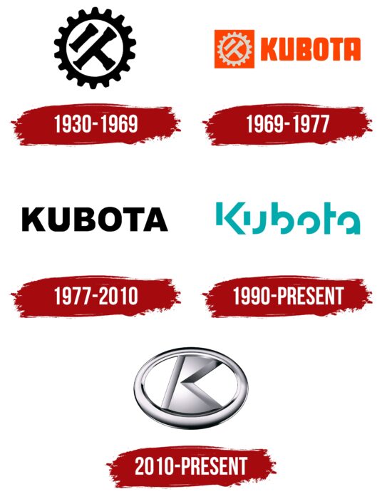
Since its inception, the tractor giant from Japan has changed only two logos. Designers made the original version based on the initial one, removing the lower part of each letter. Its history also includes a small icon that complements the word part in official promotional materials and marks the products.
What is Kubota?
Kubota Corporation is a Japanese multinational company manufacturing a wide range of products – from air conditioners, hardware products, and vending machines to engines, construction, and agricultural machinery. In America, its products are distributed by Kubota Tractor Corporation and produced by Kubota’s American Manufacturing.
1930 – 1969
Initially, Kubota used a technical icon of a round shape. It featured two tubular keys for machine repair (in the center) and a large gear (around them). They were painted in black.
1969 – 1977
In 1969, the logo became colorful and multi-structured. The designers added the word “Kubota,” which is placed on the icon’s right side. The name was written in rectangular glyphs with narrow letter spacing in the uppercase. The letter “B” consisted of two thick dots, and “U,” “O,” and “A” were small vertical stripes. The gear and spanner were painted silver and placed in an orange square. The text next to them was the same color.
1977 – 2010
The concept was completely changed after redesigning the Kubota logo: the emphasis was placed on text, not graphics. Designers removed it altogether, focusing on the brand name of the transportation construction. The inscription received a strict style and classic grotesque. The letters became bold, large, and uppercase. Black color remained predominant, as it clearly stood out against a white background.
1990 – today
Over the next 40 years, the company changed the logo several times, making minor adjustments to the design. This continued until 2010, when the enterprise owners did not conduct a large-scale rebranding. They adopted global corporate principles, developed the Kubota Identity program, and approved a new logo.
The original trademark was created from scratch. The inscription “Kubota” remained, but its style changed significantly. The lower right corner of each letter is cut out. The exception is the letter “t,” which lacks the right part of the horizontal stroke. If you don’t pay attention to this feature, the font can be called rounded. The absence of serifs emphasizes the smoothness of the lines. The palette also radically differs: the word is painted in mint green and merges with the white background.
2010 – today
Since Kubota is an engineering company, it had to switch to the corresponding identity. For this, developers used a horizontal oval – a classic for marking products in this industry. It has a chrome-silver color with reflections, shadows, and voluminous edges. Inside is a large letter “K.” It is voluminous, wide, and connected by a frame at the top and bottom. Clear cuts at the edges give this element a precise literal shape.
Kubota: Interesting Facts
Kubota is a big company from Japan that makes all kinds of machinery for farming, building things, and more. It started way back in 1890 and has grown into a company that works worldwide.
- Starting Small: In 1890, Gonshiro Kubota started making weights for scales in Osaka, Japan. Since then, Kubota has started making machines like tractors and construction equipment.
- Making Farming Easier: In 1960, Kubota made the first small tractor, which was great for farmers with less space. This helped more people farm their land with machines.
- All Over the World: Kubota isn’t just in Japan; it has places to make and sell its stuff in over 110 countries, helping people everywhere grow food, build stuff, and take care of the environment.
- Making Lots of Things: Besides farm equipment, Kubota also makes construction machines, things that sell drinks and pipes, and even works on making the environment better.
- Caring for the Earth: Kubota works hard to ensure its machines don’t harm the planet. They make things that clean water, help keep the air clean, and have engines that don’t pollute much.
- Cleaning Water: Kubota has devised smart ways to clean dirty water, like sewage, so it’s safe for people and the environment.
- Focus on Quality: Kubota believes in making things well, paying attention to every little detail to ensure everything they make is top-notch.
- Looking to the Future of Farming: They’re also developing new farming methods that use technology like the Internet and AI to help farmers do more with less work.
- Kubota Museum: In Osaka, a museum explains Kubota’s history and the cool stuff they’ve made. It also shows how Kubota has helped in many different ways.
From its beginnings in Japan, Kubota has become important in helping with farming, building, and protecting the environment worldwide.
Font and Colors
The stylish graphic element complements the inscription: right above it is the letter “K,” placed in an oval. For the image design, the designers chose gradient transitions of shades. Thanks to this, the image seems voluminous. The metallic color serves as a reminder of the company’s main activity.
Kubota color codes
| Verdigris | Hex color: | #00aaad |
|---|---|---|
| RGB: | 0 170 173 | |
| CMYK: | 100 2 0 32 | |
| Pantone: | PMS 7467 C |
FAQ
What does the Kubota logo mean?
The Kubota logo represents the brand name in an unusual design. It testifies to the uniqueness of everything produced by the Japanese corporation. The oval symbol with the letter K signifies high speed and a commitment to innovation, as the letter is inclined forward.
What does the wrench symbol on the Kubota tractor mean?
The wrench symbol lights up every time the tractor requires maintenance. This happens at certain hourly intervals corresponding to the recommended oil change frequency for cars of this series. To disable the reminder, you must simultaneously press both buttons on the dashboard and hold them until the icon disappears.
What font is used in the Kubota logo?
The basis for the Kubota logo was a bold sans-serif font – likely FortuneCity or similar. Wishing to make the inscription unique, designers erased the left lower corner of all letters except “t.”


