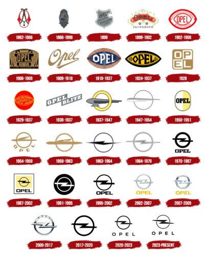
The Opel emblem symbolizes cars that go so fast that you barely have time to notice them. The shine and metal of the emblem are a prototype of the power and speed that distinguish the cars of this brand. The sign hints at modern technologies that help in driving the car.
Opel: Brand overview
Opel (full name – Opel Automobile GmbH) is a German car brand owned by Stellantis (since January 2021). The founder of the company is Adam Opel, whose surname it was named after. The year of its appearance is considered to be 1862. The head office is located in the city of Rüsselsheim am Main (Germany).
Meaning and History
The brand has an incredibly rich history, which began in a barn where the Opel family made sewing machines. At the time, the logo had nothing to do with transportation. The company made sewing machines until 1886 – when it developed a line of bicycles. The first automobile from the company appeared in 1899. Since then, it has been designing, constructing, and assembling automobiles, as well as accessories for them. Everyone was involved in the family business – the head of the house, his sons, and his wife, who contracted the locksmith Friedrich Lutzmann, who played an important role in shaping the design of the car. In total, Opel has 47 logos.
What is Opel?
Opel is an acronym for the German company Opel Automobile GmbH, part of the Stellantis Group. The company started in 1862 with the production of sewing machines, hammers, and bicycles and then moved on to the production of automobiles. Currently, the manufacturer produces cars of various types – from sedans to minibusses. They are represented by such models as Mokka, Zafira, Insignia, Astra, Corsa and some others.
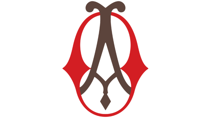
1862 – 1866
The debut emblem is a monogram formed from the first and last name of the owner of the company. The elegant letters “O” and “A,” made in the Old English style, create a symbolic composition. To make the letters look distinct, the authors painted them in different colors: “O” – in red, “A” – in brown.
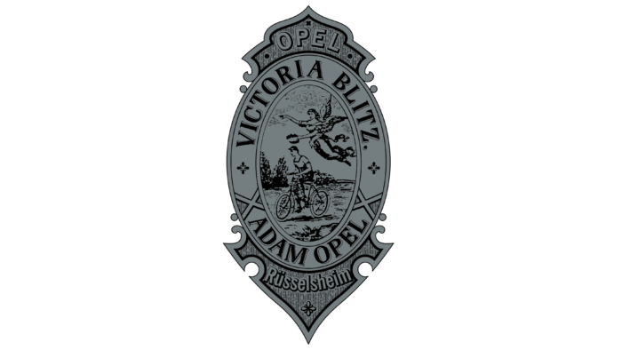
1866 – 1899
With the appearance of the first bicycle, the company changed the design of the logo. The inscriptions “Rüsselsheim,” “Opel,” and “Blitz” remained from the previous version used on sewing machines, to which the word “Victoria” was added. It symbolizes victory. The logo is in the form of a vertical oval with a cyclist in the center, above which the goddess Victoria hovers with a laurel wreath in her hand.
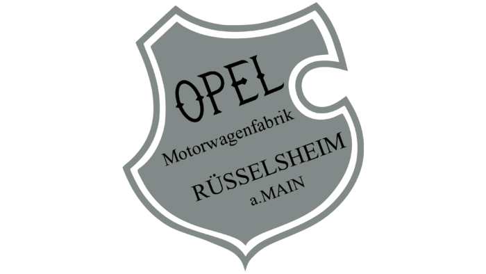
1899
This emblem existed for a very short time and was proposed by Sophie Opel, the wife of the company’s founder, who took over as CEO. The stylized shield contains several inscriptions arranged in four lines: “Opel Motorwagenfabrik Rüsselheim a.Main.” All words are arranged diagonally. A double outline runs along the edge of the shield.
1899 – 1902
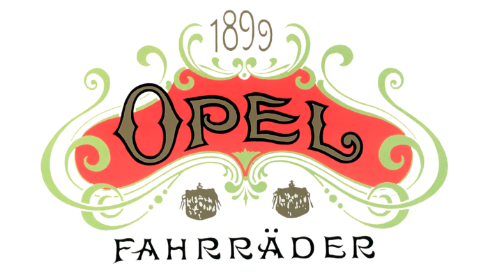
In 1899, the production of automobiles began, so the company changed the design of the emblem. It is now richly decorated with swirls, vignettes, and curved symbols in the Old English style. At the top of the coral figure is the word “Opel,” and at the bottom is “Fahrräder.” This logo was never used on passenger cars – it served only for advertising.
1902 – 1906
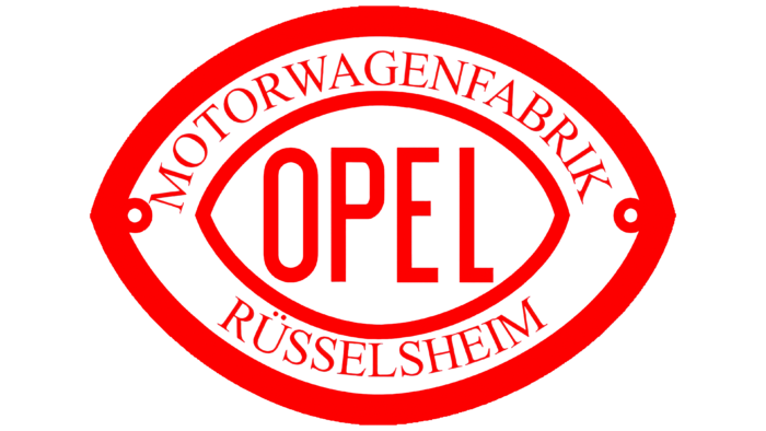
The trademark has a strict shape and resembles an eye or an American soccer. The brand name is placed in the center of the oval sign with tapering ends. Above it is written “Motorenwagenfabrik,” below it – “Rüsselheim.” The main colors of the logo are red and white.
1906 – 1909
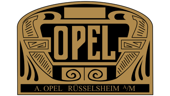
The whimsical logo has an original shape and resembles an ancient Greek engraving with the monolithic word “Opel” in the center. The colors also began to match the style: the authors chose gold and black.
1909 – 1910
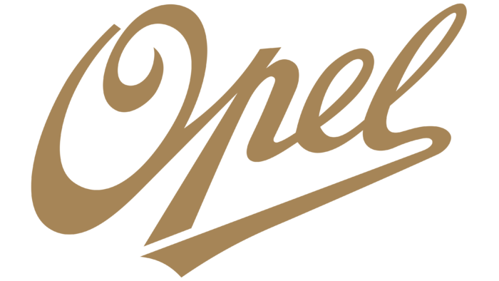
The complex emblem was replaced by a simple and laconic one. It does not have a mass of details, so nothing distracts from the name of the automaker. The linked inscription “Opel” is located diagonally. It is handwritten in italics and colored in dark gold. The lower stroke of the “l” is elongated and turned to the left.
1910 – 1937
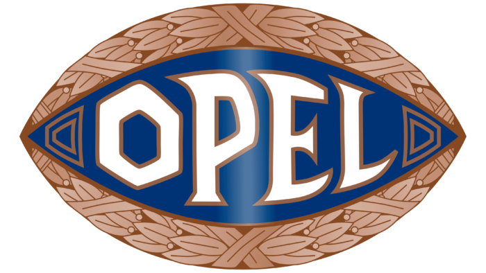
This is a repetition of the 1902-1906 variant but in a more noble form. On the edges of the elongated emblem in the form of a rugby ball lined with laurel wreaths. In the center of the blue field is the brand name, and to the right and left of it are double trapezoids. The style of this logo is very reminiscent of ancient Greek.
1924 – 1937
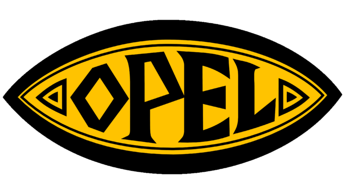
At the same time, another variant of the emblem appeared – yellow-black, with a narrow oval. But with the same curly letters in the word “Opel.” The symbols are uneven in different heights: the largest are in the center, and the smaller are on the sides.
1928
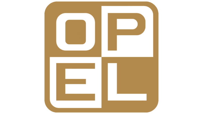
A beige and white square logo with rounded corners was used temporarily. Inside, it is divided into four segments, each containing one letter from the brand name: “P” and “E” on a white background, “O” and “L” on a light beige background.
1929 – 1937
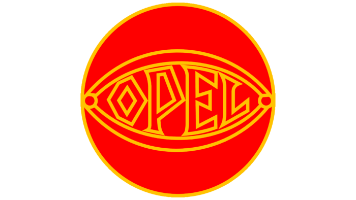
The designers brought back the old 1902 version of the emblem and placed it in the center of the orange circle, highlighted with thin yellow strokes. The style of the text remains the same (1910). It is decorated with figural symbols reminiscent of Greek script.
1936 – 1937
This logo consists of just two elements – the words “Opel” and “Blitz” in capital letters. They are painted white and enclosed in gray diagonal rectangles. This variant was used on heavy cars, so it was in keeping with the rough style.
1937 – 1947
In 1937, the era of rockets and lightning bolts flying through the ring began. But before that, the designers depicted a gray airship floating through a pale yellow circle on a white background. All lettering from the logo was removed.
1947 – 1954
This is a simplified version of the previous logo. The airship now looks like a rocket crossing horizontally across a large silver circle. The elements have gained sophistication and elegance.
1950 – 1951
At the same time as the graphic logo, a textual version of the visual identity was used. It is a vertical oval divided by color into two equal parts: white on the left and gold on the right. It also bears the inscription “Opel”. The capital black letters are highlighted with large serifs.
1954 – 1959
The half helicopter half rocket resembles a flying airplane. The developers took the company name outside the ring, placing it at the bottom with a wide gap between the letters.
1959 – 1963
The circle acquired a semi-oval shape and became pale golden in color. The rocket flying in front of it is colored in the same shade. It consists of three geometric elements, two of which mirror each other.
1963 – 1964
The designers made the circle black and added a border of two gray stripes (inside and outside). The rocket resembles a lightning bolt pointing with its short tip to the left. It is also black with a silver border.
1964 – 1970
At this time, the legendary car company mascot appeared – a lightning bolt resembling an elongated letter “Z.” It appeared not accidentally and was inspired by the logo of 1866. At the beginning of the production of bicycles, the manufacturer used the emblem of the word “Blitz,” denoting the lightning speed of his two-wheeled transport. Now, it received a graphic embodiment in the form of a horizontal gray zigzag on the background of a thin circle.
1970 – 1987
This is a complex logo consisting of a square with a circle in the middle, through which a wide lightning bolt stretches. At the bottom is the inscription “Opel.” Instead of a light gray color, the designers used black, depicting all the elements on a rich yellow background.
1987 – 2002
The developers removed excessive brightness, keeping a pale golden color only in the central part of the square. In the rectangle, they placed the trademark in the form of a circle with a lightning bolt. The designers left the brand name at the bottom but changed the font – now it has become grotesque.
1991 – 1995
The emblem is a double circle with a wide white lightning bolt in the middle.
1995 – 2002
In this version, the colors changed places: everything that was black became white, and vice versa. The word “Opel” reappeared on the emblem.
2002 – 2007
The changes were made only in color. Now the inscription became yellow, and the ring and the lightning bolt – gray.
2007 – 2009
Designers added three-dimensionality to the logo by means of highlights, shadows, and highlights. As a result, the circle and the horizontal zigzag became convex, silver, resembling a metallic detail.
2009 – 2017
The authors of the logo enhanced the 3D effect and added some shadows. In the upper part of the circle, they engraved the brand name on a solid surface. Thanks to this, the emblem turned out to be very stylish and metallic.
2017 – 2020
The logo again underwent a major change and was transformed into a flat monochrome icon. Only two elements are present on it – the ring and the lightning bolt. They are colored in black.
2020 – 2023
The current version contains all the previous parts plus the inscription. The name of the company is located at the bottom. It is made in block letters that are spaced far apart.
2023 – today
The new logo is a bright image with a zigzag strip resembling a horizontal lightning bolt. The updated design is a departure from the past: the connection between the top and bottom has disappeared. Now, these elements exist independently of each other, without crossing or overlapping. Each part mimics the other, resembling trapezoids slightly pinched at opposite ends, creating an intriguing mirror effect. The outer protrusions of these trapezoids are pointed, creating a sense of direction and dynamism.
The brand mark is enclosed in a small circle outlined by a thin black ring. A unique design solution is the separation of the right and left sides of the ring, separated by lines emanating from the center of the circle. This purposeful disconnect gives the logo a sense of expansion and openness, indicating a desire to move out from the center.
The lower part of the logo is adorned with an inscription. The text is thoughtfully executed in a geometric style using a raised bold font that complements the angular design elements. The distance between the symbols is noticeably increased, which gives the logo openness and airiness while providing excellent readability.
Overall, the updated logo makes a strong visual impression. The separation of the upper and lower parts, mirrored trapezoids, and disconnected rings – all create an impression of independence and unity, balance, and dynamism. Combined with the bold geometric text, the logo is a modern, forward-looking brand symbol that attracts the eye and leaves a lasting impression.
Opel: Interesting Facts
Opel, also called Adam Opel AG, is a historic European car maker known for its big impact on the car industry.
- Beginnings: Opel was started in 1862 in Rüsselsheim, Germany, by Adam Opel. It made sewing machines, then bicycles, and moved to cars in 1899.
- Shift to Cars: Opel’s move from sewing machines and bicycles to cars showed its focus on innovation and getting people moving. It was a huge bicycle maker before it started making cars.
- Innovations: Opel introduced mass production lines in Germany, making cars cheaper and allowing more people to afford them.
- Famous Cars: The Opel Kadett, from the 1930s, and its later versions were very popular in Europe, making Opel known for affordable and reliable cars.
- Racing Success: Opel did well in rally racing, especially in the 1970s and 1980s, with the Opel Ascona and Opel Manta winning many races.
- Joining General Motors: In 1929, Opel joined General Motors (GM), which helped it use GM’s resources and reach globally. It stayed with GM until 2017.
- New Ownership: In 2017, the French group PSA (now Stellantis) bought Opel, starting a new phase for the company with hopes of refreshing its cars.
- Electric Cars: After joining PSA, Opel pledged to make electric versions of all its models by 2024, following the industry’s move towards greener cars.
- Iconic Models: Opel made famous cars like the Opel GT, known as the “baby Corvette,” and the Opel Corsa, a top European seller since the 1980s.
- Worldwide Reach: Opel is mainly known in Europe but also sells cars in Africa, Asia, and South America under its name or by rebadging them with other car makers.
Opel’s story, from starting with sewing machines to becoming a leading car manufacturer in Europe, shows its dedication to innovation, ability to change with the times, and commitment to making cars for everyone.
Font and Colors
The visual identity mark of this automobile company has come a long and complicated way. It has changed at key moments in its history, when it transformed, expanded, or merged with other entities. Also, its logos were updated when the next series of cars or heavy trucks appeared. In addition, the logo existed in various forms: in the form of advertising symbols, badges, icons, and product labels, as well as in the form of an imprint on the hood.
Designer Matthias Lamken executed the late typography. The early versions used a variety of serif and sans-serif fonts. They looked like Old English symbols, ancient Greek signs, elongated thin letters, or, on the contrary, flattened wide letters. Opel Next was chosen as the final font. It is characterized by clean lines and sharp angles, which supports the business style of the logo.
The corporate palette is also diverse, as it has changed many times over the years of the company’s existence. There were red, gold, graphite, beige, blue, yellow, orange, and silver colors. Now, a monochrome gamma is used – black and white.
Opel color codes
| Eerie Black | Hex color: | #171714 |
|---|---|---|
| RGB: | 23 23 20 | |
| CMYK: | 0 0 13 91 | |
| Pantone: | PMS Neutral Black C |

