The Nissan logo, a simple, concise emblem, accurately reflects the brand’s evolution and development history. The Japanese automotive brand was founded in 1933. The logo reflects the sphere of activity and national identity.
Nissan: Brand overview
Nissan is a Japanese automotive brand owned by Nissan Motor Company. It emerged from the Datsun brand after Jidosha Seizo acquired Tobata Casting and Kwaishinsha Motor Car Works. In 1934, the main company’s name was changed to Nissan Motor Company. The first word is an abbreviation of Nippon Sangyo.
Nissan’s journey from its inception in 1933 through its evolution into a global automotive powerhouse reflects a history of innovation, resilience, and strategic alliances. Founded through the merger of Kwaishinsha Co. and Nihon Sangyo, the company initially named Jidosha Seizo Co., Ltd. quickly adopted the name Nissan Motor Co., Ltd., marking the start of a significant legacy in the automotive industry.
The early years saw Nissan expand beyond Japan, exporting cars to Asia, Europe, and Australia by 1935. Even in its nascent stage, this global outlook set the tone for the company’s future direction. The wartime effort saw Nissan contributing to Japan’s military needs, but the post-war era defined the company’s path. Nissan’s resumption of passenger car production and the expansion of its model lineup in the 1950s and 1960s laid the groundwork for its international presence, especially in the crucial U.S. market.
Establishing a manufacturing plant in the UK in 1989 underscored Nissan’s commitment to global expansion and was a pioneering move among European Japanese automakers. However, it was Nissan’s strategic alliance with Renault in 1999 that arguably marked a turning point, helping it navigate financial challenges and setting the stage for a new era of innovation and growth.
Today, Nissan stands as a testament to the enduring appeal of its brand and the quality of its products. From the popular Qashqai and X-Trail to the pioneering electric vehicle, the Leaf, Nissan’s model lineup caters to a broad spectrum of consumer needs and preferences. This diversity in product offerings is matched by the company’s commitment to technological advancement, particularly in areas such as autonomous driving, electrification, and connected vehicles.
Meaning and History
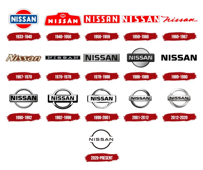
The evolution of the brand from Datsun to Nissan can be traced through the change in logos. There are at least 29 of them, but the focus is often on the main variants that have left a significant mark in history.
What is Nissan?
Nissan is primarily known as the name of the Japanese car manufacturer Nissan Motor Co, Ltd. However, Nissan Group’s focus on automobile manufacturing was secondary for a long time, with its main activities being insurance and real estate. This changed in the 1990s when the conglomerate nearly went bankrupt and had to spin off its automotive division into an independent company.
1933 – 1940
The debut emblem featured a blue rounded rectangle. At the center is the company name, written in white bold serif letters. The uppercase font makes the inscription more expressive. In the background is a large red circle, symbolizing the rising sun as a sign of respect for the Japanese nation.
Initially, it was a reference to the word “Datsun,” which is composed of two parts: “DAT” (abbreviation for investors Den, Aoyama, and Takeuchi) and “sun.” Then it was replaced with the name “Nissan,” harmoniously echoing the characters “ni” (“sun”) and “ssan” (“birth”).
1940 – 1950
In the 1940s, the brand introduced a new logo. It is trapezoid-shaped with rounded corners and a small protrusion at the top. The word Nissan is written in the center of this geometric figure. The letters appear uneven as “A” is higher than “N,” “I,” and “S.” All strokes are rounded at the ends, and only the top edges of “S” are cut at an angle.
Above the car brand’s name is a familiar symbol: a circle encompassed by a horizontal rectangle. This is a reference to the previous logo used since the early 1930s. The designers also retained the red color and wide white contours with gray hatching.
1950 – 1959
In the 1950s, a rectangular red emblem with the white Nissan inscription was approved. The familiar light frame remained in place. The font became angular, making the “S” letters resemble the number “5.”
1959 – 1960
Over time, the red rectangle shrank. The corners’ roundings and light contours also disappeared.
1960 – 1967
In 1960, the designers experimented: they removed the background geometric figure and made the word red. For a more striking effect, they chose an original handwritten font.
1967 – 1970
For three years, a logo with the italicized inscription was used. Its distinguishing features are a brown palette, uneven line thickness, and a protruding serif on the capital “N.”
1970 – 1978
The rectangular frame returned but in a different color. The designers preferred black as the main color and added a silver outline. The “Nissan” inscription became light. The font was completely unlike the previous one: now the letters were even, with large serifs.
1978 – 1988
The word “NISSAN” in black is placed inside a silver plate. The rectangle has a dark stripe along the edge and appears convex due to the gradient. The letters are also unevenly colored. The brand name used a bold geometric font similar to Murano Sans Regular by FontSite Inc.
1988 – 1989
The designers made the rectangle dark gray and rounded its corners. At the same time, the frame became wide and uneven in color, enhancing the 3D effect. The letters were repainted in light gray, almost white, and acquired black shadows of varying thickness. A large silver circle with a dark stroke along the edge appeared behind the plate.
1989 – 1990
After simplification, only the Nissan inscription remained. It has become black and is placed on a clean white background.
1990 – 1992
In 1990, a version appeared with a black inscription on a silver rectangle, connected at the top and bottom by two semicircles. Black contours and gradients make the image volumetric.
1992 – 1998
This is one of Nissan’s most minimalist logos. It has black contours of a rectangle merging with a ring and the same black letters. All the remaining space is white.
1998 – 2001
The designers reduced the black color, narrowed the contours, and removed some of the shadows, making the image visually cleaner.
2001 – 2012
The logo became three-dimensional. It consists of three elements: a wide ring (in the background), a convex rectangle (in the center), and the word “Nissan.” Two golden segments of the circle’s diameter determine the position of the horizontal bar. Geometric elements are gray with a silver gradient. The inscription is completely black.
2012 – 2020
The new logo version differs from the previous one in color scheme. It has more light gray tones, white highlights, and gradients.
2020 – today
In March 2020, the automotive brand applied for registration of a new trademark in Argentina, Chile, Uruguay, Peru, and the United Kingdom. It decided to replace the chromed symbol with its minimalist version. Following the latest fashion, the manufacturer abandoned the multicolored 3D logo. The circular shape was retained, but the lines became much thinner.
Now, the word “Nissan” is on a clean white background. Two thin black arcs, one at the top and the other at the bottom, are attached. Small horizontal strips stretch outward from their ends—the only thing left from the rectangle.
Nissan: Interesting Facts
One of the world’s leading automobile manufacturers, Nissan has a rich innovation, competition, and global expansion history.
- Early Beginnings: Nissan was founded in 1933, but its roots can be traced back to the Kwaishinsha Motor Car Works, which produced the DAT car in 1914. The name “DAT” comes from the initials of the company’s partners’ last names.
- Name Origin: The name “Nissan” originated from the abbreviation of Nihon Sangyo, which appeared on the Tokyo stock market. The company was officially named Nissan Motor Co., Ltd. in 1934.
- Datsun Brand: In its early years, Nissan exported cars named “Datsun.” This name was used because it was considered more marketable to Western countries. The Datsun brand was phased out in the 1980s but briefly revived in the 2010s for some markets.
- Innovation in Electric Vehicles: Nissan has pioneered electric vehicle technology. The Nissan Leaf, introduced in 2010, is one of the world’s first and best-selling all-electric vehicles, marking a significant step forward in adopting clean transportation.
- World War II Effort: During World War II, Nissan shifted its production from cars to trucks and military vehicles. The company’s factories were heavily bombed, and the war significantly impacted its operations.
- Global Expansion: Nissan was one of the first Japanese car manufacturers to establish a manufacturing presence in the United States. In 1983, Nissan opened its first US assembly plant in Smyrna, Tennessee, now one of North America’s most productive plants.
- Renault-Nissan Alliance: In 1999, Nissan entered a strategic alliance with the French automobile manufacturer Renault, a groundbreaking partnership between a French and Japanese company. This alliance has grown to include Mitsubishi Motors, forming one of the largest automotive groups in the world.
- NISMO: Nissan’s performance division, NISMO (short for Nissan Motorsport International Limited), was founded in 1984. NISMO cars are known for their enhanced performance and sportier appearance and participate in various motorsport competitions.
- Pioneering Safety Features: Nissan has been a leader in developing innovative safety technologies, such as the Around View Monitor, which provides a 360-degree bird’s-eye view of the vehicle to assist with parking and navigating tight spaces.
- Cultural Impact: The Nissan Skyline GT-R, also known as “Godzilla,” has become an icon in automotive culture, especially among enthusiasts of Japanese sports cars. Its appearances in movies, video games, and car shows have cemented its legendary status.
These facts showcase Nissan’s journey from a small automaker to a global powerhouse, emphasizing its commitment to innovation, sustainability, and performance.
Font and Colors
The modern Nissan logo is a wide silver ring with a crossbar on which the name of the automotive brand is depicted. Its minimalist style differs from previous versions, as the Japanese car manufacturer previously tried to attract attention with bright, unusually shaped trademarks. But in 2001, the designers changed the logo to indicate the company’s sphere of activity. This happened after the company came under Renault’s control.
Nissan logos have always included the brand name. For this, developers used various fonts: round (from 1933 to 1950), angular (from 1959 to 1960), handwritten (from 1960 to 1971), italic (from 1967 to 1970), and antique (from 1970 to 1983). The “NISSAN” inscription in the modern version is grotesque and without serifs.
Before 2001, the company had colorful logos, with red and blue shades predominating in the palette. The current color scheme is black, white, and silver. There is a gradient, creating a 3D effect.
The Nissan logo’s font plays a key role in forming the company’s updated look, showcasing a mix of elegance and practicality. This custom font, selected specifically for Nissan’s name, features straightforward lines and even proportions, mirroring the company’s commitment to innovation and dependability. The thickness and adaptability of the font were carefully fine-tuned to ensure it’s easy to read and leaves a strong impression in different settings, from the logo to online use and on business cards. The creation of this font was driven by Nissan’s principle of “shisei tenjitsu o tsuranuku,” or cutting through to the essence, which is evident in the typeface’s clear and accurate style.
This font symbolizes Nissan’s evolution and important achievements, capturing the company’s progress and offering a view that aligns with the current needs for digital engagement.
FAQ
What does the Nissan logo represent?
The Nissan logo, a well-recognized symbol in the automotive industry, has undergone several evolutions since the company’s inception. As of my last update, the current logo represents a more modern and simplified design than its predecessors, aiming to convey innovation, sophistication, and connectivity in the era of electric vehicles and advanced automotive technologies.
The logo typically features the name “Nissan” in a stylized font, enclosed within a circle or surrounded by a circular design. This circular motif is often interpreted as representing the sun, a nod to Nissan’s Japanese heritage (“Nissan” is a part of Nihon Sangyo, which means “Japanese industry”), and symbolizing the brand’s commitment to sustainability, especially in their push towards electric vehicles. The simplicity and sleekness of the design aim to reflect Nissan’s focus on innovation and the future of mobility, with clean lines and a minimalist aesthetic that aligns with modern design trends.
Why did Nissan change its logo?
Nissan changed its logo to reflect the company’s shift towards innovation, sustainability, and connectivity in the modern automotive landscape, particularly with the rise of electric vehicles and autonomous driving technologies. The transition to a new logo is part of Nissan’s broader strategy to rejuvenate its brand and align with contemporary design trends, signaling a more modern, simplified, and digital-friendly identity.
The updated logo was unveiled in 2020 as a symbol of the company’s dedication to innovation and the future of mobility. This change came when Nissan, like many other automotive manufacturers, increasingly focused on electric vehicles and sustainable technologies, aiming to position itself as a leader in the transition towards a more environmentally friendly and connected automotive future.
The new logo is minimalist and sleek, designed to be more adaptable and recognizable in digital and physical environments. It departs from the previous logo’s more traditional, three-dimensional appearance to a flat, two-dimensional design better suited for the digital age. This aligns with the design trends of many other companies across various industries, adopting simpler, more versatile logos to enhance their digital presence.
Is Nissan changing its logo?
Yes, Nissan changed its logo for 2020, removing the 3D look, silver lines, and wide horizontal icon. As a result, the chromed symbol disappeared. The inscription remained suspended in the air, and two holes appeared on the sides of the ring frame.

