The brand’s emblem says Honda is a car from the future. Modern details, automation, and advanced software are hidden behind the machines’ streamlined, smooth bodies. “Look in the rearview mirror; all the competition is left behind,” says the Honda logo.
Honda: Brand overview
Meaning and History
The Japanese company manufactures motorcycles and cars, and these areas have different logos. The motorcycle brand can be recognized by the wings of the goddess of victory, Nike, and the automotive brand by the stylized letter “H.” Their symbolism is different because they are two different subsidiaries. The multinational corporation owns them mainly uses wordmarks with the inscription “HONDA.”
What is Honda?
Honda Motor Company Ltd. is not just a car manufacturer. Its divisions are engaged in the manufacture of mountain bikes, motorcycles, aircraft, robots, internal combustion engines, garden equipment, pumps, inflatable boats, ATVs, and other products. The corporate headquarters is located in the Japanese city of Tokyo.
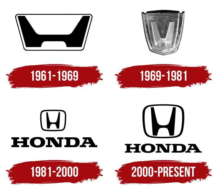
1961 – 1969
The “H” badge was first seen on the hood of the T360 mini pickup. It went on sale in 1963.
1969 – 1981
Two years after the debut of the N360 city car, the company updated the logo. As a result, the letter became white and narrow. And she also had a foundation: a dark isosceles trapezoid.
1981 – 2000
In 1981, Honda invented the world’s first GPS-like navigation system. It entered the US market around the same time. These events coincided with the modernization of the logo. The “H” is now thin and black. The developers have placed it in a white trapezoidal shape with rounded corners. The brand’s name appeared at the bottom, written in branded bold type with large rectangular serifs.
2000 – today
The new logo only differs from the old one by the enlarged letter “H” in the trapezoid frame. Car enthusiasts first saw this version at the presentation of the Honda Civic in 2000.
The Honda brand name has always looked like a capital “H,” drawn in a recognizable and unique style. This is the first letter from the company’s name and creator’s surname. In the emblem, the top of the “H” is widened, and the bottom is tapered, so it looks like a car part. For many, such a symbol is associated with a humanoid figure stretching its arms to the sky. The iconic badge is used on the bonnet, steering wheel, or small elements (such as buttons) thanks to its simple form.
Despite its popularity, the stylized “H” does not adorn all Honda cars. In particular, Acura’s luxury sports cars, sedans, and crossovers have the letter “A” in their logo, similar to a caliper conceived by the developers. Nevertheless, the emblem with “H” is the most successful design solution.
Honda: Interesting Facts
Honda Motor Co., Ltd. is widely recognized not just for its cars but for a variety of products and innovations.
- Starting Small: Founded in Japan in 1946 by Soichiro Honda and Takeo Fujisawa, Honda initially made motorized bicycles from leftover war materials. This led to their first motorcycle, the D-Type, in 1949.
- Motorcycle Mastery: Honda has been the top motorcycle maker worldwide since the 1950s, with the Honda Super Cub being one of the most produced vehicles ever.
- Automotive Breakthroughs: Honda entered the car market in 1963 with two vehicles and launched the luxury brand Acura in the U.S. in 1986, a first for a Japanese company.
- Eco-Friendly Moves: Leading in environmental efforts, Honda introduced the first hybrid electric car in North America, the Insight, in 1999 and continues to develop electric and fuel cell technologies.
- Robots and AI: Honda has also made advances in robotics, especially with ASIMO, a robot introduced in 2000 that can walk, run, and climb stairs. This highlights Honda’s progress in AI.
- Into the Sky: The HondaJet, first flown in 2003, showcases Honda’s innovation in aerospace with its unique engine design for better performance and efficiency.
- On the Water: Since 1964, Honda has been creating four-stroke outboard motors for boats, which are noted for their durability and efficiency.
- Power on the Ground: Honda is a key figure in power equipment, offering generators, lawnmowers, and snow blowers. The first four-stroke engine in this market was introduced in 1959 for less noise and more efficiency.
- Racing Legacy: Honda’s commitment to motorsports includes participating in Formula One as a team and engine provider, highlighting its dedication to performance and competition.
- Worldwide Impact: Honda operates globally and invests in the community through education, environmental projects, and traffic safety initiatives.
Honda’s journey from making motorized bicycles to becoming a leader in multiple industries showcases its dedication to innovation, environmental stewardship, and societal improvement. The company continues to explore new technology and design avenues.
Font and Colors
In the full version, the famous graphic sign is supplemented with the word “HONDA.” The text uses a simple font owned by the car company. Capital letters are bold and flattened at the top, with large rectangular serifs. Looking closely, you can see that the typeface changed slightly in 2000. The typographers rounded off all the corners, making the characters streamlined. This redesign had little or no effect on the lettering’s perception, but the company executives found it necessary.
Advertising materials often feature a black-and-white logo. It has other color versions that adorn Honda vehicles. For example, the regular Civic lineup has all the emblems, either black or silver. On the Civic Type R, they are mostly red. Perhaps this is because Soichiro Honda was fond of red clothes and wore red business shirts and ties. This color reminds me of when the company’s sports cars first participated in the Formula 1 competition.
FAQ
What does the Honda symbol mean?
The brand’s logo is a stylized silver letter “H” on a blue background. It denotes the company’s name.
The silver color of the letter “H” suggests sophistication, modernity, and high standards, which the brand strives to demonstrate in its products and services. The blue background is associated with trust, reliability, and stability. The name, written in a bold sans serif font under the letter “H,” is simple and clean, conveying clarity and strength.
Each element of the logo, from the stylized “H” to the colors and font, combines to create a powerful brand symbol in the automotive and manufacturing industries.
What is the H symbol on Honda cars?
The car symbol represents the company’s name and founder, Soichiro Honda. This letter has always been part of the logo, reflecting the brand’s values and message in the global market.
The logo has remained unchanged; the “H” symbolizes the brand’s uniqueness. Keeping it shows the company’s respect for its history and founder. The emblem reminds everyone of the brand’s origins and mission to bring excellence to the automotive industry.
What is the part number of the Honda red emblem?
The red emblem part number is 75701-TGH-A01. The brand makes this emblem and enhances the appearance of various models, giving them a unique and sporty look.
This emblem is known for its high quality, reflecting the brand’s commitment to excellence. The red makes it a favorite among enthusiasts who want their car to stand out.
When was the Honda logo created?
The logo was first introduced in 1961, a significant year in the brand’s history. This year marked the company’s first win at the Isle of Man Tourist Trophy and opening a new research and development center in Saitama, Japan. At that time, the famous winged logo primarily represented the brand.
The introduction of the logo symbolized a new era for the brand, reflecting its growth and achievements in racing and technological development. Over the years, the logo has evolved to reflect the company’s journey from its early days in the racing industry to becoming a world leader in automobiles and motorcycles.
What does the Honda logo mean?
The logo is a large letter “H” inside a frame, representing the brand name. The “H” clearly refers to the company, making it easy to recognize. The design is notable for the rounded inner parts of the “H.”
The absence of sharp corners in the letter “H” symbolizes peace, security, and trust. These elements demonstrate the brand’s commitment to providing safe and reliable products. The sleek design is meant to instill comfort and confidence in customers.
Is the Honda logo a good car?
A passenger car is considered a good vehicle. In a 2001 survey, consumers felt it deserved the top spot. This shows the car met users’ performance, reliability, and overall satisfaction expectations.
Despite the high praise from consumers, sales were not very high. Market competition, consumer preferences, or marketing strategies could affect sales. The car’s quality and appeal were evident from the reviews, and it was highly respected by those who owned or tested it.
What was the first Honda logo?
The first logo was an inverted trapezoid with rounded corners. Inside the frame was a horizontally elongated letter “H,” reminiscent of the front part of a chair without a back.
The trapezoidal shape with soft edges gave the logo a modern and accessible look while maintaining the brand’s innovative spirit. The elongated “H” was easily recognizable and symbolized the company name, making it an effective logo.


