Confidence, progress, and strength symbolize the identity of the Indian brand Hero, whose logo is characterized by relevance and dynamism of execution. The elegant and refined sign effectively reflects the corporation’s diversity and the continual succession of generations.
Hero: Brand overview
| Founded: | 19 January 1984 |
| Founder: | Brijmohan Lall Munjal |
| Headquarters: | New Delhi, India |
| Website: | heromotocorp.com |
Meaning and History
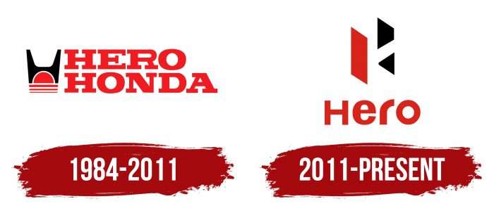
The company’s brand name appeared right after its opening. It is related to its name, which translates from English as “hero.” All versions of the logos (and there were two) reflect the main concept of the corporation – the heroic personality that lives in every person.
The original version of the logo lasted until 2011, when the company experienced a pivotal moment of separation from the Japanese corporation. Then, there was a massive rebranding of all visual symbols. This was associated with renaming the company to Hero MotoCorp. The updated logo was developed by the design agency Wolff Olins and was presented in London at a cricket match between the teams of India and Great Britain.
In the debut version, the initial letter H was depicted as a superhero mask (Batman). The second logo reflects the theme of heroism: the motto in English is “For a hero inside,” and the inscription in Hindi is “Everybody has a hero.” The color palette is identical in both versions – the brand’s combination of scarlet, black, and white.
What is Hero?
Hero is one of the most valuable brands in India. It represents the company Hero MotoCorp Limited, which got its current name after breaking ties with the Japanese conglomerate Honda in 2011. Today, it is the world’s largest motorcycle manufacturer. However, the company also produces other two-wheeled vehicles, such as electric bicycles and scooters.
1984 – 2011
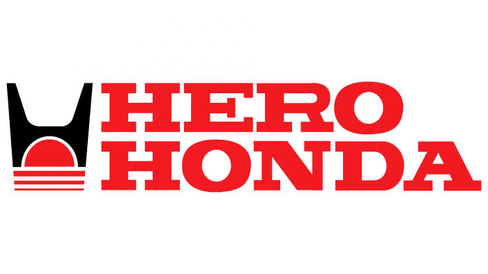
At that time, the company was called Hero Honda, so the original label consisted of these two words. They are arranged in two tiers and colored red. All letters are uppercase with classic serif font and bold lines. This gives the logo solidity and speaks to the product’s reliability, stability, and power.
A drawn sign is to the left of the wordmark, stylized as the letter H and Batman’s headgear. Below it is a semi-disc of the rising sun, and even lower are three lines, like reflections of its glints on the water. The stripes also represent the tracks left by various types of two-wheeled transport on the ground.
2011 – today
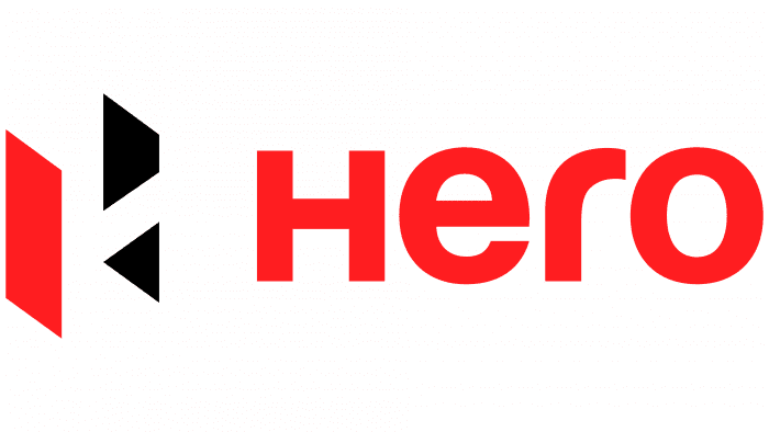
In 2011, the logo was redesigned in connection with the name change to Hero MotoCorp. The variant proposed by Wolff Olins fits into the flow of modernity, as it is characterized by relevance and dynamism. At the same time, it is an elegant and refined sign that graphically plays with the multifaceted nature of the Indian corporation.
The new logo also consists of two parts – word and hand-drawn. Below is the company’s name. All letters are lowercase except for the first. It is written with a capital letter, although it is the same size as the others. The font is simple, sans serif, reminiscent of Harabara. The small letter “r” is smooth and slightly rounded.
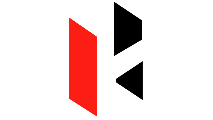
The design of the graphic part is geometrically precise and meticulously calibrated. It reflects the letter H in a 3D projection, where two rectangular plates replace the side walls. The connecting bar is made inconspicuous, emphasizing the invisible but constant succession of generations. The sharp angles of the sign make it energetic and dynamic, embodying the company’s confidence, progress, and strength.
Hero: Interesting Facts
Hero MotoCorp, once known as Hero Honda, is a big deal in making motorcycles in India and worldwide.
- How It Started: Back in 1984, Hero from India and Honda from Japan decided to make motorcycles together for people in India. They did well, becoming the top motorcycle company in India.
- New Name and Direction: 2011 Hero and Honda parted ways. Hero changed its name to Hero MotoCorp and started focusing on selling bikes worldwide and making new ones.
- Top of the World: Hero MotoCorp is known as the biggest company in the world for making motorcycles, thanks to selling a lot of them and having shops everywhere.
- Making New Things: After splitting from Honda, Hero started to focus on coming up with new ideas and made a big place in Jaipur just to create new bikes.
- Going Global: Hero isn’t just about India; it’s selling bikes in places like Asia, Africa, and the Americas and wants to be in more than 50 countries by 2022.
- Thinking Green: Hero is also developing electric bikes to be kinder to the planet.
- Record Breakers: In 2020, Hero set a world record by having 1,845 Hero motorcycles ride together, showing how much people love their bikes.
- Helping Out: Hero does many good things, like helping with education and health and improving life in rural areas through the Hero MotoCorp Foundation.
- Loving Sports: Hero supports sports like golf, football, and cricket by sponsoring events and teams, helping them get noticed more by people everywhere.
- New and Cool Bikes: Hero keeps making cool new motorcycles and scooters that save gas, can stop and start by themselves, and connect to your phone.
From starting as a joint effort with Honda to leading the world in making motorcycles, Hero MotoCorp shows how being brave, smart, and caring can help a company keep growing and doing great things.
Font and Colors
The redesign of the logo brought in a completely different style and radically different font. Instead of powerful serifs, the emblem now uses smooth, streamlined symbols without sharp angles. The shape and design of this font are as close as possible to Harabara. Such exquisite simplicity was proposed by the developer of the new logo, Wolff Olins. In addition, the inscription has its own subtlety, which is not immediately noticeable. Look closely: although all the letters in the word “Hero” are the same size, three of them are lowercase (“e,” “r,” “o”), and one is uppercase (“H”).
Regarding color, the brand settled on the traditional combination of black and red. According to its concept, the first conveys strength, while the second reflects beauty.
Hero color codes
| Maximum Red | Hex color: | #d9241c |
|---|---|---|
| RGB: | 217 36 28 | |
| CMYK: | 0 83 87 15 | |
| Pantone: | PMS Bright Red C |
| Black | Hex color: | #000000 |
|---|---|---|
| RGB: | 0 0 0 | |
| CMYK: | 0 0 0 100 | |
| Pantone: | PMS Process Black C |

