


![]() Volkswagen Logo PNG
Volkswagen Logo PNG
The emblem’s sophistication and elegance emphasize the car’s impeccable and concise design. The Volkswagen logo signifies industry leadership, VIP service, and a range of models.
Volkswagen began as a political project in Nazi Germany. In 1933, Hitler demanded a “people’s car” for two adults and three children, using no more than 7 liters per 100 km and costing under 1,000 Reichsmarks. Ferdinand Porsche received the development contract on June 22, 1934.
On May 28, 1937, the German Labour Front founded Gesellschaft zur Vorbereitung des Deutschen Volkswagens mbH. Managers studied Ford’s mass production methods in Detroit, and construction of the factory near Fallersleben began in 1938. The car was renamed KdF-Wagen, but workers who paid into the savings plan never received it because the war began.
From 1939, the plant produced military equipment, aircraft parts, and components for the V-1 rocket, using forced labor. In 1945, the factory came under British control. Major Ivan Hirst revived production with a 20,000-car order for the British Army, and the factory town became Wolfsburg.
In 1960, West Germany sold 60% of Volkswagen to the public. The Beetle then became a U.S. success, helped by Doyle Dane Bernbach’s 1959 “Think Small” campaign. In 1972, it passed the Ford Model T production record. By the mid-1970s, the Beetle was aging. Volkswagen answered in 1974 with the Golf, a front-wheel-drive hatchback designed by Giorgetto Giugiaro. The 1976 GTI helped define the hot hatch class.
Volkswagen later built a group around Auto Union, Audi, NSU, SEAT, Škoda, Bentley, Lamborghini, Bugatti, and Porsche AG. The New Beetle arrived in 1998. In 2015, Dieselgate exposed the use of software to cheat on emissions tests in about 11 million cars, costing Volkswagen over €30 billion.
Meaning and History
![]()
Immediately after its opening, the company received its original name, which consists of two pillars: “volks” (people) and “wagen” (car). Therefore, it means “people’s car” or “people’s car.” The logo is based on the first letters of these words: VW. Moreover, the reduction was taken as the basis for the brand’s emblems, of which he had 13.
What is Volkswagen?
Volkswagen is the brand of the German Volkswagen Group, in which Porsche Automobil Holding SE is a shareholder. The company was founded in 1937 at the behest of Adolf Hitler, who asked Ferdinand Porsche to build an inexpensive car for the German people. But after the war, the concept was deemed unviable because cheap, simple models in Germany were not in demand.
1937 – 1939
![]()
The debut version includes several elements that emphasize the founder’s political preferences. The letters “V” and “W” are located one above the other, forming a geometrically correct monogram with straight lines and corners. The initials are placed in a large cogwheel. It is surrounded by flag silhouettes resembling wings but featuring swastika elements. The lines are elongated and grouped around the wheel. In total, four flags with three black half-arcs were used. Engineer Franz Xaver Reimspiess created the first emblem.
1939 – 1945
![]()
Before World War II, the German automaker removed everything resembling a Nazi swastika from its logo. As a result, there are inscriptions in the center and a gear wheel. The logo has become more practical and brutal thanks to a competitive balance, telling about the company’s technical orientation rather than a political concept.
1945 – 1948
![]()
After World War II, the company undertook a redesign, transforming the emblem beyond recognition so that nothing would remind people of the Nazis. The developers removed the black color and square lugs, so the cogwheel became a beige circle with a dark brown edging strip. The abbreviation was given the same color. The designers connected the upper part of the “V” to the outer circle, whereas the letter “W” separated it. They also added a red background.
1948 – 1960
![]()
The new logo is a continuation of the old one with some alterations. This was the need for growth in Germany’s automotive industry, so the logo was retouched. The developers returned it to monochrome, making it black-and-white again. They also thickened the outer border by connecting the legs of the “W” to the circle and bringing the “V” closer.
1960 – 1967
![]()
In 1960, designers squared the emblem and mirrored the colors; everything white turned black and vice versa. Also, the outer edging disappeared, and the lines acquired the same thickness.
1967 – 1978
![]()
The only change from this period is the color: instead of black, the Volkswagen emblem appeared in sky blue.
1978 – 1989
![]()
The management redesigned the logo again to meet the progressive requirements. The work resulted in a color inversion: the painted elements turned white, and the white ones turned blue. Moreover, the shades’ intensity was increased several times, resulting in a light cobalt version with an edging line.
1989 – 1995
![]()
The emblem of that time was a circle with a blue frame and a wide white stripe inside. It was connected with the letters “W” and “V” on a light blue background. It was a color version of 1945.
1995 – 2000
![]()
In 1995, Volkswagen returned to the 1978 logo. The developers only intensified the color by using dark blue instead of neon.
1999 – 2000
![]()
In parallel, another modification of the logo appeared. This one was distinguished by a gradient transition from the middle to the edges. This emblem was used on advertising materials and signs.
2000 – 2012
![]()
Designers have added volume to the logo to align it with current trends. In addition to the 3D effect, it has a double-edged circle, formed by two thin dark lines with a gray stripe in the middle. The blue gradient has been enhanced, and the letters are now silvery.
2012 – 2020
![]()
Volkswagen has approved a new logo with shiny metallic lettering. Because of the side stripes, they gained volume. This version was first used in September 2012 at the Berlin presentation of the Golf Mk7.
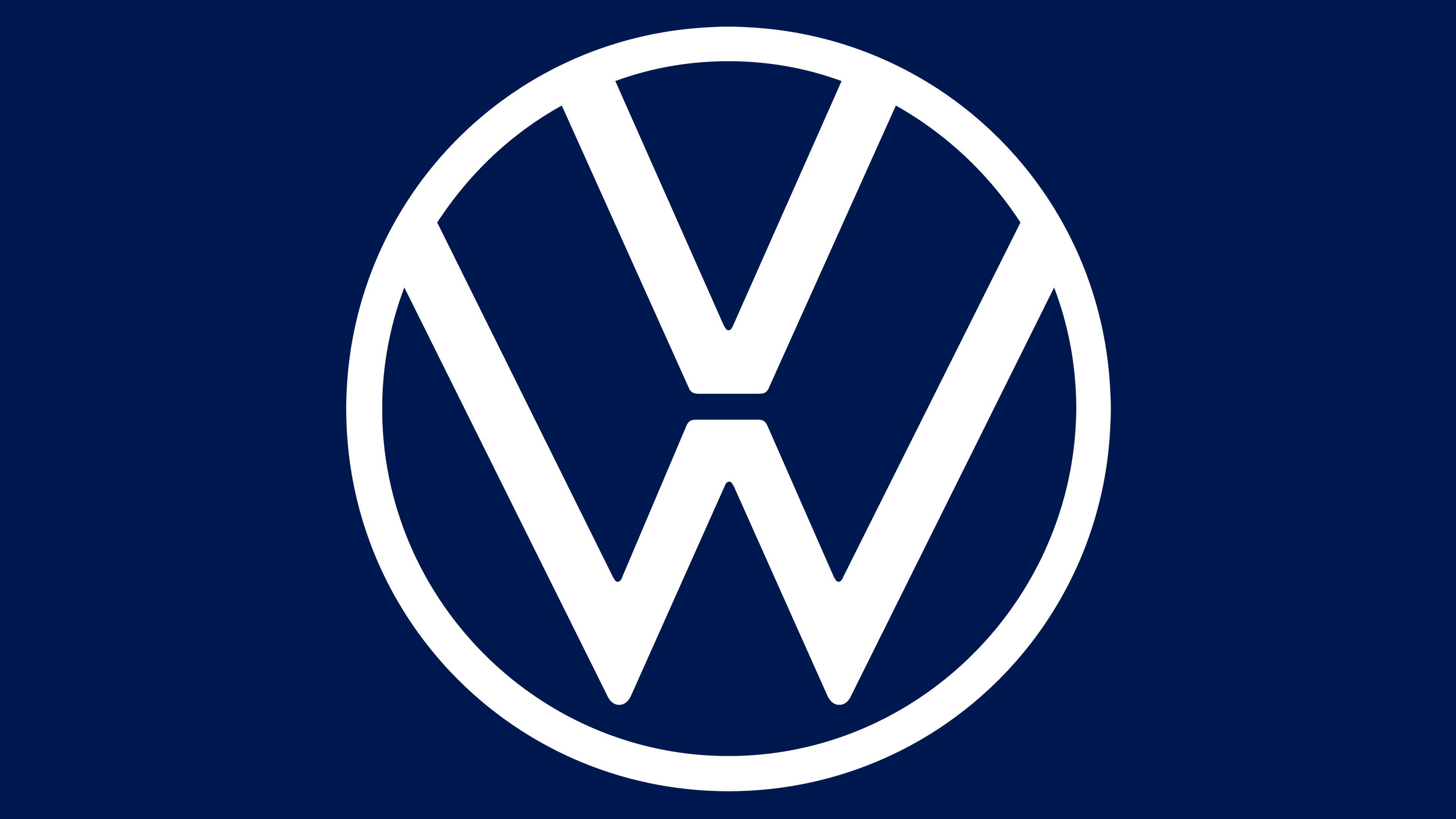
2020 – today
![]()
After a major rebranding, the automaker updated the emblem, returning to the 1967 version. The designers tweaked it, making the lines thinner and separating the bottom “W” from the circle. They also removed the 3D effect by flattening the logo, in line with the trend towards simplified, minimal signs. First, the logo was launched in Europe, then in Asia, and then in the Americas.
Font and Colors
Over the years of its evolution, the emblem first moved away from Nazi symbols, as seen in early versions. Since 1948, a stage of many years of modernization has begun. It lasted until 2020, when Volkswagen management completely simplified the design.
The logo does not contain text; it uses only two letters from the abbreviation. The letters are custom sans-serif and have thicker lines. The signature palette has many shades of blue, from pastel blue to rich cobalt.
FAQ
What does the VW symbol stand for?
The VW symbol is the famous logo of the German automobile brand. The letters “V” and “W” stand for “Volkswagen,” which is German for “People’s Car.”
The logo has changed over the years. It started with a detailed design reflecting the style of the time. A significant change came in 2000, when it adopted a flat, minimalist design suited to digital media and branding trends.
Today, the logo is clean and simple, clearly reflecting the brand’s personality. The circular shape with intertwined “V” and “W” symbolizes unity and strength. This design honors its history and works well across multiple platforms.
What color is the Volkswagen logo?
The logo is made in blue and white. The blue background symbolizes excellence, reliability, and class, important brand qualities. The white initials “V” and “W” represent nobility, purity, and charm.
Blue is associated with trust and reliability, making it suitable for a brand known for dependable cars. White details add elegance and simplicity, keeping the logo clean and easily recognizable. This color scheme looks appealing and supports the brand’s message and identity in the automotive industry.
What is the new Volkswagen logo?
The new logo has a simpler and more modern design. It’s now flat and two-dimensional, making it look cleaner. The V and W are still arranged in a circle, maintaining a classic look. The font and circle have a fresh, updated style.
This redesign represents a friendlier and more accessible brand image. The simple design ensures digital visibility and works well across devices and platforms.
What does the Volkswagen logo mean?
The logo features the letters V and W inside a circle. These letters represent the brand name, which comes from two German words: “Volks” (people) and “Wagen” (car). This translates to “people’s car.”
The design is simple and durable. The V is above the W, both of which are inside the circle. The circle signifies unity and community, aligning with the brand’s goal of serving everyone. The design is timeless and contemporary, showcasing the brand’s rich history and future goals.
How did Volkswagen get its logo?
The logo received its round shape in 1938. The original design was influenced by the Icelandic magical symbol Ginfaxi and included a swastika. The letters “V” and “W” were in the center. Later, elements associated with the Nazi flag were removed, resulting in a cleaner design.
The logo changes were part of the brand’s effort to move away from its World War II origins. The logo became a timeless and distinctive emblem by focusing on the letters V and W. The round shape and clear letters made the logo recognizable worldwide. The current logo retains classic elements while presenting a modern and inclusive image.
Why did VW change its logo?
In 2020, the brand changed its logo to simplify and make it more suitable for digital use. The developers removed the 3D effect, resulting in a flat, two-dimensional look. This made the logo clearer and more universal across different digital platforms and devices.
The new design retains the familiar ring and the letters V and W, ensuring a connection to the brand’s history. The move to a flat design reflects the brand’s desire to keep up with modern design trends and improve its digital presence.