


 Roewe Logo PNG
The Roewe logo expresses the brand’s ambitious goal of becoming a leader in the automotive industry. Traditional elements are presented in a modern style, showcasing the company’s perfect balance between innovative technology and time-tested classics.
Roewe began in 2006, when SAIC Motor Corporation created a new premium car brand for the Chinese market. Its foundation was linked to the purchase of technology and intellectual property from the bankrupt British MG Rover Group. The English name came from the Chinese “Róngwēi,” meaning “glory and prestige,” and the brand was built with a reference to British automotive history.
The first model was the Roewe 750, introduced in 2006. It was an executive sedan based on the Rover 75 platform, but with major updates for the Chinese market. In 2008, the Roewe 550 was added to the range. This mid-size sedan grew out of the Roewe W2 concept, which was connected to the unfinished Rover RDX60 project. In 2010, the company presented Roewe 350, a compact car fully developed by its own engineers.
In 2011, Roewe showed the E1 electric concept, marking an early move toward cleaner vehicle technology. In 2012, the brand launched the Roewe 950, a premium sedan aimed at models such as the Audi A6 and the BMW 5 Series. The use of a Buick LaCrosse chassis reflected cooperation with GM. In 2014, Roewe entered the crossover segment with RX5, a model that soon became one of the brand’s best sellers in China.
RX5 was also notable for an internet-connected system developed with Alibaba Group. In 2016, the i6 sedan expanded the modern lineup with new technology and updated styling. ERX5 followed in 2017 as an electric vehicle, while Marvel X arrived in 2018 as a higher-end electric crossover. In the following years, Roewe continued to develop electric cars and intelligent driving systems, and to expand exports to the Middle East and Southeast Asia.
Meaning and History
What is Roewe?
It is a Chinese luxury automobile brand owned by SAIC Motor, one of China’s largest state-owned automakers. The brand was created after SAIC acquired the intellectual property rights from the defunct British automaker MG Rover. The cars of this brand combine modern styling, advanced technology, and premium features to meet the growing demand for passenger cars in the Chinese market. The company’s lineup includes sedans, SUVs, and electric vehicles, known for their spacious interiors, exquisite craftsmanship, and competitive pricing in the luxury segment.
2006 – 2018
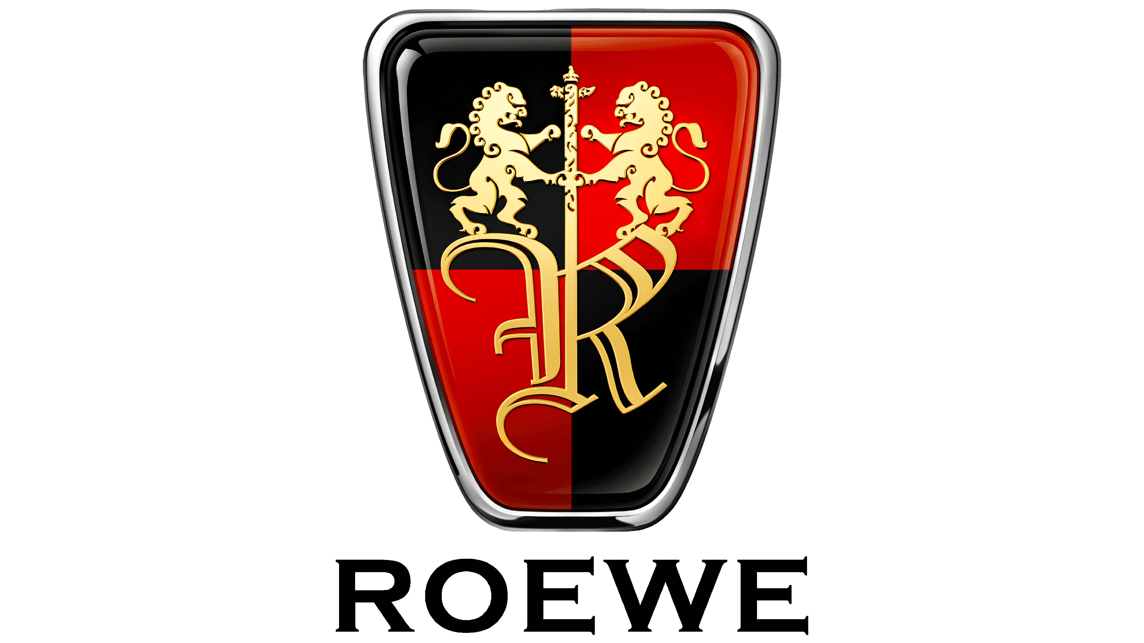
The Roewe brand was created as an equivalent to Rover, which is why it has a similar logo featuring a gleaming heraldic shield. This shield has a trapezoidal shape with rounded corners, creating a sense of perfect balance. The smooth lines evoke feelings of safety and comfort, attracting enthusiasts of practical cars designed for everyday driving.
While most Roewe cars fall into the mid-range segment, the emblem’s symbolic elements convey an impression of luxury and exclusivity.
- The capital letter “R” in a Gothic style highlights the brand’s historical heritage.
- A long sword piercing through the middle of the “R” exudes an aura of strength, protection, and confidence.
- Two heraldic lions holding the sword symbolize royal grandeur.
The shield is divided into four parts: two black and two red, arranged in a checkerboard pattern. Bright highlights, deep shadows, and a smooth gradient mimic the glossy texture of an enameled badge. The gold color of the internal elements evokes a sense of luxury.
The emblem is enclosed in a thin silver frame, which seems to shimmer in the light. This references modern materials used in automobile manufacturing. The inscription “ROEWE” looks completely different: it lacks highlights, shadows, or gradients. Its uniform black color conveys a sense of confidence and high professionalism. Its excessive strictness is balanced by the Copperplate Gothic font: elegant letters with long, sharp serifs indicate the brand’s penchant for bold experiments.
2018 – today
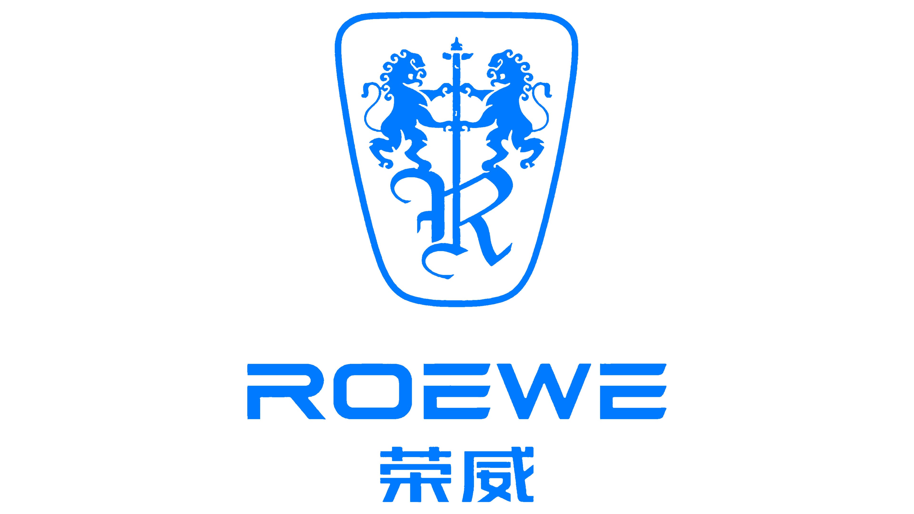
Following the widespread trend towards minimalism, the car manufacturer has significantly simplified its logo while retaining recognizable elements:
- Trapezoidal shape
- Gothic letter “R.”
- Two heraldic lions
- Long-bladed sword
Each element holds a special meaning: the ancient font symbolizes resilience and durability, the sword reflects the brand’s authority, and the proud lions embody Roewe’s vast ambitions. The rounded-corner quadrilateral creates a sense of smooth movement, highlighting the cars’ perfect handling and maneuverability.
The new blue color is associated with innovation and high quality. It has no other shades or pairs; only a white background symbolizes the company’s stability and consistency.
The name Roewe is now written in two languages: English and Chinese. One reflects the brand’s international presence and appeal to foreign car enthusiasts, while the other conveys a national flavor and focuses on the domestic Chinese market.
The English inscription uses a geometric font in a futuristic style. Some letters have unusual gaps, creating a sense of lightness and unobstructed flow. This signifies the company’s openness to progressive technologies and commitment to further developing the electric vehicle industry. This unique style ensures that the English letters harmonize well with the adjacent Chinese characters.