


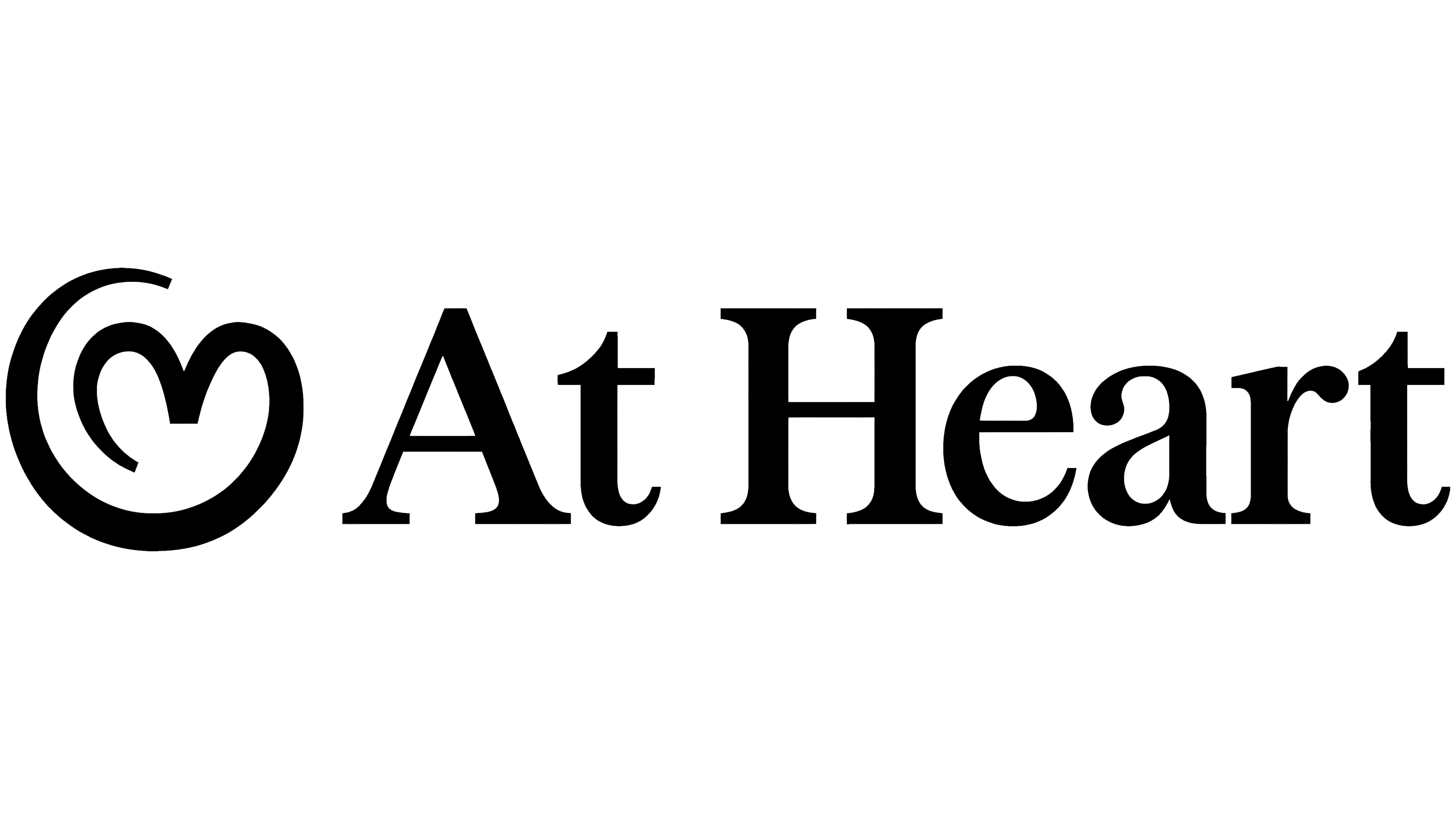
New HR service At Heart has introduced a heart-shaped logo and an identity centered on employee care. Rotterdam studio Evers + de Gier created the product’s first identity for Humanoids, a digital services developer with offices in Rotterdam and Amsterdam. Through the name, emblem, and promotional materials, the team highlighted the value of everyday attention to people at work.
At Heart is designed for small and midsize businesses. The service provides reminders for birthdays, work anniversaries, performance reviews, and contract deadlines. Automation handles some of the organizational tasks, helping business owners maintain regular contact with their teams. The designers focused on what that means for employees who receive a timely greeting or invitation to a conversation.
Before beginning the project, Evers + de Gier studied 19 competitors. The studio compared product complexity and marketing approaches, ranging from feature descriptions to emotional appeals. In the team’s assessment, many HR services emphasize administration and rely on blue-and-white color schemes, generic illustrations, and a businesslike tone. Products with a limited feature set often follow the same category conventions. For At Heart, the studio proposed combining ease of use with a warm, personable voice.
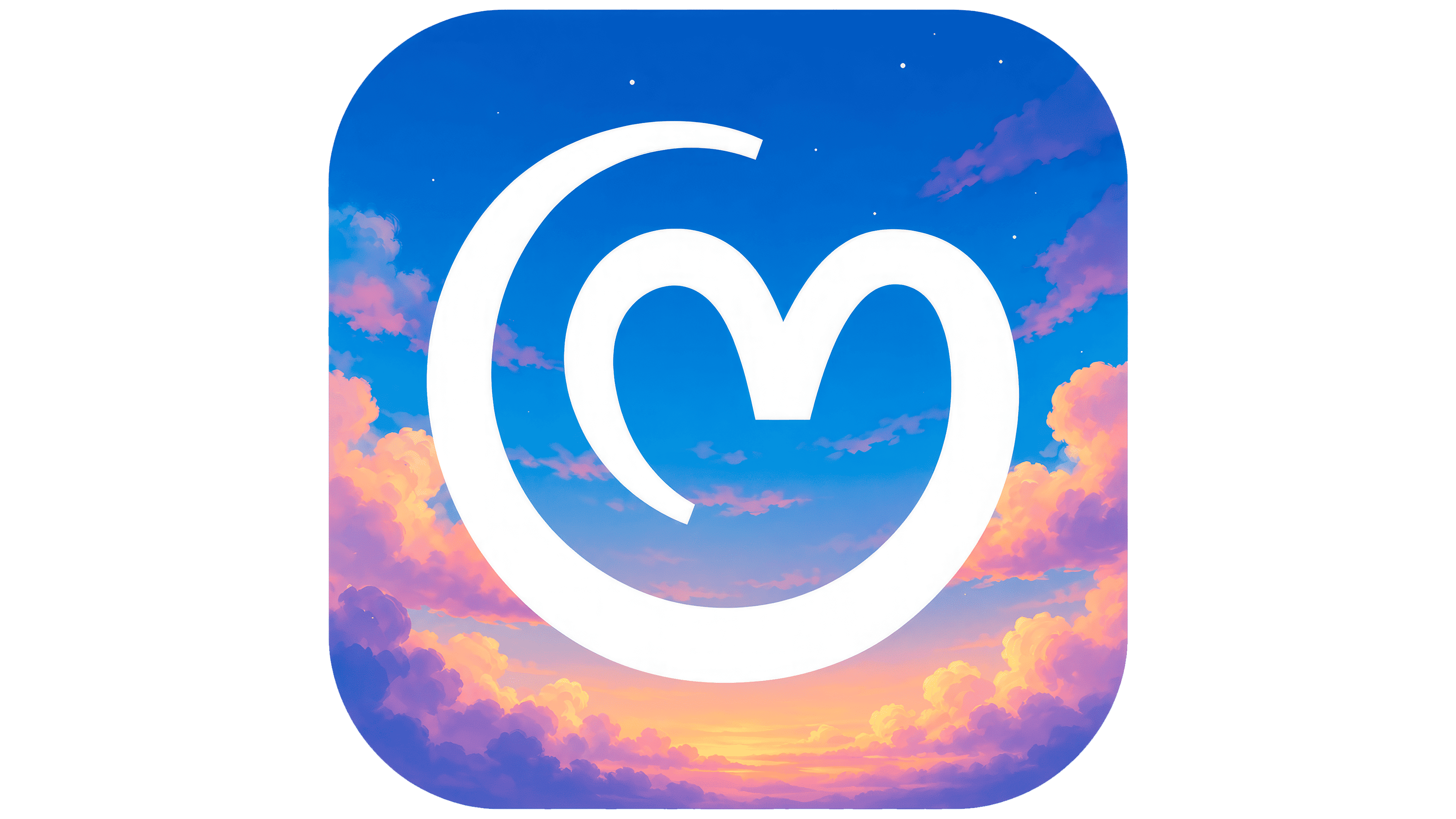
The idea of “Everyday Magic” brought the project together. It celebrates small gestures of care while letting the software handle date tracking. A work anniversary greeting or a well-timed meeting helps a company show interest in an employee’s working life. The At Heart name and heart symbol connect the HR service with human relationships.
The emblem is drawn in a single line of uniform thickness. A heart sits within a rounded loop that curves around it and stays open at the top. Beside it, the name appears with uppercase “A” and “H” letters. The serif lettering combines thick main strokes with thin connecting strokes. That contrast complements the heart’s flowing outline, pairing formal typography with the emblem’s soft curves.
In its brand description, the studio distinguished between how business owners and employees experience the product. For the buyer, At Heart combines the roles of hero and magician, freeing up time spent on repetitive tasks. For the person receiving greetings and reminders, it becomes a caring helper. These two roles explain both the software’s practical value for managers and the sense of recognition it offers employees.
Illustrated clouds, skies, and images of objects with fairy-tale motifs extend the everyday magic theme. They appear on the website, social media, and in the app interface. Product and identity development took eight weeks, from the initial discussions to the final designs. The teams worked on both within the same schedule, coordinating the logo, promotional materials, and At Heart’s app screens.