


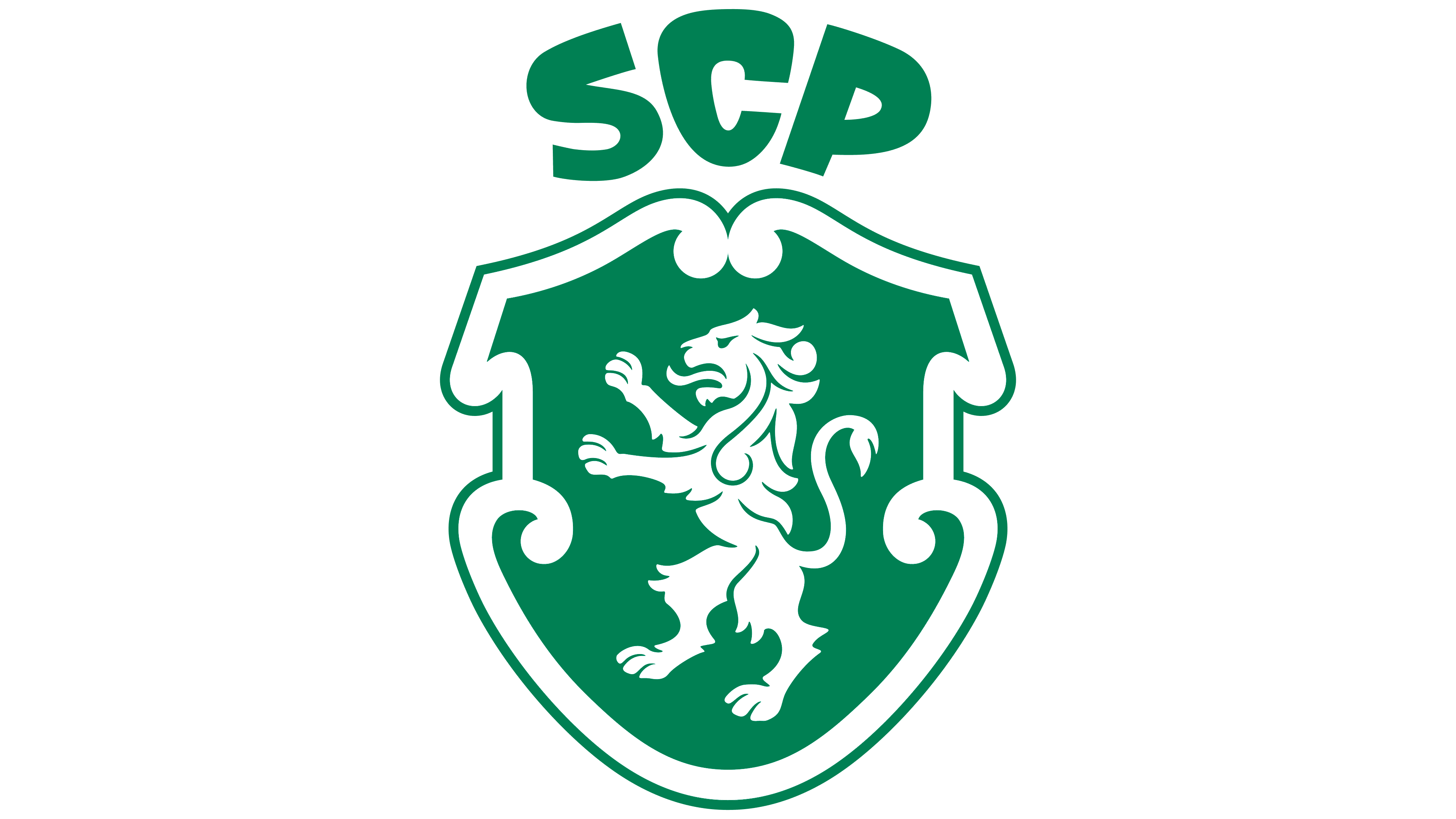
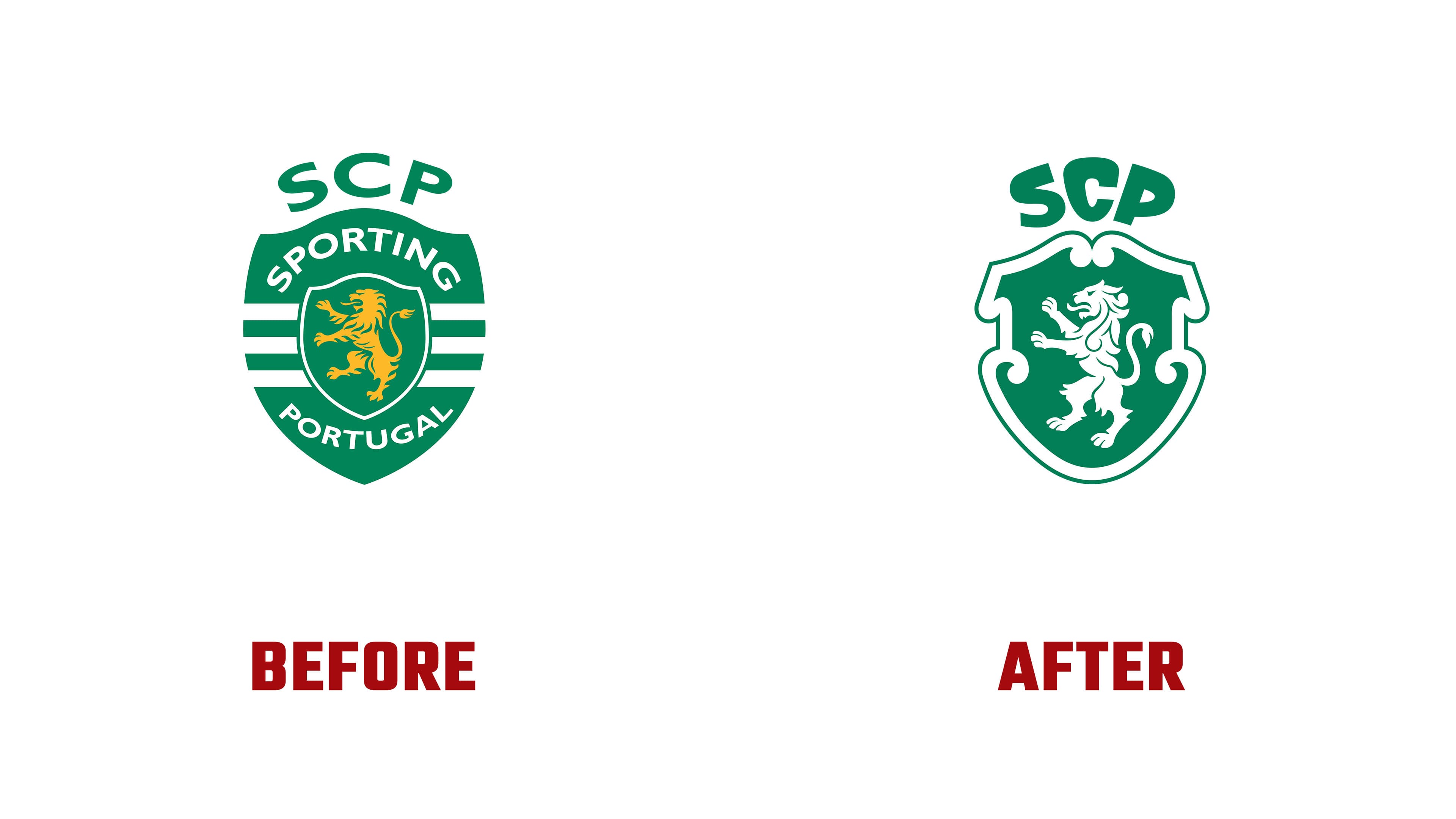
Sporting Clube de Portugal marked its 120th anniversary with an updated club crest. Jones Knowles Ritchie (JKR) unveiled the work on July 1, 2026. The design draws on the fan-favorite crest from 1945. The designers restored the lion’s white color and reworked the shaped shield and the “SCP” lettering above it. For the Portuguese club, founded in 1906, the update marks its first major identity overhaul in 25 years.
The redesign revisits many features of the version introduced on July 4, 2001. That crest added an inner shield, horizontal stripes, and the words “SPORTING” and “PORTUGAL,” while changing the lion to gold. The club wanted to standardize its identity and establish the name Sporting Clube de Portugal internationally, replacing the commonly used Sporting Lisbon. Three white stripes referenced the team’s jersey. In the 2026 version, a white lion stands against a solid green background inside the shield.
The white-and-green combination dates to Sporting’s early history. The lion came from the family coat of arms of Fernando de Castelo Branco, who permitted its use on the condition that the blue background be replaced. Green represented hope for the club’s future success. Lisbon’s Casa Anjos produced the first emblem in 1907. By restoring the white lion, JKR returned to a tradition that preceded the gold version.
The designers combined features from 5 earlier crests to create the new lion. It retains its raised forelegs, left-facing head, and curved tail. The mane’s curls echo the curves of the surrounding shield. The club associates the lion with the Sportinguista, a community member committed to personal growth. The relationship between the mane and shield represents the individual’s connection to the club’s code.
The shield follows Portuguese heraldic tradition. Its thick outline forms two curves at the top, curls inward at the sides, and tapers to a rounded point at the bottom. Above it sit the letters “SCP,” short for Sporting Clube de Portugal. The initials first appeared above the shield in 1945. They are now heavier, with rounded corners and strokes of varying thickness. The “S” and “P” tilt relative to the central “C.” According to the designers, this lettered “crown” represents the club as an institution and the passing of its legacy from one generation to the next.
The archives helped connect longtime supporters’ interests with those of future audiences. Sporting has more than 179,000 members and supports more than 30 sports. Sporting CP executive André Bernardo described the update as developing the person before the athlete. Through its work with people, the club aims to reach audiences beyond the sporting community. JKR Executive Creative Director Sean Thomas saw Sporting’s heritage as a foundation for connecting with a new generation.
The lettered “crown” carries through to Sporting Sans, which F37 developed in collaboration with JKR. The typeface draws on the masthead of the club’s internal newspaper. Because the original lettering covered only the publication’s name, the designers had to establish consistent proportions across a complete alphabet. F37 strengthened the thin strokes and softened the curves of the “O,” “C,” and “G.” The typeface pairs heavy upper sections with slender supporting strokes and rounded corners, continuing the club’s lettering tradition.
Green and white stripes remain across other materials and form the basis for animation. The metalwork of the Porta 10-A gates at José Alvalade Stadium inspired decorative patterns. The shield outline frames photography, while Sporting Sans appears throughout club spaces and in print and digital materials.