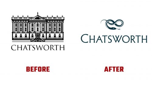
Chatsworth House, a historic estate home to the Cavendish family for 16 generations, has revealed a new logo and brand identity designed by Pentagram. This change reflects a shift aimed at modernizing the brand while honoring its rich heritage.
The new logo features a hand-drawn serpent motif, replacing the previous detailed depiction of the Chatsworth House. This choice is a nod to the family’s heraldic heritage and a step toward a more contemporary identity. The serpent, a recurring emblem in the Cavendish family heraldry, symbolizes stewardship, wisdom, renewal, and growth. Stone-carved serpents are prominent across the Chatsworth estate and at Bolton Abbey and Lismore Castle, reinforcing this historical link.
The serpent in the logo is intricately drawn, with a dimensionality achieved through twisting scales that suggest volume. This detailed rendering makes the serpent a compelling visual element. The new wordmark complements the logo by maintaining the classic feel of the previous typeface, Trajan, but with refined execution. This approach balances tradition and modernity, aligning with the estate’s historical significance.
In addition to the main logo, different serpent configurations have been developed to identify various sites within the Devonshire Group, including Chatsworth, Bolton Abbey, Lismore Castle, and the Devonshire Group itself. This system of varied serpents provides a cohesive yet flexible brand architecture, an unusual and innovative approach in the heritage sector.
The new branding’s color palette combines muted blues and greens with brighter, more dynamic colors. This contrast creates visual interest and highlights different aspects of the estate’s identity. Some elements, like the combination of elegant “Deep Estate Blue” with jarring pink banners, may sometimes seem conflicting. Despite this, the overall effect is to make the brand feel more inclusive and dynamic.
Typography plays a crucial role in the new identity. Azo Sans, a simple and sophisticated typeface, leads the way, sitting elegantly atop the estate’s photography. This choice of typography enhances the brand’s refined and opulent character.
The new branding is designed to meet the evolving expectations of visitors who seek a more inclusive and dynamic experience at heritage sites. By moving away from the overly detailed house edifice logo of the 1980s to a motif that combines ancient symbolism with forward momentum, Chatsworth and the Devonshire Group are well-positioned to engage with contemporary audiences while preserving their commitment to heritage conservation.
Introducing the new brand identity signifies a broader shift for Chatsworth and its associated sites. It aims to make these historical locations feel more relevant and engaging to today’s visitors without compromising their historical integrity. The hand-drawn serpent motif and the refined wordmark together create a visual language that is both timeless and forward-looking.


