


TYPE Books updated its identity in 2026. The chain’s stores are well known in Toronto, and Marissa Korda chose to carefully refine a familiar image. The brand received a fresher tone for the website, social media, posters, and printed materials.
The logo kept the four circles with the letters “T,” “Y,” “P,” and “E.” Beneath them, as before, is the italic word books. The connection to the old mark remained, while the overall tone became lighter. Earlier, the black circles recalled typewriter keys and looked heavy. In the new version, the fill became dark gray, while the outlines gained more weight.
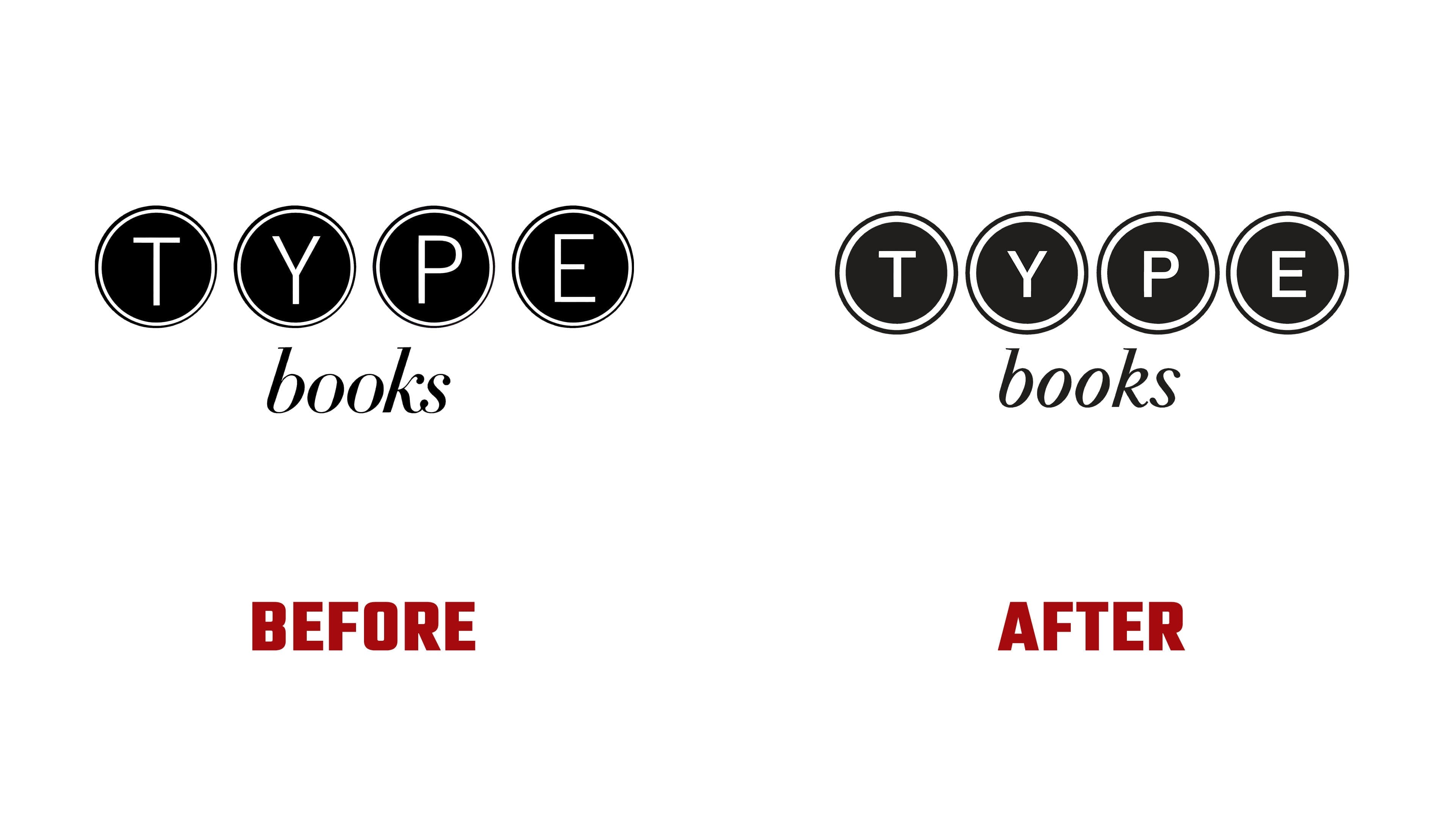
After the refinements, the logo looks lighter. It maintains ties to typesetting, printing, and book culture. At the same time, its mood grew closer to that of a lively store where people choose books, attend events, listen to authors, and return for recommendations.
The TYPE Books identity is built around a simple mark. The lettered circles connect to typography and books. The italic books add a warm, personal tone. The brand keeps its previous image and looks cleaner.
For the store, the connection with readers, authors, and Toronto’s literary scene carries weight. The new logo helps preserve the familiar name and remove visual heaviness. The update feels like good editing of a text. The same foundation, a calm form, and careful adjustment of details.
TYPE Books remains an independent bookstore with curated selections, a cultural program, and attention to different authors. The identity supports this image through a calm tone and a careful connection to the past.