


Cambrium works with materials born in the lab. Their work begins at the molecular level, so the brand needed a way to explain complex science in a living, accessible tone. In June 2026, True Arrow introduced a new identity and logo.
Cambrium calls itself a molecular intelligence company. The team designs materials using enzymes, polymers, and peptides, supported by molecular prediction and living systems. Its products are used in personal care, textiles, and other fields that need new material properties.
The idea “Alive with possibility” became the starting point of the update. Cambrium wanted to show the connection between science and practice. The brand needed to be understandable for investors, partners, and customers while preserving its scientific foundation.
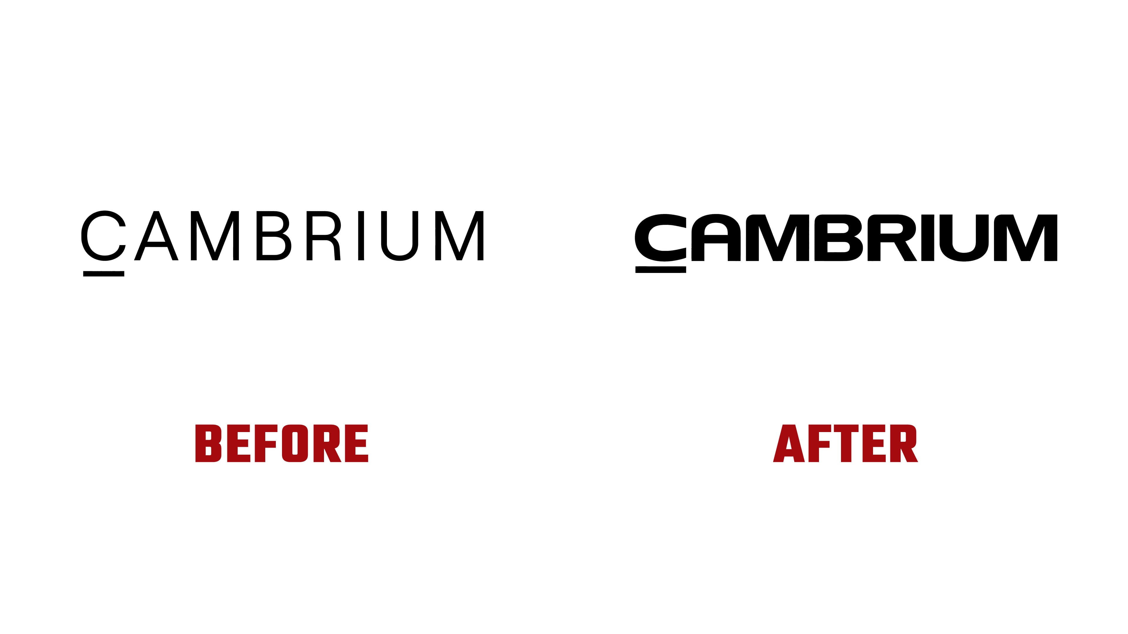
The previous logo looked almost academic. Thin lines, wide spacing between letters, and a restrained appearance recalled the mark of a research laboratory. The new version feels denser and warmer. The letters received soft rounding, and the wordmark began to look more unified.
A small element remained under the letter “C.” Earlier, it read as a separate accent. Now it is built into the logo’s form, unifying the mark into a single structure. On a black background, the white wordmark looks technological while keeping a living tone.
The connection to Cambrium’s work comes through modularity. The company sees amino acid chains as nature’s building blocks. The logo follows a similar principle, with separate parts joining into a complete form. This principle connects to developing new materials from molecular components.
The update moves Cambrium away from the image of a narrow scientific laboratory and toward a brand at the intersection of biology, computation, and materials science. The new mark recalls the path of a future material from molecular formula, hypothesis, and precise teamwork to practical application.